Maybe Navy?

I have a red dining room. With orange chairs. And a sleazy velvet painting of a tiger. And a zebra rug. It might be -- maybe -- a little much. Now I love me some drama, but I don't want my house to look like a psychotic palm beach housewife took acid and decided to spruce things up a bit. So, dear readers, I am enlisting your help today. I am offering up my dining room like a wee sacrificial lamb for your entertainment. You know how it's really easy to go to a friend's house and rearrange furniture and pick paint colors and choose a new couch (all within the span of an hour), but sometimes it's nigh IMPOSSIBLE to make decisions at your own home? Well, sometimes is now. Yes, I'm asking for advice, and I know that several of you are interior designers, so come out, come out, wherever you are. Your mission -- if you choose to accept it -- is the first room I decorated in our first house. So it's feeling a bit 2007:
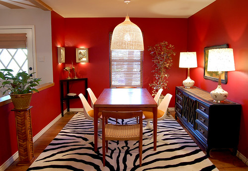
dining room

Now don't wuss out on me, ok? Before you start formulating strategies, let me say that I know the plant stand needs to get painted black and the pot is fugly, so just pretend I already fixed those things. That's what I usually do.

Here are main the issues at hand: Should I keep the red and get a new rug? I'm considering this relatively inexpensive hemp and white leather flat weave rug from Overstock (it's reversible! Yaaaaaay!):

overstock rug

Or should I paint the walls navy blue instead? Somehow, I feel like I could keep the rug if I painted the walls navy, even though zebra is officially double dead. Sadly, the rug, at $350 buckaroos, is far and away the most expensive thing in that room. What have I learned from this experience? I will never buy a patterned rug again.  Also, I will never buy an expensive white rug again, because my cat LOVES to puke on rugs. (In case you're wondering, Folex is the best carpet cleaner ever.)

The suspect in question:

hina

Hina Hina thinks she's modeling for Cat Fancy magazine. She's so vain that I had to turn on the vacuum cleaner to get her off the table and out of my photo shoot. But I digress (surprising, right?). Other possible points of contention include the always popular orange chairs with red walls combo. Yep. And an orange tiger painting to boot (but he's such a handsome fellow).

tiger

Obviously blue and orange would look better together... but maybe I shouldn't have the tulip chairs with that table, anyway? I actually have 6 of the Danish ropecord chairs, but 3 of them need repairs. Two are currently in the living room, to be used when we pull the leaves out of the table. Also, I used to have the tulip table in the dining room, but it was too small for company, so it's now my office desk. That's pretty much the catalog of available furniture, and I'm definitely not buying any more. (Have you checked the Dow today? Wowsers).

And what do you think about the lamps? I'm kind of on the hunt for new shades at the very least, but I only buy secondhand stuff, so that has limited my options severely (that, and my $50 budget).

One last teensy consideration:

kitchen

My humble kitchen, as viewed from the laundry room. (Don't worry -- it doesn't actually look like a cubist painting in real life. It's just the camera lens.) The kitchen shares a wall (along the right side) as well as a clear line of sight with the dining area, so it has to be the same color as the dining room, and I think the kitchen is really cute in red. We're planning to knock all the upper cabinets out and install shelves (can you see from the upper right hand corner that the cabinets float over our bar? It's WEIRD. There's like, 8 million of them, too. We have 75 gargantuan square feet of countertops, all with cabinets hovering overhead. They must have cut down an entire forest to make those stupid cabinets. But, alas, this tragic story is way too big to be contained within this little post). Anyway, the point is that navy would have to look good in here, too.

So, I'm not sold on the navy, but I'm definitely considering it. I have a lot of black furniture, and most people surveyed say that blue and black together looks bruised, but I'm thinking the right color of blue would be ok. Kind of like the color on this crazy rocking chair that doesn't go anywhere in my house

rocking chair:

And here are some navy rooms to help you further visualize the possibilities. I spotted several of them at Alicia B Designs, where she did this fantastic post on dark rooms... Worth a look.

Romano

This one is from Todd Alexander Romano Designs, and honestly, I'm not even sure if this color is navy. Or purple. Or charcoal. But it's pretty, and my couch in the living room (visible from the kitchen and dining room) is the same color leather as those chairs.

domino

These are from Domino, and I like the one on the right, but lefty is a little too blue for my purposes... I think?

drake design

Navy grasscloth from Drake Design Associates. That desk is Ohmigod gorgeous. Drool. Drool. Drool.
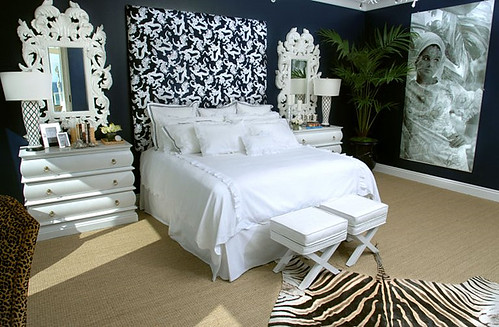
kristi lei

Somehow navy and zebra is a popular combination... I guess it's slightly less obvious than red and zebra. Courtesy of Kristi Lei Interiors, this is a trifle froof and poof for my taste, but the paint color is nice.

I am a little worried that navy will feel stuffy and too... federal. We don't have an eat in kitchen, so I'd like to keep my dining room fun and convivial. Not like these rooms:
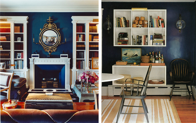
scheerer roberts

It's not that I don't like these rooms from Markham Roberts and Tom Scheerer, but they're just not for me.

I think if I do navy, I will definitely have to do some punchy accents, sort of like this vignette from Domino:

domino

Ok, friends, I'm ready. What do you think? tell me what to do. Don't be shy. Do your worst best. If I like you advice I might even take it...
Derelicte

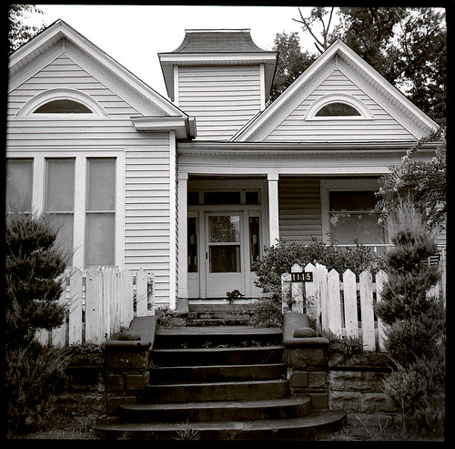
I know I shouldn't keep shoving the old buildings down your collective throat, but Karly's out of town and I'm in charge (insert maniacal laugh here), so I shall therefore continue to post unabated on my unabashed love affair with history (but I promise to do something different for tomorrow, ok?). It probably all started with my childhood home, built in the early 1900s, which was undoubtedly uninhabitable when we moved in. I mean, peeling walls, wood burning stove, no a/c (IN TEXAS) -- the craptacular works. My mom spent most of my tender years with me on one hip and a bucket of wallpaper paint on the other. I learned to climb a 14 foot ladder at 5. It was freaking awesome. Except that we lived across from the welfare clinic, because all the old houses in Texarkana are in the worst parts of town. Anyway, the only picture I have isn't the greatest, but at least you'll have an image to fix on:

1115 main

1115 Main Street: where nothing is square and wild cats eat bologna out of your hands. The outside almost always existed in this ramshackle state, as if at any minute the entire house could revert to a heap of sticks and concrete, but the inside was like a passport to crazytown. My Mom covered EVERYTHING (even the entryway tiles) in florals and damasks. Although not my taste, it was pretty freaking genius.

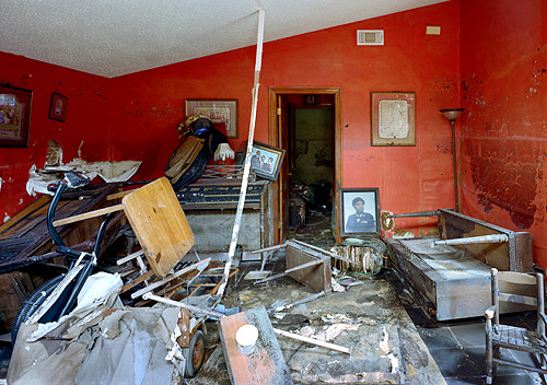
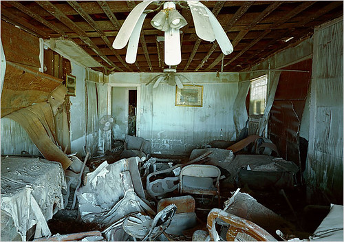
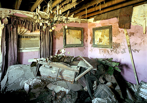
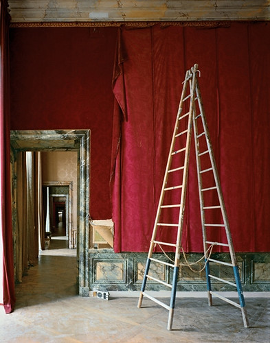
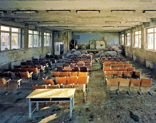
So when I became interested in photography, I was probably predetermined to gravitate towards pictures of dilapidated interiors. Robert Polidori, photographer of the aftermath of Katrina and Chernobyl, as well as documenter of the restoration of Versailles, in glorious, large format film, is a particular hero:

robert polidori

robert polidori

robert polidori

robert polidori

robert polidori

(Photos courtesy of the artist and found at Bomb Magazine, Art Info, Polis, and Metvier Gallery)

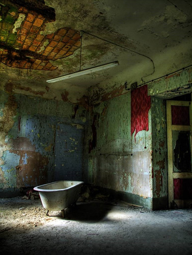
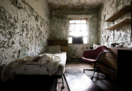
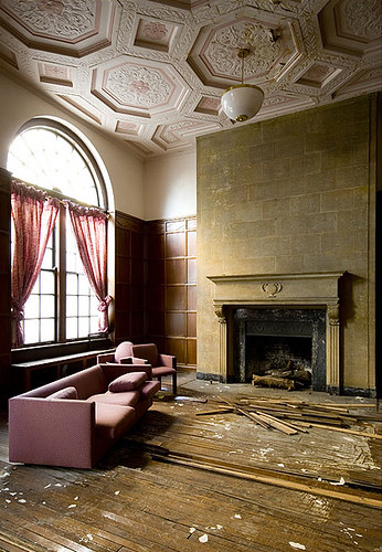
The camera loves texture. It loves the peeling bits of old paper, the elegant curve of a water stain, the shadows cast by a million pebbles, and so it loves age and ruin and decay. And I love these pictures I recently found by a photographer in Spain on a blog called Abandonalia:

abandonalia

abandonalia

As well as these lovely images from a photographer who runs The Kohrman Report:

kohrman report

kohrman report

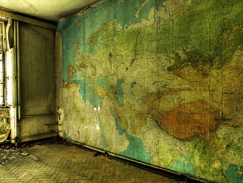
What I am getting at here, in a very roundabout kind of way, is that I have a fantasy about living in a place like this. A place where I would just sweep the dust off the rickety floors and put a coat of varnish over the peeling walls (and the map is staying, fo shizz). It is a ridiculously romantic notion to think you can preserve layers of history like a fly in amber, and I know that the rats and water leaks and hobos squatting in the hallway are all scary, dirty things (not to mention whatever is hiding out in that dank fireplace), but I really can't help myself. I shall call my new style Derelicte, but I'll be needing some new furniture. And I bet you've already seen these pictures because they're everywhere, but this is what it's all about in crazy Erin's wildest dreams:

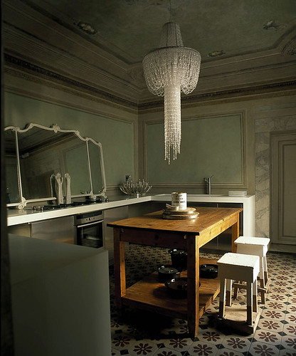
sabrina bignami

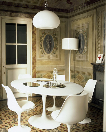
sabrina bignami

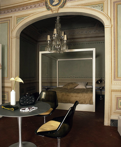
sabrina bignami

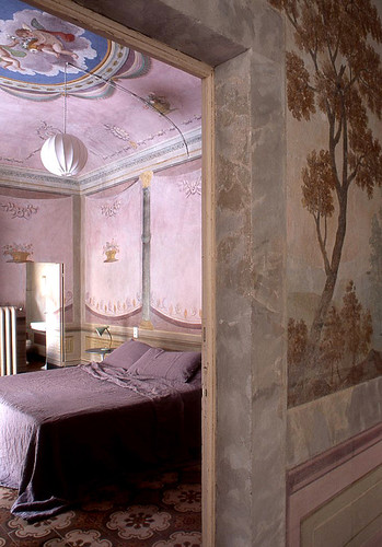
sabrina bignami

sabrina bignami

I love everything about it: the patina of age and dinginess, yes -- the shocking contrast of the furniture, the lack of fuss in accessorizing, even the purple bedroom, although purple is my least favorite color. Sabrina Bignami, architect and owner of Casa Orlandi, you are today's recipient of my super stalker girl crush, so don't be surprised if I show up at your door (as soon as I can figure out where it is). I promise to do my own laundry and sweep the crumbs off the table.

Something Old, Something New (Maybe Something Borrowed, I'll Pass on Blue)

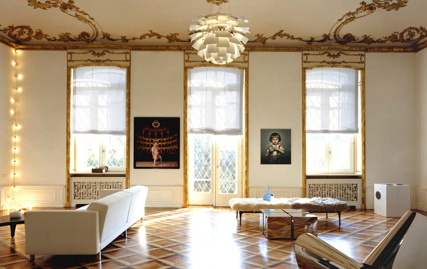
Yeah, I might want to marry these pictures... is that really so wrong? Is it truly unnatural to have a crush on home decor porn? Because there is a straight up delicious zeitgeist sweeping the decornation, and it's taken me a while to pinpoint exactly what it is that I like about it, but I'm on to it now. Contrast. Oh, sure, contrast has always been a decorating principle; the eye loves a good focal point, right? It's just that lately it's been contrast in pattern(s), contrast in color(s), and some of it -- while fun -- is frankly fatiguing and may cause retinal scarring. I'm certainly not going to abandon the best of trends past (why throw the baby out with the zebra bathwater?), but what I'm currently digging is contrast in form and texture, and especially, especially, contrast that comes from abutting something old with something slick and new. Like this:

thomas loof

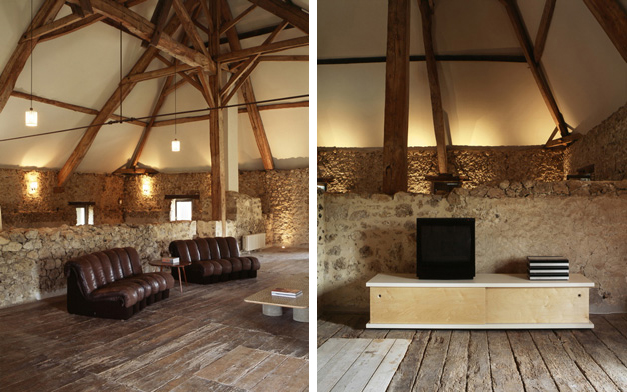
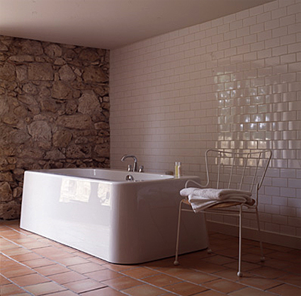
This is the number one reason that I'm sad to be an American: we don't have buildings this old, and if we do, I will never, ever, be able to afford to live in one (insert your own economy joke here). Nevertheless, I can freely admire these images shot by photographer Thomas Loof because they are sexy as all get out (whatever that means).

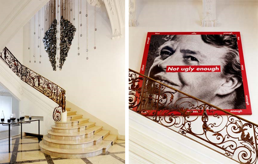
thomas loof

I spy a Barbara Kruger photograph and it's funny. That hallway is NOT ugly enough, but somehow such an ugly print just sharpens the pretty. Oh, and my family members may or may not be reading my posts, so I won't mention all of the illicit things I would do to own that house. (Instead, just think about what you would do, and feel free to leave your musings in the comments section below...)

Of course, there's contrast that real people can achieve, that isn't entirely dependent on jaw dropping architecture (although gorgeous bones definitely mean you can cut down on the makeup, as seen above).

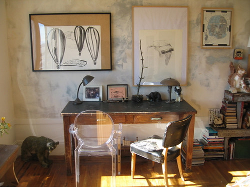
apartment therapy

This little gem comes from Apartment Therapy, where the owners chronicle their hellish transition from cesspool to quirky San Francisco repository for a billion vintage collections. I do really love all the modern touches that keep this young couple's roughed up home from looking like crazy old Aunt Frances' cat-filled hovel. What do you think: is one Ghost Chair a gimmick, or does it go a long way towards adding polish and structure to this deliberately aged space? (Guess you know which way I'm leaning, but I love to argue...)

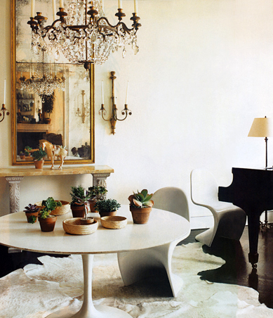
Of course, you can always depend on Tom Scheerer to show you how to mix and match new and old furniture for a splash of eclectic panache:

tom scheerer

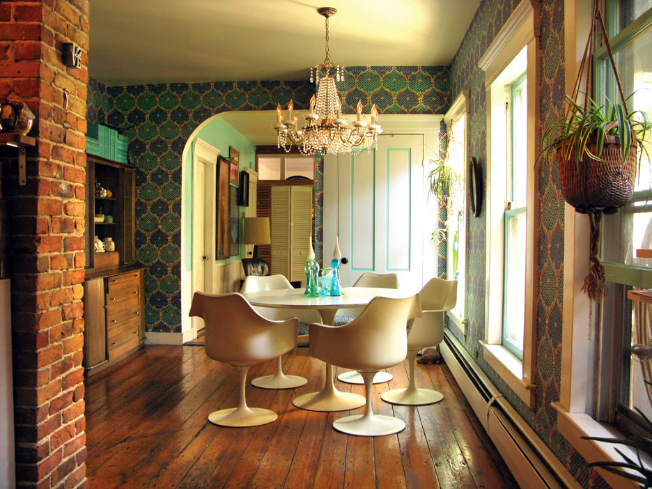
Are you sick of tulip tables and Panton chairs yet? I'm not, as long as they look like this.

Although I appreciate the clean white walls of Scheerer's rooms, I also like the ancient looking, rough hewn treatments that have been popping up everywhere, as seen here in Lucas Allen's portfolio:

lucas allen

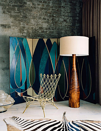
Did I say I didn't like zebra rugs, or blue for that matter? (But I totally want that Marcel Wanders chair!) As crazy Harvard professor cum shaman Timothy Leary said, "Set and setting." Modern shapes and patterns take on a new life when paired with natural elements (as in, NO imperial trellis wallpaper... although I'll probably eat those words when I see a single trellis papered wall hanging out in the middle of a forest... Actually, I kind of like that idea).

More brick juxtaposed with modern angles courtesy of Shoot Factory:

shoot factory

shoot factory

I love the bluntness of the furnishings against the randomness of the brick. (But I'd have white couches instead of brown, thank you very much).

Perennial faves Wary Meyers are masters of this aesthetic:

wary meyers

Yep. Another tulip table. But it looks so good when it's set against dark and natural surroundings. I love the oldness of the floor and the dinginess of the brick heroically holding its own against what appears to be relatively alien technology. I love the contrast. I know the new rustic aesthetic would throw a farmhouse table into this woodland mix, but I just can't go there. I need some relief from the browness of it all. (But there ain't nothing wrong with a farmhouse table in a super sleek and modern white house...)

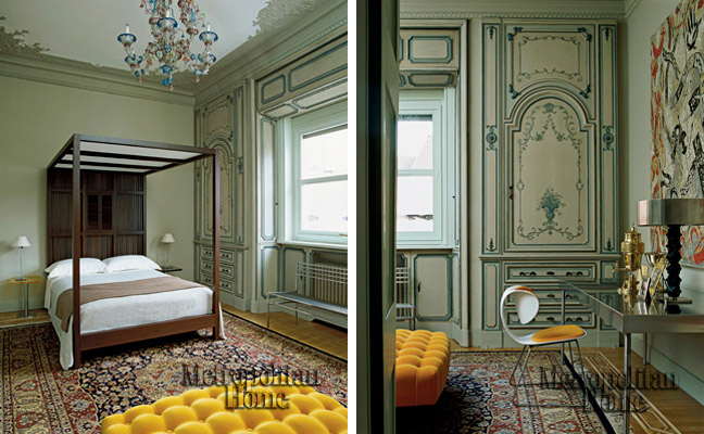
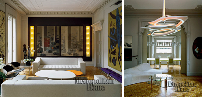
This is another house that deftly mixes old and new, muted and punchy, baroque and sleek:

met home

sawaya

Holy hotness, William Sawaya's home featured in Metropolitan Home is incredible. To say anything else would be superfluous. (Except this: hey Met Home, your pictures are too tiny and would it kill you to make the watermark smaller???)

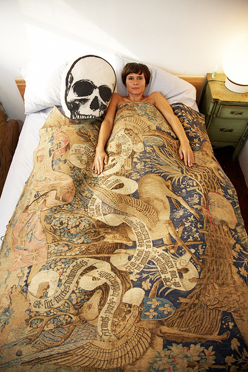
My last picture for today comes from He Who Must Not Be Named (no, it's not Voldemort. Well, maybe it is).

must not benamed

Reminds me very much of the gorgeous Suzy Hoodless pics I posted a few days ago. I now have the overwhelming urge to run out and buy some fusty old tapestries for my guest bedroom and artfully toss some shockingly red pillows on top. Stay tuned...