One Room Challenge: Week Six -- REVEAL!

Hi everyone! Welcome back for the final installment in the One Room Challenge series, wherein I and a host of talented bloggers aim to transform a space in six extremely short weeks. Feel free to catch up on previous posts HERE. Before we get started, I just want to give Linda of Calling it Home a big shoutout for organizing this challenge. Without the threat of public failure, I probably would have flaked a month ago. So who's tired of looking at an empty green box where my dining area should be? If you've been following along, you know that I started with a fleshy peach disaster of a charmless room that housed sad chairs, a hideous table, and wicked dirty grout. I planned to push myself into designing something bright, edgy and polished, yet still breakfast casual. I had big dreams to resurrect my cracked marble Saarinen table in hopes of creating greater seating flexibility, but that plan failed and I was left bereft. What's a tableless girl to do when the world is waiting for a dining area makeover?

arsenic austin interiors

Bust out the sandpaper and spray paint, that's what. I waited and waited for St. Craig to reward my fervent prayers with an oval top for my leftover tulip base, but Frankensaarinen table was not to be. I investigated many fabrication options but was stymied by cost and lead time. So my sad, flaking, peeling old table got a coat of semi gloss black paint on the apron and legs. Then, we sanded the top finish off and wiped on about five coats of dark walnut Danish oil.  It actually looks not too shabby, and I love the matte quality of the finish. Plus the fruitwood inlay really pops now.

That left me with the art conundrum to solve. This was a toughie. I really have too many choices and I like them all for various reasons. What I chose surprised even me...

arsenic austin interiors

Say what? Maybe it's because it was PITCH BLACK and pouring on shoot day, but the acid yellow of this 70s abstract painting appealed to me. Let the sunshine in!

arsenic austin interiors

I tried lots of art in multiple situations with tons of different styling options, and somehow this dark horse ended up the winner. When I paired it with the crazy Clarence House fabric I used to upholster this vintage ebay bench, something clicked into place for me and I saw things differently. It really is so important to shift your perspective and keep an open mind. Wine helps.

arsenic austin interiors

I know I kept saying I was going to use that red Robert Allen fabric -- I do love it and I even ordered a yard. But me and Clarence House have a thing going on. Don't tell Robert... I don't want him to be jealous.

arsenic austin interiors

So far the brassy bench is popular seating -- like elbow your baby brother out of the way popular. I'm pretty happy with the way it opens the dining area to the kitchen, in that it feels less fenced off.

erin-williamson-designs-38

And then there is the vintage head vase... it's 80s deco eurovibe o'clock up in here, with a Fornasetti twist. Say that 20 times fast.

arsenic austin interiors

Everything on the table is thrifted -- from the $5 flatware to the fringed napkins, cobra commando candlesticks, glassware and Bavarian china.

arsenic austin interiors

erin-williamson-designs-12

I have TONS more china, flatware and glassware, but I just put way too much work into the table to completely cover all that sexy woodgrain up.

arsenic austin interiors

In case you were wondering, the other half of the room still exists.... Of course my ugly door has been properly rejuvenated with a shiny brass doorknob. And what's that on the kitchen side of things?

arsenic austin interiors

Oh, it's just a creepy haunted mirror. No biggie -- apparently I have to showcase something haunted in every room. I have no idea what this thing is, but my hunch is turn of the 20th century central European. The hammered brass vase came from Round Top and it is far cooler than pictures give it credit for.

arsenic austin interiors

This picture is supremely awful... it was the end of a (literally) dark day and the kids were (literally) three seconds from walking through the door, but I wanted you to see the whole humble setup.

arsenic austin interiors

Even the china cabinet got a mini restyle. Notice all the gold glassware that didn't make it to the table...

arsenic austin interiors

I bought the unicorn for a client kid room, but little Susie may have to live in a land of shattered dreams. Or maybe I will let it go... I am a giver, after all.

And that's about it for my teeny tiny dinette makeover. Let's have a proper before and after, shall we?

BEFORE

erin-williamson-orc-2

AFTER

arsenic austin interiors

arsenic austin interiors

arsenic austin designer

I think I accomplished what I set out to do. The room is functional and finished, plus there are a few surprise moments. Nothing like a little shock and awe to go with your morning cereal, right? By relying on thrift stores, craigslist, and ebay I was able to keep the budget in check. The bulk of my funds was spent on simple window treatments and a cowhide rug that can be used in different decorating schemes. Content to play supporting roles, neutral basics allow color and quirky accessories to take center stage in the dinette drama. And of course I can always switch out the cheapie flashies when my fickle side takes hold.
As Leonardo da Vinci said: art is never finished, only abandoned.  I read that in Parent's magazine or something. Hey, I'm no snob -- inspiration comes from everywhere.

It's been a blast hanging with you fine people throughout the challenge! Thank you for your support and comments -- they have been the wind beneath my wings. I read each and every word and I love them all, good or bad. Feel free to leave a comment and tell me all about what you think of the new old dinette. Maybe you can even talk me into doing the kitchen next... Maybe.

Please don't forget to visit the other participants to see how their rooms resolved. There is some amazing work taking place!

one room challenge

It's been real. Signing off and taking a nap.
xo,
Erin

Luke's Mini Mod Nursery Tour

What what? It's tour time!

untitled (1 of 1)-4

I'm sure you had nothing better to do than refresh your browser 800 times a day until I posted the latest tour, right? Or, if you're like me, you barely have time to eat and sitting down at the computer for three minutes is a major luxury.

Thanks for spending that three minutes on me. Let me try to make it worth your while.

untitled (1 of 1)-9

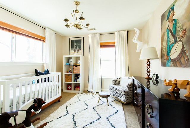
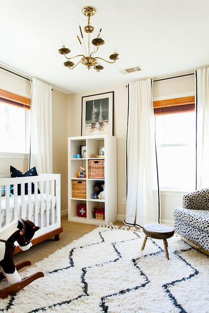
Much like the rest of our house, this room was a hot mess when we moved in. Tobacco green carpet that reeked of tobacco, hideous paint, a weird booby light fixture that hung long and low from the faux wood fan... it pretty much had it all.

untitled (1 of 1)-8

For a while it was Ben's office, but then I got knocked up and the baby had to sleep somewhere besides our bedroom, duh.

untitled (1 of 2)-2

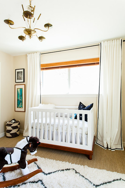
Except, guess who's never ever ever in his entire seven months of life slept here?

untitled (17 of 19)

Thanks a bundle, pyloric stenosis and insane food allergies. I hated sleeping, anyway.

untitled (1 of 1)-2

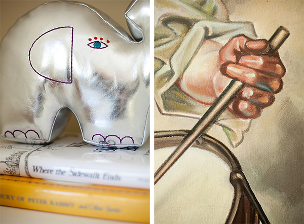
But it's kind of ok because that means I can keep my sock monkey shrine unbesmirched by snot, and also the hot air balloon sheets that I am unnaturally fond of are still clean months after their debut.

details 2

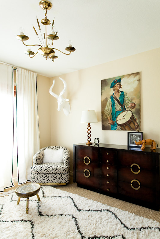
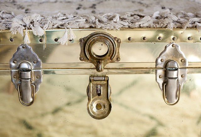
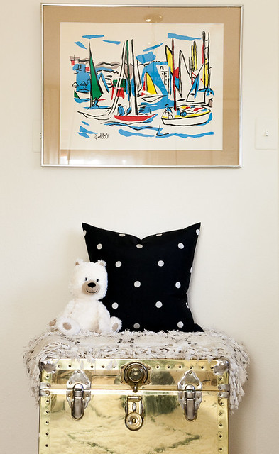
Plus I doubt very much that Luke will appreciate the brass overload that's going on in here as much as I do.

untitled (6 of 19)

Brassssssssss.

untitled (8 of 19)

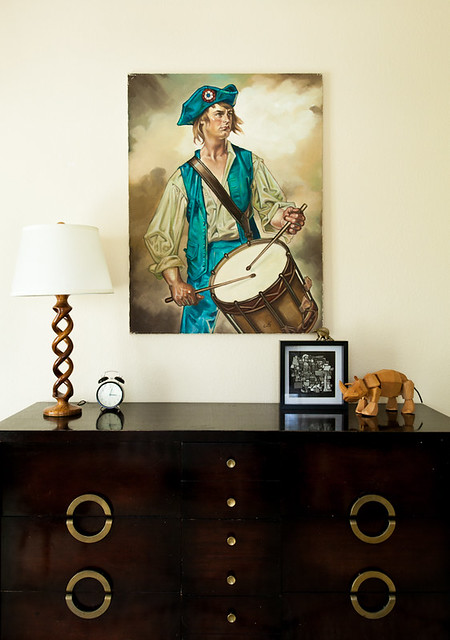
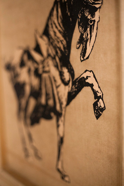
But I'm betting he will totally love the vintage Dufy screenprint I snagged for him at a thrift shop.

untitled (15 of 19)

He's probably not my kid if he doesn't.

That was a joke since I vividly recall squeezing him out of my lady center.

Some things stick with you.

untitled (19 of 19)

Things like this guy.

Speaking of sticky important things, do you remember The Great Rug Debate of 2012?

Solved.

untitled (2 of 2)

I hemmed and hawed over a handful of 8x10 rugs until I stumbled upon the West Elm Souk at the outlets for $70.

Score one for poverty.

It's cute, but it's also a mess. I do not recommend it for high traffic areas unless you like to hoard leaves.

Detailz.

details

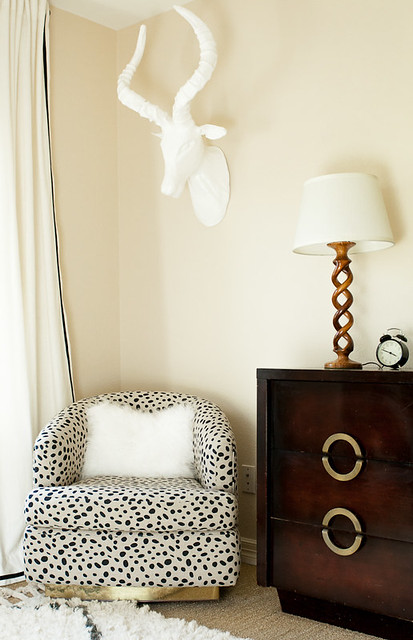
I have to say, I love designing kid rooms. There are so many fun details, like this totally crazy chair I had sitting around forever. New upholstery made him a mega comfy scene stealer.

untitled (1 of 1)-5

untitled (1 of 1)-3

Almost as cute as the dude who lives here. Or sort of lives here. Or will live here someday.

I hope.

Thanks for hanging out for Luke's grand tour! Sorry the writing is so sleepy, but I am whipped. I'm so tired I'm going to lazily paste the source list from a previous sneak peek I posted.

Paint color is Benjamin Moore Frappe, courtesy of the amazing Sanders.

Chair is vintage Milo Baughman that I had recovered in Togo fabric. This was the big splurge for this room — about $450 total.

Curtains are super cheap Ikea Ritva onto which my sweet MIL spent two nights sewing ribbon trim… LOVE THEM! Four panels cost $65 plus time. Can’t beat that.

Mongolian fur pillow came from the West Elm outlet for $5.

Light fixture came from Ebay.

Vintage Raoul Dufy screenprint came from Room Service for $28. I cut a new mat for it.

Bookshelf is Ikea Expedit.

Sheepskin rug is old news.

Everything else is thrifted. I really tried to reuse as much stuff as possible to keep the cost down.

And that's it!

I hate to be a ho, but if you want to see another tour please please please let me know. Because in my house, the menu of options goes something like dinner OR shower.  So I'm hungry and dirty. But I wrote a post.

Yay, me!

Until next week.

[all images copyright ERIN WILLIAMSON]

Teal Room Tour

I know it sounds like I think I'm a rock star or something, but I am pretty excited about this tour. I mean, I only finished this room seven months ago, but back then I was carrying a 700 lb baby in my belly and couldn't muster the strength to really show you around the place. I also couldn't tie my own shoes, however that's another story.

Fast forward half a year and I'm down to my pre pregnancy weight, we just did sleep training and the dude is not keeping me up all night (don't judge -- he's still keeping me up most of the night), and occasionally I even leave the house to do photoshoots and decorating consults. Like a regular person. By myself. I'd say I pretty much own the world. Let's celebrate in living color.

untitled (1 of 1)

This teeny tiny room was used as the formal dining room by the previous owners. Behold:

Yes, it is the same room. Scary indeed. As you can see a full size oval dining table doesn't even fit lengthwise, so we decided to repurpose this room and use the dinette as our primary dining space. That space is fraught with its own issues, but we'll deal with them another time since I promised no kitchen talk today... (but look, you can see the kitchen from here).

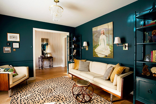
Ultimately we would like this room to function as an office, but for now it's actually a playroom. I moved the big wheels out of the picture just for you.

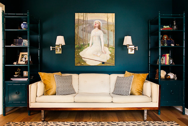
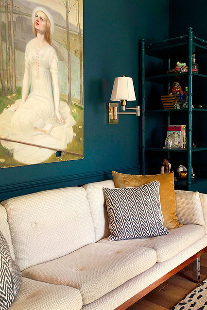
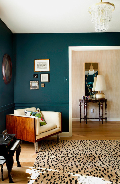
I was kind of going for an old school library look, so Sanders helped me choose some mega dark paint (Benjamin Moore Dark Harbor). Then I added flanking shelves in matching glossy paint, swing arm sconces, and of course my crazy lady painting.

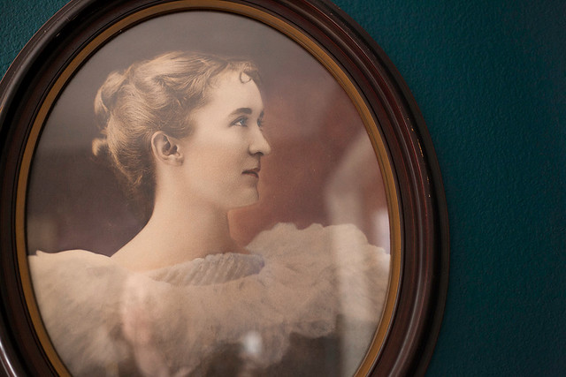
I love her.

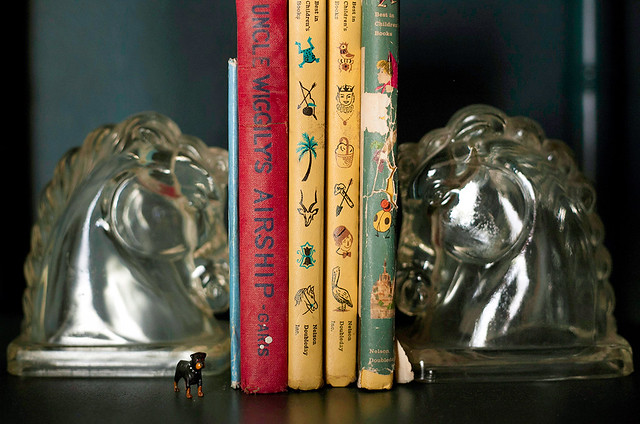
Somehow this room has become the repository for all the weird antique things I own. Grab a drink and get cozy, because for some reason I thought you might want to see every single item on my shelves.

On the other side of the room you can maybe kinda almost see my new hall wallpaper...

The styling looks like a dirt sandwich because I'm too afraid to hang anything on the paper. Maybe my new print?

My cat is obsessed with that chair, therefore it is always littered with leaves. I would love to reupholster our vintage rosewood couch and chair someday, but I will probably let the kids and pets totally destroy it first.

This room is great grandmother approved. I hope you enjoyed it, too.

What do you say: should I post more tours?

They take a long time to work up so pretty please leave a comment if you want to see more of this kind of stuff.

Or maybe you just want to talk kitchens?

I just want you to love me. Let me make you happy.

[all images copyright ERIN WILLIAMSON]