Ok, You Got Me, It's Officially Spring

Welcome to the first day of Spring, everyone.  I know I was Debbie Downer mid week with all my talk of snow fall and icy slopes.  But I got my fix and I'm ready to admit what the calendar tells me is true:  it is officially spring.  The Southern California-esque weather here in Austin is absolute perfection and I'm not so mad to see my plants coming back to life.  Of course, I would be really, really not mad if my yard looked a thing like I want it to.  While I am blessed with a lush layer of deeply saturated green grass, and have a few trees to hold up my hammock, my yard is light years away from the landscaped wonder of my dreams. While I have confidence in my interior design choices, landscaping is an entirely different story:  plants and yard layouts are magical beasts that I can't quite figure out how to tame.  Whenever I talk with one of my plant-friendly pals I simply say "I want my yard to look like the Hotel San Jose"

The San Jose is an adorable hotel made up of several bungalows here in Austin.  The cocktail patio outback is open to all, not just hotel guests and is one of my favorite spots to get a drink (psst, try the champassion, it will rock your face off).  Cool cocktails on hot summer nights are just a front:  I really go to this place to admire the landscaping.

None of these photos do the space the justice it deserves, but trust me when I say:  it is freekin awesome.  Until now, I did not know who the genius was behind the landscaping, I didn't even think to look it up.  I suppose I assumed that grounds so lovely just magically appeared after the Gods waved their hands over the land or something.  I guess I was wrong.  There is a designer, and he has a name:

Meet Mark Word.  While I had never heard of him before today, almost every outdoor space in Austin that I adore can be traced back to him.  His mix of wild grasses, over sized agave, and invasive (but stunning!!) ivy have me week at the knees.  

Uhhhh!!! My dream front yard.  My house is on a small hill, so this vision isn't totally unreasonable.  Well, unless you factor in the whole Karly doesn't understand how to layout plants thing.  I think it's a fair guess to assume that Mark's services are out of my price range, but what if I were to ply him with vodka? 

I tore this image out of a magazine ages ago, not realizing that it was even in Austin, much less the work of my new yard hero.  I would love to have a little cubby bench surrounding loose gravel behind my house.

Or, maybe a little grassy platform is right for me?  I love how he mixes structured spaces with wild growth.

While several of you may be able to attest to my dislike for water features, especially when they involve fish or loud motors, but I find his custom metal pieces quite charming.  Ok, I'm starting to see a formula surface:  rusted industrial + minimal structure + some wild native Texas crap= Karly's heart literally bleeds.  Maybe I can try to pull this off on my own?

Ok, maybe I can't do this myself.  This is another picture I tore out ages ago, from a different magazine than the last one I pointed out.  Seriously, how did I not figure out who this guy was?  Oh, and just incase you're wondering, here's what the front of the house pictured above looks like:

Funny story:  I actually made the final decision to buy the house I live in now because my entry walkway is not unlike the one pictured above.  Just a thousand times less cool.

This seems a bit more attainable, but still light years beyond my landscaping ability.  So if any of you readers out there happen to know Mr. Word, and, if, by chance he owes you a favor, how about you go ahead and hook a sister up?

Designer Spotlight: Joel Mozersky

Last Friday I was on my way to lunch with a long-time client, the co-owner of Birds Barbershop.  While stuck in traffic, I called to tell him that I would be a few minutes late, he nonchalantly mentioned that Joel Mozersky would be joining us. "No problem" I casually replied, then hung up the phone.  JOEL MOZERSKY!  Holy Hell!  How am I going to handle this with no time to prepare?   Let me give you some back-story:  Joel is an interior designer in Austin who's interiors I've been, to put it lightly, stalking for the last 6 years.  Whenever I instantly fall in love with a new bar or shop it always turns out to be one of his designs.  So here I am, going on a surprise lunch with my favorite Austin designer and I'm wearing a sweatshirt.  To be fair, it was a good one, not some pull-over number with a college logo:

You may be surprised to learn that I did not pair my top with gold leggings.  But this post isn't about me, it's about Joel and my lovely lunch with him.

Turns out, Joel is as nice (and funny!) as can be and didn't seem to mind my sweatshirt in the least.  He's pictured above in a hidden east-side fave, The Peacock.  Here's a closer look at the interior:

This bar is absolutely adorable inside, the picture doesn't really do it justice.  I would also like to confirm that the weird gold garland (top right) is not a permanent fixture.

My very favorite space of Joel's is the now-defunct Oslo.  The space was out of control.  Despite the minimal decor, there were secret design treats around every corner.  Unfortunately, the lame-os who took over the space didn't realize that they'd been handed badass design in a box and instead gutted it and redecorated with a dirty frat boy theme.  I can't even walk by now without gagging.  Here are more shots of the former digs:

Joel was also the designer behind Bettysport here in town, you may remember them from the post I did on Redstart's Murals:

The above shots are from the dressing rooms.  Please tell me when you have seen a prettier dressing room!  Tell me!  One of my biggest retail pet-peeves is overhead lighting when you're trying on clothes.  Companies spend millions building nationwide stores, marketing their goods, and luring you in.  Inevitably, you're lead down a trail of tears that ends with unflattering lighting over a mirror.  While you're naked.  I must say:  Kudos, Joel, for avoiding the trap of every other cheap retailer.  Your lighting is divine.

The above is from the, also now defunct, Mars restaurant.  It was so so pretty inside, I'm sorry to see it go.  But, well, the food was just OK.  Hopefully owner #2 will not make the same mistake as the new owners of Oslo.

Joel also went Hollywood Regency / Chesterfield crazy in the Belmont.  I saw Michael Phelps win a gold medal while at this bar, between the tufted leather and all that hot swimmer ass, I was in heaven.  (PS sorry for the small pics, I couldn't decide on just one)

Similar in style to the Belmont is the Drake Bar in Houston.  I've never been here (who goes to Houston?) but I'm sure I will run there to claim asylum if I ever find myself surrounded by too many debutants and crack whores while slummin it in The Magnolia City.

more views of The Drake

So, why did I end up going to lunch with Joel while meeting with Birds?  Here's why:

Each of the Birds Shops have had Joel's design input.  Their South Lamar location is pictured above.  The mural was designed and hand screen-printed onto the wall by my favorite local graphic designer, Bryan Keplesky.  PSST... Bryan also designed the mural for the new shop which opens tomorrow, you dudes will get pictures on Monday.

Joel also landed the job of interior designer for the Real World Austin house, which was inside a gutted downtown warehouse:

I'm so all about-about that round ottoman / light combo in bottom left.

And for interiors real people (not to be confused with Real World people) would actually live in, here are a couple of shots from his portfolio:

I got the impression from speaking with Joel that he actually does several residential interiors but the above is the only one pictured on his site.

So, what did I find out about Joel at lunch that can't be deduced from walking into one of his spaces?  Here are some bullet points:

- He actually went to business school and fell into interior design when working with a former creative partner

- He often juggles 10 - 15 projects at once, he currently has 3 restaurants and several residences in the mix

- He knows how to have a good time on halloween.  Next year, Joel, take me!

Designer Spotlight: Redstart Design

Last Sunday, just after watching back to back episodes of my two favorite shows:  Rock of Love Bus and Tool Academy, I was ripped from the comfort of my bed by a prior obligation.  I had promised a few of my favorite ladies that I would join them for drinks.  Of course, I made said promise at 11 a.m., and was remiss to fulfill said promise at 11 p.m..  Yes, 11 p.m., on a Sunday.  What had I been thinking?  Well, anyway, I'm quite glad that I pulled myself together and scooted out the door because, not only did I have a great time with the favorite ladies, but I also met Michelle Marchesseault of Redstart Design.  

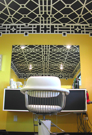
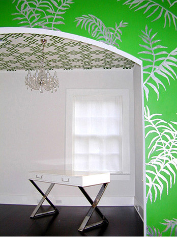
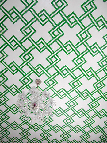
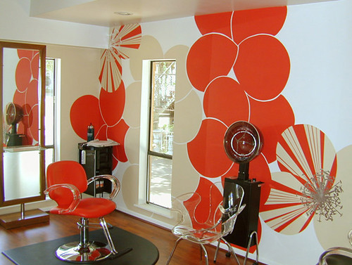
Michelle and her business partner, Rachel Shannon are notorious in Austin for their Op Art commercial and residential murals.   Using nothing but tape (only sometimes) hand painting, and a lot of math, these ladies put together the freshest non-wallpapered backdrops in town. 

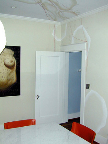
The residential mural above was achieved using silver leaf.  Do any of you know how tedious that is?  The painting I did in my living room (by hand-cut stencil and latex paint) took a week and a half, I can't even imagine how long this takes the ladies:

Perhaps if I had conducted an interview (per our Sunday discussion) I would have learned the answer.  But I was busy working so you dudes get pretty pictures and lots of unanswered questions.

This photo of former partner, Jason, does provide some insight on what a bitch this job must be.  But I have to say, that finished ceiling is out-of-control amazing, and totally worth the effort. 

Clearly, these ladies like ceilings.  Writing this post is only heightening my ever-present craving to scrape all of the popcorn off my ceiling so that I, too, can have the Redstart treatment.

The Vivid Walls of Austin's Viva Salon

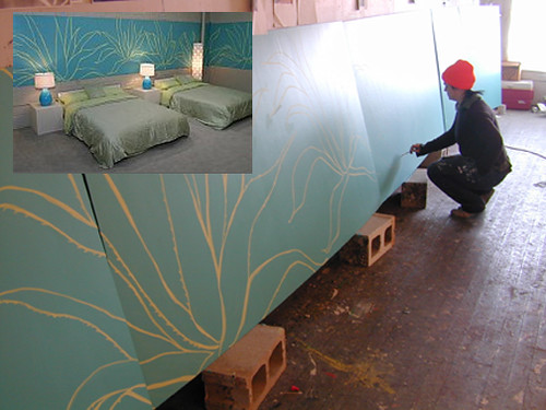
One of the many bedrooms for, ahem, the Real World Austin set

I love when artists and designers post pictures of their process.   Same with set building on DVD extras.  I could probably skip most of the movies I watch and just enjoy all the behind-the-scenes design goodness alone.  Ok, actually, I have done that before, it was pretty damn awesome.

This freeform latex and GOLD LEAF(!!!!!!!!!) residential mural Speaks directly to my heart.  Shhhh... can you hear it?

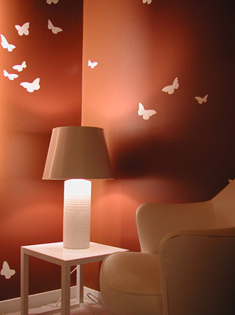
And I know that I was just getting all mad at Elle Decor the other day about their piss-poor butterfly trend prediction, but I really like the space above.  I'm 100% sure it's the palette, and the fact that the butterflies aren't all lame and colorful.

Speaking of animals I love:

This lovely horse is snugly nestled in at one of my favorite bars in town, the Red House.  There are plastic and painted horse heads everywhere, and that, my friends, is a motif I can get behind.

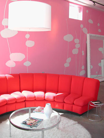
The mural at Frou Frou always caught my eye when I lived a couple of blocks away.  Somehow taking things I don't generally like on their own:  red and pink, and putting them together, really does it for me.

The ladies of Redstart don't just sit around contemplating repeating pattern and huffing paint all day, they also get their exercise on by participating in Austin's own synchronized swimming troupe, The H2Hos.  

So, looking back on my Sunday night on the town, I have to admit, it wasn't so bad after all, almost as good as Rock of Love Bus, almost.