Featured Artist (the day before) Friday: Rachel Denny

You may remember, way back at the beginning of the year, we promised a new installment here at Design Crisis: Featured Artist Fridays. Well, tomorrow is Erin's day and I don't want to make you wait another week to meet artist Rachel Denny so, Thursday it is. We first stumbled across Rachel's work months ago and were delighted when she wrote us with kudos on our blog (we love nothing more than compliments around here) bells and firecrackers went off and the angels began to sing when we saw her new work and we knew we had to share it with you. Rachel has a stockpile of stunning works in her wake as well as big designs for the future. Let's start at the beginning:

Green Doe, 2008, polyurethane foam, wood, wool

Upon first seeing Rachel's work my mind went into a whirlwind considering the amount of math, time and planning a single piece must take. Once I recovered from my admiration fatigue, I was struck by the brilliance of the pieces: they seamlessly converge the dichotomous imagery of masculinity and femininity with a thought-provoking balance of serenity and humor. I asked Rachel how she began tying these images together:


I grew up in rural Northern Idaho and Montana and my father would take me hunting as a child. I don't think I ever actually hit anything ( I was very young) but it did make a strong impression on me - the seriousness of the task and the quiet waiting in the forest for hours. There was a lot of wonder and also necessity in it; at that age it seems a bit surreal. The knit pieces just came together and made sense to me with these memories.

Her explanation conjures up memories of my own family history: my grandfather was a hunter and his wife, my grandmother made clothing for the family. Her knit deer would have served as an ideal icon for my own family. Add to the list of accomplishments found in a single Denny piece: the ability to connect with it's audience on a profoundly personal and familial level.

(left) Nordic Knit, 2008, wool, polyurethane foam, wood, thread; (right) Arrow Buck, 2008, polyurethane foam, wood, wool, thread, zipper

Rachel tells me

The first knit piece was intended to be a chromed deer head mount, referring to the carcasses seen on the side of the road, but it proved too expensive to make for me at the time. I played around with the imagery for awhile, looking for a suitable replacement and this juxtaposition came about.

I am from the school of thought that believes that creativity flourishes under restrictive circumstances. While I would never turn a stray chrome deer head away from my living room, I think the knit pieces are so meaningful and stunning (and, of course, proof positive that I am right about that whole creativity flourishing thing, and I love being right)

Blue Doe, 2008, wool, polyurethane foam, wood, thread

Quick! Let's make a list of all the amazing things happening in this room: #1 Blue Doe (obv.) #2 HORSE FIGURINE! & tied for second, Design Crisis Gift Guide approved, Carlos Night Light!

Are you wondering why I didn't mention all that glove action going on in the mirror? Are you thinking I'm a horrible person for putting a silly dog light above what just might be one of the greatest pieces of art ever made? Well then, you're very astute, now aren't you:

Proper Lady

Like Rachel's knit deer, the Proper Lady rug works on so many, often opposing, levels: Repurposing the gloves to warm the feet while simultaneously mimicking a shag rug is genius. I also love that these gloves in particular are generally reserved for the purpose of protecting debutantes and other do-gooders from getting their hands soiled, but in this instance, they are offering themselves up as little sacrificial lambs to be tracked upon by whatever comes their way. Even the draped nature of the gloves makes them appear as though they are bowing down before you. And, well, you know I like that. Let's get a closer look:

By this point I want to crawl inside Rachel's head and poke around awhile to find out how she comes up with these brilliant pieces:

The "Proper Lady" idea began its life as a quilt, but it seemed unfinished - a bit flat and I didn't like the texture on a bed. The piece took on even more meaning when demoted to the floor and I loved the contrast of these prim, ladies gloves as a rug. I like when a work can take on multiple meanings and I also like leaving that up to the viewer because they bring in their own experiences to work.

I appreciate that, like the original chrome deer that evolved into a knit work, Rachel allows the works to speak to her, dictating their own outcome as she goes. I believe it is because of this that her pieces can exist on so many levels. She mentions that she was initially hesitant to let humor show through in her work. Noting "I wanted to be taken seriously, but I feel humor and beauty are often very successful ways to get someone to approach a new idea." I couldn't agree more. I also think it is the existence of humor in her work that adds the final finishing touch to each piece.

Buckshot, 2007, Lead, nails, foam, wood, steel, life size

When sifting through Rachel's portfolio I find the above piece, which appears to be laying the groundwork for her later works: early conceptions of the chrome deer head, and a shag rug that will later take its form in a landscape of lady's gloves.

One of my favorite images on her site is a snapshot of her studio:

Most of the pieces from her current body show themselves in various stages of completion. Rachel mentioned that she is best when kept busy, but the appearance of at least 6 projects here makes my head spin.

And, in case your wondering, that lovely turquoise piece in the bottom left corner now looks like this:

Clover, 2008, angora, polyurethane foam, thread, steel

Unfortunately, someone has already snapped this little guy up, otherwise, I would love to have an angora rabbit in my home. I am sure I could also be quite happy with this:

Antler Buck, 2008, Wool, thread, antler, polyurethane foam, wood

I am so enchanted with how snugly the wool fits each piece. Rachel uses found sweaters rather than knitting the pieces by hand - can you imagine how long that would take??!! -  often felting the pieces before stretching them around the musculature of a deer (that she made herself, mind you).

Unfortunately, you can not currently come to my home to see Rachel's works in person, but you can look for her work at Rare Device in San Francisco this May. She will also be featured on the cover of the Western Humanities Review this fall.  Most works are available for purchase on her site: racheldenny.com
Weight Watchers

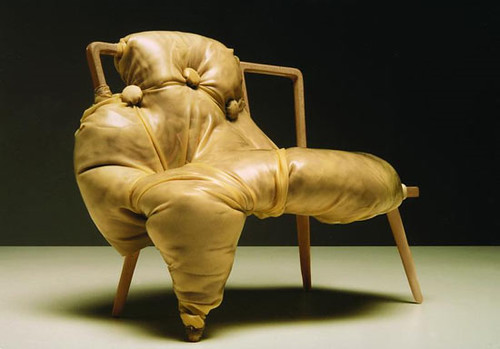
It's the New Year and resolutions are rolling in. Most everyone has decided to start a new diet and exercise program (myself included), which is not surprising considering all of the confusing signals the media sends us. Don't you love seeing rail thin celebrities juxtaposed against muffin tops and love handles on magazine covers? Meanwhile, the TV is coercing you to stop by Pizza Hut for a Super Colossal Meat Meltdown on your way back from a vain attempt to squeeze yourself into those 00 skinny jeans. And so the bottom line is that we're all really HUNGRY, but none of us want to look like this:

charlotte kingsworth

And all of us want to look like this:

conran thonet chairs

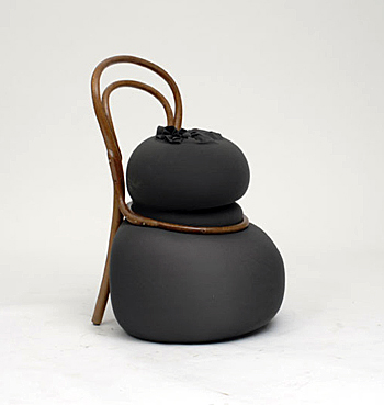
On the top you've got Charlotte Kingsnorth's award-winning One chair, modeled after the stunningly fleshy paintings of Saatchi favorite Jenny Saville, while on the bottom you have an extremely attenuated Thonet chair, modified by Martino Gamper for the Conran Shop. True -- one may be more elegant. But the other looks a hell of a lot more comfortable. Nothing wrong with a little extra padding, right?

pabo reinoso

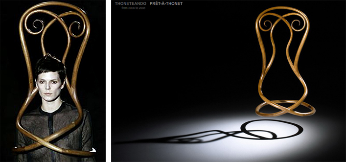
Alas, it seems the fashion industry has other plans for our bodies. Must we starve our forms into utter weightlessness? Pablo Reinoso seems to think so, as evinced by his Pret-A-Thonet series, also seen in Karly's post here.

pablo reinoso

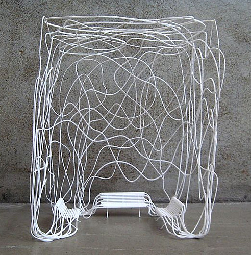
With his all too innocently titled Summerhouse, Reinoso sells skinny by seducing us with the ethereal quality of long limbs so painfully thin they function like pliable spaghetti. Mmmm.... thinking about spaghetti makes me hungry.

nobodyandco

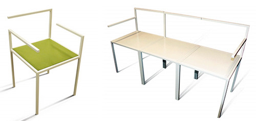
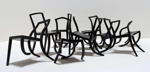
Those who resist the temptation to assuage their hunger pangs with dubiously nutritious pasta, chocolate Ho Ho's and delectable french toast, may be rewarded with less heft, but at what cost, I say? Starvation leads to brittle bones and an unhealthy physique. For proof, see the Missing Chairs above, designed by Nobody&co.

tango chairs

tango chairs

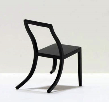
Obviously, improper nutrition will turn you into a wimp who buckles under the slightest pressure. Even their creator, Ante Vojnovic, imagines these statement-making skinny minnies to be "non-functional." I don't know about you, but I have to work. And walk. And be functional and stuff.

pablo reinoso

And let's not forget there's a dark side to dieting: all that extra skin has gotta go somewhere. Reinoso shows that with no fatty flesh underneath to buoy it up, scrawny skin is likely to sag south.

Shall we then head the opposite direction and stuff ourselves silly, bloating our bodies to maximum capacity?

obese eames chair

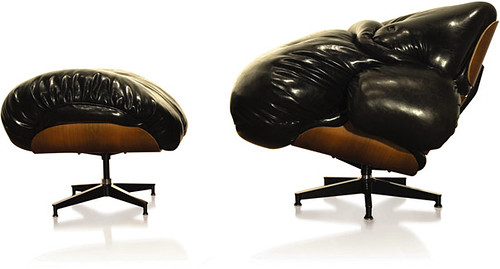
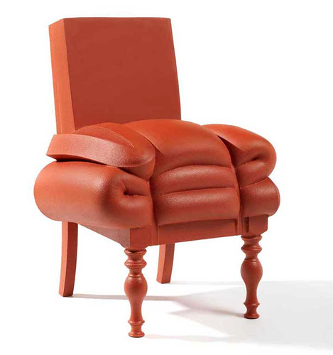
That approach seems a smidge problematic, as well. To wit, this classic Eames Chair reworked by Mark Wentzel -- once perfectly proportioned with ass room to spare -- might want to lay off the Cheetos. Otherwise it could forever remain an XLounge.

What to do, then? Diet, exercise, binge, purge, starve?

thonet knot

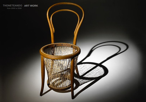
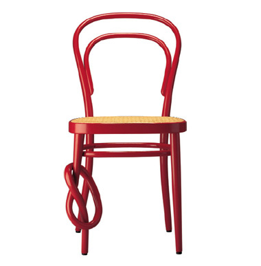
Anxiety only makes it worse, so don't tie yourself in a pretzel-shaped knot worrying about it, like this Thonet chair. Yum, I love hot, squishy, salty pretzels with mustard on top...

It seems that the only possible hope for health lies in balance.

gamper martino

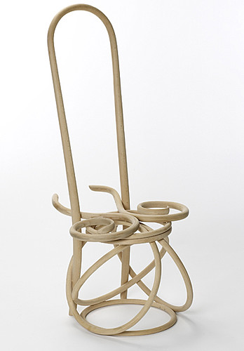
This example from Gamper Martino's 100 Chairs in 100 Days series serves as a lesson: there will always be a skinny bitch wrestling a, uh... somewhat less skinny bitch inside us all. All that wrestling may involve mud chocolate pudding and bikinis. It could get ugly, but don't despair.

frank willems

Frank Willems reminds us with his Madam Rubens Collection that not everyone has the same definition of beauty. It's all subjective, yo. So if we're all feeling a touch Rubenesque ourselves from the holiday cakes and pies and scrumptious cookies (and mashed potatoes and casserole and stuffing [it can't be good for you if it's called STUFFING, right?!]), well, give yourself a break. A little extra sqush adds to da swish, and a pair of shapely legs never hurt anyone.

Trend Spotting: Garland

As you already know, everyday is a party here at DC headquarters.  Unfortunately, the South South Austin branch of our conglomeration is not reflecting this ideology all too well.  Enter, a trend I've been spotting all over the web:  Garland.  Both festive and feminine, these lovely paper cutouts say "Yeah, it's Wednesday, why don't you just go ahead and get your groove on?"

via Please Sir

The flag banner in it's most basic form.  Can't you just smell the turkey legs and screaming children?

Artist Sophie Cuvelier juxtaposes the flag banner hype with quite interiors:

The small scale of her hand cut pieces become blissfully overwhelming when produced en masse. I can see these in every single room of my house.  If only I had the patience and time it must take to assemble these suckers. 

Wedding stylist Rebecca Thuss  Brings the jamz with her large scale garland alter.  I am wondering how my husband and mother will feel if I file for divorce so that I may remarry (same man) under this insane piece.  I will not be wearing that blue dress, though.

For a totally over-powering paper cutout experience, check out the works of stylist Zoe Bradley  her garland displays are to-die-for and probably even bring window-dresser-to-the-stars, Simon Doonan, to his Burberry knees. 

Zoe combines boxes, bags, paper and bows to make a Karly-Flavored dream display

If you need to water down your garland fashion for everyday wear, perhaps something like this is a bit more your style:

This garland inspired necklace from flickr user Vera Joao creates an instant traveling party.  Perfect for running errands or taking your cats to the vet. 

One of my very favorite flag banner pieces is this print by artist Elisabeth Dunker.  It has been my desktop image for as long as I can remember, one day I will own it in the flesh but for now it cheers me up every time I hop on my computer (which is almost every second of the day).  Note:  much more inspiring than a keep calm and carry on poster/pillow/towel/trash can liner.

You may remember that I have a smallish obsession with twins, when twin brothers Marc and Ian Hundley were featured on the Selby with their garland I almost fainted.  Seriously, why don't you just throw Christain Bale into the shot so I can be completely sent over the edge?

If like me your heart rate has excelled to a no-longer healthy pace and your head is spinning with visions of garland throughout your house but you find the task of construction a bit daunting, you can always visit our fine friends at Etsy:

clockwise from top left: cupcake garland by etsy user Frivolous Whimsey; Garland of Paper Flowers by Millalove; Royal Garland and Royal Garland detail by Royalbuffet; Baby Mama Papel Picado by Aymujer

While (thank god) I don't have a use for the Baby Mama garland, I think it's probably one of the funniest things I've ever seen.  Millalove's paper flowers are so delightfully perfect. I can barely fold a booklet and this gal is whipping out paper dalias like it's nobody's business.

I'm a pretty crafty lady, but the one quality I possess that outweighs my creativity is my aversion to tedium - I'm willing to bet a million dollars that I never knit an entire scarf - so it's good to know that these Etsy kids have my back and are willing to bring the party while I kick back and spike the punch.

+++++

UPDATE!  2 of our lovely readers reminded us about these lovely flag banners:

Woodley Park Zoo welcomes her new Feesh flag banner style.  I dare you to find a cuter fish welcome sign.

And thank you, Anna, for reminding me about my favorite Ikea fabric (how could I forget????)!!!