It's the New Year and resolutions are rolling in. Most everyone has decided to start a new diet and exercise program (myself included), which is not surprising considering all of the confusing signals the media sends us. Don't you love seeing rail thin celebrities juxtaposed against muffin tops and love handles on magazine covers? Meanwhile, the TV is coercing you to stop by Pizza Hut for a Super Colossal Meat Meltdown on your way back from a vain attempt to squeeze yourself into those 00 skinny jeans. And so the bottom line is that we're all really HUNGRY, but none of us want to look like this:
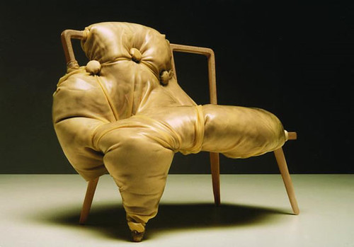
And all of us want to look like this:
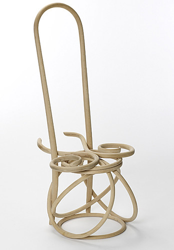
On the top you've got Charlotte Kingsnorth's award-winning One chair, modeled after the stunningly fleshy paintings of Saatchi favorite Jenny Saville, while on the bottom you have an extremely attenuated Thonet chair, modified by Martino Gamper for the Conran Shop. True -- one may be more elegant. But the other looks a hell of a lot more comfortable. Nothing wrong with a little extra padding, right?
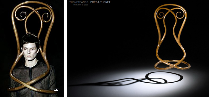
Alas, it seems the fashion industry has other plans for our bodies. Must we starve our forms into utter weightlessness? Pablo Reinoso seems to think so, as evinced by his Pret-A-Thonet series, also seen in Karly's post here.
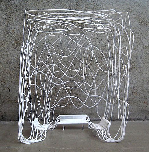
With his all too innocently titled Summerhouse, Reinoso sells skinny by seducing us with the ethereal quality of long limbs so painfully thin they function like pliable spaghetti. Mmmm.... thinking about spaghetti makes me hungry.
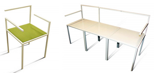
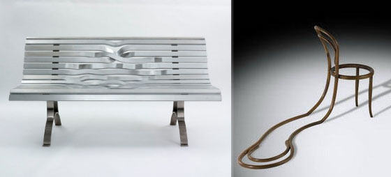
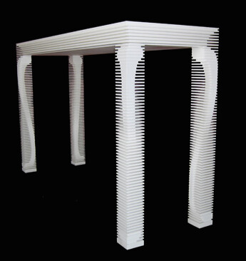
Those who resist the temptation to assuage their hunger pangs with dubiously nutritious pasta, chocolate Ho Ho's and delectable french toast, may be rewarded with less heft, but at what cost, I say? Starvation leads to brittle bones and an unhealthy physique. For proof, see the Missing Chairs above, designed by Nobody&co.
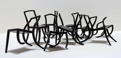
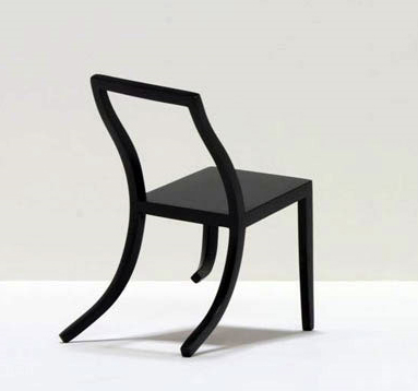
Obviously, improper nutrition will turn you into a wimp who buckles under the slightest pressure. Even their creator, Ante Vojnovic, imagines these statement-making skinny minnies to be "non-functional." I don't know about you, but I have to work. And walk. And be functional and stuff.
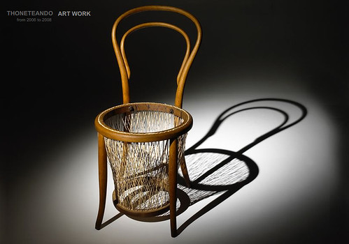
And let's not forget there's a dark side to dieting: all that extra skin has gotta go somewhere. Reinoso shows that with no fatty flesh underneath to buoy it up, scrawny skin is likely to sag south.
Shall we then head the opposite direction and stuff ourselves silly, bloating our bodies to maximum capacity?
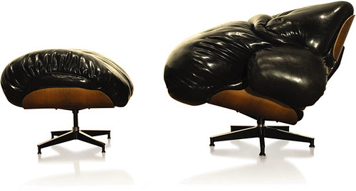
That approach seems a smidge problematic, as well. To wit, this classic Eames Chair reworked by Mark Wentzel -- once perfectly proportioned with ass room to spare -- might want to lay off the Cheetos. Otherwise it could forever remain an XLounge.
What to do, then? Diet, exercise, binge, purge, starve?
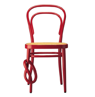
Anxiety only makes it worse, so don't tie yourself in a pretzel-shaped knot worrying about it, like this Thonet chair. Yum, I love hot, squishy, salty pretzels with mustard on top...
It seems that the only possible hope for health lies in balance.
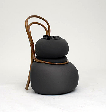
This example from Gamper Martino's 100 Chairs in 100 Days series serves as a lesson: there will always be a skinny bitch wrestling a, uh... somewhat less skinny bitch inside us all. All that wrestling may involve mud chocolate pudding and bikinis. It could get ugly, but don't despair.
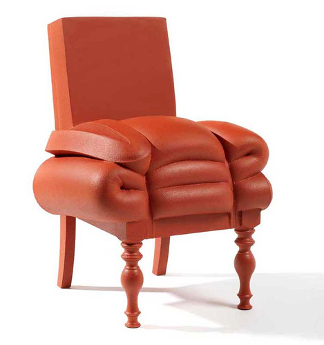
Frank Willems reminds us with his Madam Rubens Collection that not everyone has the same definition of beauty. It's all subjective, yo. So if we're all feeling a touch Rubenesque ourselves from the holiday cakes and pies and scrumptious cookies (and mashed potatoes and casserole and stuffing [it can't be good for you if it's called STUFFING, right?!]), well, give yourself a break. A little extra sqush adds to da swish, and a pair of shapely legs never hurt anyone.
