Ok dudes, I have maybe four minutes to write this post before Luke demands to be fed and then proceeds to vomit forth said feeding all over my briefly clean clothes, so buckle your seat belts because this is going to be a lightning fast haunted ass trip.
Remember how I said I can't stop shopping at 4 am? Yeah, I wasn't kidding. And at 4 am your brain isn't wired quite properly... it might gravitate towards the quirky end of the spectrum. So when I saw this, my semi wired synapses sputtered and sparked up the old paypal account pretty much immediately. Love at first bleary sight.
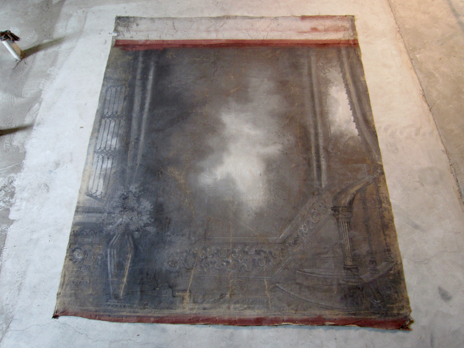
Yes, that is a mega giant hand painted Victorian backdrop used for photographs. Like this.
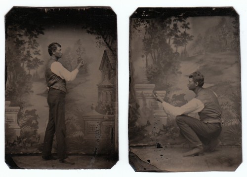
These painted backdrops were used as early as the daguerreotype era, but more commonly for tintypes or carte de visites. Oh, and did I mention that I used to make daguerreotypes and albumen prints and all sorts of other toxic and delightful antique processes? I had to have this thing. Had. To.
Then it arrived in all its crumbling, eight-foot-square glory. Holy shit -- BIG. Oh, and look at my new leprechaun green velvet chairs... they are GREEN.
Anyway, lucky for me Ben and my sweet father in law are handy men, capable of nothing less than magic. In other words, they built stretcher bars for this bad boy and then framed him up with cheapo molding from Home Depot that I spray painted gold (duh).
All along I had plans to transform the back wall of our living room from this drab, flat blahdom:

To this splendifirous rendering:

Ok, sure that may be Albert Hadley's house, but you get the idea. I bought the backdrop to be a backdrop.
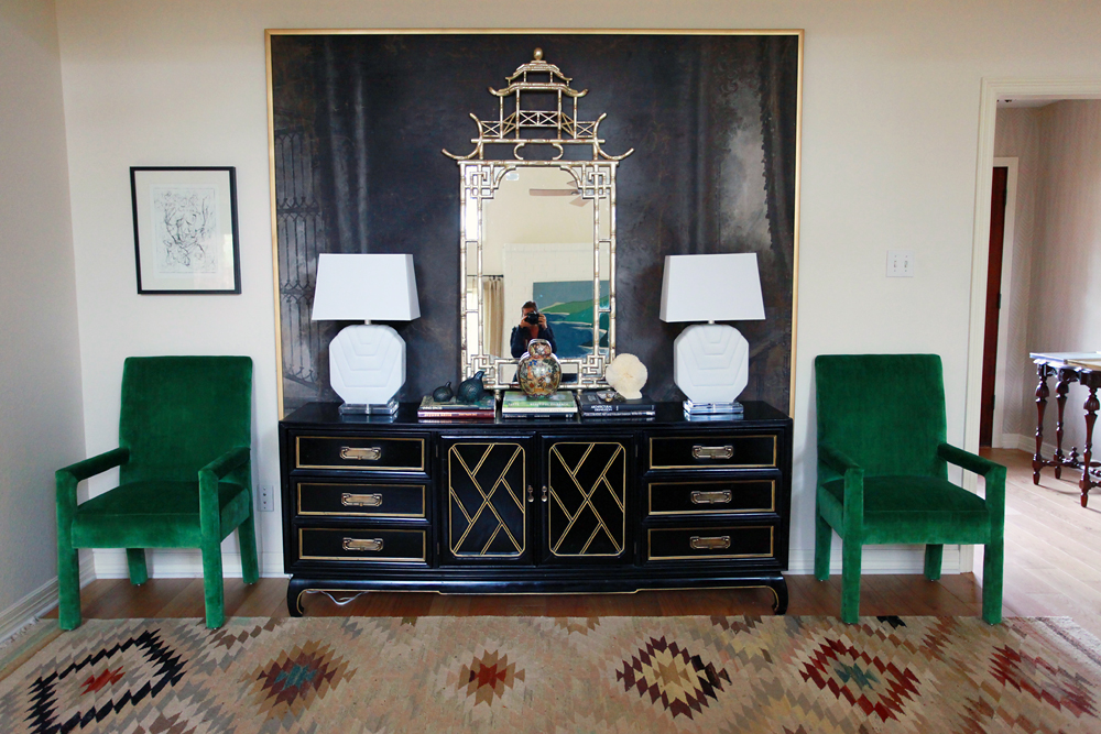
But, huh. Hmmmm. Yeah, I don't know about that. PS, this is about how dark and flat that wall really is for most of the day. I photoshopped the bejeezus out of the other picture I posted previously... before I had a baby. When I had time to photoshop things and use a tripod and SHOWER.
Where was I?
I think I need to rethink my Albert Hadley plan. I don't like how much of the backdrop is being backdropified by all the stuff piled in front of it. Should I ditch the mirror? The lamps? The credenza?
All of it?
I haven't had the time or pumped up the muscles to move that credenza out of the way, but I have had time to make some mockups. Of course. Behold:
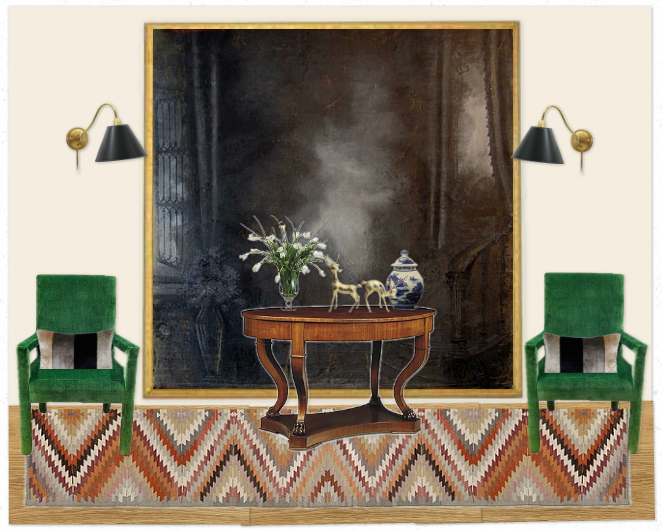
Option 1 recycles the rug I already have, tosses the credenza and adds a smaller antique oval library table. I saw one similar to this a few days ago... totally doable. I did black library sconces and muted pillows to tone down the rug.
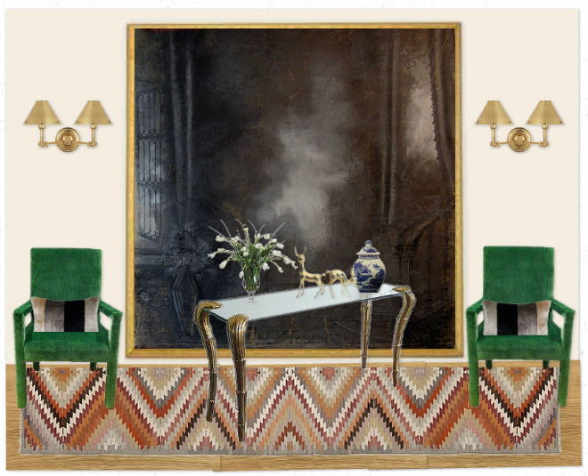
Option 2 is a little more glamooooor. Brass and glass console (this is an actual table I could buy, thus the wonky angle), brass double sconces, same rug and pillows.
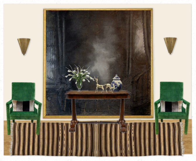
Option 3 is muted maximus. The sconces are similar to a pair I'm eyeing... new rug in this mockup.
I guess what I'm thinking is that the credenza has to go. It might fit somewhere else in this room...

Like where it used to be or behind the couch? But I use that white console as my desk, so then I would lose my desk space.
Also, thank gawd my house doesn't look like that anymore.

Phew, that's better.
Also also, whatever I do on the back wall needs to flow with the front part of the room. So I probably shouldn't go too Tudor Regency all up on it. Whatever that means.
Ok, kids. There you have it.
What should I do?
Here are jpegs of the chairs and backdrop... make your own mockups if you want to.
I'm sure you have nothing better to do -- like grocery shop and wash the sheets and sweep dust bunnies under the rug before your Thanksgiving guests arrive.
Speaking of, I need to do those things STAT.
Check y'all later.


