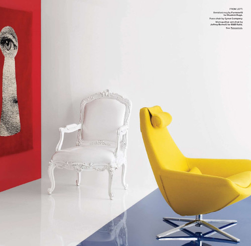
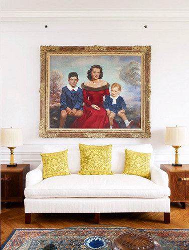
About a year ago, I went on a strict color diet of black, brown and pale gray, with a smattering of gold to add some pizazzle dazzle. I have to say this house was looking pretty svelte until Ike came along. Now it's been fattened up by red, yellow and blue plastic, and I swear the living room alone has gained 20 pounds. Apparently babies aren't really into drabby neutrals. Who knew? Thankfully the decorating world now says, Hey -- it's ok to binge on primary colors.
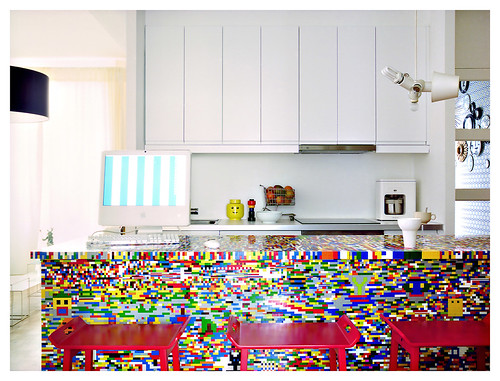
And guess what? You don't even have to resort to building your home out of kiddie colored Legos to get the look (because if that were the case, I'd already be 50 steps ahead). Remember the slew of Roy Lichtenstein inspired interiors I presented for your consideration? Well, now get ready for a burst of Bauhaus brights.
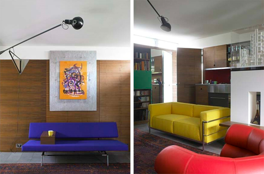
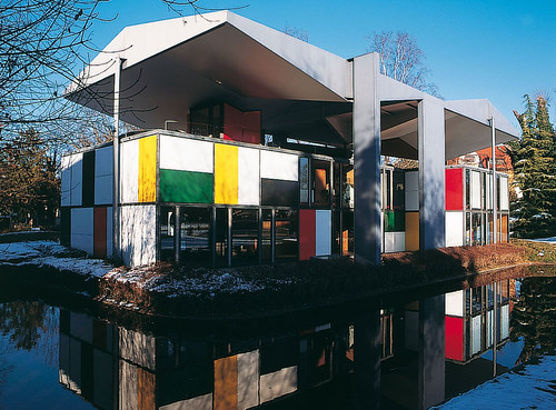
Those crazy Bauhaus dudes were all about form, function, and screaming color -- but no fussy, frilly pants color shall be allowed. Green is about as crazy as party animals Gropius, Van der Rohe and Corbusier, were willing to get, because it's all about heading back to basics. So sit back, strap up, and put your goggles on. We're going on a grand tour.

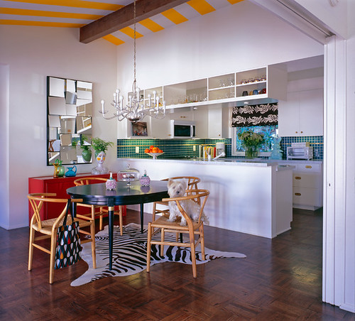
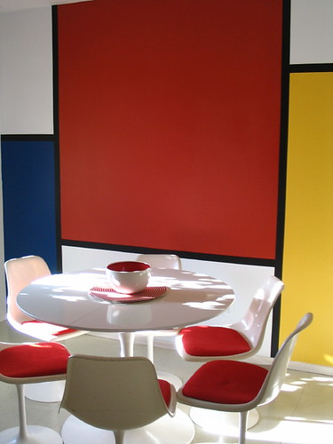
A Mondrian inspired kitchen from Apartment Therapy
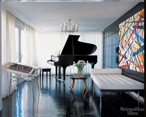
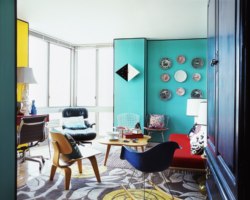
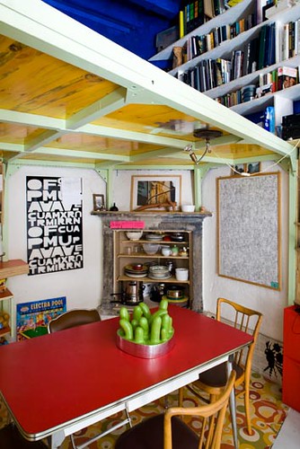
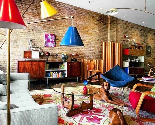
No source, but check out that Arteluce lamp.
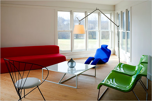

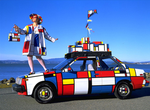
Well, dudes? What do you think? Are you ready to inject some hot primary color into your home? Just be careful, because Danger! It's ok to be bold, but with such strong colors, it's all too easy to go overboard. Like, way overboard. Simple shapes and small doses are the best bet for keeping your visual weight under control.
Don't be a color glutton.