So yesterday I revealed yet another thorn in my side, the dopey dinette area. It's really wee and oddly shaped and it sports hideous tile and the light fixture makes me want to vomit khaki green paint into my cheerios. It's an appetite killer, for sure.
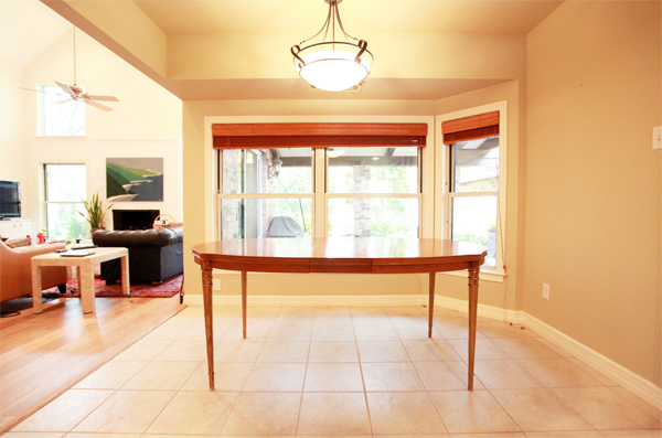
My eyes! I'm pretty sure that square beige tile is the eighth level of hell. The suburban pinata light fixture is even more offensive, but far easier to remove -- we'll call it Level Four.
As I said yesterday, when we redo the adjoining kitchen the tile will get sledgehammered into a fine dust and kicked to the curb, making way for the wood flooring to move on in. But until that day, this is what I have to work with. Did I mention that this is to be our one and only dinner table?
You can exhale now.
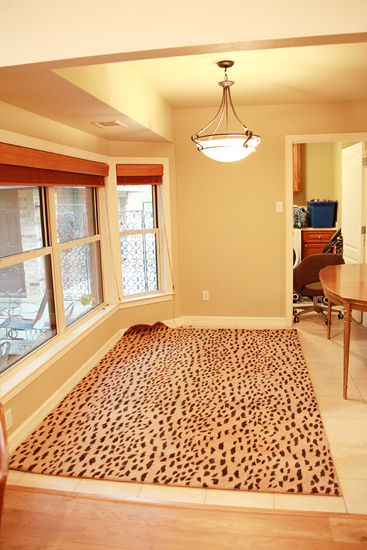
So I think a rug would help, but the inset on the window wall is really throwing a wrench into the works. I put the 6x9 leopard rug in there just to see how it would fit, and you can see that it butts up against the wall. I could see doing a custom cut carpet that fit exactly into that space, except that this isn't wide enough...
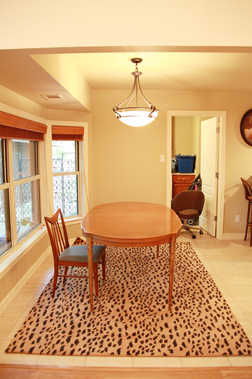
When I centered the rug under the table, it ran into the walkway, which I think looks kinda funny. Am I crazy? Also, six feet really isn't wide enough for a full size table and chairs. I think seven is minimum, which would create even more issues in terms of the odd window wall and walkway.
What to do?
Mockups, duh.

I painted Board #1 in living room wall color, left the table unpainted, used chairs from Copenhagen, and threw in a hide rug so I could sidestep rug dimension issues. But I have to tell you, I kind of hate hide rugs. They feel so gross... and they are giant dead cows. But I have also heard how durable! and amazing! they are. What do you think?
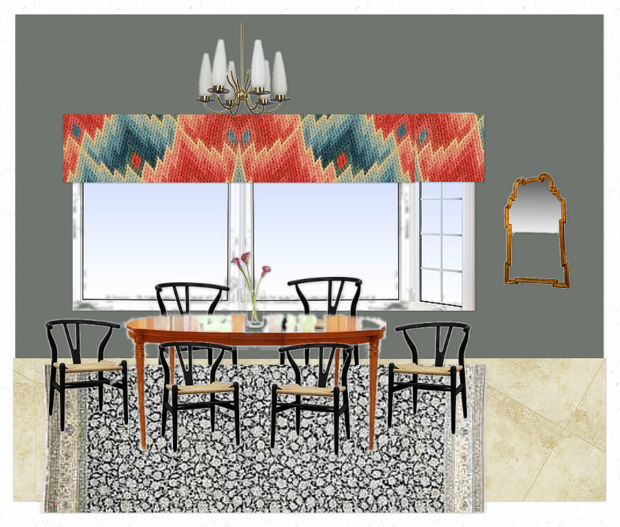
For Board #2 I painted the room in Gray Gardens, left the table unpainted, added black wishbone chairs, and threw caution to the woven wind with a Nain rug. I did 8000 variations and I'm not sure I'm digging the rug on this one, but I threw it in for variety's sake.
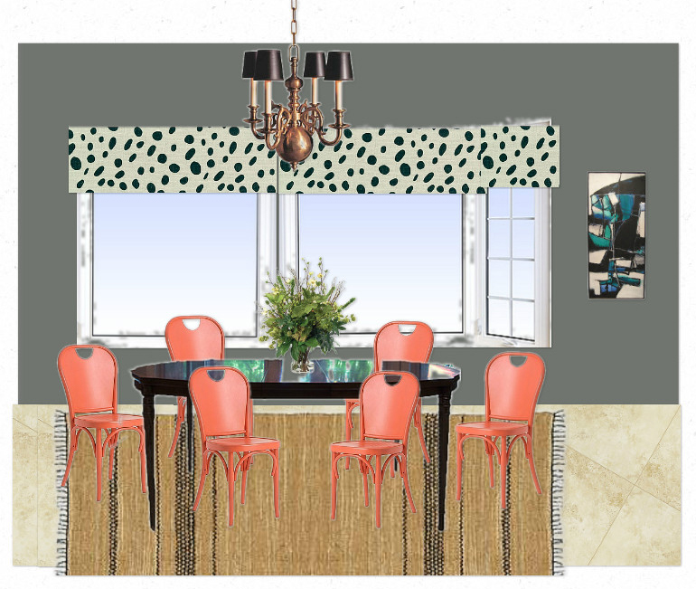
For Board #3 I switched up almost everything... Les Touches knockoff fabric for the roman shades, painted table, Anthropologie chairs, and a more antiquey light fixture to balance the polka dot bizness. I used a warmer rug because I want something natural in there -- be it table, chairs or rug.
So, what do you dudes think? Are there any bits or pieces you love/hate? And fresh new combos you want to see? We've only just begun...
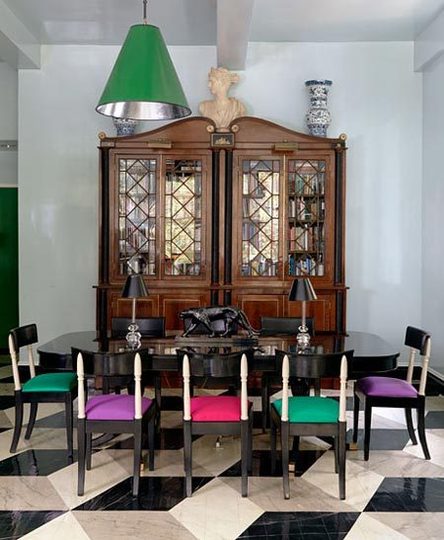
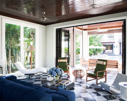
ps: here was my inspiration photo, which looks almost nothing like any of my mockups:

Gotta love Molly Luetkemeyer.
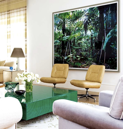
Maybe the solution to all my problems is a kick ass Henri Rousseau inspired mural?
Most likely.
