Superflossy Superfly Supergraphic

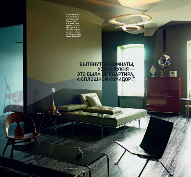
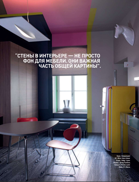
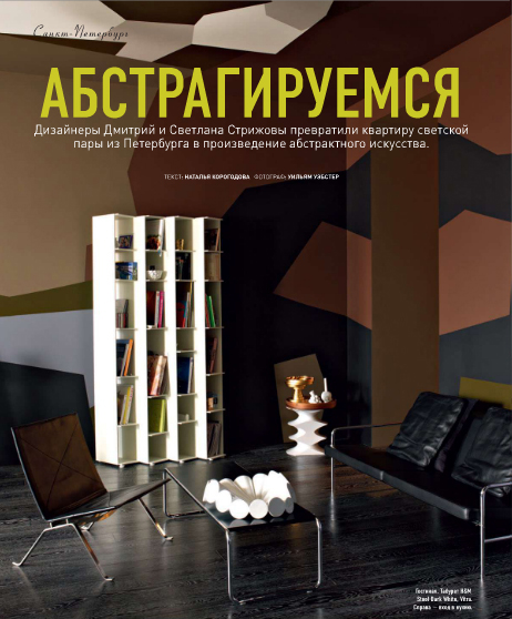
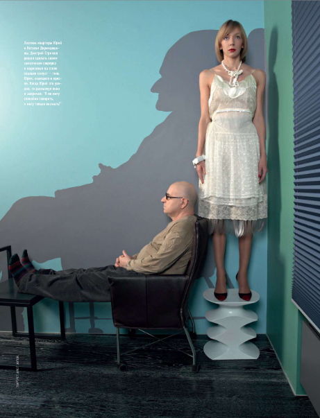
I'm taking a breather from publicly flipping out over the house hunt today, but that doesn't mean I'm not feverishly searching for inspiration just in case we do sign on the dotted line. It's a safe bet that whatever we buy will need renovation. Most houses we like were built in the 70s and have remained in museum like condition -- carpet, faux wood paneling, and drop down ceilings included. I found this sweet little apartment in AD and first glommed on to the walls, then moved on to the floors.

It would be really helpful if I read cyrillic so I could tell you who is responsible for this hottie, but I'm a romance language only kind of a girl. When I see all those squiggly lines, I just want to bust out my calculator and solve for X.

Damn you, American language skills! Who are you people? In completely unrelated news, I think I spy her underpants. Ok, enough with the non sequiturs. Back to the apartment.

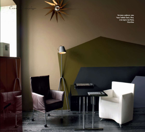
Check out those floors! They look like cerused oak, but I'm guessing not since ceruse is apparently some kind of toxic lead based chemical. A two step stain and wax, maybe? Whatever the case, I adore them. Dark and sexy, but not overpowering. Plus I think they would hide dust fairly well. Bonus!

Those chairs... sucker punch to the love gut. I also like how there's no molding in the space -- everything is super crisp and clean, and the paint heightens the arty architectural feel. The floor provides the perfect textural foil.

So good. The color palette is uber unique.

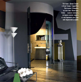
Sorry this picture is wee (and that there's a weird cutoff letter at the bottom of the frame), but check out the spacey bathroom. So awesome.

What do you think about the floors? Do you think an ordinary house could handle this kind of wall treatment? Do you think you could be comfortable in a space like this?

Why isn't this place for sale?

Industrial Chic Part Deux: Non-Lighting (and Also Some More Lighting Because I Said So)

Ok, wonderful readers, in my quest to bring back that bright and shiny feeling of hope and growth and prosperity, I'm taking our bandwidth to the max to present a day of industrial inspired furnishings that evince the streamlined yet utilitarian perfection of yesteryear. I have so many pictures that it may be a miracle if I don't find myself babbling in a rudderless sea of despair somewhere around the middle of this post, but right now I feel GOOD, so let's capitalize on this moment and get started, shall we? Come on in!
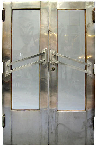
deco doors

These fantastic Art Deco doors welcome you to a tour of machine age simplicty, of Bauhausian form and function, and obviously of scintillating surfaces sure to dazzle the eye.

Yesterday I showed a lot of kitchen pictures because it seems so easy to integrate the industrial aesthetic into a space devoted to utility. Let's review with this image from Desire to Inspire:
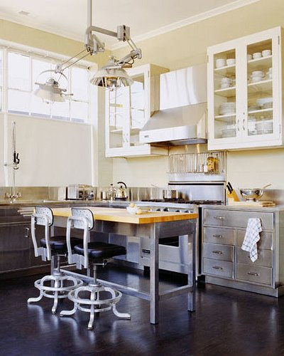
desire to inspire

Apparently the lighting, cabinets and stools, are of the vintage medical/dental persuasion, and given the sterility of those environments, it's easy to see how those pieces work well in a food prep space. I'm not normally a fan of bar stools, but I like that pair.

i suwannee

Here's a homier set up courtesy of I Suwannee's lovely blog, and while I adore the articulated lamp, I'm really fixated on the stools. Actually, it seems like vintage laboratory style stools have been cropping up everywhere lately:
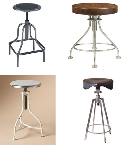
stools

Clockwise from the top left: Super cheap industrial stool from School Outfitters, Alchemy Stool from CB2, Rollie Stool from AvroKo (via the fabulously Nerdy Fashionista), and Modern Times Stool from Sundance.

If you're looking for something a little less curvy, you could always pull these stools from Crate and Barrel up to your farmhouse table:
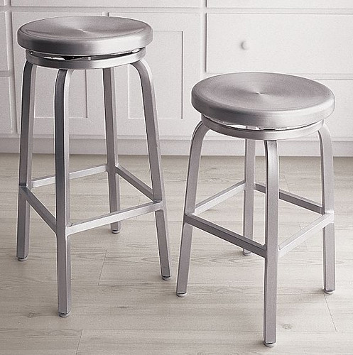
crate and barrel

I'm guessing that you savvy readers saw the home of ersatz director Roland Emmerich in The New York Times. If not, I'll skip the craziest rooms and go straight for the highlights:
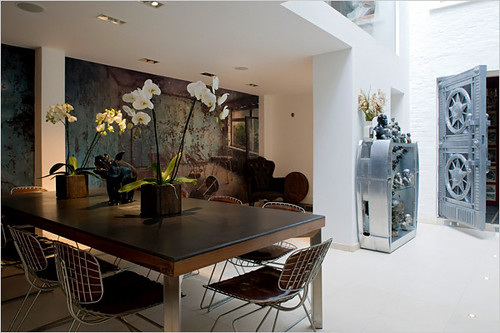
emmerich

Love the webby wire chairs with the wooden table, the gorgeous stainless cubby, and holy moly, yet another bank vault in a home!
emmerich

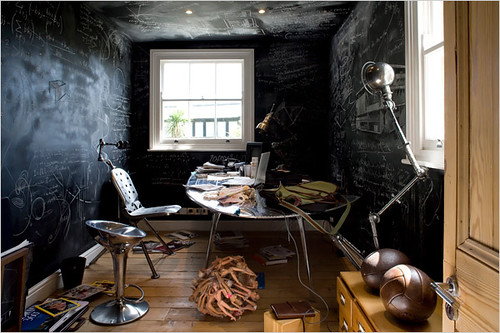
This room is kind of Captain Insano amazing... check out the lamp, the vintage dental chairs, and the repurposed airplane desk (and the chalkboard wall that totally makes this room happen).
emmerich

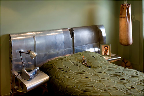
Continuing on the wartime industrial magical mystery tour, this bed has a custom headboard made from a plane parts. Do you think he dreams of flying? (Also, I think the headshot on the nightstand is of him, which is kind of... different. But the GI Joe is hilarious!)

If you want your very own piece of a plane, check out LA Designer Voila's booth at the recent SF Art and Design Expo, which Leah from More Ways to Waste Time so elegantly documented:

voila

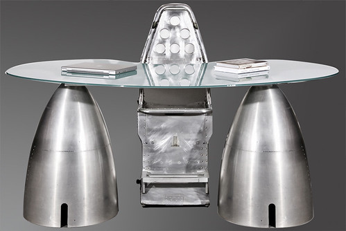
Lo and behold, Voila carries all kinds of recycled sheet metal pieces, which have found new uses as homey aesthetic anchors:
voila

This desk looks like it's primed for lift off!

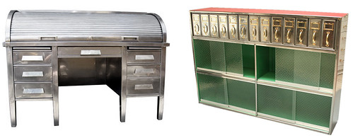
For those of us with slightly less adventurous tastes, these pieces from Sultana (formerly known as X21) could easily blend with contemporary rustic and vintage 70's furnishings.
sultana

The desk is a little, tiny bit expensive, and ok -- the bookcase isn't much cheaper, but I can honestly say that Sultana is THE GREATEST STORE I HAVE EVER BEEN IN. The top floor is crammed full of 1st Dibs caliber pieces, and the bottom floor is a labyrinth of of the most amazing "castoffs" you have ever seen. Deals abound. I found a sweet Milo Baughman chrome base couch for $400 bucks, people. Plus the guy who runs the store looks exactly like The Dude from The Big Lebowski. If you are ever in SF, go there. You will find something.

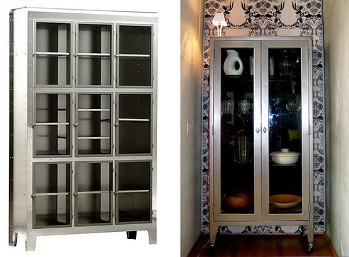
My friend and I were drooling over the vintage industrial stainless cabinets, kind of like these:
stainless cabinets

The one on the left is designed by Piet Hein Eek, available through Cibone, and the one on the right appears courtesy of the Ferm Living blog. When I used to live in Hawaii, they had tons of those at the State Surplus, and I even saw one or two (sadly, already sold) at the Austin State Surplus. So if you have access to your local surplus, it may be worth a look.

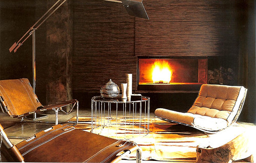
Warning: the next image is so powerful that when I saw it on Miss Raina's awesome blog, If the Lampshade Fits, I nearly wet myself.
jeff andrews

Yeah, I'm busting out with 70's architectural modern, but it works as industrial, right? I'm not going to split hairs when I can't stop staring at this hot number from Jeff Andrews Designs, who has hereby earned a spot in the Design God Pantheon with this room.

Plus it inspired me to think outside of my tufted box and check out these fancy furnishings:

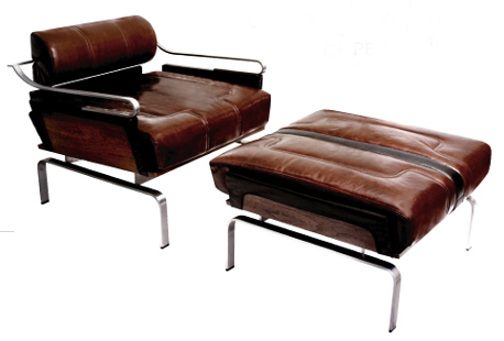
Gorgeous hunk of burning chair from the previously mentioned AvroKo:
avro ko

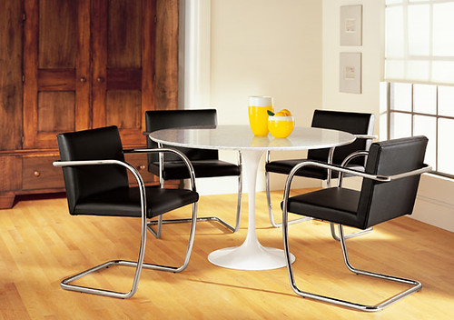
The original gangsta Brno chair reissued through Room and Board was designed in the 1930's by his majesty Mies van der Rohe (and you can ditch the tulip table. Really. It's ok):
brno chair

I'm getting tired and punchy... told you this would happen. Know what always makes me feel better? Coffee (tables)!

coffee tables

coffee tables

Clockwise from the top left: Spool table by CB2, vintage red firehose table that I desperately want at Sultana, crazy 1940's coffee table at 1st Dibs, Bradley Hughes coffee table on casters (via Raina at La Lampshade).

Nope. Not done yet. Perhaps you already have some ladderback farmhouse chairs, but you really want to mix them up with a more modern dining table?

Below: 70's chic Rivet Table on left by CB2 (if their lighting was better, they'd be my one stop mid-price interiors shop), uber hot 40's metal table on casters at 1st Dibs on the right. You know, I think I like just about anything on casters...

tables

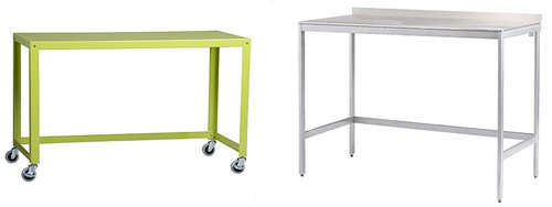
desks

Above, tables on a smaller scale: Lime green desk at left by CB2 (on casters for under $150! Use it as a console table, perhaps?) and stainless table on right by Ikea. It's for a kitchen, but who cares? Why should they have all the fun... use it as a console table or desk. For even less than CB2's version, you can buy two.

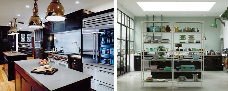
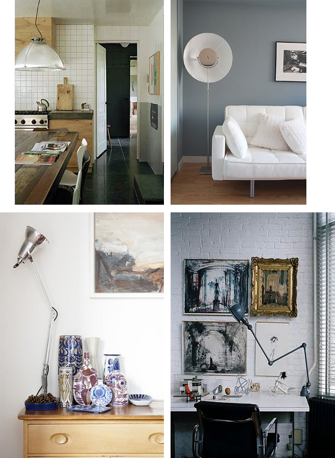
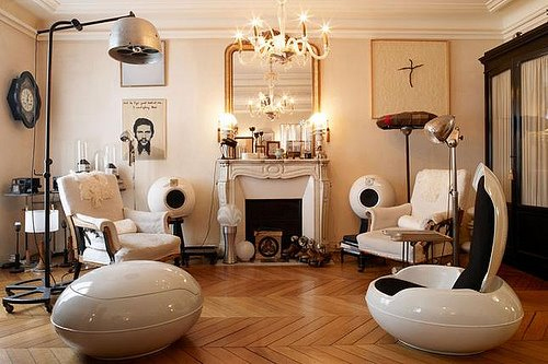
Ok, we're almost done here, but I'm throwing in a couple of home porn pictures via Desire to Inspire that show the most amazing industrial lights (I know, I know... I already did that post, but I think you'll thank me for this anyway).
desire to inspire

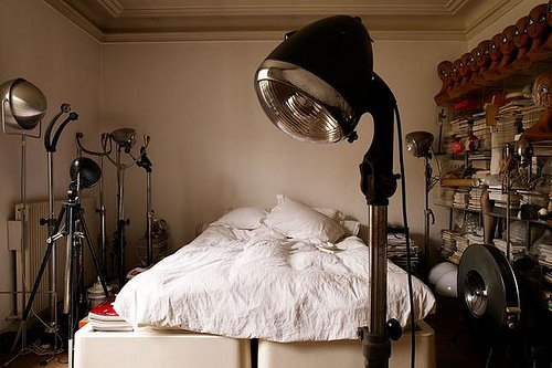
Don't you LOVE the eclectic mix of things in this room? Mix and match eras at will, just keep the color and pattern minimal if you're going to wildly vary shapes, textures and scale. One more:
desire to inspire

This is probably the kind of person I'd be if Hunny Bunny would let me. A freaky pack rat with a penchant for 40's lighting and a row of bald mannequin heads to watch over me. Yes I would.
Industrial Revolution

I enjoyed Karly's post on rough and tumble agrarian chic immensely, possibly because it might be the perfect foil for my new obsession: industrial chic. I know, we should stop using the word chic because it has the aura of class, and we all know that Klassy = Sarracuda t-shirts. If I once again employ the transitive property A=B and B=C, therefore A=C, then we can agree that chic is a very bad word indeed. Special brownie points and a gold star to anyone who can think of a better word than chic, but which also sounds good with agrarian and industrial. "Bravura" is not an acceptable submission. It might help if I showed you some pictures, right?
desire to inspire

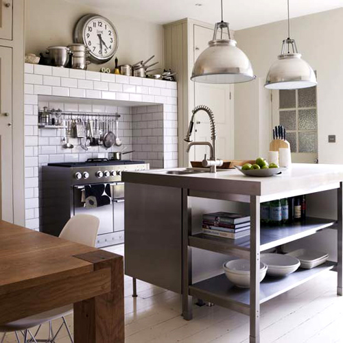
Industrial light fixtures have been de rigeur in the kitchen since stainless took over as the metal of choice. The oversized pendant lights on the left evoke 30s/40s elegance in a thoroughly modern kitchen, while the (tiny picture of the) green wall-mounted beasties on the right from Desire to Inspire's fab site are a little more turn of the 20th century.

Actually, get ready to see a lot of pics from Desire to Inspire because Kim is remodeling her own kitchen and she and I share similar taste in fixtures, including articulated lamps like the ones I posted about recently.

The Style Files also showcases some great kitchens, including this very simple one with gargantuan pendant lights:

style files

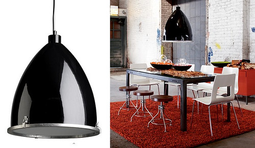
Speaking of lights with titanic proportions, check out this baby from CB2:

cb2

She is very sexy, no? Like a polished fusilage or jet afterburner, whatever those things are. Too bad that rug is KILLING me. Too small, too red, too marled. Actually, I like marled things... I just had to add one more insult for a little bit of tertiary symmetry.

Time for some retail therapy:

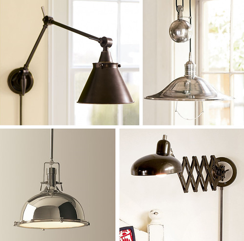
pendants and sconces

Pendants and sconces and a SCISSOR lamp, oh my! All from Pottery Barn -- seriously -- except for the bottom left one, which is from Restoration Hardware.

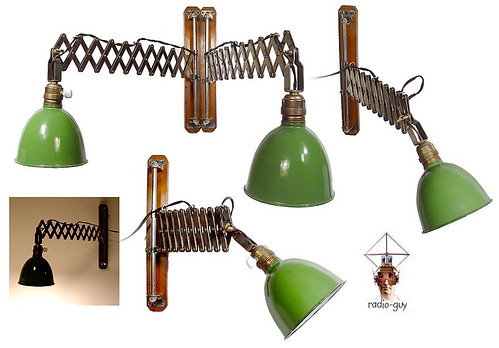
I have a rabid scissor lamp fetish... start snatching them up where you can because people are getting fizzy over them on Ebay. I kind of think either super sleek or super crazy, like this funky green pair from Radio Guy:

radio guy

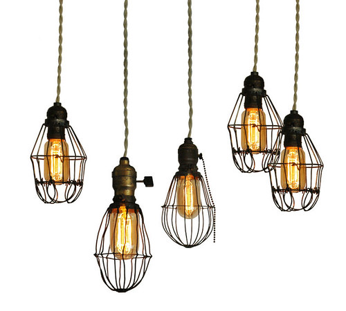
Radio Guy has some awesome fixtures (plus a ton of really weird masks and mannequins) in a more turn of the century vein, and I can definitely get down with some old school shizz, like these cage lights from Rewire.

rewire

Hotness! These are from 1915-1920, and Rewire says they're shown with Edison bulbs. Can you even buy those anymore??? (Totally unnecessary aside: maybe they should be called Tesla bulbs, since Edison was such a damn dirty thief...) Whereas the 30s/40s sleek chrome fixtures would be fabulous with more rustic materials, I think these antique fixtures need a more modern backdrop to give them bite.

Par example, check out this hot number via Desire to Inspire:

desire to imspire

Perfect combination of all that is good: bare natural materials in conjunction with clean hard lines, and to accessorize: THE MOST AMAZING LAMP EVER (check check and checkmate).

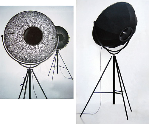
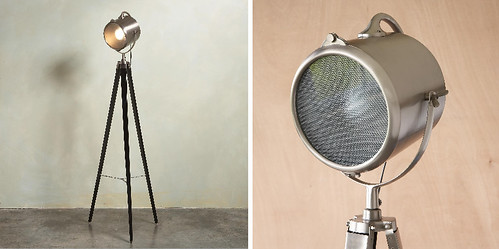
fortuny lamp

Bongiorno, I am the the most amazing lamp EVER, designed by maestro Mariano Fortuny in 1907. Yes, that Mariano Fortuny. I may be over 100 years old, but I look as fresh as a newborn babe, and I represent all that is holy and good in the lighting universe. As a matter of fact, even though I was originally designed with theatrical and photographic industries (wink, wink!) in mind, I am so hot that no one would dare think of hiding me behind a curtain. Because I'm hot. And Italian. And expensive. And did I mention hot?

There's no topping that. But I shall press on bravely.

desire to inspire

Some more inspiring images via Desire to Inspire, soon to be followed by a veritable onslaught of retail lighting goodness.

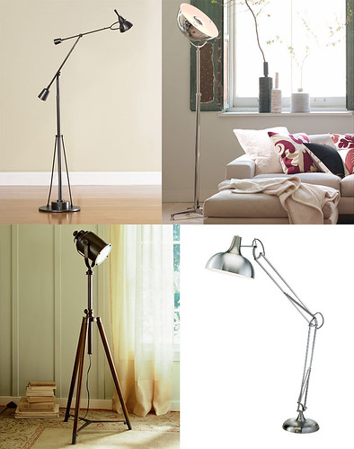
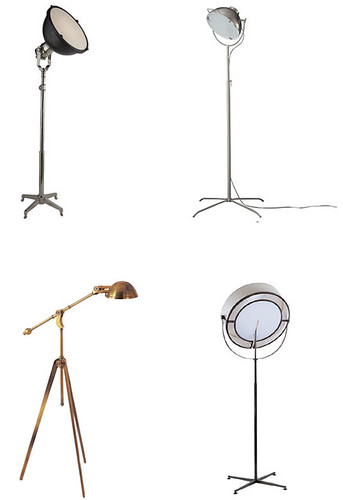
floor lamps

Floor lamps that aren't as cool as the Fortuny, but we can't all be gazillionaires: Clockwise from the top left we have Restoration Hardware, Pottery Barn (!), Chiasso (that hunk of steel is over 6 feet tall), and Pottery Barn (again!!).

And for those of us that aren't even thousandaires (thanks, Reaganomics!), even Ikea has some good lights with game:

ikea

Wouldn't it be cool if that sconce were really that big? Like four feet tall? Wouldn't it also be cool if it took a regular bulb instead of a halogen one???

You all know by now that I'm partial to brass and gold, but maybe I'll take my cue from fashion and mix and match metals with abandon.

floor lamps

All lamps from Circa Lighting, which is fast becoming a favorite, except for the top right, which is from CB2 (another perennial provider).

Even Sundance is busting out with goodies, like this Luminary Lamp. Yeah. Sundance

sundance

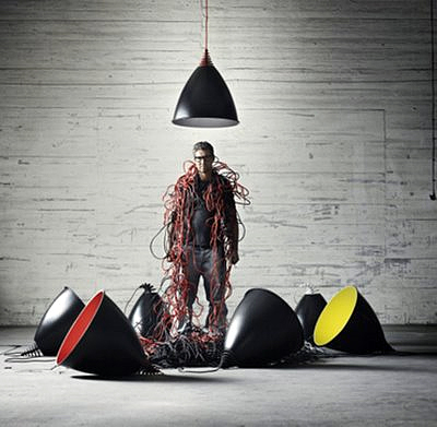
Stay tuned for my next post on Friday, where I fully intend to cover industrial furnishings that are totally unrelated to lighting. Because in my world, there are only two categories: lighting and not lighting. In the meantime, try not to get too overwhelmed by all of the choices out there and end up like this guy:

pand dan

Electricity is dangerous, and something tells me he may want to step away from the wires.

(via pan-dan)