Our house looks like an earthquake hit -- you couldn't find any survivors in here if you tore up the house with a crane. Perhaps I am waxing a little heartless and cruel (what with all the natural disasters going around of late) but I think you catch my drift. It's rully messy in here.
Why, you ask? Because after a record shattering eight glorious hours of sleep, I decided in a fit spastic energy that we should convert our guest bedroom/Ike's nursery to Ike's nursery/playroom.

Doesn't it look like a kid lives here? No? You obviously get more sleep than me.
The whole conversion thing is really a pretty easy leap to make (unless you are very very tired), but it did involve lots of moving. And throwing away. And then... I decided to ditch the old cloying Smoke color and repaint the entire room. And now the sleep buzz has worn off but the mess is still here.
I am a walking natural disaster.
Anyway, finding the perfect gray is like finding your soulmate: get as close you can and then compromise on the rest. Sorry, HB, I'm just saying that a good relationship takes effort. I still like you.
Most of my house is painted Benjamin Moore's Abalone Gray:


So I thought to myself, slam dunk! This is going to be MF awesome. But, no. Gray is a bitch. She is a hooker by night and a puritan by day -- a chameleon in gekko's clothing. Who knows what that's supposed to mean, but I think you catch my drift. Maybe.
While lovely in no less than five other rooms of my home, Abalone looks like lavender crap in Ike's room. So today I'm going to visit Sanders again and pray that the god of paint (that would be Sanders) can help me solve this riddle wrapped in an enigmatic conundrum of a cookie. Or however that hackneyed phrase goes that I can't even properly recall. Guess it's not that hackneyed after all...
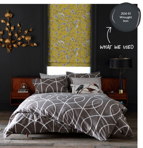
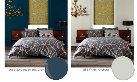
To sum it up: my house is a mess. I am busy. Please, occupy yourselves with the AMAZING transformative properties of paint, as evinced by Christiane Lemieux, the creative director behind Dwell Studio:


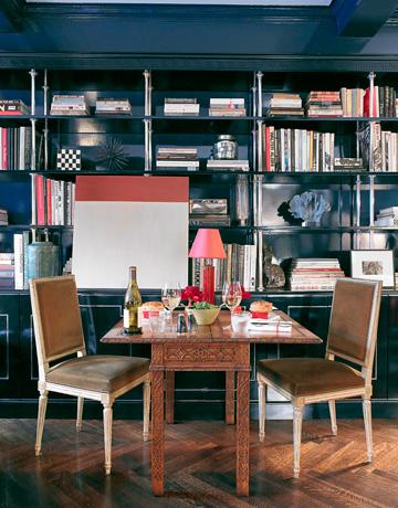
One room, three Benjamin Moore colors: Wrought Iron, Gentleman's Gray, Winter Orchard. I am completely totally obsessed with all three colors. The plan was always to do three of Ike's walls in Abalone, but since it sucks I'm hoping Winter Orchard will take the gold medal here. One focal wall will be in Wrought Iron (I think. Or I could change my mind entirely...). I would KILL to paint the entire room in Gentleman's Gray (or perhaps that Major Tom wallpaper I keep kissing when I think HB isn't watching?), which is oh so close to the ever popular Farrow and Ball Hague Blue:

Miles Redd kills it.
But it's really too dark and just doesn't make sense for this house. Next house. Promise.
Ok, now it's time to get busy and work my everloving ass off. See you when the rubble clears.
If you catch my drift.

