One Room Challenge: Week Five -- Things Fall Apart

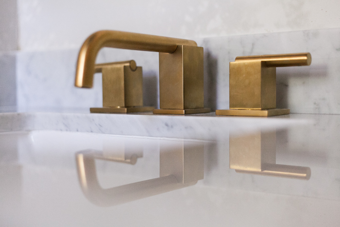
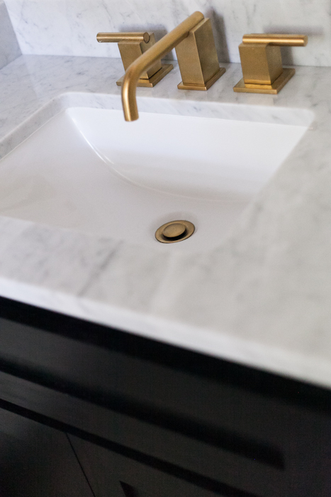
Hello and welcome back for the penultimate week of the One Room Challenge, the race to make a finished space happen in six short weeks. [Catch up on previous weeks HERE.] When we left off last week I was feeling a little dumpy about my wallpaper conundrum, so dumpy that I forgot to show you my new counter and faucet power couple, which is basically like forgetting to tell you I won the lottery. Let's talk about this sparkle magic, shall we? In the continued interest of test driving potential materials for the future maybe possibly never kitchen remodel, I decided to go with marble counters after pricing out several options. I wanted to use the broken marble table from the last ORC debacle. That would have been epic and so very poetic, but fabricators didn't want to touch my giant cracked, glued and screwed table with a 10 foot pole. I also considered silestone, but... meh. Somehow a tiny slab of white silestone felt limp when what I wanted was jazz hands.

erin williamson | design crisis

The counter is small so I held my breath and splurged on carrara, or not so much splurged as spent $35 more on marble than quartz. Right after it was installed I set about to wiping and worrying, but not 24 hours later I found Luke sitting in the sink with the faucet running and a hot wheels clutched in each hand. I guess the cars needed a wash.

erin williamson | design crisis

So far there has been toothpaste, plaster, water, and god only knows what else all over those counters... and I don't see a thing except for the reflection of yon Altmans faucet, shining like handsome Narcissus in the golden afterglow of his beauty. Even better I scored that dude off Ebay for $250 including shipping and every part necessary for install. I mean, did I want to spend $250 on a faucet? No... more like $25. But $250 is better than $1000.

erin williamson | design crisis

Room shot of the install shows that I got the baseboards all a-painted and yikes, there is still an ugly wire thing playing with my emotions. What the what am I going to put there?

erin williamson | design crisis

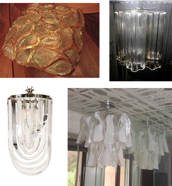
You know how I got my faucet from ebay? I get pretty much everything from ebay, including all this here lighting that I bought in a bingefest rivaling the great Round Top buyathon of 2013 when I went temporarily insane and spent half a month's salary in one day. Don't worry, I'm not rich so half of a month is like $10. I digress. Look at all the lighting I bought! A super weird heavy blown glass flushmout, a petite Tronchi chandelier with smoked glass tubes, an insane Mazzega chandelier, and a teeny tiny lucite ribbon chandelier.

erin williamson | design crisis

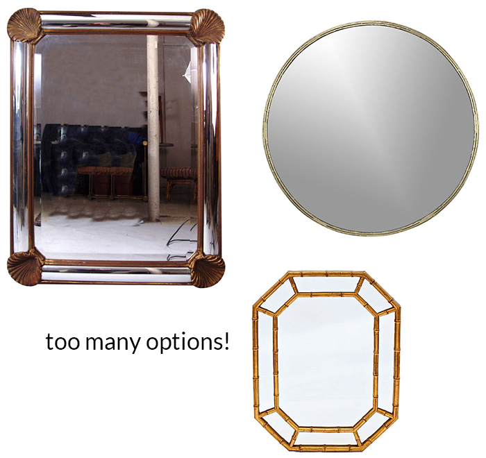
I should probably put a mirror up, too. UGHHHHH. My faucet is handsome, meanwhile I prefer to pretend I am just a walking manifestation of being, that I have no face, or at least no face that is slowly but surely melting from years of parenting. So this is just a small sampling of my wares. A thrifted vintage La Barge mirror with gold leaf shells, a CB2 Tork mirror, and a gold bamboo octagonal mirror for all your feng shui toilety needs.

Also, you may have noticed that there is skim coat on my walls. That's because if you follow me on instagram then you know that this happened:

erin williamson | design crisis

My favoritest wallpaper man in the world. He's so good that I have a secret crush on him. I hope he never reads this because the next time I see him it will be super awkward. For all you nerds out there, notice he is pasting and booking a non woven paper which is supposed to be a paste the wall product. Directions? What directions?

erin williamson | design crisis

I'm sure you thought I might attempt to hang that crazy wallpaper myself, because how hard can it be right? Well I have hung my fair share of paper and let me tell you that textured walls + metallic wallpaper = professional installation. I'm not a DIY wimp but I draw the line at skim coating and sanding all the walls, then lining said skim coated walls with blankstock liner, then hanging some very fussy shiny paper behind toilets and around lots of corners. Had I done the job, there is no way this would have been the result:

erin williamson | design crisis

Hooray! But what am I going to use for blinds? Can I do bamboo?

erin williamson | design crisis

Also I am freaking out about drilling into my fancy expensive wallpaper, but I gots to have a towel ring and toilet paper holder... don't I? I happen to have a vintage lucite set, but I am wondering if it's a leeetle too much. Or maybe even way too much. I mean, do I just go Lucy in the Sky with Diamonds here? Or should I dial it down to Let it Be?

erin williamson | design crisis

I totally want some black toilet paper.

There are a lot of exclamation points and question marks in the works today. I'm obviously not amped up or stressed or anything. I have 50 billion (or maybe five) big decisions to make and then I can peace out and sleep for a month or possibly even a night. Next week is the big one... the final countdown is upon us. The Final Countdooooooowwwwwwnnnnn.

I need to resolve some issues. Lucite or possibly black finishing hardware? Can I get away with bamboo blinds in here? I've got to nail down a lighting and mirror combo. And art. You may remember from the last ORC that I have a few extra pieces lying around... am I going old and dirty or bright and peppy?

You'll have to tune in next week to find out. In the meantime, drop me a line and let me know your thoughts. I'm feeling weak and tired. I might listen to you. Or not. Nothing personal, I'm just a control freak with an emphasis on the control. Ok, and the freak.

Until then please do check out the progress of my talented compadres. The game is afoot!
 Abby M. Interiors

Because it’s Awesome

Bijou & Boheme

Calling It Home

Chez V

Chinoiserie Chic

Copy Cat Chic

The Decorista

Design Crisis

Design Indulgence

Design Manifest

The English Room

The Glam Pad

Little Black Door

Mimosa Lane

My Notting Hill

The Pink Pagoda

Simple Details

My Sweet Savannah

Verandah House

One Room Challenge: Week Four -- Karma Police

Welcome back for week four of the One Room Challenge, aka the madcap race to completely transform a room in six short weeks. [You can catch up on previous weeks HERE.] Ok, I'm not going to mince words... week four hurts. It is rough like a cheese grater on your soft and vulnerable pinky knuckles. It is the point where fantasizing and planning meet the cold hard slap of reality. In a dystopian turn, I inevitably come to loathe every idea that previously seemed like a bright and shining beacon of awesomeness because I am my own worst client. Deep breaths. Let's do this. erin williamson | design crisis

Last week my wonder husband who still loves me but doesn't like me anymore dropped in an overhead light so that we could see. If you are wondering why we didn't go with sconces, it's because the space felt too narrow and I didn't care for the idea of sconces on opposing walls. Now I thought the gift of vision would be a major improvement, but like many things the room looked better in the dark. I see cellulite. Everywhere. Adding insult to injury, I had to match the ceiling texture to the rest of the lumpy bumpy ugliness. I also textured my hair in the process. Kinda feels like dry shampoo.

erin-williamson-orc-4

I decided to paint out the ceiling and wood work in Black Beauty. I had this on a wall at our old house, and it's warm and dramatic. Just like me. Sadly you can still see orange peel in the raking window light, but at least the extractor fan looks skinnier in black. And even though my paint job reminds me of putting on eyeliner with two kids grabbing at my legs (erryday), I do think the black moldings are a vast improvement. Sanders my magical amazing incredible paint guy made me try the new Benjamin Moore Grand Entrance enamel paint and I LOVE IT -- goes on like pudding and hides pesky brush marks. Delicious.

So that's the end of the good stuff. The bad stuff goes a little something like this: the more time I spent in that room, the more I felt the beadboard from the original design had to get out of my life. It was too many elements for this tiny space -- too many stain/paint/weird transitions. And that meant I had to make a life decision about the wallpaper I oh so optimistically purchased two years ago.

erin williamson | design crisis

Long ago I planned for this beatific wallpaper trifecta, for which I was sure I deserved an award. The middle paper was installed in the foyer years ago. I grew afeared of a long term relationship with the color in the wallpaper on the left. But I still loved the Little Greene wallpaper on the right and thought it would be right at home in the powder room. Except that this paper is very... absorbent. We have two little boys. It's a very real problem that affects my design decisions. The beadboard would have repelled moisture, but without it I was at a loss.

erin williamson | design crisis

I decided I should get new wallpaper. Is there anything, ANYTHING more of a true Design Crisis than choosing wallpaper? It's like holding a mirror to your very soul and looking into the blackest depths. It's like getting married... but more expensive.

erin williamson | design crisis

I had a serious case of Goldilocks and the Three Bears going on. Nothing was working. Cole and Son Nuvolette would have been my top choice but the pattern didn't resolve in such a small space.

erin-williamson-orc-10

Then I started to get really picky about print quality... I'm just not loving the vast majority of digitally printed papers. Honestly, as a photographer I was surprised at the resolution on some of these. I realized I pretty much only go for screened or gravure printed papers because apparently I like to look at my wallpaper with a microscope.

erin-williamson-orc-8

Then I was tripping on the pattern repeats. A lot of patterns look good on a little square but have obvious weird repeats when you see them installed on unbroken walls. I tend to gravitate towards large carefully hidden repeats or small textural papers, probably because I used to count the flower people and creepy alligator men in the wallpaper of my childhood bedroom. We'll discuss that some other time.

erin williamson | design crisis

Finally, the expense factor got super scary. I am obsessed with some of these papers, but wow. When wallpaper is priced by the square foot, I get spooked and file it away for my brave and well heeled clients. At one point I was calculating literally thousands of dollars in paper alone for that one tiny toilet room, and I just had to step back.

Let's not forget that the whole reason I started searching for new wallpaper was this:

erin williamson | design crisis

This guy had been sitting in the cat's food-filled water bowl, then he ran with his catfood stew pajamas across the house and all over my wallpaper samples.

The criteria became clearer. Durable, inexpensive, awesome. I decided to go with a non woven for the durability factor. And then I decided to go with this for the awesome and inexpensive factor:

bain de minuit designers guild

Designer's Guild's Bain de Minuit in zinc. Ike approved.

erin williamson | design crisis

I was the decider! I felt good! I was pumped! I ordered four rolls and steeled myself for the award I thought I deserved a few years ago but definitely deserved now.

And then I saw that Holly from The English Room had chosen the same paper for her design. And then I freaked out.

Basically I had looked into my soul and found... someone else's soul. Even worse, someone might think I was trying to steal their soul.

I felt terribly guilty and ashamed -- about what I am not sure, but it doesn't really matter because I am the guiltiest person in the world. I should immediately start wearing hairshirts and flagellate myself with glass studded whips just for fun. I was sure Holly would think I was a jerk, but she didn't even bat an eyelash because she has better things to do than to worry about what other people are doing.

Meanwhile I feel like I am constantly worrying about what other people are doing -- worrying like it's my job. And partly it is. I am supposed to be up on design trends -- what's coming in the future, and most certainly what's been done. People pay me for this. And yet it really is a vicious cycle, made even more cruel by the speed of the internet. One trend must die in order to sell sell sell a new one. We are all scurrying to get ahead of the curve, and for me that often means zagging where others are zigging. It's juvenile and contrarian, frankly. And I'm not sure it does me any lasting favors, but it is turning me into a crazy(er) person.

I like this wallpaper. It's awesome and soon it will probably be in every house in the world, much like the infamous Woods wallpaper. But that's ok. I had that wallpaper too, and I loved it. So friends, the afterschool special lesson of the day is: if you like it, do it. And do not apologize for your choices. Unless you are me, and then you should apologize for everything.

Sorry about that!

There have got to be some people making good progress this week. Go find them! Check back next week to see if I actually hung this paper. Or that paper. Or some other paper.

Abby M. Interiors

Because it’s Awesome

Bijou & Boheme

Calling It Home

Chez V

Chinoiserie Chic

Copy Cat Chic

The Decorista

Design Crisis

Design Indulgence

Design Manifest

The English Room

The Glam Pad

Little Black Door

Mimosa Lane

My Notting Hill

The Pink Pagoda

Simple Details

My Sweet Savannah

Verandah House