Last week a DC reader wrote with a question very near and dear to my heart: how to display photos of family and friends in a modern home. Flip through any design mag (or blog for that matter) and one might believe that robots inhabit the space as evidence of an extended family or memoirs of a night out on the town are never shown. Clustered art? Sure Giant black and white prints? Yep, lots of those. But when it comes to a quick pic of you and your BFF smiling ear to ear at last weekend's rager, forget it. Can you have snap shots in your home? How do you display them? Below are a few of my thoughts on the matter... you know I always have thoughts on every stupid matter... but I also want to hear what you think*
*if anyone mentions arranging photos with one of these, I will be very very mad
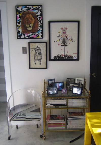
Ok, first I'm starting with a picture of a display in my home. I apologize for the uber-craptastic manner in which this photo was taken. My flu last week made it difficult for Erin and I to schedule a super star photo shoot.
I really wanted pictures of my family & friends in the house but was having a hard time working color snapshots in with everything else. I find that basic, everyday photos work best on a tabletop or shelf, not on a wall.
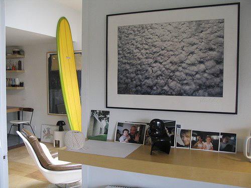
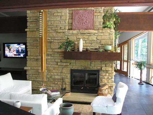
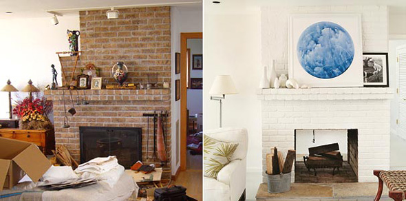
Like me, whoever arranged this house likes their photos on the table. These dudes got all gangsta and just skipped frames altogether. Also like me, they kept a large piece of art (pieces in my case) over the photos to keep the look modern.

Another fast and hard rule I stick to with framing current photos: keep those frames simple. I repeat SIMPLE. Stick with a thin frame and keep them all similarly colored. Pick either white or black frames then mix in with only ONE of the following: wood (all the same shade), gold or silver. Note, I did not list any crazy shades here. Remember, your pictures are the star and chances are they are busy enough that the whole display need not be cluttered with a bunch of hot pink frames with butterflies drawn on them.
Most of the above frames are from target (except the one in the upper right, that's Ikea). These are all the cheapest frames they carry, which works out well, because they are also my favorite. The cube in the lower left just looked kinda nice and think it could work well sitting on the right table. It's sculpture. sort of.
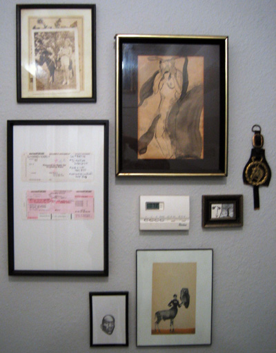
Here's an arrangement from the hallway in my house. In the upper left is a photo of my grandmother as a little girl. Below that are framed airplane tickets from the trip I took where I ended up meeting my husband. I've mixed these items in with other pieces of art I've found along the way. I kept the frames simple: black or black and gold; and the tones in all the images similar. As long as you keep everything the same color you can even mix in your thermostat and no one will ever notice. Look, I didn't have a choice, and really, you don't even notice.
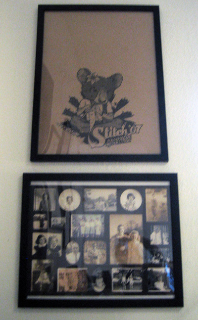
Another crappy photo from my house. The pictures on the bottom are all family portraits, above it hangs a poster from a show I used to produce. I felt like I could mix the art and the photos as they were all similarly toned.
That's the last picture of my stuff. I promise.
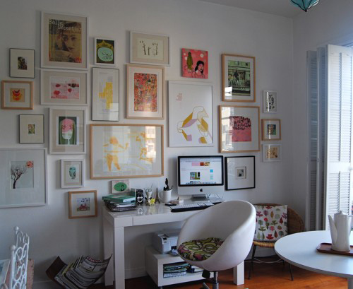
Now, I know there's not a single photo in this mix, but I feel like you could squeeze in a few color photos among all this colorful art. I'm also giving this photo 5 stars for using simple frames in very few colors. Well done.
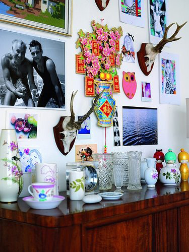
I think this is a great example of photos mixed with art and nicknacks. And that's all I have to say about that.
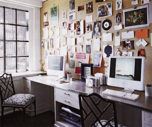
This month's issue of Elle Decor featured this home office. Snapshots are gripped with bulldog clips which hang from thumbtacks in a bulletin board. This is the most organized bulletin board in America, FYI.
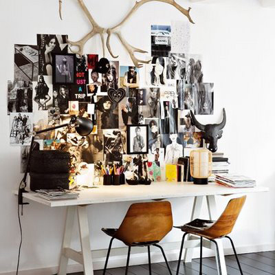
And here is the least organized bulletin board. I prefer this one, hands down. Ok, so most of these pictures are ripped from a magazine, but I feel like personal photos could get tossed into a look like this and hold their own just fine.
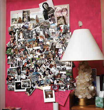
Just try not to let your bulletin board look like this. Too many small things piled on top of each other is janky to the maxx. Admittedly, I only showed his picture so we could all collectively swoon over that lamp (not the shade).
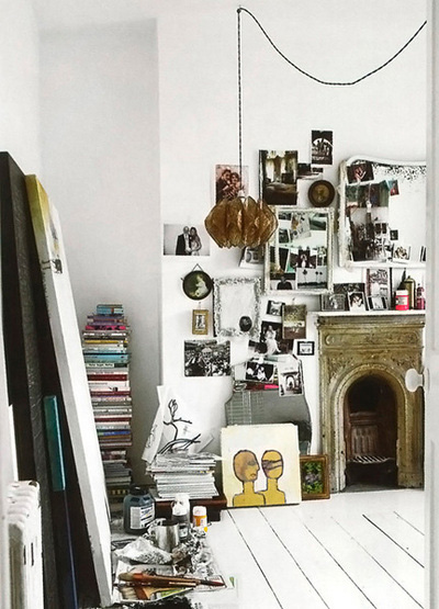
Another haphazard arrangement of art and photos. These dudes have even thrown a few mirrors in for good measure. I like it.
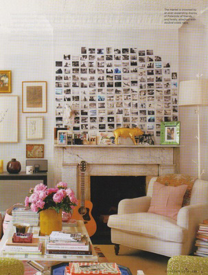
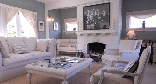
And on the opposite end of the spectrum, these perfectly spaced photos function as one large piece over the fireplace.
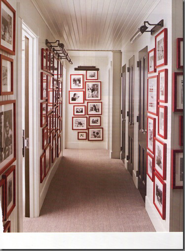
If you truly want to get OCD, you can pimp out your hallway like-a so. But then you would be ignoring my first rule of framing: simple colors, dudes, simple. Ok, I just really don't like red on anything.
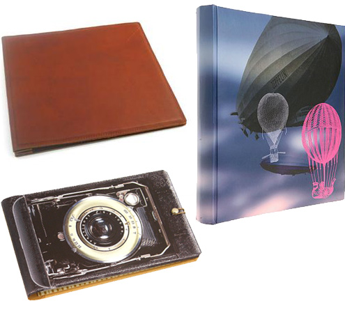
If all of this seems like too much work, and I really wouldn't blame you if it did, might I suggest a nice photo album on your coffee table? Relax! You need not look like you do your shopping at the scrap booking store, there are a few nice photo albums out there for you. You can always go uber simple with this leather album from rustico leather, the air traffic control (my name) album from urban outfitters, or this lovely camera album available at fred flare.
I hope this helped, dear reader. And, if not, I'm sure our readers will hook you up with some great suggestions in the comments section (wink wink, nudge nudge, ya'll!)
