Last week when I posted this new top-ten pad I started thinking about the various spaces we've written about in the TWO PLUS years since design crisis hit the interwebs. The very first place that always pops into my head is the one featured below. I've reposted the post today. (look it was from November of 2008 and only 3 of you have been reading this blog that long) Originally I was obsessed with the mural in the opening picture, but whenever I think about this space now I always fantasize about the wood paneled walls. Anyhow, let's take a look back at the days when I only had 2 cats, thought Missoni chevron was the bees knees, and I hadn't been pregnant for 41 weeks straight. Enjoy!
+++
Good morning, good morning! What a wonderful Monday it is thanks to Raina who sent me this insane article from W magazine. After months of loyal readership she has managed to pinpoint, with laser-like accuracy, exactly what mama likes: obscene use of color? Check. Artwork run wild? Check. Garish accessories, interesting use of materials and a view to boot? Check, check, and check. Behold:
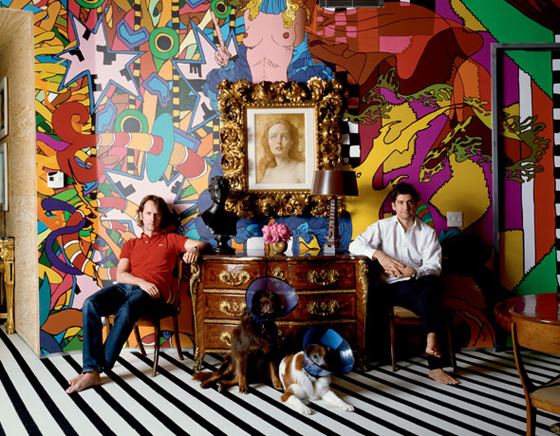
You may be wondering if I could actually wake up every morning to such a full-blown-hyper-color attack on my retinas. The answer is: yep, you bet your sweet ass I can. Did you get a load of those dogs? If I thought my pets would still come snuggle up to me at night, Laser and Magnus would be in neon lampshades faster than you could say holy good lord that's hot.
Let's talk about what's going on here: Blessed owners Tobias Meyer (ahem, head of Sotheby's worldwide contemporary art) and Mark Fletcher pose in front of mural by Brazilian artist Assume Vivid Astro Focus. A John Currin oil is perched above a French 1740s kingwood commode. Commode! Who owns one of those? Jeeze.
These dudes had me at hello, but I'm sure, like me, you're dying (dying!) for more:
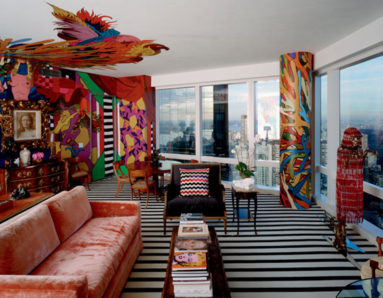
The only dream-shatterer here is the mural on the ceiling, I'm not 100% on that. But really, don't you all just want to curl up in a little ball next to that pillar while hugging the Missoni pillow, thanking whatever god you believe in that you're alive? Holy Crap my mind is going to explode!
Time for us all to hyperventilate in tandem:
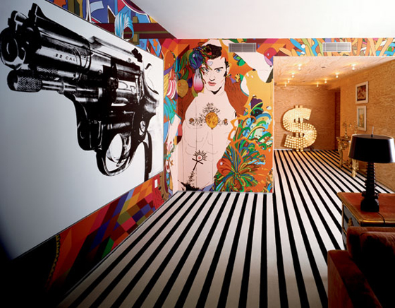
Andy Warhol gun + LIGHT UP DOLLAR SIGN + a naked man that Nagal would have painted if he'd painted men? It's just TOO GOOD! Here's what the owner's had to say:
Everything is about the reality of it all, about the human condition and facing death. Art right now is about desire, human nature, sexuality, power and violence.
These men are spending life inside a living, breathing piece of art. And I want to strangle them for it.
Kleenex time!
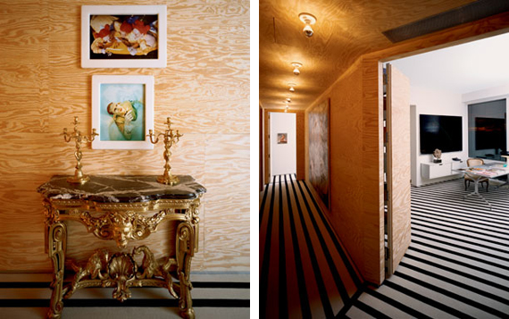
Plywood befriends the trippy Stark carpet while a diptych from Matthew Barney's Cremaster series hangs above a German 1760 gilt-wood console. The whole kitten-kaboodle is topped by German rococo ormolu candelabra (MATTHEW BARNEY!!! what is this? The freakin Guggenheim?)
The owner's note that they enjoy using low-grade materials in the design as there is "a hopefullness to it's unfinished quality." Um, right. Keep talkin, buddy. Now, don't get me wrong, j'adore la plywood, but if I even consider putting that moldy old board next to my plethora of craigslist finds, it will be all over. I think it's important to note the power of context here, with a side note that I, despite my delusions of grandure, am not the head of the world's premier art auction house.
To wrap it all up, let's take a look at the window I may or may not have to jump out of:
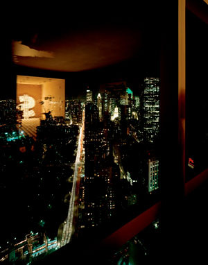
Do you see the dollar sign reflection? Doesn't it just make your heart sing? You can all send your thank you notes for providing such a majestic kick off to your week to me at godsend@design-crisis.com*.
*not a real email address, but it should be, huh?