Let's talk shelter mags for a minute here: 1. Architectural Digest used to be total crapola. Like, really bad. Then 2. Margaret Russel left her post as Editor in Chief at Elle Decor for the same position at AD last fall and ever since 3. Architectural Digest has been pretty awesome. Simultaniously 4. Elle Decor: not so good (as evidenced by this cover, hello zombi cox). However, and this is what I really want to talk about today 5. The September issue of Elle Decore Brought. It. It killed. Not only was it better than AD, it was easily one of the best issues of ED I've ever ever seen.
My very favorite article featured the San Antonio home of designer Gwynn Griffith and, wouldn't you know it, my scanner doesn't work and there are NO pictures of this home online save one crappy one:

No justice is done here and I encourage you to pick up the rag and check it out. Meanwhile, I'll show you pictures of another stunning home from the September Issue which probably has Erin panting and sweating with all it's acid-waspy wonder:
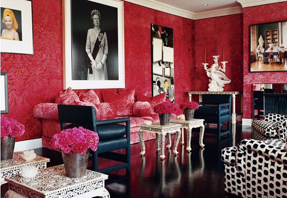
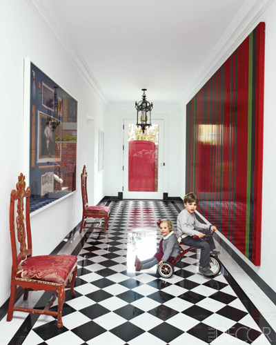
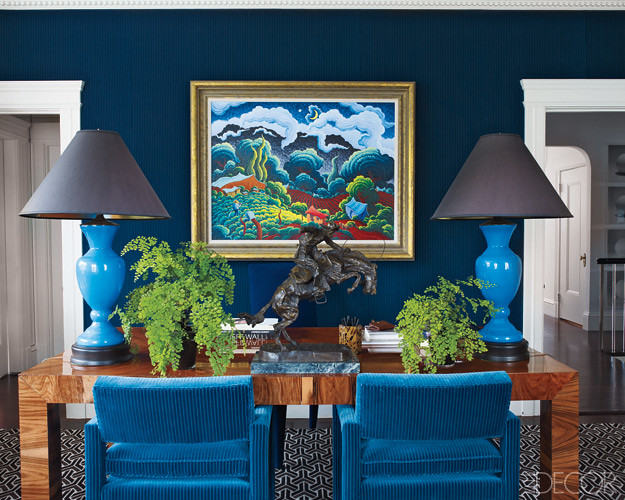
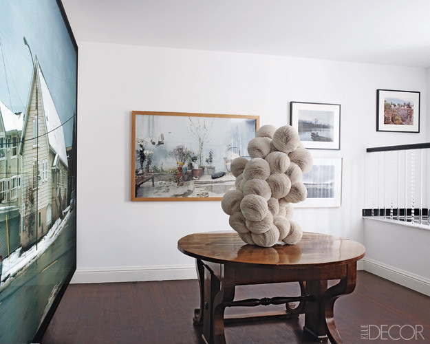
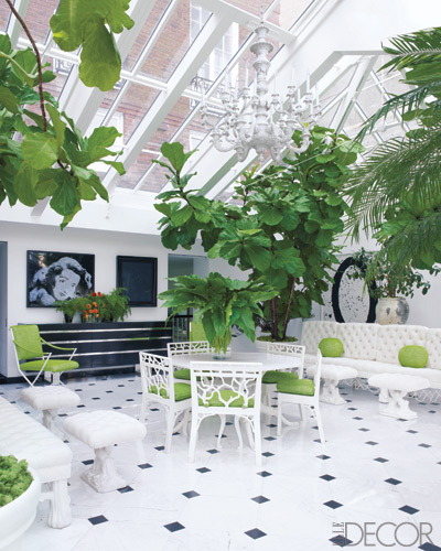
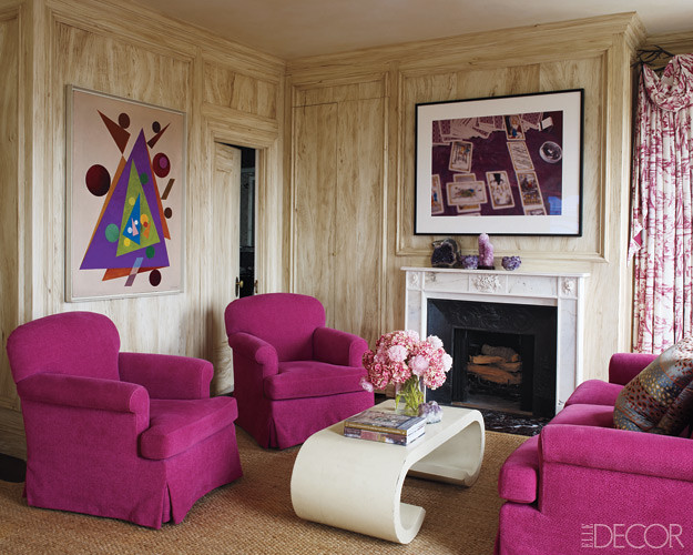
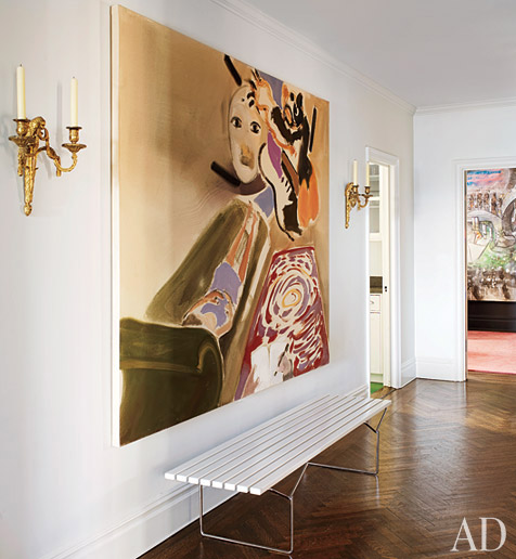
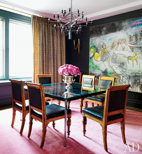
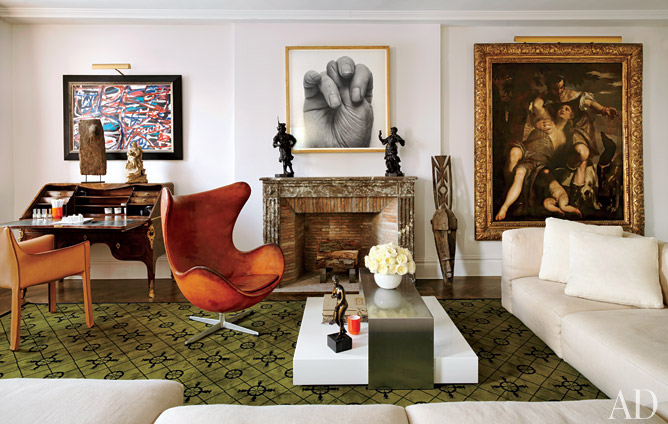
Behold, the San Francisco home of Alexis and Trevor Traina. Exaggerated proportions plus 80's symmetry plus ironic, expensive art = trippy good times.
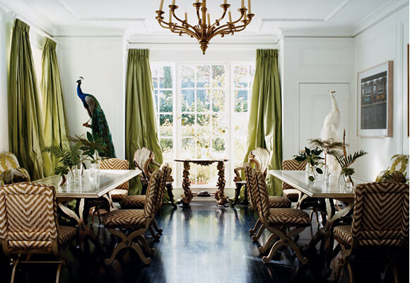 Yes to all of this. Even those upholstered dining chairs aren't getting me down, which is unusual

Could you imagine growing up here? We need to make this happen for Eero

There are, like, 12 elements here that Erin currently has in her home. I think she might cry when she sees this

Another day another giant ball sculputure right in the middle of a million dollar gallery space. yawn.

Ficus Figs on steroids: check.

Yes to that tarot card photo. If I were Erin I could probably tell you who took it. But I'm not. I'm Karly, enjoying our all-time record breaking 70th day of triple digit, rain-free heat, not to be confused with Erin who is currently laying on the beaches of Hawaii. Small difference, easy mix-up.
Also in this issue: The San Francisco loft of designer Steven Volpe, which is pretty dang awesome. Just go pick the dumb magazine up already.


 Yes to all of this. Even those upholstered dining chairs aren't getting me down, which is unusual