Hello! And welcome back for week four of the One Room Challenge, wherein I treat yo selves to a six week long dear diary of how my kitchen and adjoining study will be completely renovated, hopefully with all brain cells intact. Thank yous are due to our lovely host Linda of Calling it Home, and to our media sponsor House Beautiful for helping to make this happen. Catch up on previous weeks HERE.
You know that movie A Perfect Storm, where they are steering a tiny boat up a ginormous wave, and daring said huge wall of water to capsize their puny glued together stick shelter? I think that sums up week four. This ain't my first ORC rodeo and I knew week four would be hard, but it's still a bit shocking once you're climbing up that wave.
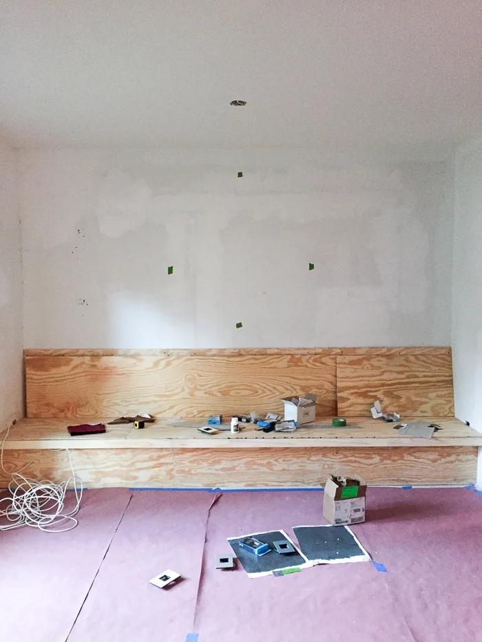
Nevertheless, it is not a complete downward spiral towards a whirlpool of despair. A platform for the banquette I mentioned last week is built, and the important pieces have been dropped off to the upholsterer (bless you, VMC upholstery for rushing this through!!!). Bellacor is generously supplying the most fantastic Legrand switches and outlets, which you can see me testing against paint swatches. More about that later...
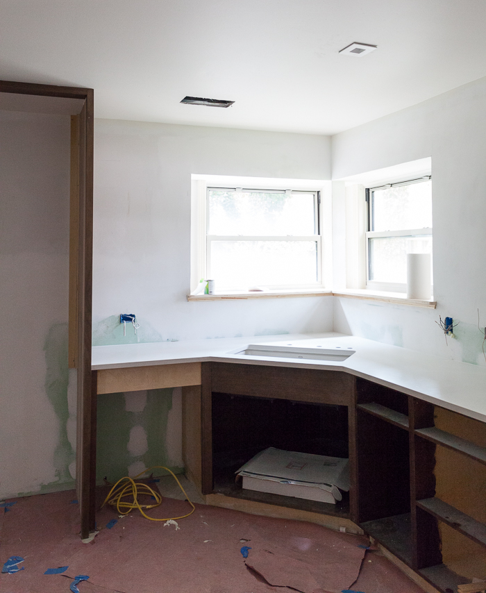
Most joyously we have some base cabinets and counters and a sink! I am feeling pretty stressed that we don't have more cabinetry at this point, but the construction industry in Austin is crazy and everyone just has to wait patiently... Except I am on a tight deadline and I'm tired of living with a fridge in my living room and I'm teetering on toxic levels of deli meat build up.
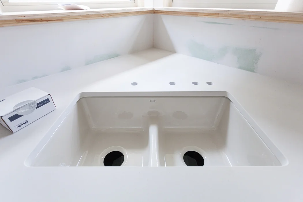
Still, A SINK! AND COUNTERS! Ahhh it's so beautiful I could cry... I think I am crying. So, the counters are gorgeoussss Caesarstone Fresh Concrete. It's so pretty and matte and indestructible, which is great because wine. The sink is Kohler's Deerfield smart divide in the sexiest custom color called Dune. I could not love it more with the counters! We went with a low divide because I tend to have a dirty and clean side of the sink, and never the twain shall meet. But this is still low enough to wash big pots and pans.
Now if they could just hook this baby up to running water I think I'd crest that wave.
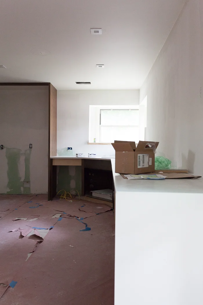
A little Caesarstone waterfall (sea metaphors paying off) counter action at the end of the cabinet run. Oh yeah we did. Also the cans are in (apparently I need to straighten them, ahem) and that faint circle drawn on the ceiling represents future speaker homes. We plan to party in here... once the paper is gone, and we have electricity and running water and a refrigerator. Gah, we have a long way to go!
You are probably wondering what I plan for the backsplash. The answer to that is nothing. Behold:
This is Lauren Liess' beautiful kitchen and she has zero backsplash. Nothing. Nada. Zip. I read somewhere that she keeps a can of touch up paint under the sink for smudge repair, and I'm going to try it. I don't need anything behind my deep corner sink, and there isn't really a way to gracefully end a splash between the corner windows and the tall window. Plus there is already a lot of tile happening with the floors. I have a Plan B to deal with this if I hate it after six months, so don't worry about me too much.
Speaking of paint, I am wrestling hard with the paint demon. The notorious Sanders P. Gibbs (SPG) came to help me. Am I painting this crazy room pink??? I am not a white wall person, but I want something airy and architectural. This is tough... I really love my dark moody walls but not in here.
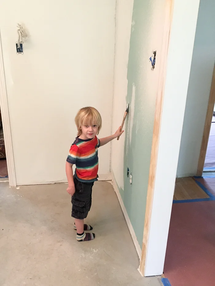
And speaking of dark moody walls, my little helpers transformed the new study space into a cozy corner. Primer first! Here's a sneak peek:
I love dark paint and I cannot lie. The color is Benjamin Moore Dragon's Breath, and it's kind of a greenish charcoal that looks muy fantastico with brass. Ps, this torchiere has been MVP during the renovation since we have zero electric in the kitchen and can only bring lighting in via extension cord. It's covered in plaster but is still the most glamorous work light ever.
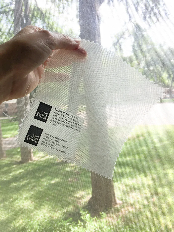
And finally, let's leave on a high note with my Shade Store order for fabby grown up window treatments. We use The Shade Store for our design projects often, so I was over the moon to find they are sponsoring this round of the ORC. I choose this ultra sheer fabric for relaxed romans at the corner window and minimalist ripple fold drapes at the tall window, paired with a roller shade for privacy. Can't let the neighbors see us dancing at night.
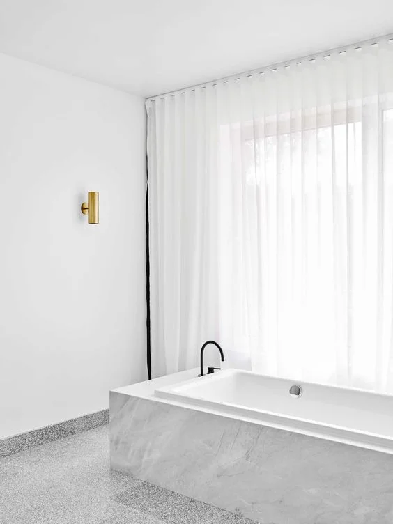
Well, that's gorgeous. Maybe I should do the bathroom next? Just gotta get over that wave first. Bathroom by the fabulous Flack Studio.
Until next week, my friends. And please do see what progress the other designers have made this week!
Centsational Girl | Chris Loves Julia | Christine Dovey | Dwell With Dignity | The English Room
Glitter Guide | House of Brinson | House Updated | J+J Design Group | Lark & Linen | Abby Manchesky
Nesting Place | Old Brand New | Old Home Love | The Pink Pagoda | Rambling Renovators
Erica Reitman | Sketch 42 | Suburban B’s | Media Partner House Beautiful | TM by CIH
