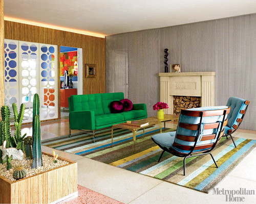
I know that the June issues of our shelter mags are old news by now but apparently I've been too busy eating bon bons and watching episodes of Ninja Warrior to notice. My monthly subscriptions arrived weeks ago but I hadn't even cracked them open until Erin and Ben came over on Saturday night. Our husbands decided they could best socialize by diving head-first into somecrappyx-boxgame, leaving Erin and I with a stack of design magazines and a bottle of wine. Since Erin is knocked up, I had the unfortunate task of getting rid of the booze. Ok, where is this all going? The bottom line is that we saw this house in Met home and it knocked our socks off. You've probably seen it all by now but, because of the bon bons and ninja warrior, it was new to me (and Erin). Enjoy:
I love everything except the small dorky painting over the fireplace. Erin and I have also decided that it's in my best interest to replicate that little cactus garden in my bay window.
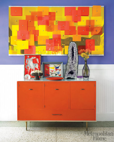
Ok, this picture wasn't in the magazine, and for good reason, I say. That big ole rock is good, the 2 smaller pieces of art are ok, but the rest is too craft-corner-kitsch.
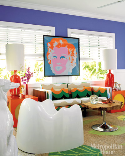
Erin and I decided to divvy up the furniture in this room: she got, what she refers to as the giant tooth, while I took the wood tulip table. I really wanted the tooth, but she did such a good job naming it I really couldn't argue. Neither of us took Marilyn. Sorry Marilyn.
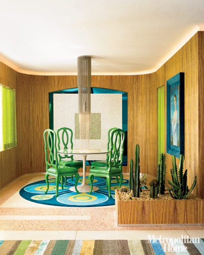
Erin immediately claimed these lovely green chairs and I have since ordered the pieces necessary to knock off that wicked ball chain lamp. Do you see how it's touching the table? Do you?!
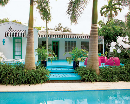
What I find most lovely about this patio is that the homeowners are probably able to spend time on it. Right now my UNCOVERED patio is reaching daytime temperatures of what feels like a million bazillion degrees (ok, today was like 100). With few trees in sight, my porch is currently off limits. Oh, and the blue and pink here are nice, too.
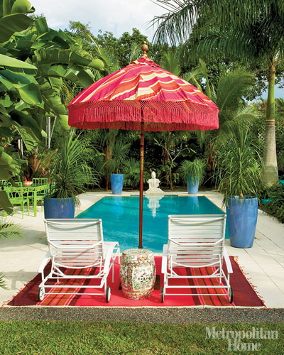
A pool and an umbrella could quickly shift my backyard from uninhabitable to party-town-usa. Yes, I would like fringe on my umbrella, too.
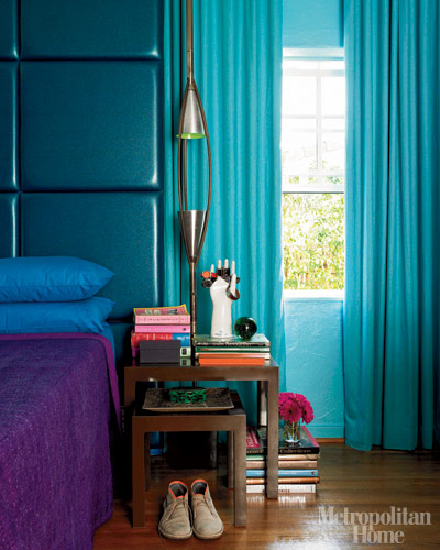
We have seen this image before on The Daily Bed, loved it then, love it now, love love love.
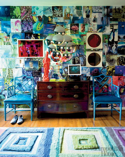
Ok, I'm gonna level with ya: I'm not really sure what's goin on here but, no matter, I love it. While the wall looks like it's covered in magazine clippings I don't remember my high school bedroom looking nearly as cool when I tried the same budget wallpaper stunt.
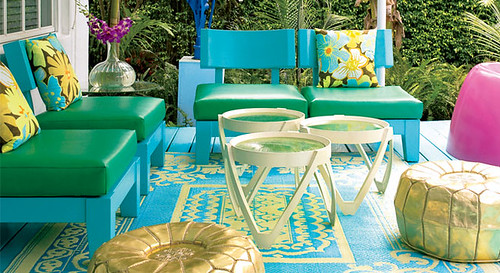
oh goodness, you had me at gold poufs.
Have I ever told you guys how much I like those colorful plastic outdoor rugs? Well, I really do.

Our Protagonist, artist Doug Meyer in front of the yellow entry way he whipped up.
GUESS WHAT Y'ALL?!? I was just trying to find a link to Doug's design site when I found a NYT hometour slideshow from 2006.

Chairs: same. Deck: now turquoise, no fringy umbrella out by the sun chairs

I don't even know what this space is now but holy ick, I'm glad he changed it.
Also, you may now visit that knoll sofa in photo #1, it has been recovered in green.

Ok, This room looks like it is now the room in photo #1, the one on the far side of the partition. Erin, overt your eyes from the chrome ball lamp. Look! That chair has now been recovered and it found a friend (see photo #1). The lamp in the corner is now in the bedroom (see photo #7) The table is in the Marilyn room. The painting is in the dining room. They all look so much better in their new homes.
For some reason this reveal feels very juicy gossipy to me. This is the decor equivalent of Brittany's car-exit stunts.
One last pic for the road:

The jade green Ondine console ($5,900) and wall piece ($3,900), are part of the Doug & Gene collection. So, let's see $9,800. Yep, seems about right.
Let's get this straight: I really do like the house as shown in Met Home, I didn't mean for this to become a bitchy design-coverup-exposed expose, it was a last minute addition. Doug, A+ on the home redo, it was much needed. Can I come swim in your pool?
