PUMPKIN SPICE AKA AMBER AKA YOUR NEW OBSESSION

Here in Austin the temperatures have finally dropped below 80 degrees, so we are calling it FALL all caps like. The desperation for seasonal variety is fierce in the face of year round warmth, so we rely on visual cues to trick us into feeling a nip in the air. Case in point: there are approximately 500 scarecrows and pumpkins littering the neighborhood, and I can’t take a walk without smacking a ghost in the face.

Texans have all the subtlety of a sledgehammer.

You know what says fall but has year round appeal? What does not punch you in the face, so much as lovingly caress your rods and cones? What works equally well as a minimal accent or an architectural focal point?

Don’t say Pumpkin Spice, although I could lick those walls.

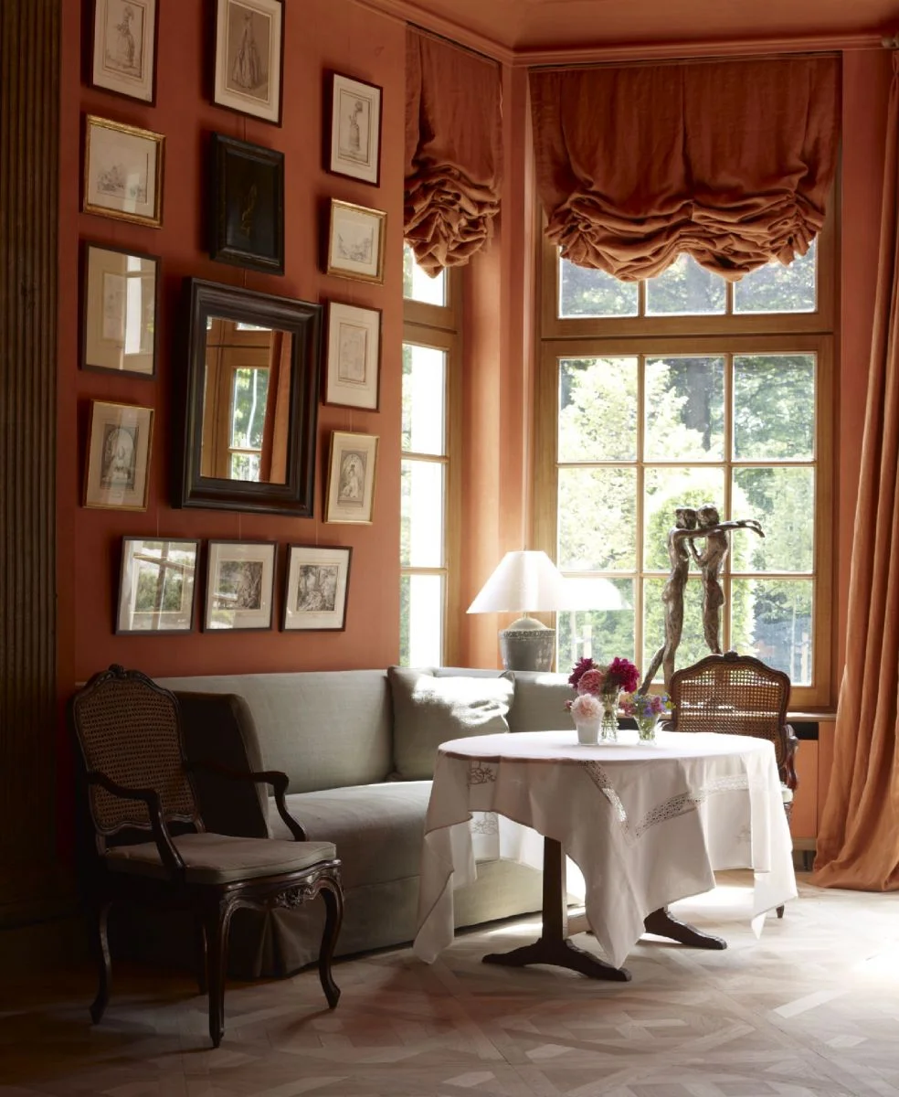
It’s not orange, and it’s not rust… let’s call it Amber. She’s a 70s girl, comfortable in a library or doing martini fueled cartwheels downtown. (Full disclosure, I am 100% describing myself.)

That’s one fine ass cartwheeling kitchen.

The entire room is perfection, and it’s really all about the curtains. Amber makes a strong architectural statement, but it’s not as aloof or bossy as some of the power shades of past.

Apparatus blew my mind with their apartment in AD. Every single thing is a work of art, yet it feels cozy and warm and seductive. It’s the perfect antidote to that bleached out easter egg palette that has been sucking the personality from every room on pinterest.

Transform your space AND YOUR LIFE with a coat of this sexy shade by Benjamin Moore.

If that’s too scary, a little splash still has big impact.

I for one will be saving my dolla bills for this sexy lady. That color is so delicious. It tastes just like…

Pumpkin Spice.

Happy fall, y’all.
TOOLBOX: THE SHADE STORE

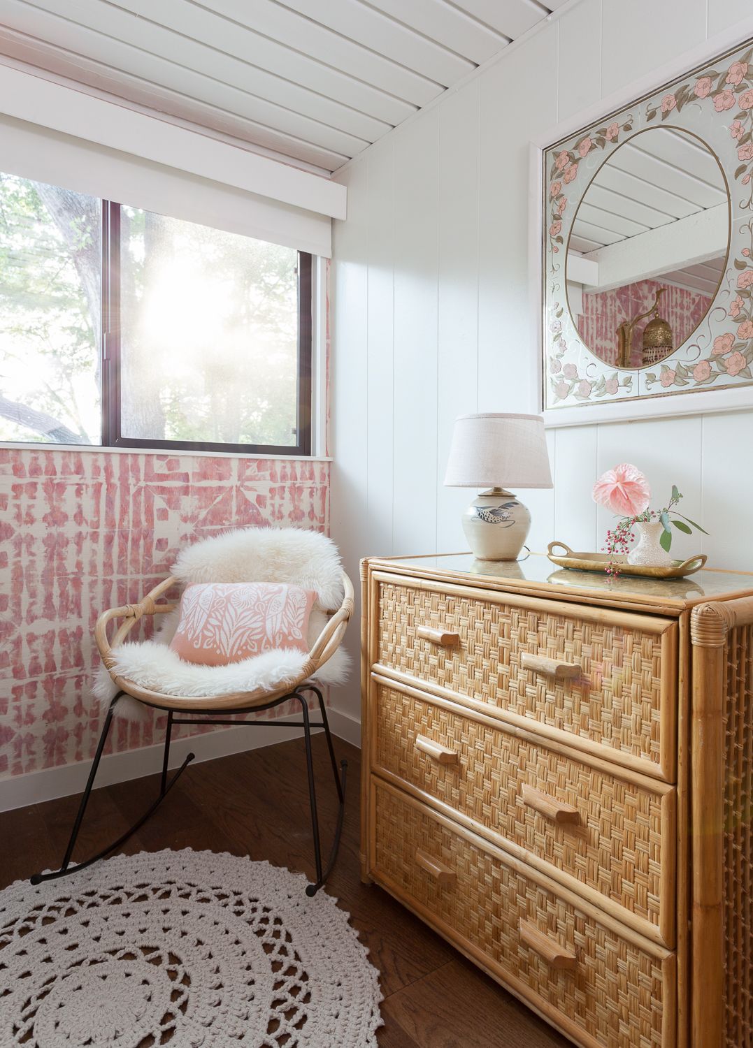
In honor of The One Room Challenge's fall round of makeovers, I'm reliving the least stressful moment from my ORC kitchen renovation -- courtesy of The Shade Store. We have used The Shade Store many times for clients in the past, and I can't say enough about how easy they make the process. Take this adorable nursery we designed for a funky 50s lakehouse with tricky shallow window casing and very little header space, plus a giant beam that buts up to the edge of the window on the other side. Not challenging at all.
erin williamson design, nersery design, eskayel wallpaper, urban outfitters, granny chic, baby boho, lakehouse, 50s design, grasscloth wallpaper, pink wallpaper, shade store

Turns out babies don't sleep well in the blazing sun, so we had to get a blackout shade on that window and fast. Shade Store to the rescue, with a roller shade/valance combo that is functional, easy, and doesn't detract from the sweet decor. {PS, can't wait to share the rest of this huge project with you!}

When Shade Store signed on with The One Room Challenge I knew everything was going to be a ok. It might sound vaguely ridiculous, but I am 100% serious. I really needed something about that renovation to be easy, because gutting that room and rebuilding it in six weeks was like pulling teeth while walking uphill in the snow blindfolded with hands trussed behind my back.

kitchen makeover, one room challenge, ripplefold drapes, chevron floors, farrow and ball peignoir, fabricut. walnut counters, caesarstone, pierre cardin, brass chandelier, saarinen table, walnut table

Those beautiful ripplefold traverse drapes with a light filtering roller shade you see above? All I had to do was pick my fabric, hardware and style, and The Shade Store did the rest.

There are many designers out there who love the smell of custom drapery in the morning. The insanely tedious measuring, calculating, remeasuring and recalculating... and then some more measuring and calculating and -- don't forget -- managing of multiple subcontractors. I am not that person. I took trig, calculus and physics, and none of that equipped me to figure out how to specify the length and width of a panel with pinch pleats and rods and rings. Drapes that touch the floor in high traffic areas give me hives, but you can't highwater that bizness either. Precision, darlings. Shade Store gots it.

TSS_Interiors_07Print.jpg

And you know what? The Shade Store will pinch pleat those drapes for you. And they will do ripplefold and traverse rods, which I am loving right now. And they will come and measure and send someone to install and you, dear reader, can manage it yourself with the click of a button. Click. 

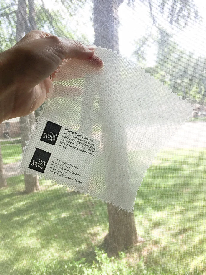
I love their handy online estimator, which is fairly accurate. You can also order 500000 fabric swatches online and then hold them up to your windows for days on end. Not that I would ever do that.

erin williamson | the shade store

Busted.

Designers, did you know you can do COM with The Shade Store? For you civvies out there, that means customer's own material. And bonus check plus, The Shade Store now has locations inside many Kravet showrooms which is ultra convenient. Dear Shade Store, can you please add one to the San Francisco Kravet showroom??? Thanks.

erin williamson | the shade store

Speaking of showrooms, I love the Austin location because they will give you a giant bottle of sparkling water to guzzle, and while the east coast is traipsing through drifts of saturated fall foliage sparkling with artfully placed lens flares, it is still freaking hot in Austin. Also, the sales team is lovely to work with and didn't chastise me one bit when I laid all my sheetrock dust encrusted samples out on their pristine work tables.

And there you have it. The Shade Store -- it's just like home. Except it's a store, with shades.

And drapes.

ONE ROOM CHALLENGE KITCHEN EDITION WEEK SIX: REVEAL!

Le whoa. It has been one wild ride around here. We finished up the details for our kitchen remodel in the nick of time... we were up until 1 am painting and cleaning the night before the shoot, and working around the electrician the day of. BUT WE ARE DONE, HALLELUJAH! Before I get around to the good stuff, let me first thank our wonderful media sponsor House Beautiful and also our lovely host Linda Weinstein of Calling it Home. She is The One Room Challenge, and I owe her a debt of gratitude for the invitation and the motivation. 

And now... I hope you have some snacks and canteens on hand because this is going to be a LONG post full of big juicy pictures that show every angle. Let's do this.

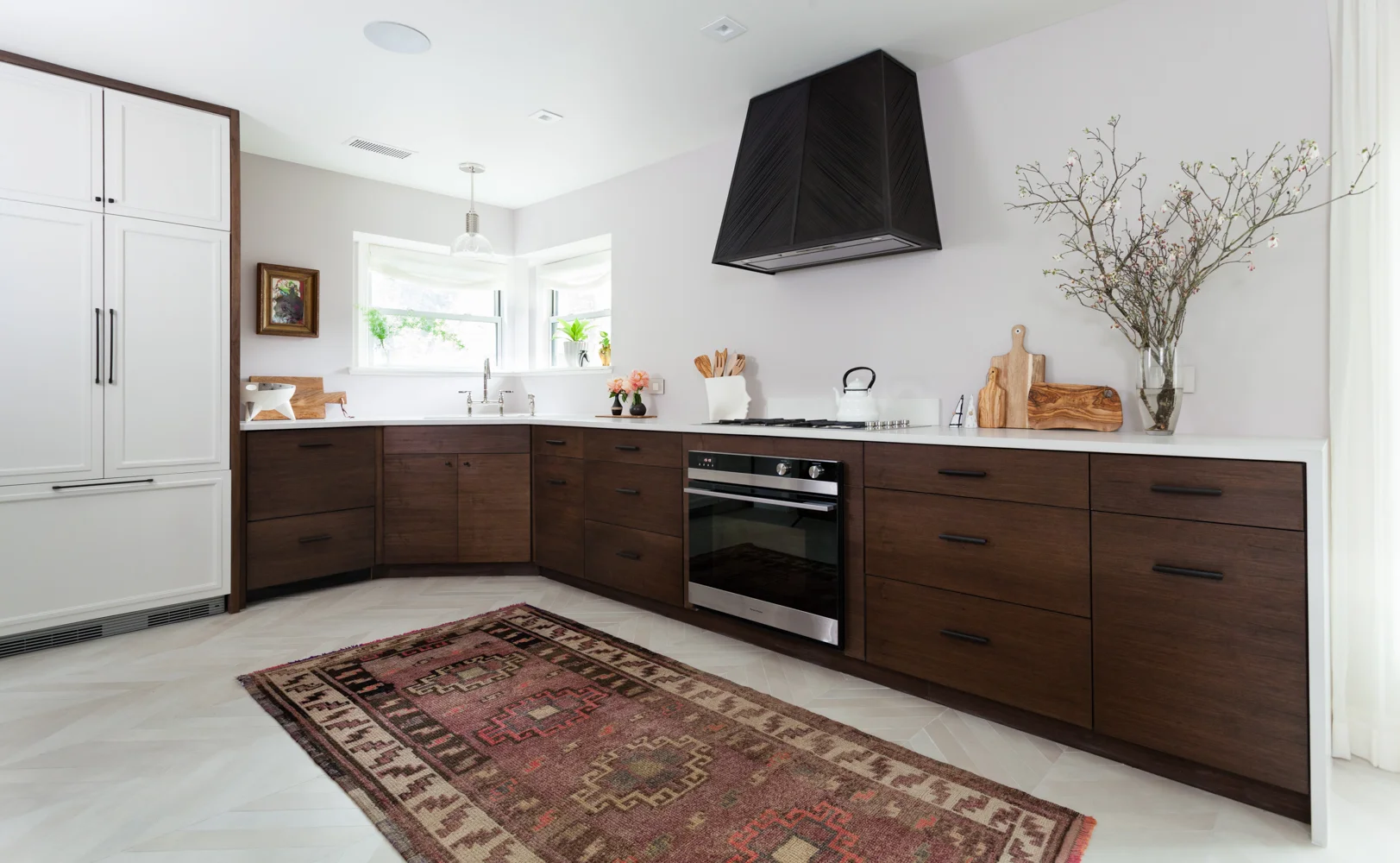
Fisher and Paykel integrated appliances chevron floors and antique turkish rug

Ta da! I have running water, working electricity, gas, and a dishwasher. I'M SO HAPPY. 

Built in banquette and vintage Pierre Cardin chandelier

We even have a place to sit and eat together that is not a coffee table. 

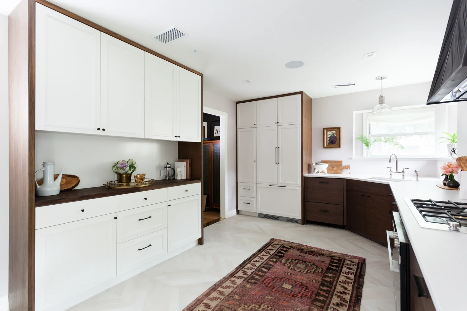
Walnut and white custom cabinets with chevron floors and an integrated refrigerator

The hutch and pantry are stocked with delicacies like mustard and mayonnaise... I may need to work on that.

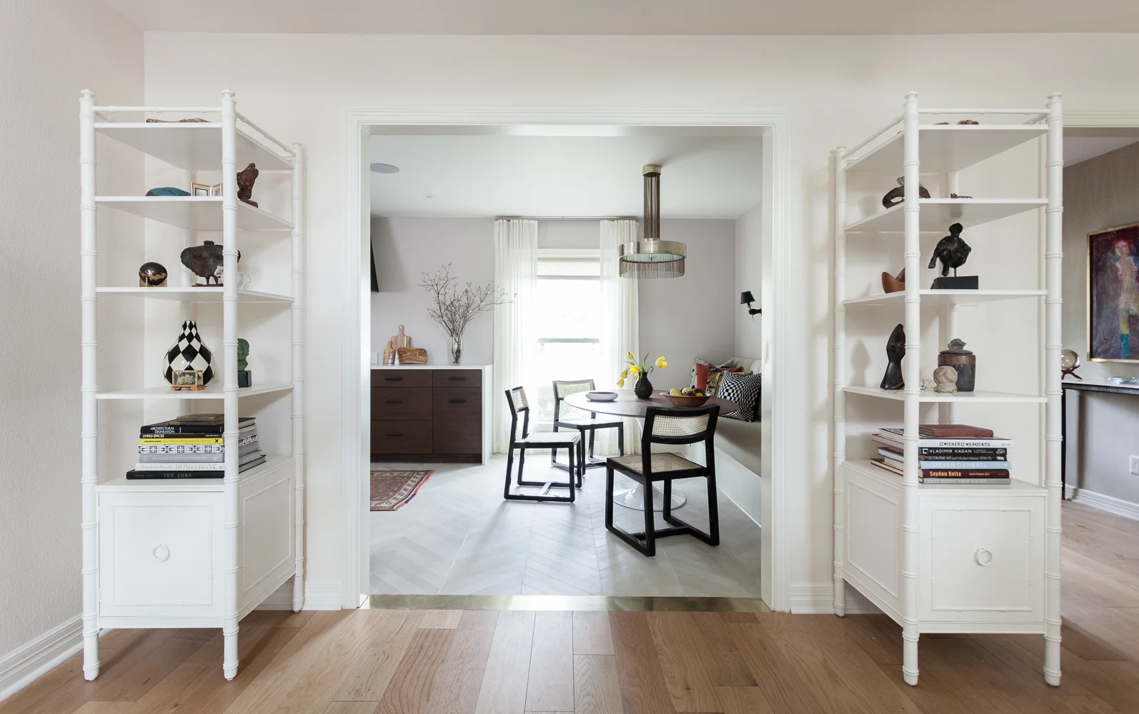
Brass threshold transition strip from white oak wood floors to chevron floors. Bookcases matched to paint. Farrow and Ball Wimborne White.

One can walk into the kitchen from the living room, it's amazing!

I am just soooooooo excited to not be living in a construction zone anymore. Everything else is gravy. 

Speaking of gravy:

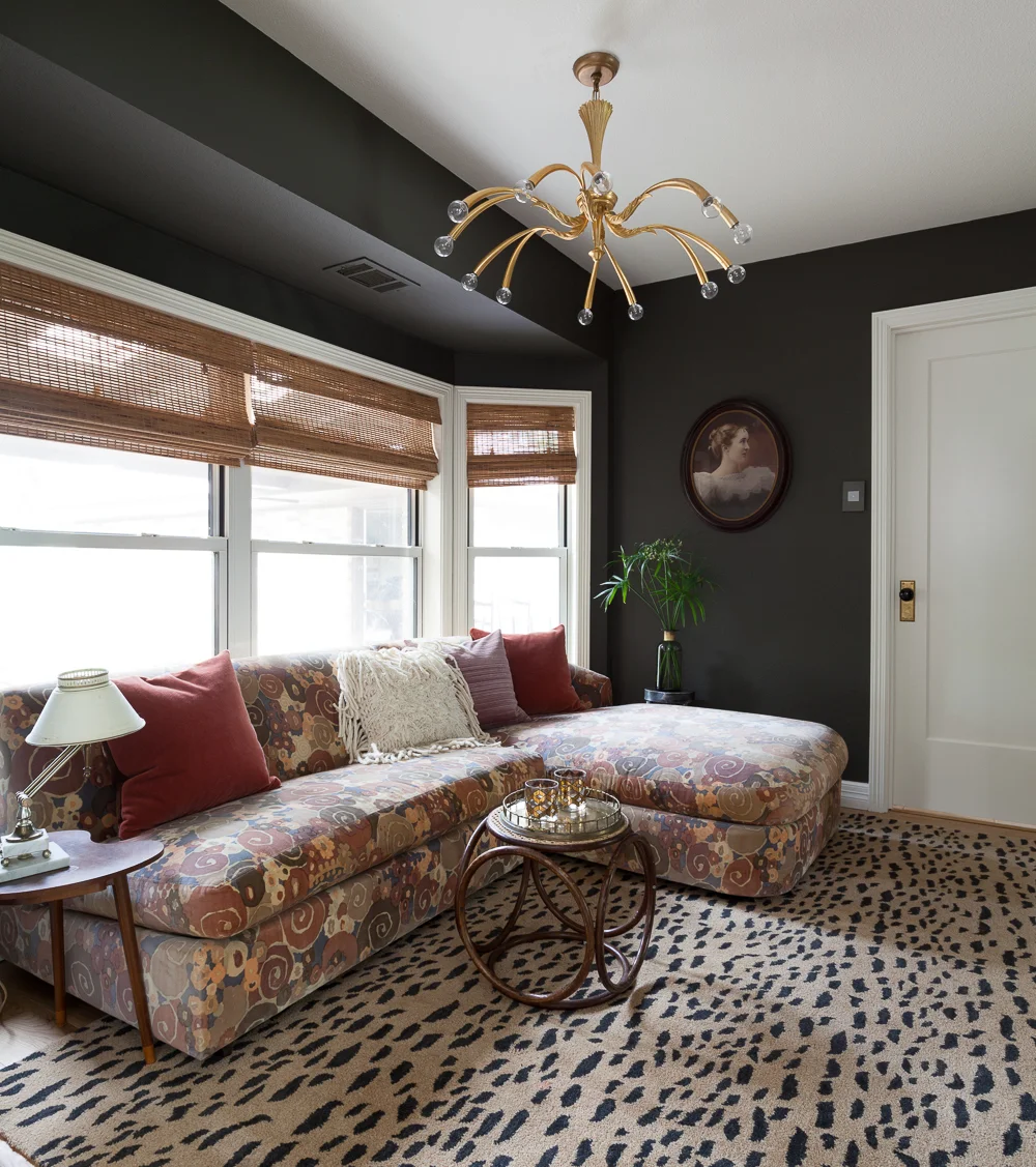
Benjamin Moore Dragons Breath paint with a Jack Larsen sofa and leopard rug. Vintage brass Italian chandelier and bamboo blinds.

Our old dinky dining area has become everyone's favorite spot thanks to new floors, this fab vintage sofa from Gillian Bryce Fine Art, and the leopard rug from our demolished teal room (RIP, sweet lover). The pillows are new -- the rust and pink fabrics are from Fabricut and white dhurri pillow is from Candelabra -- but most other decor is recycled. That crazy chandelier has been gathering dust in the garage for a year. Waste not, want not, right?

Dark and moody den with pattern on pattern sectional and Metrie door.

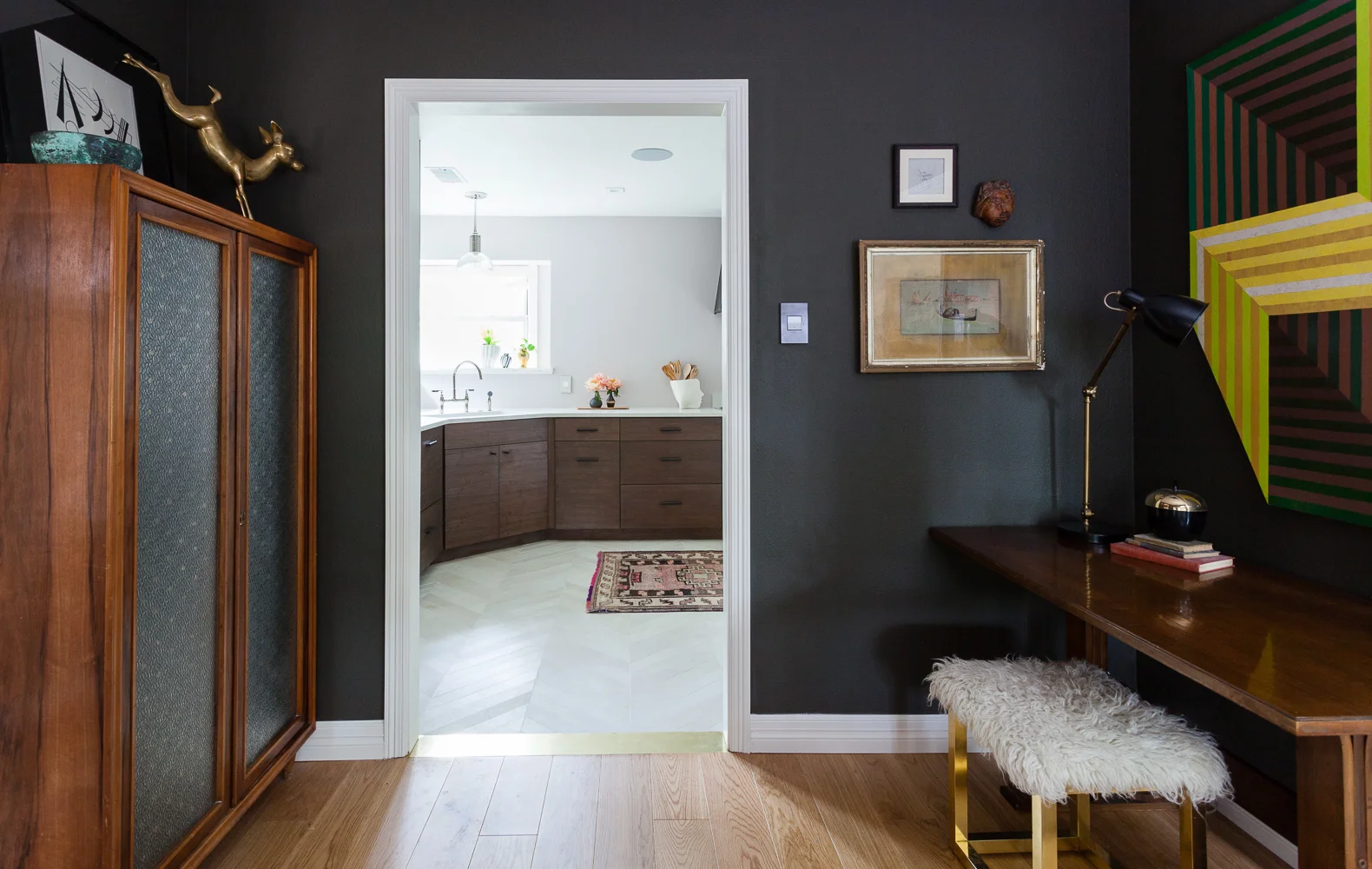
Look at that beautiful cased entry! I know our modest Tudor house ain't the ritz, but for crying out loud openings in formal type homes should be cased. Hard stop. So we fixed that problem, and we added a new True Craft door from Metrie to boot. This is the only visible door downstairs and swapping it for a simple solid beauty made a HUGE difference. Likewise, the switches by Legrand from Bellacor are a game changer. I despise switches and plugs but these are super nice -- discreet yet possessing nice weighty "thingness" -- and I will be using them from now on. 

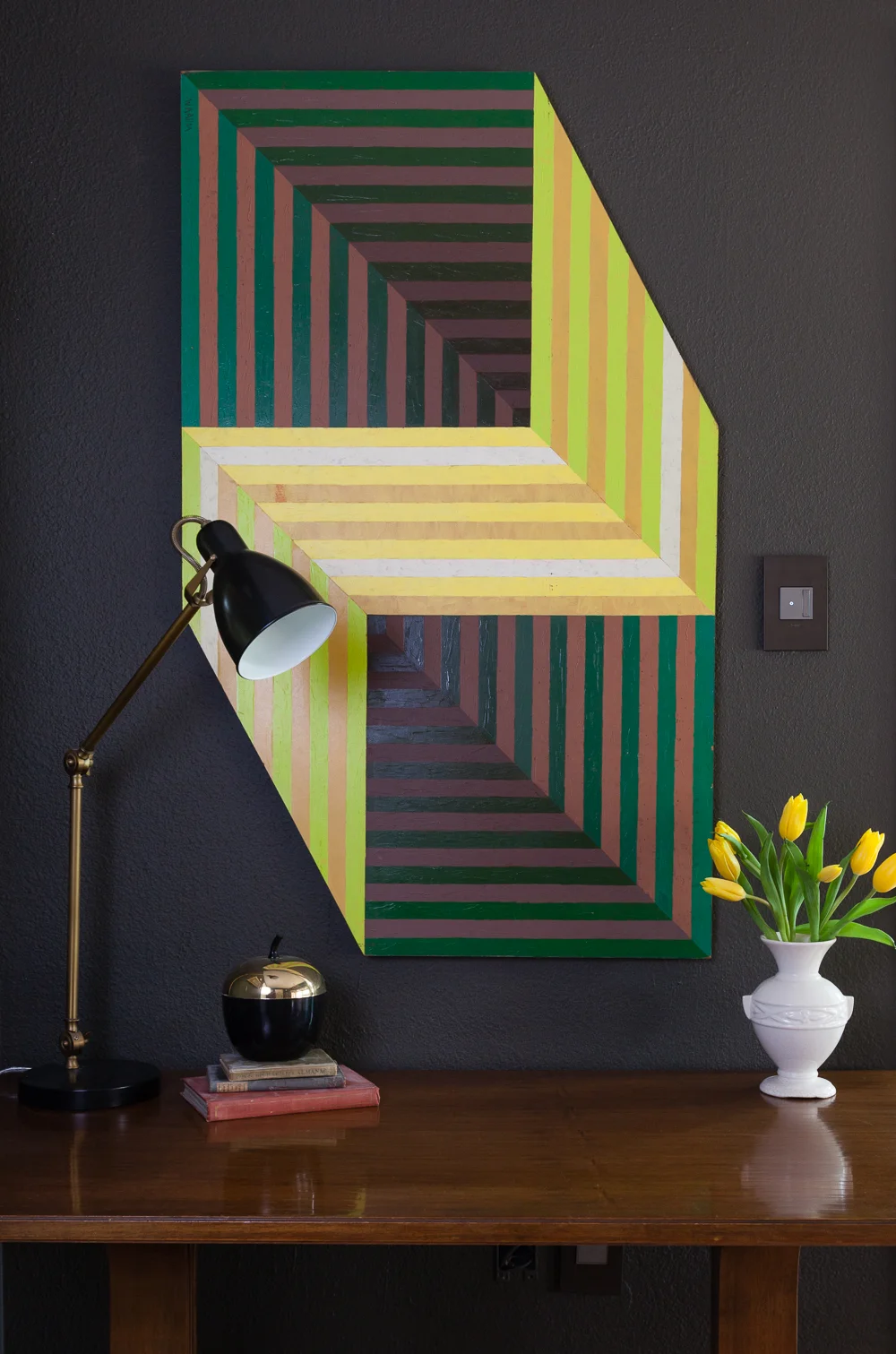
Benjamin Moore Dragons Breath paint with vintage 70s op art painting and switches by Legrand. Yellow tulips and brass West Elm lamp.

So this was supposed to be a boys' study room but somehow it became martinis in Mom's psychedelic Victorian parlor. We still managed to squeeze a little vintage desk in here, and how about that hard edge art??! It's glamazing, and it's also from my bff Gillian Bryce. She's my one stop vintage and art shop, and I can't believe she's still speaking to me after how much I have pestered her throughout this ordeal.

Dark den and bright kitchen

Here's the wall opposite the bay windows. It's a teeny room, but now it feels cozy and purposeful. 

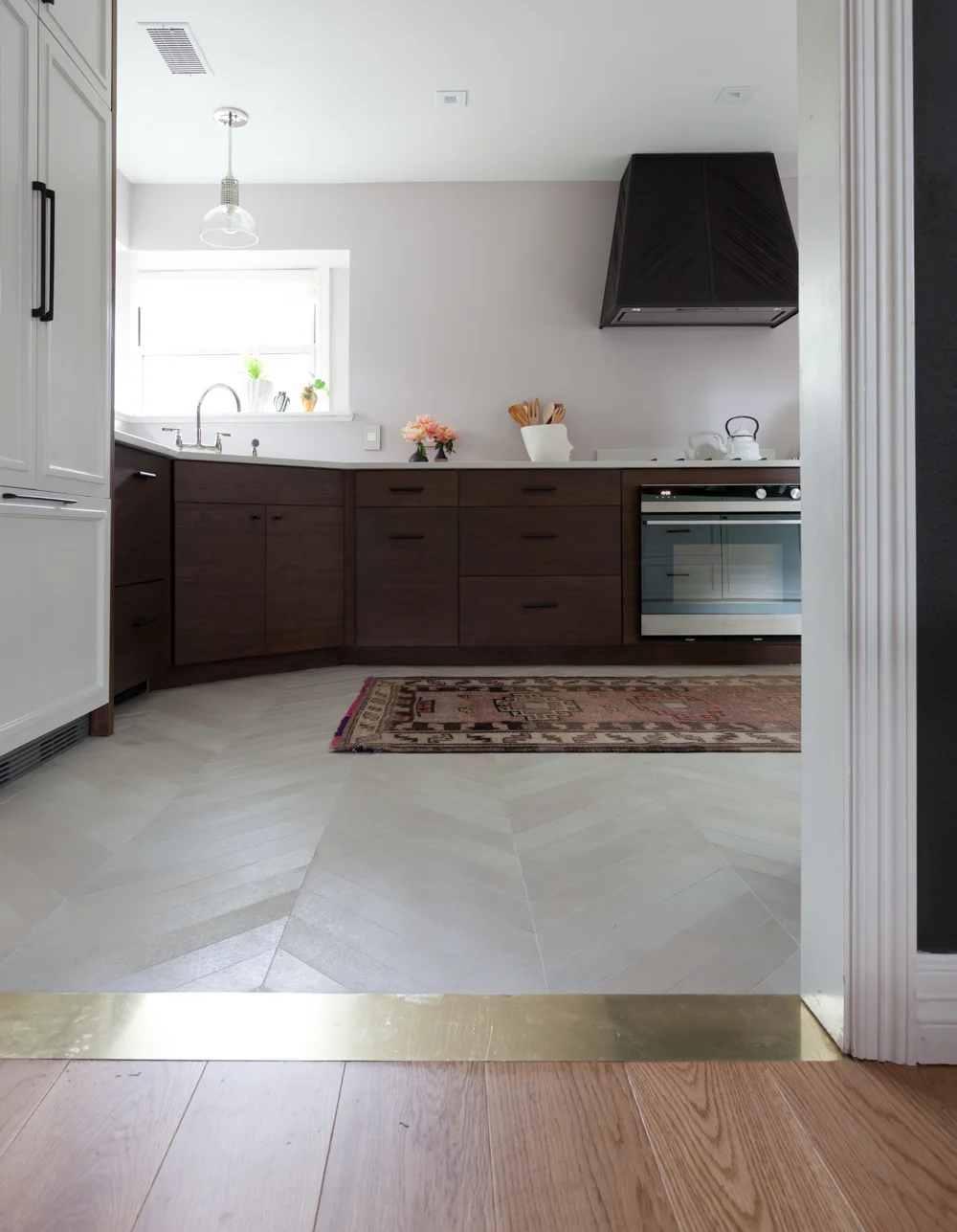
Brass threshold transition strip from white oak wood floors to chevron porcelain floors. Antique vintage Turkish rug.

Did you notice my sweet brass transition strips? I think they make both floors look better, but I am a little biased and might have an entire floor made of brass if it wouldn't cost a fortune. PS it is hard to tell what the chevron floors from Stone Source look like in some pictures, but I think this is pretty accurate. They are beige with lots of variation. I am hoping every single glob of jelly won't show up, but I'm also hoping to win the lottery and I haven't entered yet.

Ok, we're making a loop around this part of the house and find ourselves back to the kitchen. Let's deep dive into the details.

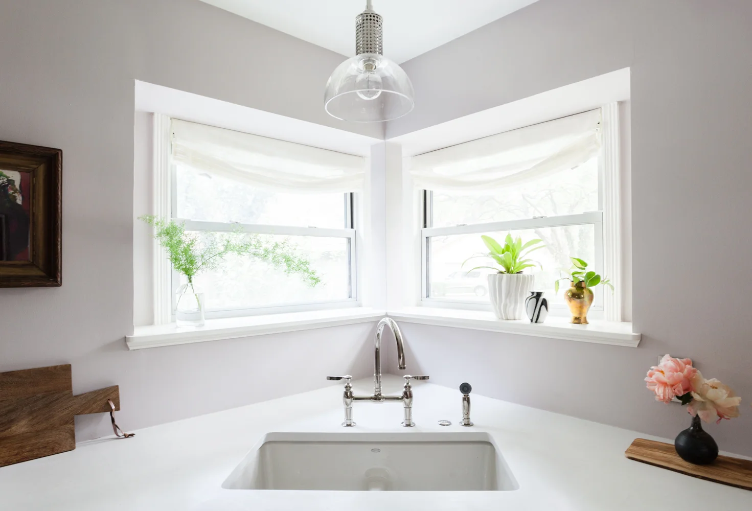
Farrow and Ball Peignoir paint with Kohler bridge faucet and relaxed roman shades by the shade store. Bright kitchen with caesarstone Fresh Concrete counters.

Here we have the lovely Kohler Deerfield low divide sink in Dune and Kohler's Parq bridge faucet in polished nickel. The extra button you see there is an air switch for the disposal. Light fixture is by Hudson Valley from Bellacor. Speaking of light, the paint color is Farrow and Ball Peignoir and it's very elusive... I tried to match all the images but it was impossible. Depending on the light it can be purple, pink, brown or gray.

Farrow and Ball Peignor paint in kitchen with Caesarstone Fresh Concrete counters. 

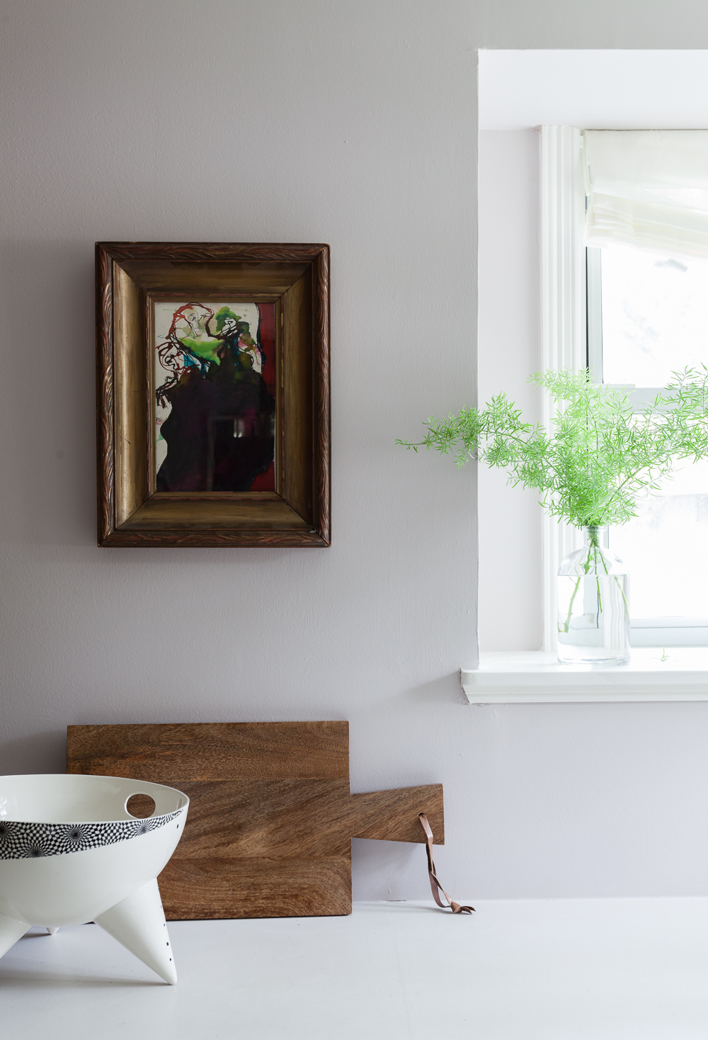
The relaxed roman shades are in Lannister Sheer fabric from The Shade Store, and the sheer drapes by the banquette are in the same fabric, also by The Shade Store. The art is a vintage Martin Sumers watercolor from Gillian Bryce. She's the best. Counters are Caesarstone Fresh Concrete and I LOVE.

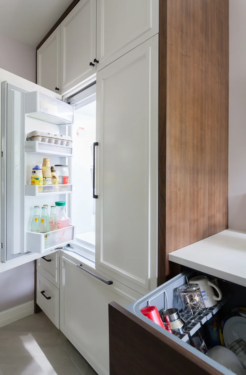
Integrated Fisher and Paykel refrigerator and dishwasher. Custom white cabinets with quartersawn walnut casing.

Check out my stealth appliances from Fisher and Paykel. Everyone keeps asking where the dishwasher is, because it's two drawers. So far we have run it every night and only used the top drawer, so it's environmentally friendly and our dishes are not stinky. And, in refrigerator news I am not hip enough to stock it with leafy organics, so please feast your eyes on mayonnaise and topo chico. Priorities!

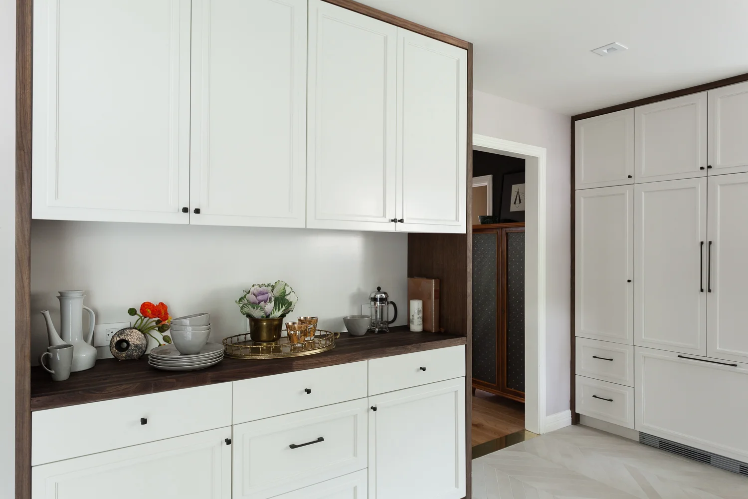
Built in custom hutch with white cabinets in Benjamin Moore Sea Pearl paint and walnut casing.

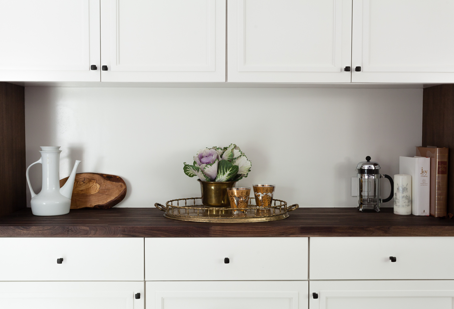
I'm circling back to the built in hutch, now artfully decorated with ornamental cabbages and our new everyday sculptured dinnerware from Candelabra. Our old plates were chipped to pieces, so these are definitely a welcome addition. 

Custom white cabinets and walnut butcherblock counters with hardware by Top Knobs in a sable finish. Built in hutch.

The microwave is tucked into a cabinet and someday I will move our ugly old toaster oven into this space, but for now I am enjoying the still pristine walnut counters. The paint grade and quartersawn walnut cabinetry was fabricated by Llamas Custom Cabinets, and the hardware is from Top Knobs' Mercer collection supplied by The Mine

Kitchen remodel with chevron floors built in banquette walnut cabinets and modern appliances.

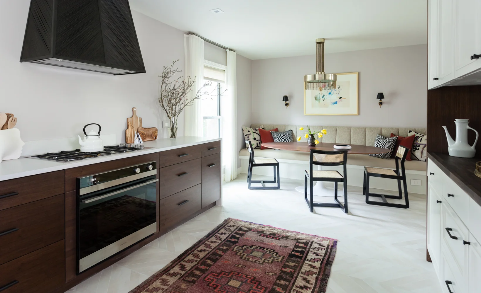
Here's a shot to show you how everything relates. I am pretty happy with the floorplan we agonized over. The hutch feels functional but not too imposing, and there is plenty of space to move around but not so much that you feel like you're running all over the place. And of course everything looks better with a fabulous antique Kars rug from Black Sheep Unique. It was hard to pick a favorite from their beautiful wares.

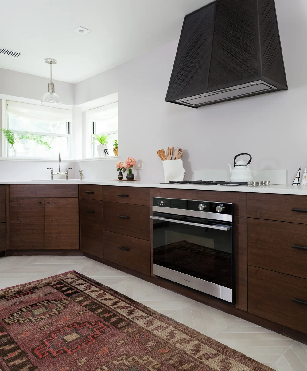
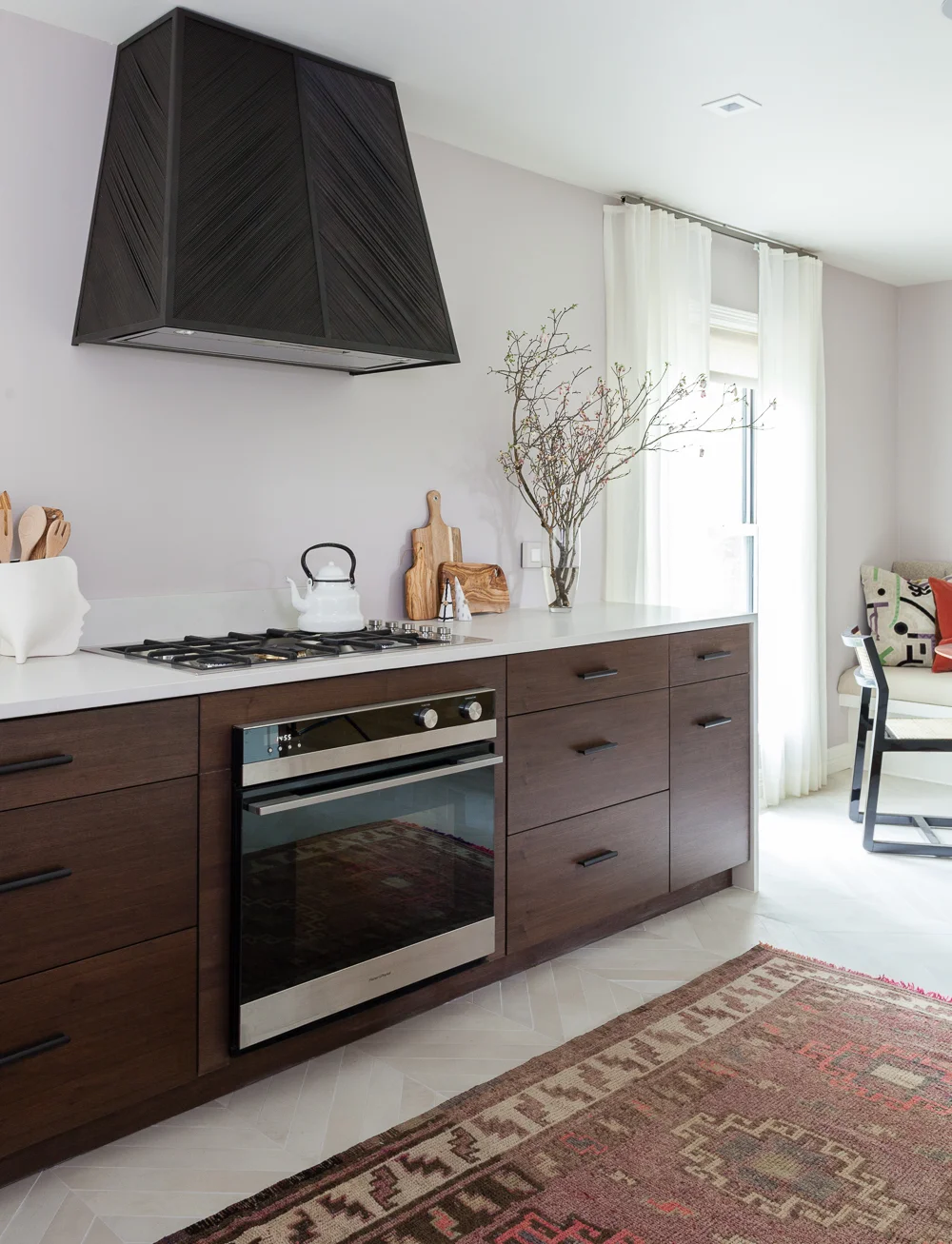
Custom brass chevron range hood with chevron floors and caesarstone counters. Corner window with built in oven and flush mount cooktop.

Let's talk about this hood for a hot minute. I knew I had to have a free standing hood because the corner window did not allow me to disguise ventilation in decorative soffits/corbels/cabinetry -- basically I had no trick cards to play. And I really didn't want shelves in my face while prepping, so the hood had to be AMAZING since it would be the only thing on the wall. Enter Brian Chilton, who made this gorgeous hood out of a million tiny rods of metal welded into a chevron point to match up with my floor. It's inspired by straw marquetry and it looks like fabric in person. I mean... metal that looks like fabric! Brian is so talented. 
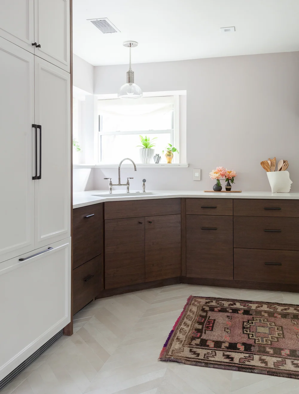
Also please note my awesome head vase reporting for utensil duty. I got it from 214 Modern Vintage, aka the coolest place at High Point.

Custom chevron range hood with walnut cabinets caesarstone Fresh Concrete waterfall counters and sheer traverse drapes by the Shade Store. Full kitchen remodel.
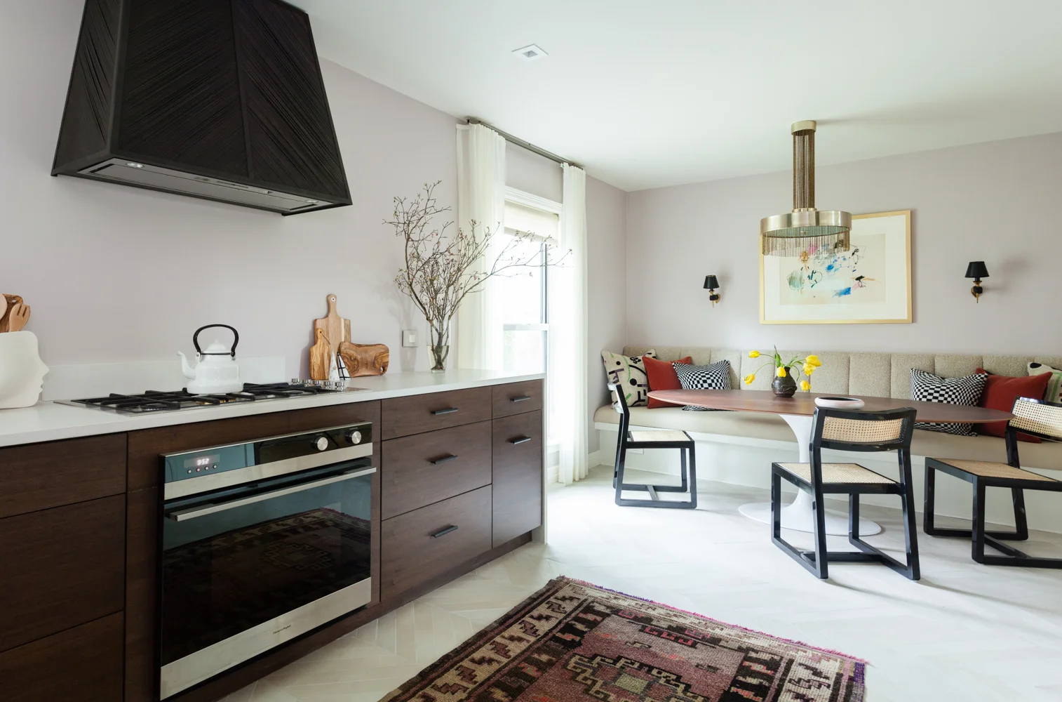
The surround is fitted out with a Fisher and Paykel ventilation insert, and it's powerful. Since we literally JUST FINISHED the kitchen, I have yet to cook a meal with the beautiful new 36" gas cooktop and wall oven, also by Fisher and Paykel, but I am hoping to wrap this post up and cook tonight [Update, still writing but Ben is cooking -- even better!]. I will report back soon on the functionality for all you foodies out there, but I can tell you now everything is just as sleek and beautiful as I had hoped it would be.
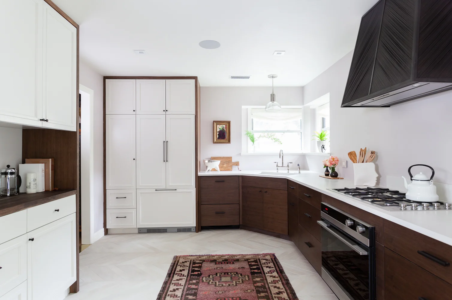
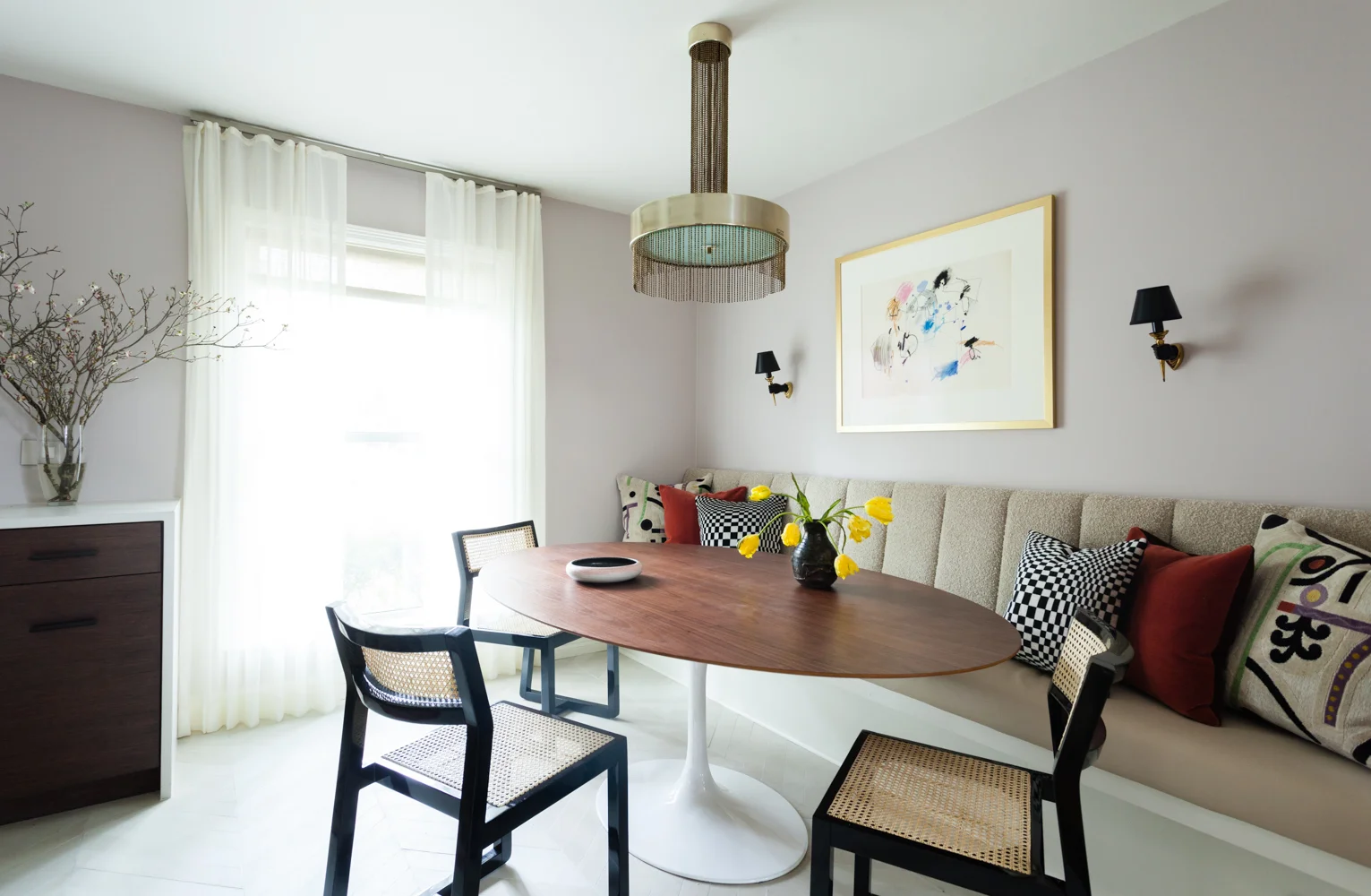
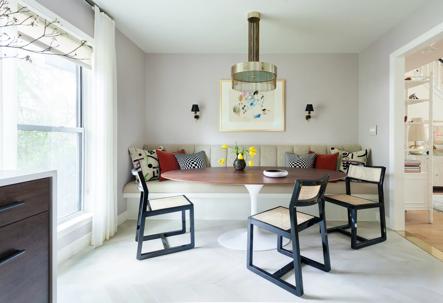
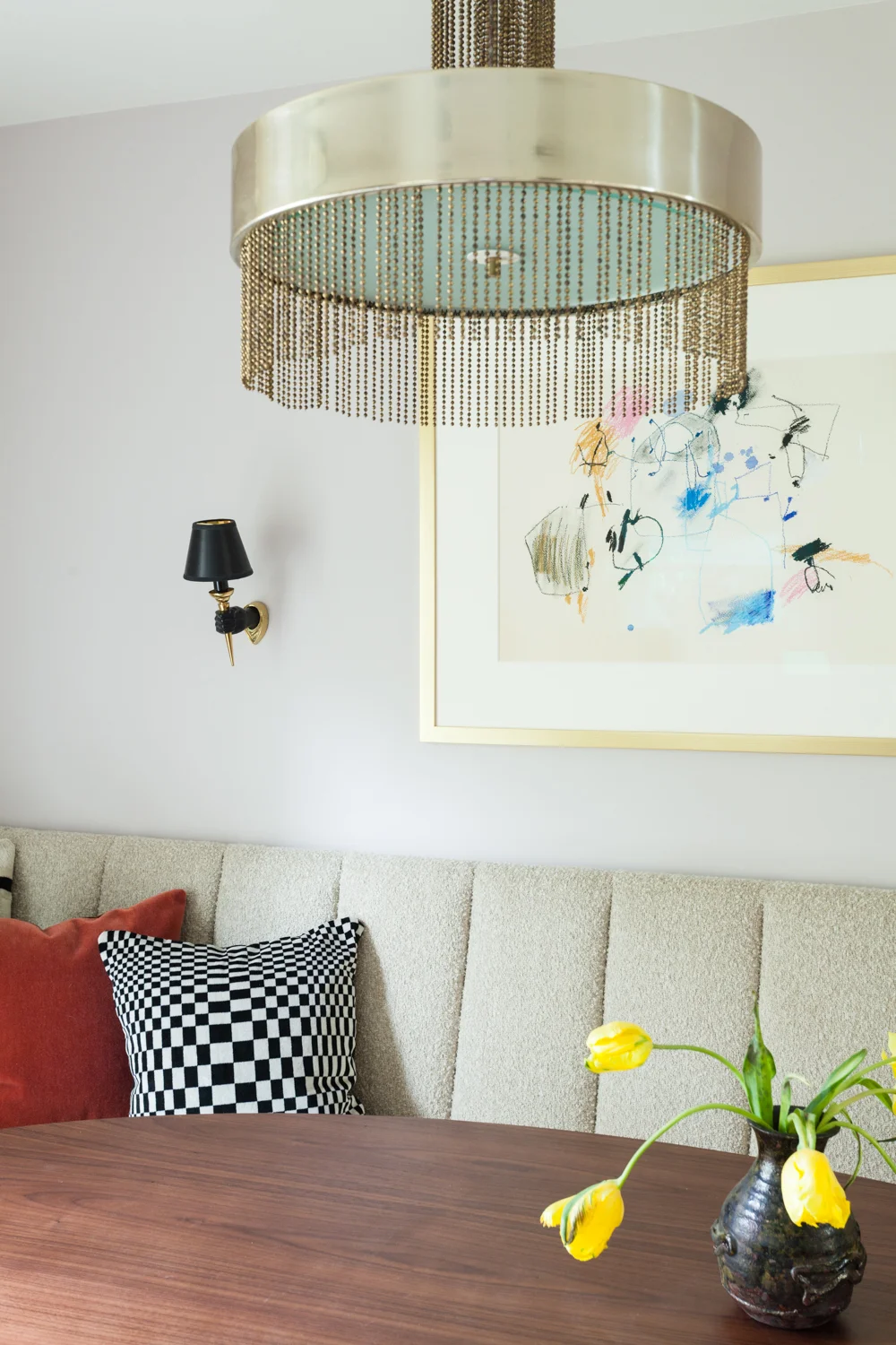
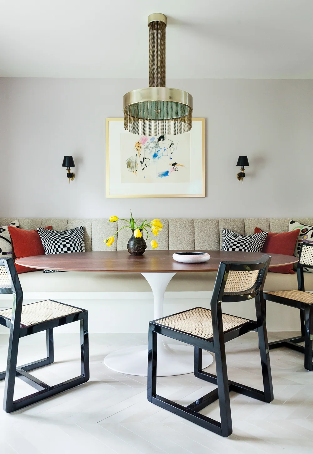
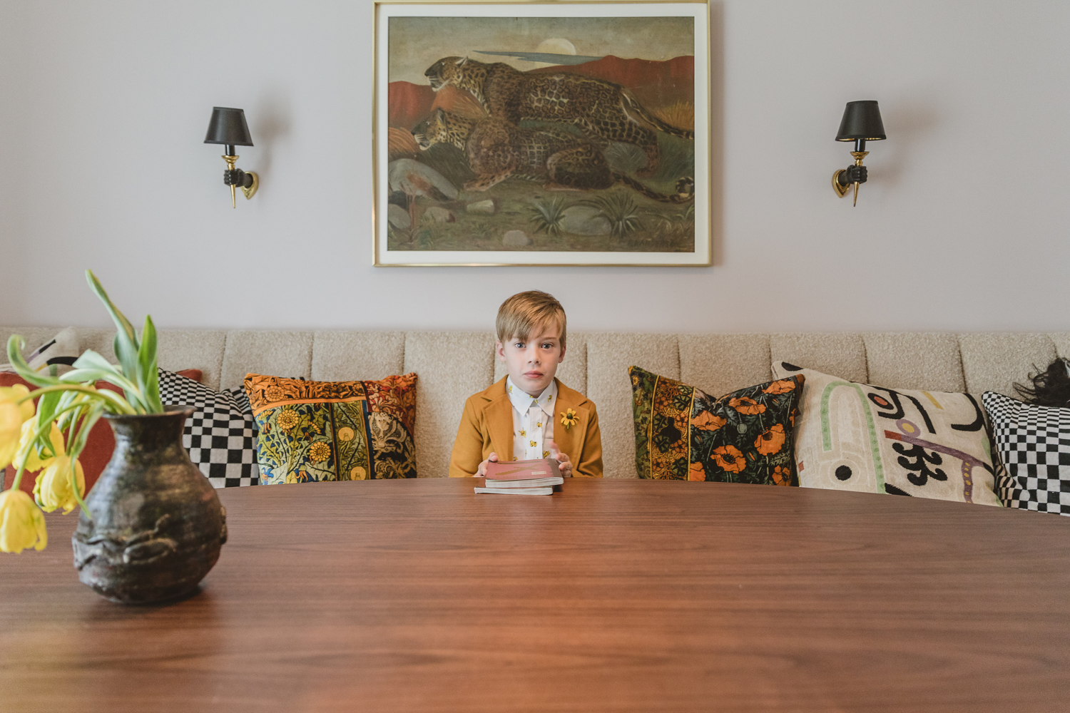
Built in banquette with Saarinen style tulip table with a walnut top vintage Brass fringe Pierre Cardin chandelier and hand sconces. Abstract art by Nancy Lee.

Getting close to the end here, so we must discuss the banquette situation. As you may recall, we went back and forth on whether to keep the entry off the foyer open or closed. We finally decided that closing it in would give us more space for dining, and as this is our only dining space we felt the need to max it out. I think it was a good call -- it's super long but very plush and feels comfortable as well as easy to access.

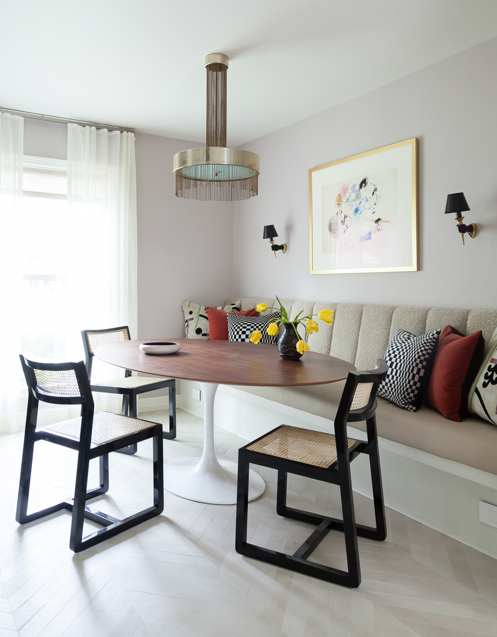
Custom built in banquette with S. Harris fabric Pierre Cardin vintage brass fringe chandelier CB2 lacquer chairs and abstract art by Nancy Lee.

The table is by Nuevo from The Mine, chairs are by CB2, and the ultra mega sexxxy chandelier is vintage Pierre Cardin from City Issue Vintage in Atlanta. Thank you, Justin Wiles!

Vintage brass Pierre Cardin fringe chandelier and abstract art by Nancy Lee

Banquette fabric is by S. Harris from Fabricut and it was upholstered by VMC Upholstery. The pillows are a mix of S. Harris, vintage, and Clarence House, all sewn by the amazing Dian Sierra of Allred Leather Company. Sconces are vintage Arbus, and the art is Nancy Lee from Gillian Bryce Fine Art.

CB2 Makan chairs with walnut tulip table and custom banquette with Fabricut fabric. Vintage brass fringe Pierre Cardin chandelier and art by Nancy Lee. Arbus hand sconces.

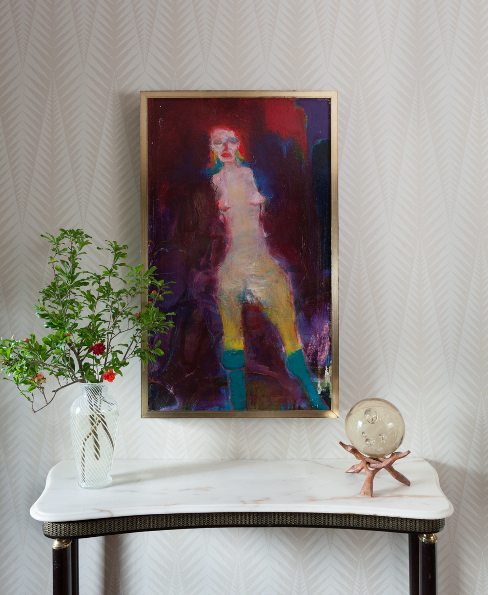
On the flip side of the banquette wall, we still have a fresh new wall in the foyer with no paint or paper and the giant Victorian backdrop is towering over everything. But since the existing wallpaper is pretty much wrecked I finally committed to a piece of art and put a nail it already.

Martin Sumers painting and Neisha Crosland zebra wallpaper. Tone on tone

The beautiful Martin Sumers painting is from... (it's getting comical) Gillian Bryce. Someday I will find new paper and fix up this space, but right now I'm taking a break and this is not too shabby, right?

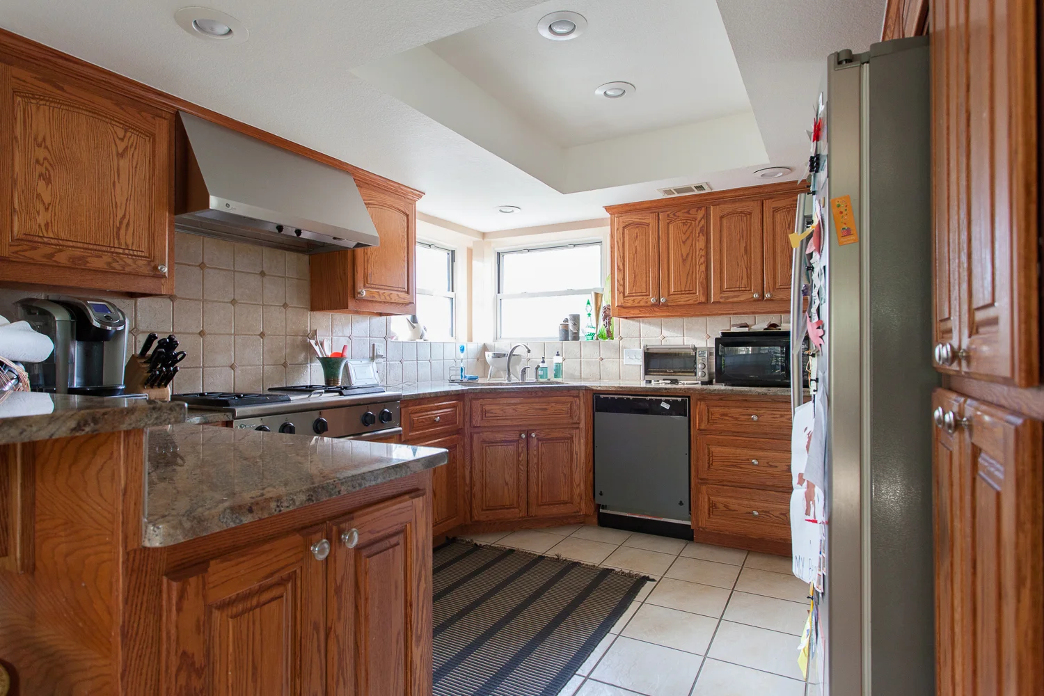
And that, my friends, is the whole shebang! Let's not forget how we started out this ginormous endeavor. Behold the before:

ERIN WILLIAMSON DESIGN

And the after:

ERIN WILLIAMSON DESIGN

It's a little different, no big deal.

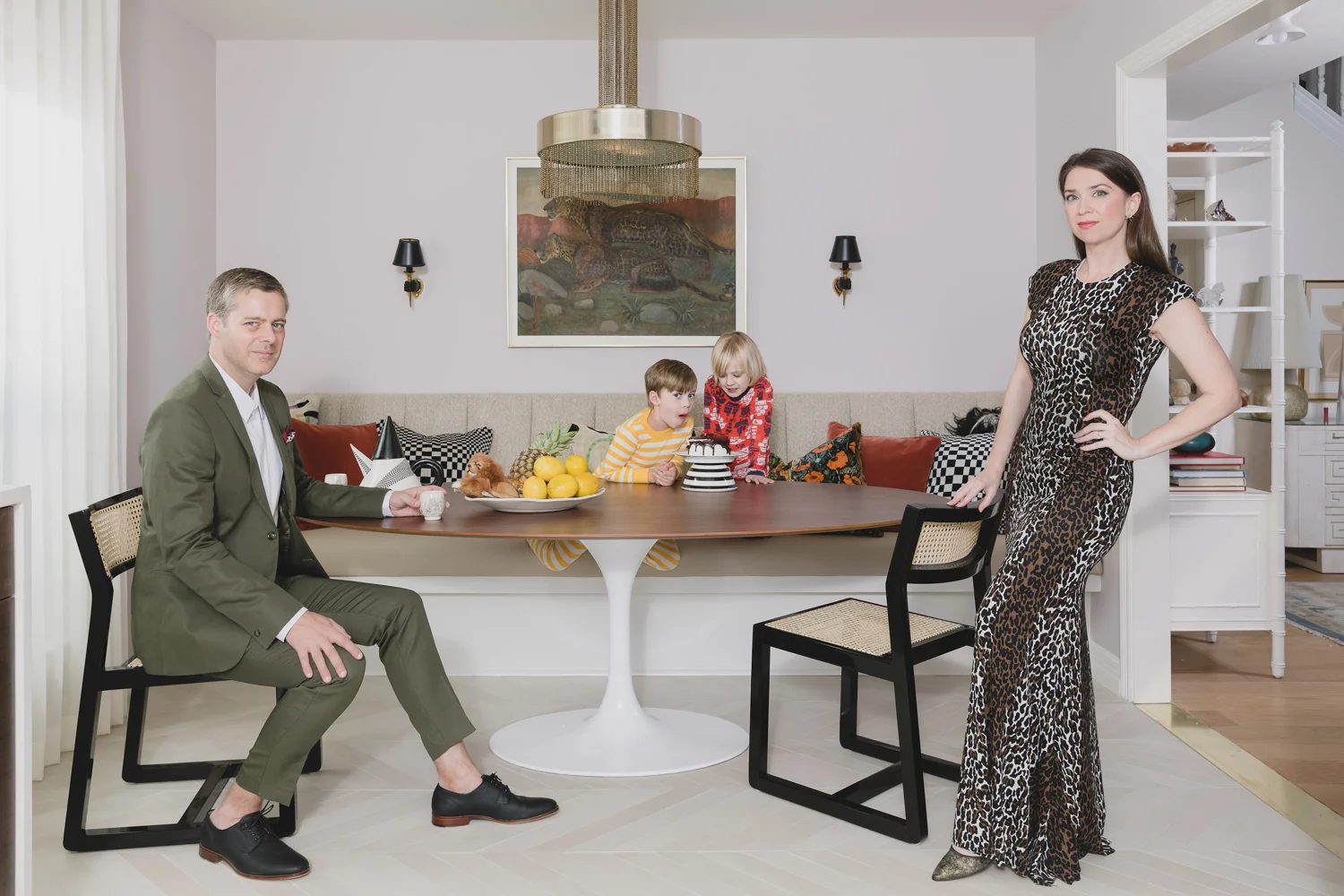
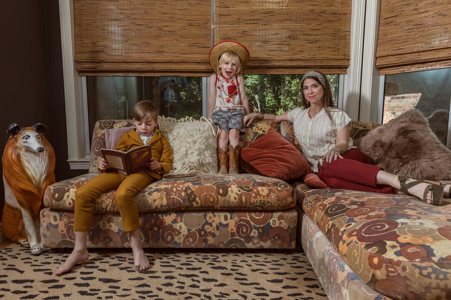
To commemorate this momentous occasion I asked my friend and photographer Cathlin McCullough to shoot family portraits in our new environment, because we haven't had family pictures taken since Luke was crawling (so embarrassing). But of course I didn't want normal portraits taken, because I am broken inside. So we devised a crazy plan to stage something fantastical... and well, you'll just have to take a look and see what happened.

CATHLIN MCCULLOUGH
CATHLIN MCCULLOUGH
CATHLIN MCCULLOUGH
CATHLIN MCCULLOUGH

I'm kind of blown away! I hate having my picture taken but Cathlin and her team made it so much fun. HIRE HER NOW!

And finally, finally, finally... I must say thank you to some amazing people. I linked to all my sources and our incredibly generous sponsors in the post (please email me if you want more info!), but there was a ton of labor involved in this project and there were many people I leaned on. It was a lot to take on in a short time, and these people made it happen for me.

Contractor: Carl Dixon of Total Performance Construction (best framing crew EVER)

Drafting and my #1 sounding board: Lindsay Hanson

Art and vintage sourcing, because I can't buy everything new: Gillian Bryce Fine Art

Interior Styling: Kristin Laing Designs

Upholstery in a hurry: VMC Upholstery

Pillow seamstress with the mostest: Allred Leather Company

People who should hate me but somehow don't: Ben, Jack, Mary, Ike and Luke Roy (family love)

All interior photographs are by me Erin Williamson. Interior styling by Kristin Laing. All portraits are by Cathlin McCullough Photography. Wardrobe styling by Jen McDonald, photo assist by Rachelle Bendixen.

It takes a village, my friends. Believe it. 

And now, hopefully I didn't wear you out because you must see what everyone else is up to!

Centsational Girl | Chris Loves Julia | Christine Dovey | Dwell With Dignity | The English Room

Glitter Guide | House of Brinson | House Updated  | J+J Design Group | Lark & Linen | Abby Manchesky

Nesting Place | Old Brand New | Old Home Love | The Pink Pagoda | Rambling Renovators

Erica Reitman | Sketch 42 | Suburban B’s | Media Partner House Beautiful | TM by CIH