Welcome back for week the second of the One Room Challenge, the quest sponsored by Calling it Home and House Beautiful to chronicle a room redo in six short weeks. If you missed last week, click HERE to read all about my plans to renovate our kitchen and adjoining kid zone.
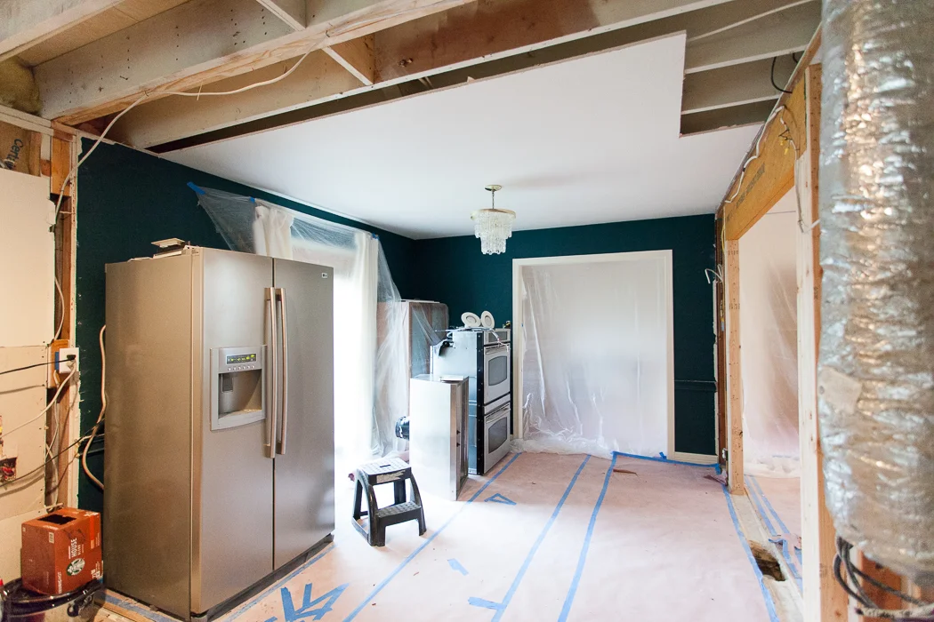
It is absolute chaos up in here... When this began, guys just started moving all our furniture into Everest sized mountains in random areas of the living room. Then they broke out the sledgehammers and ripped almost everything out. They are FAST. Kind of too fast, like I wasn't really prepared fast. Like stuff is still piled up in corners everywhere.
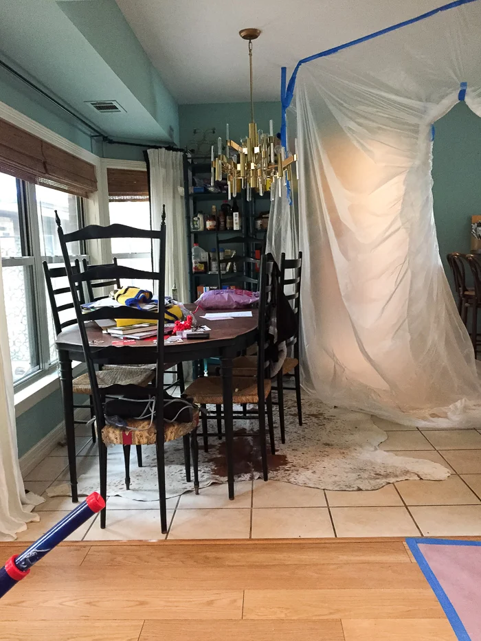
This is so embarrassing. I mean... help. All of our food is stacked on old shelving from the teal room, and apparently we eat A LOT of hatch chile sauce and condiments. Kid stuff has settled into plastic drifts around the perimeters. There is a desk, two giant chairs, and pilesssss of art wedged in our master bedroom.
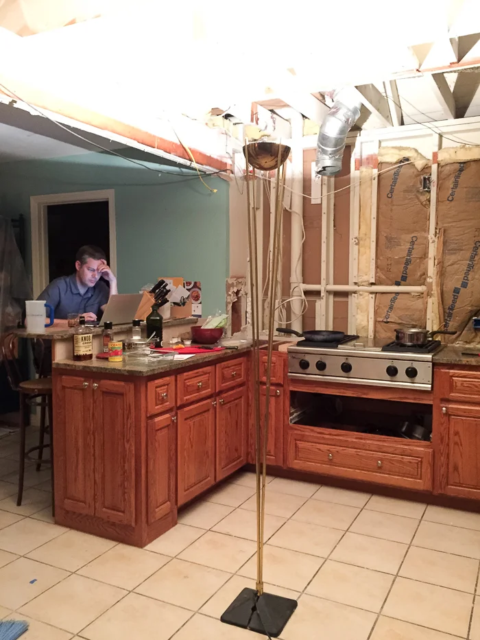
But we aren't letting it get us down. Now that the wall is gone we're honestly using the kitchen more than ever. And with the help of Knob Creek, we don't even mind the drywall special spice in our meals. We are down to the necessities and we are PUMPED about everything that's happening.
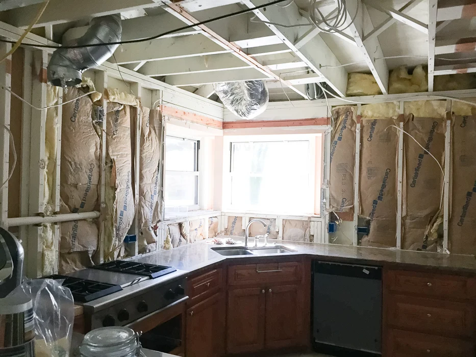
Hooray! There was no roof in the soffit so we can raise the entire ceiling. Electrical is happening and ducts are rerouted.
Of course, it can't be all fun and games (HAHAHAHAHA). We had to make some of those very difficult decisions that I alluded to last week. First, the wood flooring in the living area just can't go into the kitchen. It's pretty, but when we bought it 5-6 years ago there weren't many choices for what is now very a popular natural matte finish on engineered white oak. Long story short, it's extremely soft and it dents really easily. I love the way it looks, but I think this is going to be a super high traffic space that demands durability and I'm having a hard time spending more money on something that needs to be babied. So... drumroll, please:
I'm going with this chevron tile by 41zero42. I really surprised myself with this one. I was thinking stone, but my budget said no thanks -- at least not for the lighter stones in interesting sizes and shapes I was searching for. Luckily my super rep Jenny at Stone Source found this beauty for me at a better price point. It's porcelain but it has tons of variation, which I love. We actually used this in a different color and pattern at our fancy lakehouse job and it turned out ultra swank (reveal coming soon!), plus it will withstand the boys' trucks and legos with panache.
Ditching the prefinished wood flooring meant I could have my wood cabinets, which anyone who has read this blog for years will know I am very excited about. The irony of ripping out wood cabinets and beige tile and replacing it with wood cabinets and beige tile is not lost on me. It's classic....... right???
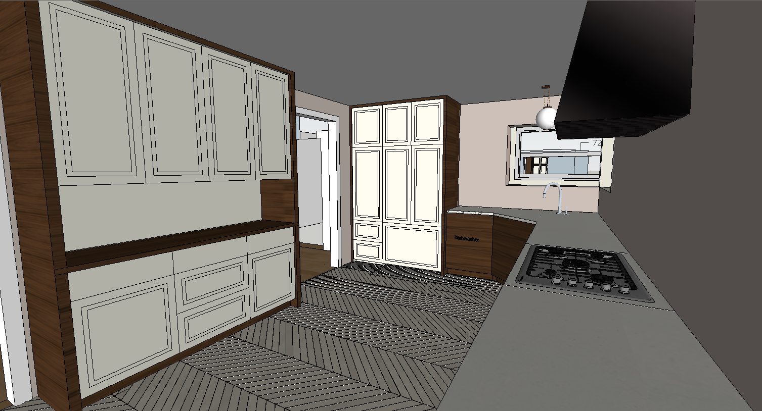
I'm going for a two tone euro vibe, with slab front wood lowers, wood casing around the floor to ceiling cabs, and paint grade shaker fronts on the floor to ceiling cabinets. We ended up increasing the width of the hutch to 72" and reducing the depth so that both upper and lowers are 18." It looks more furniture like, and I think it will be useful for storage and serving space. We decided not to build in the microwave, so we're just going to tuck a small one inside the upper cabinets.
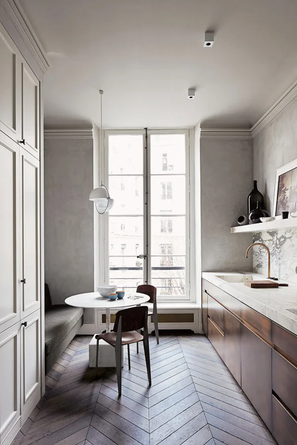
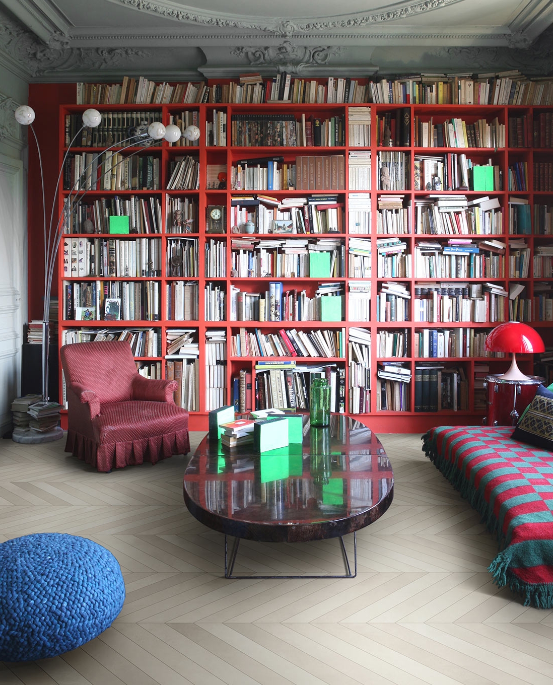
I'm totally stealing inspiration from Joseph Dirand's gorgeous kitchen. I love how simple yet complex the elements are. It manages to be elegant and accessible, and I fingers-and-toes-crossed hope that's where I'm headed. Did you know those base cabinets are BRONZE? I briefly considered selling a kidney to finagle some of that goodness, but decided to go with quartersawn walnut instead. Hopefully I will get the same overall effect and retain both kidneys. Score!
Before we ever moved any walls I consulted with an architect. I had an 85% clear vision of what I wanted, but since we are slicing and dicing walls left and right and the space had many constraints, I decided to get a professional head check. Francisco Arredondo of North Arrow Studio and I have worked together before, and I value his opinion. When he walked through, we agreed about pretty much everything except for the opening at the foyer... he said close it up. I kind of freaked out and told our lovely contractor Carl Dixon to give me some time with everything open before I made a life decision.
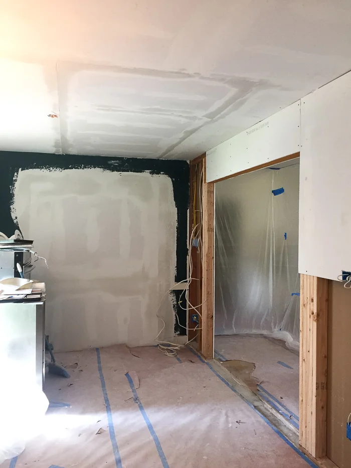
Francisco was right. This picture frankly looks terrible and makes me seem like a crazy person, but it felt like swiss cheese with all the openings in here. And I really don't like the idea of looking straight into my messy kitchen directly off the front door. We live here -- it's not a museum. So I had to think about how best to direct traffic in a way that creates a journey from public to private. The dining side of this room will be visible from the living area, and the kitchen (aka dirty sink) side will be more connected to the kid/den area. That feels right to me.
So now we have way more room for a banquette, which is great. But do I run it across the whole wall?
Decisions, decisions. Tune in next week to see what happens, and also we have to catch up on the kid zone progress. Don't forget to send moral support! And please check out what the 19 other wonderful designers are up to:
Centsational Girl | Chris Loves Julia | Christine Dovey | Dwell With Dignity | The English Room
Glitter Guide | House of Brinson | House Updated | J+J Design Group | Lark & Linen | Abby Manchesky
Nesting Place | Old Brand New | Old Home Love | The Pink Pagoda | Rambling Renovators
Erica Reitman | Sketch 42 | Suburban B’s | Media Partner House Beautiful | TM by CIH