ONE ROOM CHALLENGE KITCHEN EDITION WEEK THREE: BEING AND NOTHINGNESS

Welcome back for Week Three of the One Room Challenge, wherein I chronicle the renovation of our kitchen and adjoining study over the course of six weeks. Many thanks to our host Linda of Calling it Home and to our sponsor House Beautiful for putting my feet to the fire, because we all know this would not be happening otherwise. Catch up on previous weeks HERE.

Well, well. Here we are at the halfway point, and bleep is getting real. It was all fun and games when we still had a sink, but those days are gone. We trucked through a super long week, so grab the popcorn while I regale you with scintillating tales of gypsum and epoxy.

erin williamson design | one room challenge

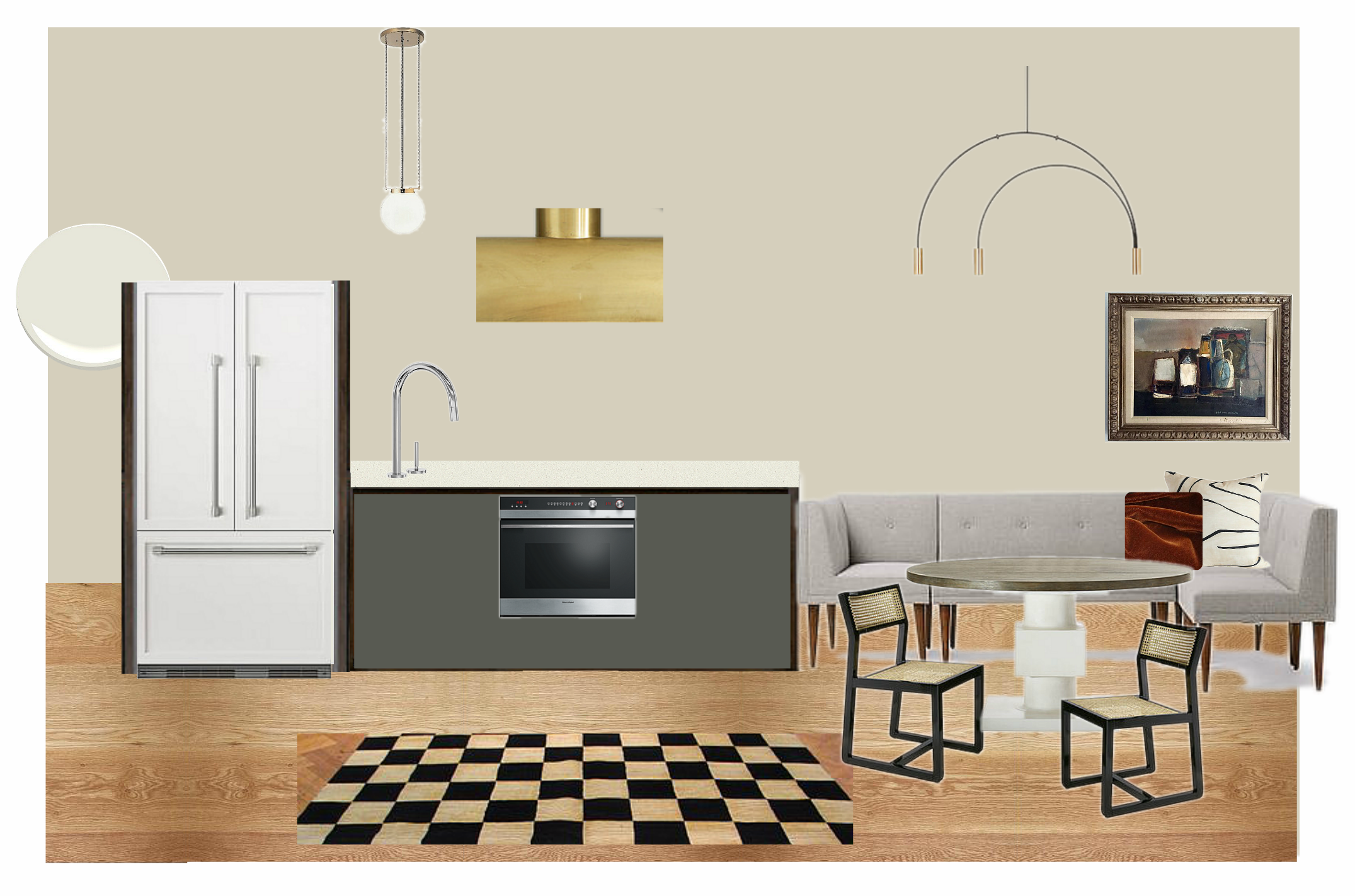
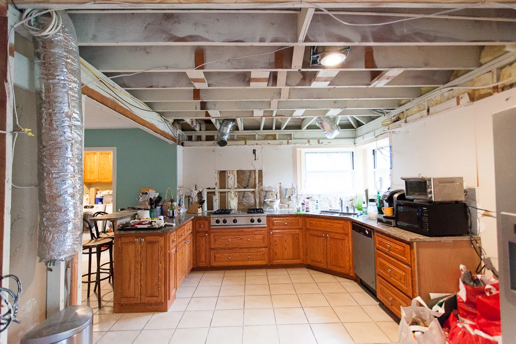
This picture might be too pretty for the ugly reality of the situation, which is that running water is the essence of modern civilization. We acclimated quickly to no oven, and I think we could have easily moved over to barbecue after the range top went, but no sink is the pits. This gives me a new level of wonder and respect for communities where obtaining clean water on a daily basis is a struggle. And we have a powder room around the corner... let's just say I am incredibly grateful to live in a place where this is not the norm and I don't ever want to take my sink for granted again.

Meanwhile, I can say I'm excited about what's happening over on this wall:

erin williamson design |one room challenge

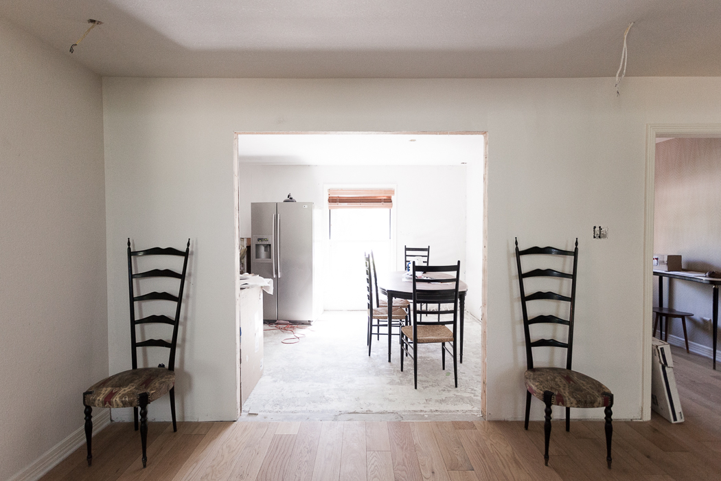
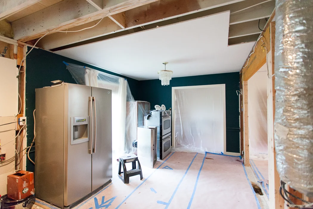
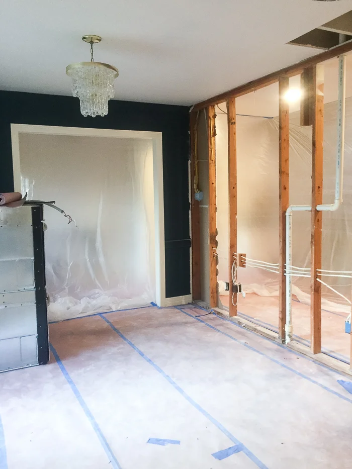
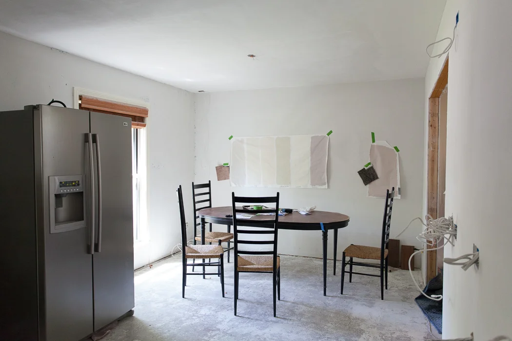
No, not the stainless behemoth I can't wait to relocate to the garage (it's going to fit, right???). If you read my post last week you know I was hemming and hawing about wrapping a banquette around the corner and in front of the window. Once we enclosed the old entry we found ourselves with a long void, so we decided to run a custom banquette across the new back wall. Our aging table and chairs are filling out the space just to triple check clearance. Forget measuring twice, measure 50 times before you spend those dolla bills on custom upholstery.

erin williamson design | one room challenge

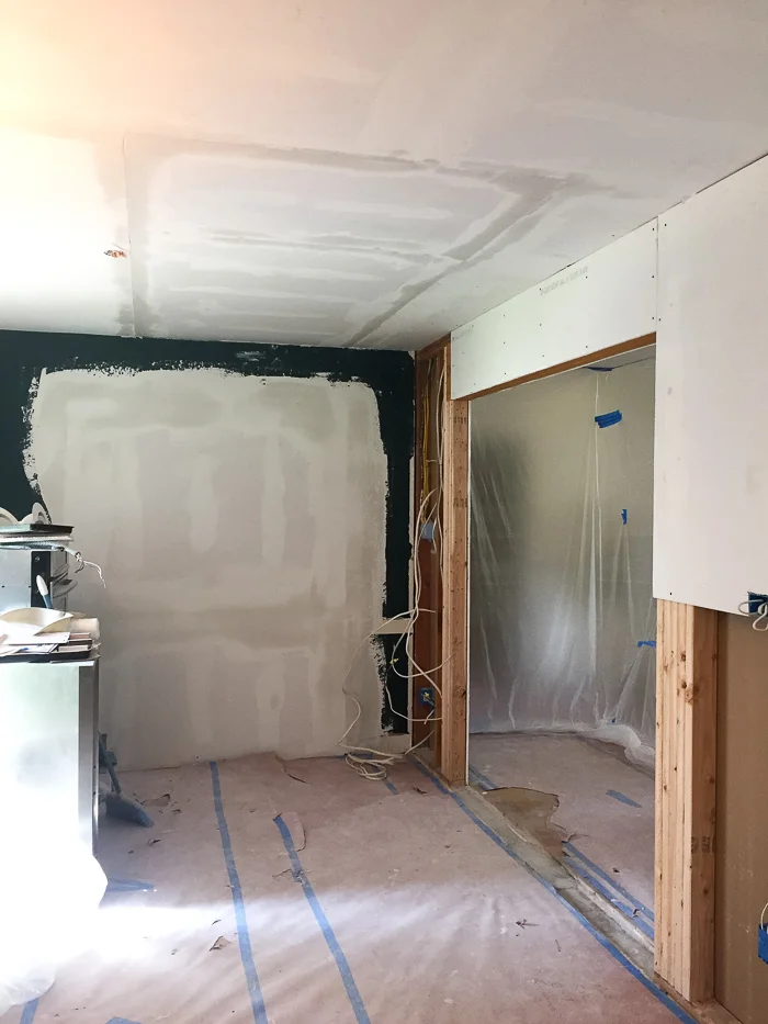
Here's the view from the living room side, where I am thinking the old teal shelves might find a new home. I'm pleased that running the banquette along the back wall will allow more light in from the window. BUT... when we decided to run the banquette across the wall edge to edge I realized we had to enclose the right side of the wall opening in a bit more to allow for plenty of seating depth. This meant adding more drywall, texture, re centering overhead lights, etc. It was all for the best, as now the opening is centered on the window, but my point is every change order unleashes a world of hurt on the most wonderful framing crew in the world. Thanks guys for never making me feel like a jerk. I sincerely appreciate it!

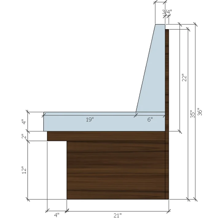
Here's the plan for the banquette, drawn by my super fabulous right hand woman Lindsay:

erin williamson design | one room challenge

No one wants to sit on an 18" deep piece of plywood, so build it out fat and cushy if you have the space.

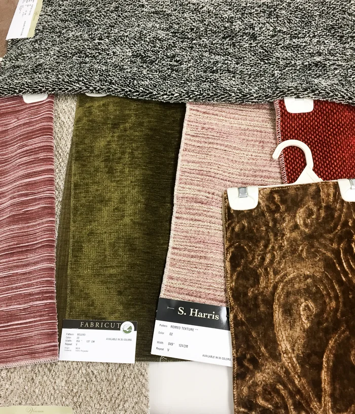
I think this is going to be tres awesome, especially with ultra swanky fabrics from Fabricut, who is generously sponsoring us:

erin williamson design | fabricut

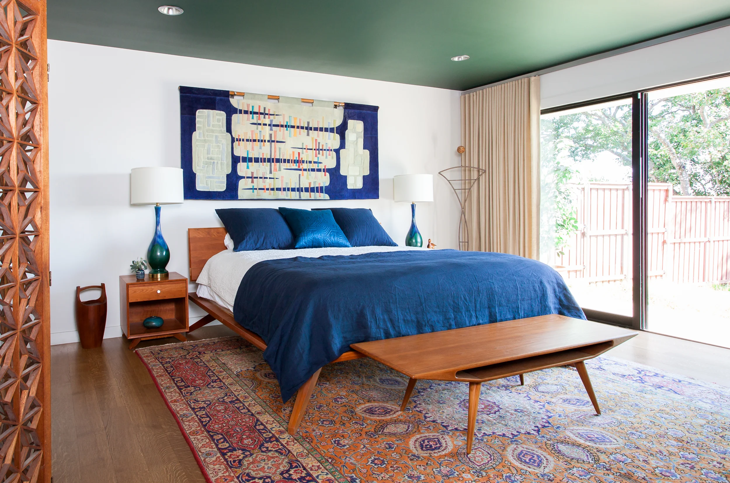
Behold a sampling of some inspiration fabrics. I am SO EXCITED about this! Have you seen the fabulous 20 ft long wall of raw silk drapery from Fabricut we used at Project Mid Mod?

erin williamson design
erin williamson design | project mid mod

Heaven. I'm a big fan of their products.

Meanwhile back at the ranch, gaining the banquette wall means losing my wallpaper in the entry. I am going to be 100% honest when I say I don't think I'm going to be able to pull the trigger on new wallpaper before the challenge time clock hits doomsday, hahaha I mean REVEAL DAY.

erin williamson | one room challenge

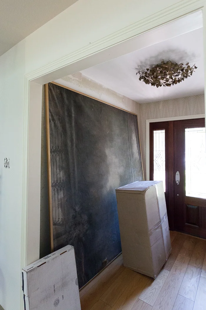
Zoinks. This whole entry needs a makeover, including new glass in the doors. I loved my Neisha Crosland paper but three walls are damaged and I'd pretty much have to start from scratch at this point. I'm not sure what to do, so I will probably do nothing right now. And somehow the Victorian backdrop has to get into our bedroom. It might have to teleport.

erin williamson design | one room challenge

In the interest of my sanity let's focus on decisions I have made, including wood stain from Rubio Monocoat (thanks for the tip, Lewis Trimble!). On the left is Cashmere Brown and on the right is Intense Gray. I chose the one on the right, and it's almost like a watery toner you apply before the final coat of sealer -- in our case Waterlox. Walnut can be kind of psychedelic and this masks some of the craziness while letting the grain show through.

erin williamson design | annie selke

If you are following along on my instagram, you know that the floors are in! Unfortunately all I have are grainy nighttime photos because as soon as the guys grouted they covered them with paper. So... I haven't even really seen them in daylight yet. Cue hysteria. I did have time to test drive this awesome rug from Annie Selke that I had been planning on, and I'm not sure the scale is going to work. I LOVE THIS RUG. It's so soft and I'm all about the checker pattern. I am crying tears of sadness because my heart and mind are not aligned. Get straight, Sybil!

If your brain is faster than mine, you have realized that floors going in means everything that was in the room must come out...

erin williamson design | one room challenge

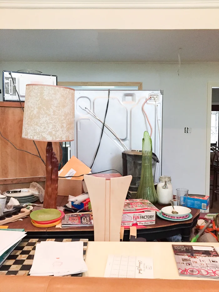
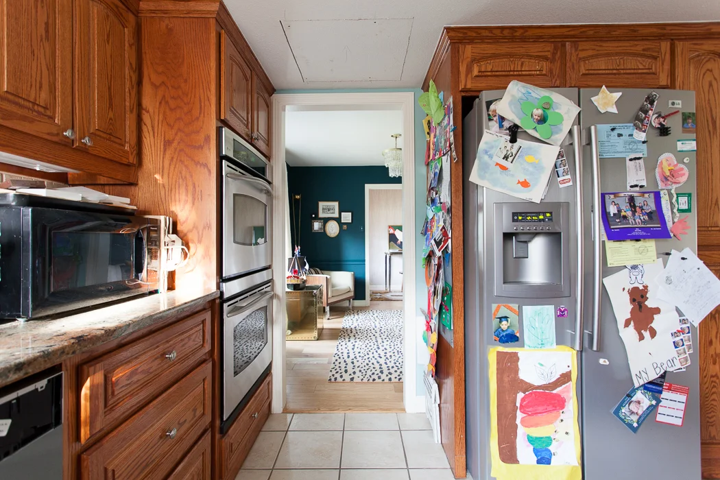
That was my desk. Send in the jaws of life. At least the beer is closer... because the fridge is in the freaking living room. You can only use the toaster or the microwave, because using both at the same time blows a fuse. I have to laugh or I might pound my face into the wall.

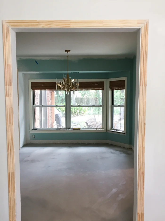
And so, dear readers, let us all leave with this moment of zen. The adjacent kid zone needs a complete redesign, including paint, seating, desk, and lighting... unless you enjoy being impaled by a precariously low Superman's fortress of solitude chandelier. Nevertheless, it is blissfully empty and ready for wood flooring. Yep, this room is getting wood since it's lower traffic and I want it to feel cozytown USA. It also flows better with the floorplan, and it is much easier to continue flooring horizontally than to patch it running vertically.

ERIN WILLIAMSON DESIGN | ONE ROOM CHALLENGE

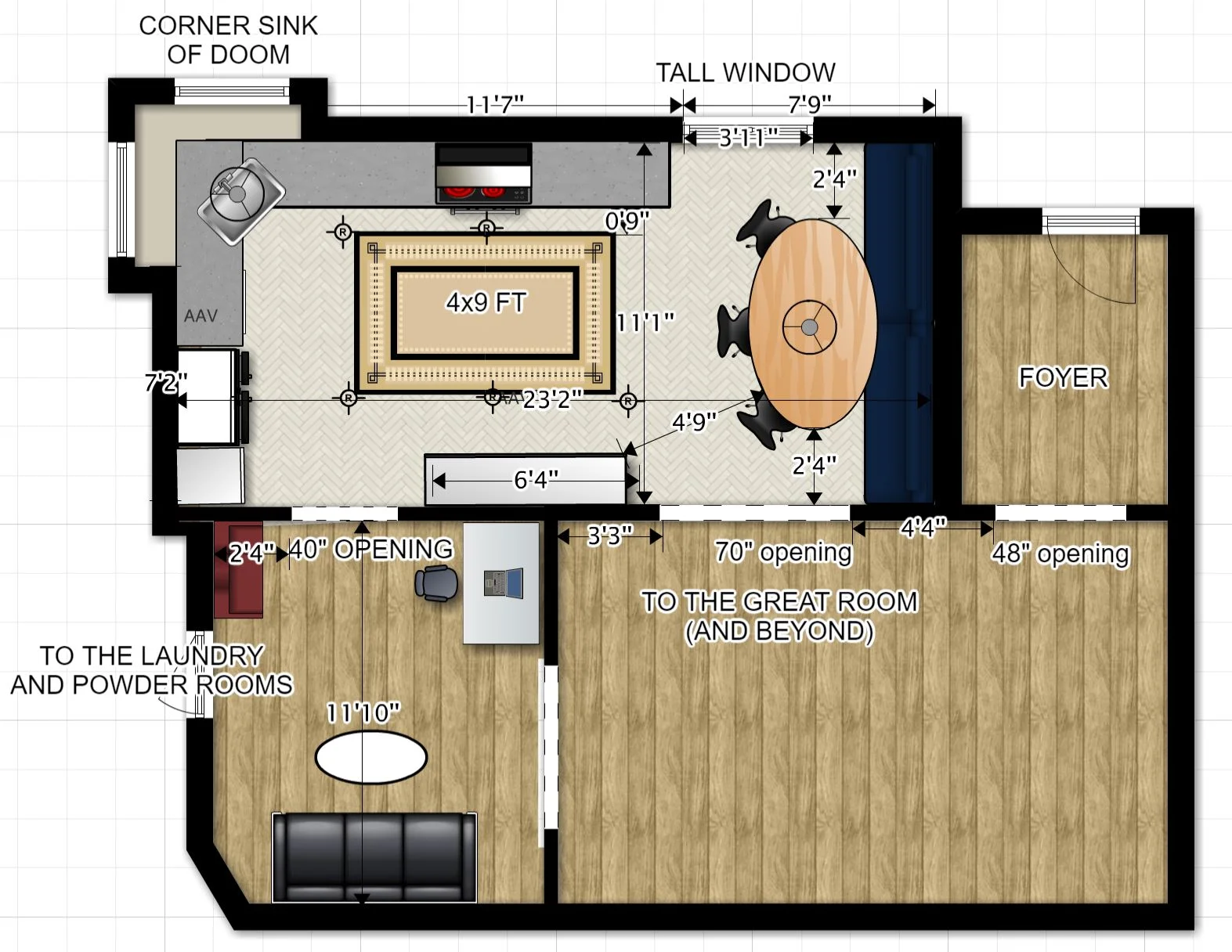
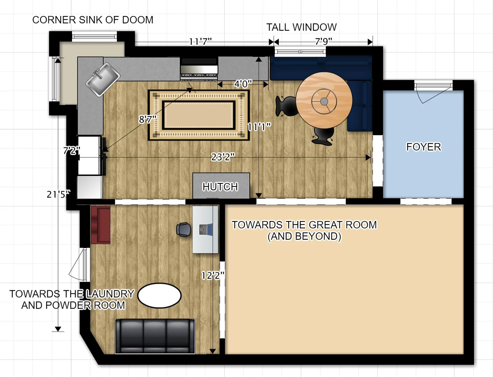
Here's the floorplan as it stands now. All the fun details will be revealed in weeks to come... Right now I hear five gallons of primer calling my name. YAY.

Feel free to come over and help, but before you bring me pizza and pats on the back check the other 19 designers for progress on their projects!


Centsational Girl | Chris Loves Julia | Christine Dovey | Dwell With Dignity | The English Room

Glitter Guide | House of Brinson | House Updated | J+J Design Group | Lark & Linen | Abby Manchesky

Nesting Place | Old Brand New | Old Home Love | The Pink Pagoda | Rambling Renovators

Erica Reitman | Sketch 42 | Suburban B’s | Erin Williamson  Media Partner House Beautiful | TM by CIH
 

ONE ROOM CHALLENGE KITCHEN EDITION WEEK TWO: FREEDOM!

Welcome back for week the second of the One Room Challenge, the quest sponsored by Calling it Home and House Beautiful to chronicle a room redo in six short weeks. If you missed last week, click HERE to read all about my plans to renovate our kitchen and adjoining kid zone.

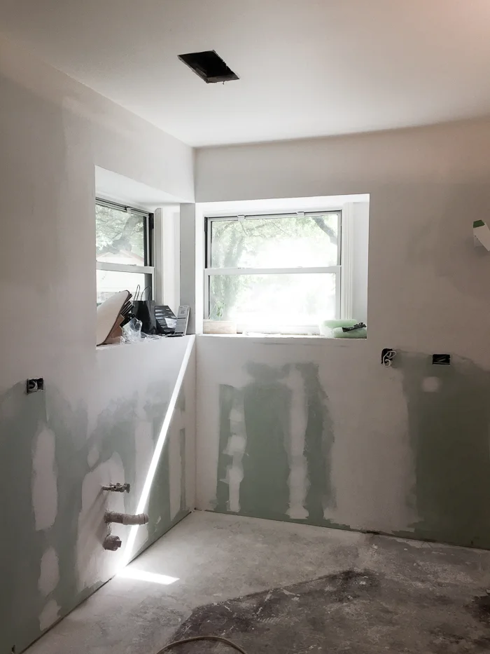
It is absolute chaos up in here... When this began, guys just started moving all our furniture into Everest sized mountains in random areas of the living room. Then they broke out the sledgehammers and ripped almost everything out. They are FAST. Kind of too fast, like I wasn't really prepared fast. Like stuff is still piled up in corners everywhere.

ERIN WILLIAMSON DESIGN | ONE ROOM CHALLENGE

This is so embarrassing. I mean... help. All of our food is stacked on old shelving from the teal room, and apparently we eat A LOT of hatch chile sauce and condiments. Kid stuff has settled into plastic drifts around the perimeters. There is a desk, two giant chairs, and pilesssss of art wedged in our master bedroom.

ERIN WILLIAMSON DESIGN | ONE ROOM CHALLENGE

But we aren't letting it get us down. Now that the wall is gone we're honestly using the kitchen more than ever. And with the help of Knob Creek, we don't even mind the drywall special spice in our meals. We are down to the necessities and we are PUMPED about everything that's happening.

erin williamson design | orc

Hooray! There was no roof in the soffit so we can raise the entire ceiling. Electrical is happening and ducts are rerouted.

Of course, it can't be all fun and games (HAHAHAHAHA). We had to make some of those very difficult decisions that I alluded to last week. First, the wood flooring in the living area just can't go into the kitchen. It's pretty, but when we bought it 5-6 years ago there weren't many choices for what is now very a popular natural matte finish on engineered white oak. Long story short, it's extremely soft and it dents really easily. I love the way it looks, but I think this is going to be a super high traffic space that demands durability and I'm having a hard time spending more money on something that needs to be babied. So... drumroll, please:

erin williamson design | one room challenge

I'm going with this chevron tile by 41zero42. I really surprised myself with this one. I was thinking stone, but my budget said no thanks -- at least not for the lighter stones in interesting sizes and shapes I was searching for. Luckily my super rep Jenny at Stone Source found this beauty for me at a better price point. It's porcelain but it has tons of variation, which I love. We actually used this in a different color and pattern at our fancy lakehouse job and it turned out ultra swank (reveal coming soon!), plus it will withstand the boys' trucks and legos with panache. 

erin williamson | ORC

Ditching the prefinished wood flooring meant I could have my wood cabinets, which anyone who has read this blog for years will know I am very excited about. The irony of ripping out wood cabinets and beige tile and replacing it with wood cabinets and beige tile is not lost on me. It's classic....... right???

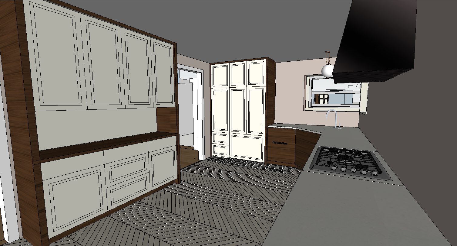
I'm going for a two tone euro vibe, with slab front wood lowers, wood casing around the floor to ceiling cabs, and paint grade shaker fronts on the floor to ceiling cabinets. We ended up increasing the width of the hutch to 72" and reducing the depth so that both upper and lowers are 18." It looks more furniture like, and I  think it will be useful for storage and serving space. We decided not to build in the microwave, so we're just going to tuck a small one inside the upper cabinets.

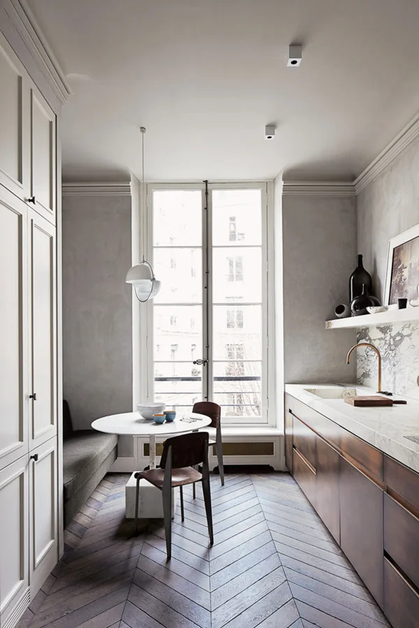
joseph dirand kitchen

I'm totally stealing inspiration from Joseph Dirand's gorgeous kitchen. I love how simple yet complex the elements are. It manages to be elegant and accessible, and I fingers-and-toes-crossed hope that's where I'm headed. Did you know those base cabinets are BRONZE? I briefly considered selling a kidney to finagle some of that goodness, but decided to go with quartersawn walnut instead. Hopefully I will get the same overall effect and retain both kidneys. Score!

erin williamson | one room challenge

Before we ever moved any walls I consulted with an architect. I had an 85% clear vision of what I wanted, but since we are slicing and dicing walls left and right and the space had many constraints, I decided to get a professional head check. Francisco Arredondo of North Arrow Studio and I have worked together before, and I value his opinion. When he walked through, we agreed about pretty much everything except for the opening at the foyer... he said close it up. I kind of freaked out and told our lovely contractor Carl Dixon to give me some time with everything open before I made a life decision.

erin williamson " one room challenge

Francisco was right. This picture frankly looks terrible and makes me seem like a crazy person, but it felt like swiss cheese with all the openings in here. And I really don't like the idea of looking straight into my messy kitchen directly off the front door. We live here -- it's not a museum. So I had to think about how best to direct traffic in a way that creates a journey from public to private. The dining side of this room will be visible from the living area, and the kitchen (aka dirty sink) side will be more connected to the kid/den area. That feels right to me.

So now we have way more room for a banquette, which is great. But do I run it across the whole wall?

Decisions, decisions. Tune in next week to see what happens, and also we have to catch up on the kid zone progress. Don't forget to send moral support! And please check out what the 19 other wonderful designers are up to:

Centsational Girl | Chris Loves Julia | Christine Dovey | Dwell With Dignity | The English Room

Glitter Guide | House of Brinson | House Updated  | J+J Design Group | Lark & Linen | Abby Manchesky

Nesting Place | Old Brand New | Old Home Love | The Pink Pagoda | Rambling Renovators

Erica Reitman | Sketch 42 | Suburban B’s | Media Partner House Beautiful | TM by CIH
ONE ROOM CHALLENGE KITCHEN EDITION WEEK ONE: EXPOSITION

Hello! Fancy meeting you here. For all you new readers, I'm Erin and I'm an Austin based interior designer and photographer. Because I can't manage to finish projects around our own house without the threat of possible public humiliation, I am once again participating in the One Room Challenge -- the adrenaline fueled event sponsored by Linda Weinstein of Calling it Home and media partner House Beautiful. Twenty designers are tasked with the daunting prospect of fully transforming a room over the course of six weeks. Let's get down to it, shall we?

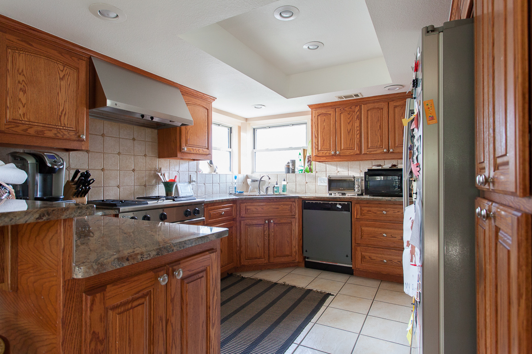
I'm redoing our cramped, Tony the Tiger orange kitchen. 

erin williamson | one room challenge

I am obviously insane! In years past I have chosen the very tiniest rooms to makeover. But I think the internet will snap me in half and toss me to the wolves if I complain about our kitchen one more time. So this is going down, whether I like it or not (rollercoaster of conflicted emotions, let me tell you.)

erin williamson design | one room challenge

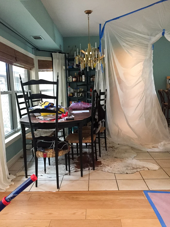
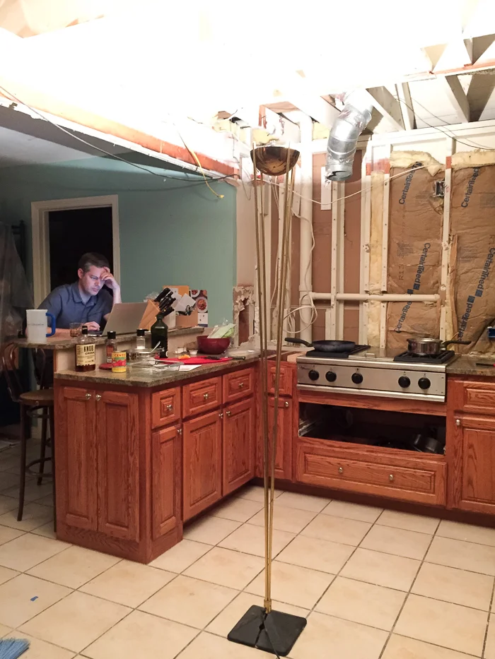
About 15 years ago the previous homeowners renovated our 70s Tudor home but didn't alter the cramped layout. And le whoa that dropped ceiling. It feels like you're cooking somewhere in the shire, minus the hobbity charm. We never use the double oven, and all the access points into this room are so tight. Have I even mentioned the dated finishes, yet?

erin williamson design | one room challenge

We've lived here for five years now, and Austin real estate prices have gone through the proverbial roof. Our house appraised at 50% more than it did when we bought it, and we had to decide whether to take our new equity plus the money we planned to put into a remodel and buy a new house, or to bite the bullet and make this place work for our family.

erin williamson design | one room challenge

We decided to stay. For one thing, there's nowhere else to go unless we jump multiple price points. With an extra comma and then some. Hahahaha. And we live at the back of a shady cul de sac with a neighborhood park/pool and good schools, we can walk to fancy groceries and cute restaurants, it's a 10 minute drive to downtown, etc., so it's a great area. But the house itself is not super dreamy or super large by Texas standards. I'm really just trying to justify the ENORMOUS amount of money we're spending here. 

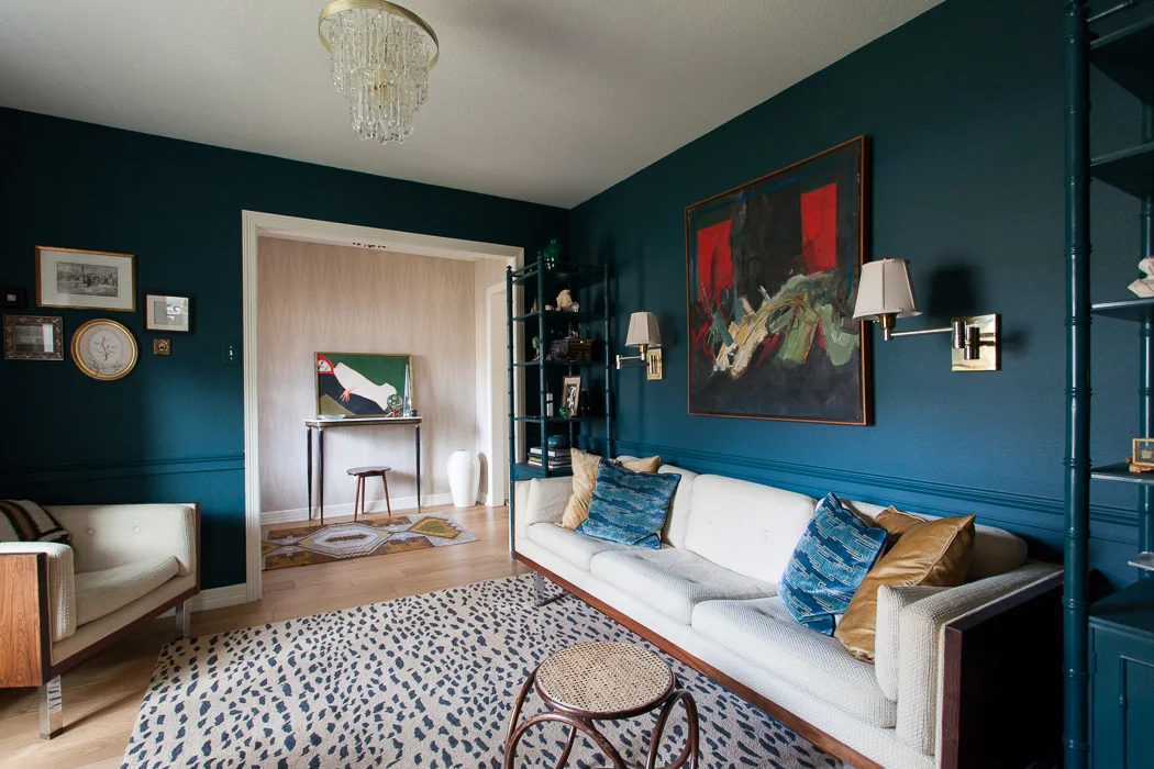
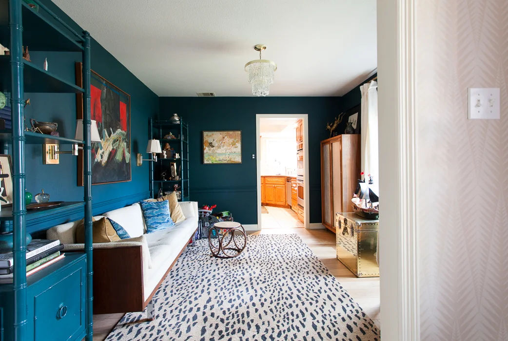
And also the fact that we tore out the teal room to combine it with the kitchen. 

erin williamson design | one room challenge

Yep, it's gone. It was sad but also liberating to say goodbye to this room that has brought me a not insignificant amount of fame and fortune. I can already feel the backlash simmering, and the pressure to bring my A+++++++++++ game is weighing mighty heavily on my shoulders. It's tough to make a kitchen as sexy as a library space, but the new setup will be ever so much more functional and I have a few aces in the hole.

Here's the plan, Stans:

erin williamson design | one room challenge

The wall between the old kitchen and teal room has been removed to create one large space. In case you are wondering, the long T-shaped wall holds our entire two story house up, so moving that intersection was not really an option. The corner sink of doom also unfortunately must stay. The wall between the old breakfast room and kitchen will be cased in to create a new study/kid zone. A new opening between the living room and old teal room will create an access point to the banquette area. And the opening from the foyer to the new eating area will... stay? Get smaller? Get closed in? Playing that decision by ear.

erin williamson design | one room challenge

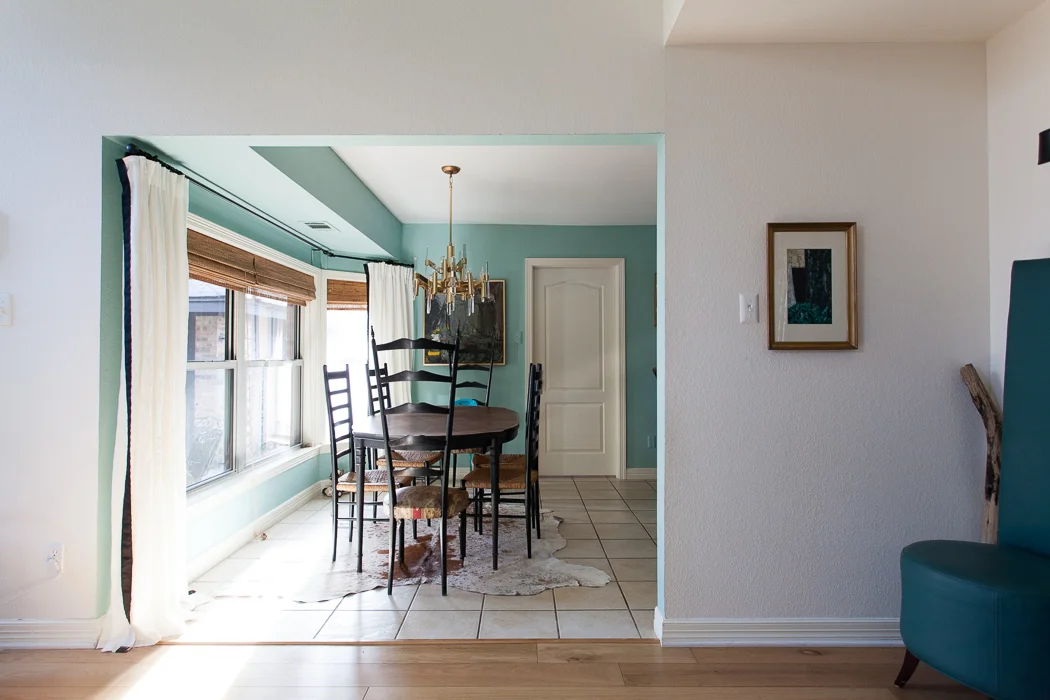
Fun fact: this room is much MUCH smaller than it looks. It was meant to be a formal dining room, but the previous owners staged it with a dining table wedged in catty corner... and it wasn't a big table. 

erin williamson design | Buff Strickland Photography

Bye, wall. PS, this crazy Victorian backdrop was built inside our great room, and it's so big it won't fit through any doorways. JOY.

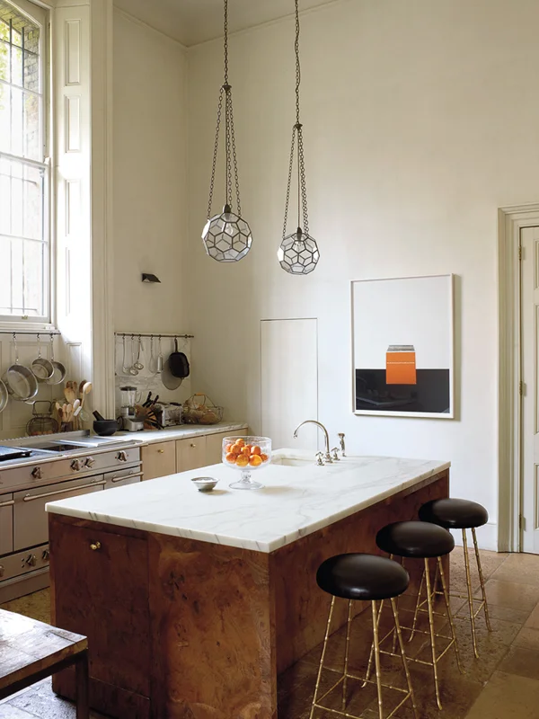
Now, I know what you're thinking: Erin, you might be the only person in America who won't have an island -- or two! An archipelago of islands, even! But what I want is space. And I was inspired by Rose Uniacke's kitchen to keep things as open as possible. I really want the luxury of volume.

rose uniacke kitchen

Here's the first iteration of her London kitchen. It's stunning, obviously. But then this happened:

rose uniacke kitchen

And I think this is just so much more of what I want. Openness, sleek modern appliances that don't overwhelm my modest space, and a proper eat in area where people can face each other. It's a room that's also a kitchen. Too bad the ceilings are so low.

I am incredibly humbled to partner with some amazing vendors and craftspeople to make my dreams come true, including Fisher and Paykel. I do actually cook. A lot. Almost every night. So I nerdily searched every appliance known to humankind, because I needed an affordable integrated refrigerator and a super flush cooktop to pull off the cozy-space-you-just-happen-to-cook-in look. Fisher and Paykel makes both, including a 36x72 fully integrated fridge for under 4K, which is about half of what most companies charge. Plus these gorgeous gadgets actually have some juice under the hood.

fisher and paykel flush cooktop

Slick! Also, I'm hungry.

I won't have acres of counters, but that's ok. We're building in a hutch opposite the range wall that will house all the microwave/toaster/blender/ipad/junque that our family collects. 

erin williamson design

That way, the counters I do have will be free and clear. And besides I have been prepping on a 4' peninsula for years and it was functional. Unfortunately the kitchen just felt super tight because of the narrow walkway between the peninsula and the old breakfast area.

erin williamson design | one room challenge

Speaking of the former breakfast area, did I mention I'm also making that space over? I tackled it years ago on my One Room Challenge maiden voyage. It was better, but never truly useful in an architectural sense, and it was way too close to the powder room for civility. The current plan is to turn it into a cool kid zone with new floors, comfy seating, toy storage and a small desk for homework. Bonus plus plus, I'm going to fix that horrible interface with the soffit (there's a roof up in there) and case the opening.

erin williamson design

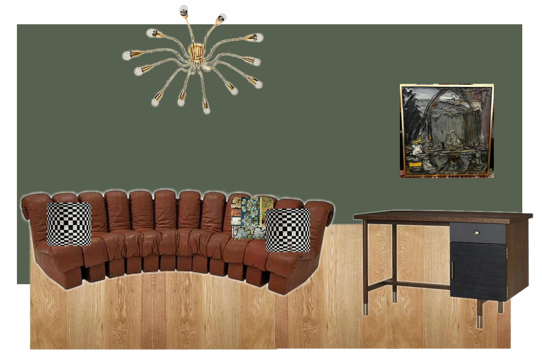
I have some wackadoodle ideas for this space that may or may not come to fruition. I am currently in possession of 80000 pieces of art plus three vintage sofa sets, and it may just take some time for this room to settle. I do know it's gonna be daaaarrrrk in here. This room adjoins a covered patio and it gets zero light, so I'm going to stop fighting it and go to the dark side. One good thing I got from painting over the teal room is some psychic space to go bolder elsewhere.

Ok, well. If you read this far into my novel you deserve a medal. But I have SO MUCH to tell you! So many things to finalize! Should I run a corner banquette in front of the tall window? Do I close the foyer opening so you can't see into the kitchen? Cabinet finish? Flooring????? Hood design? 

erin williamson

Here's my first iteration in the design process. It feels a little formulaic to me. I hope I can do better, and dang it I have always wanted nice (not orange striped) wood cabinets, but they just aren't playing well with the prefinished oak flooring I had planned to run into the kitchen. Something's gotta give. I'm talking to you, wood floors. I feel like this is my chance to do something different, and I'm not looking for a pinterest kitchen. But will I have the cojones to follow through?

Demo is well underway and there's an unforeseen pipe running in the wall that separated the old teal room from the living area. The future holds jackhammers, and that's not going to be cheap. 

erin williamson design | one room challenge

On the other hand, ding dong the wall is gone! And good riddance. Even if we screw everything else up, I know this was the right decision.

erin williamson design | one room challenge

Send help and take out meals. See you next week, when I will really have to make some Sophie's Choice type decisions. I promise the next post won't be 10,000++ words. Follow along on my Instagram for updates, and don't forget to check in and see what the other fabulous designers have gotten themselves into!

Centsational Girl | Chris Loves Julia | Christine Dovey | Dwell With Dignity | The English Room

Glitter Guide | House of Brinson | House Updated  | J+J Design Group | Lark & Linen | Abby Manchesky

Nesting Place | Old Brand New | Old Home Love | The Pink Pagoda | Rambling Renovators

Erica Reitman | Sketch 42 | Suburban B’s | Media Partner House Beautiful | TM by CIH