Designer Spotlight: Joel Mozersky

Last Friday I was on my way to lunch with a long-time client, the co-owner of Birds Barbershop.  While stuck in traffic, I called to tell him that I would be a few minutes late, he nonchalantly mentioned that Joel Mozersky would be joining us. "No problem" I casually replied, then hung up the phone.  JOEL MOZERSKY!  Holy Hell!  How am I going to handle this with no time to prepare?   Let me give you some back-story:  Joel is an interior designer in Austin who's interiors I've been, to put it lightly, stalking for the last 6 years.  Whenever I instantly fall in love with a new bar or shop it always turns out to be one of his designs.  So here I am, going on a surprise lunch with my favorite Austin designer and I'm wearing a sweatshirt.  To be fair, it was a good one, not some pull-over number with a college logo:

You may be surprised to learn that I did not pair my top with gold leggings.  But this post isn't about me, it's about Joel and my lovely lunch with him.

Turns out, Joel is as nice (and funny!) as can be and didn't seem to mind my sweatshirt in the least.  He's pictured above in a hidden east-side fave, The Peacock.  Here's a closer look at the interior:

This bar is absolutely adorable inside, the picture doesn't really do it justice.  I would also like to confirm that the weird gold garland (top right) is not a permanent fixture.

My very favorite space of Joel's is the now-defunct Oslo.  The space was out of control.  Despite the minimal decor, there were secret design treats around every corner.  Unfortunately, the lame-os who took over the space didn't realize that they'd been handed badass design in a box and instead gutted it and redecorated with a dirty frat boy theme.  I can't even walk by now without gagging.  Here are more shots of the former digs:

Joel was also the designer behind Bettysport here in town, you may remember them from the post I did on Redstart's Murals:

The above shots are from the dressing rooms.  Please tell me when you have seen a prettier dressing room!  Tell me!  One of my biggest retail pet-peeves is overhead lighting when you're trying on clothes.  Companies spend millions building nationwide stores, marketing their goods, and luring you in.  Inevitably, you're lead down a trail of tears that ends with unflattering lighting over a mirror.  While you're naked.  I must say:  Kudos, Joel, for avoiding the trap of every other cheap retailer.  Your lighting is divine.

The above is from the, also now defunct, Mars restaurant.  It was so so pretty inside, I'm sorry to see it go.  But, well, the food was just OK.  Hopefully owner #2 will not make the same mistake as the new owners of Oslo.

Joel also went Hollywood Regency / Chesterfield crazy in the Belmont.  I saw Michael Phelps win a gold medal while at this bar, between the tufted leather and all that hot swimmer ass, I was in heaven.  (PS sorry for the small pics, I couldn't decide on just one)

Similar in style to the Belmont is the Drake Bar in Houston.  I've never been here (who goes to Houston?) but I'm sure I will run there to claim asylum if I ever find myself surrounded by too many debutants and crack whores while slummin it in The Magnolia City.

more views of The Drake

So, why did I end up going to lunch with Joel while meeting with Birds?  Here's why:

Each of the Birds Shops have had Joel's design input.  Their South Lamar location is pictured above.  The mural was designed and hand screen-printed onto the wall by my favorite local graphic designer, Bryan Keplesky.  PSST... Bryan also designed the mural for the new shop which opens tomorrow, you dudes will get pictures on Monday.

Joel also landed the job of interior designer for the Real World Austin house, which was inside a gutted downtown warehouse:

I'm so all about-about that round ottoman / light combo in bottom left.

And for interiors real people (not to be confused with Real World people) would actually live in, here are a couple of shots from his portfolio:

I got the impression from speaking with Joel that he actually does several residential interiors but the above is the only one pictured on his site.

So, what did I find out about Joel at lunch that can't be deduced from walking into one of his spaces?  Here are some bullet points:

- He actually went to business school and fell into interior design when working with a former creative partner

- He often juggles 10 - 15 projects at once, he currently has 3 restaurants and several residences in the mix

- He knows how to have a good time on halloween.  Next year, Joel, take me!

Ask Sanders: Kristin's Green Bedroom

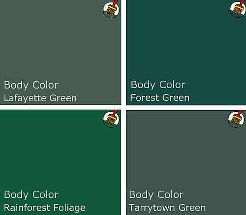
In Thursday's installment of Ask Sanders, I promised help for Kristin's bedroom. She asked our opinion on Kelly Green as a choice for bedroom paint, and Sanders was more than happy to oblige with a paint palette of greens in hues that range from shocking to sophisticated:

sanders green paint palette

And a few darker, more traditional greens:

greens

Personally, I have found that green can be a difficult color to work with, because it requires a sense of confidence that many more soothing shades do not. But when done right, green really sings. And I love the idea of using green and blue (blue in Kristin's bathroom) as a base for a household palette, since blue and green can mix and match in so many interesting ways.

john paul urizar

John Paul Urizar

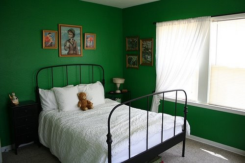
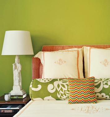
green bedroom

You'll need a pair to go all out kelly green on four walls, floor to ceiling. But this spare little bedroom courtesy of The Sweet Line gets it right with simple furnishings and accents. In a small room with strong color, paint is the star and everything else plays a supporting role.

kelly wearstler

I'm thinking that Kelly Wearstler may have kicked off the kelly green movement in a moment of vanity (hello, kelly - kelly?), but love her or hate her, the lady is not afraid of color. This bathroom shows how slick classic green (looks like Rainforest Foliage to me), black, white and chrome can be.

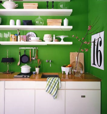
domino green kitchen

This tiny kelly green kitchen from Domino can cook. A very restricted palette with lots of white keeps the color from overwhelming.

green room

In this room from House to Home, forest green goes a little too country for my taste, but with more streamlined shapes, the color could be fresh. Imagine Danish teak instead of these tradtional furnishings. Throw in lots of white linens and a black pillow or two and you've got modern classic.

If all out green seems too heavy for you, you can break the color up in several ways.

green wallpaper

Hidden in France

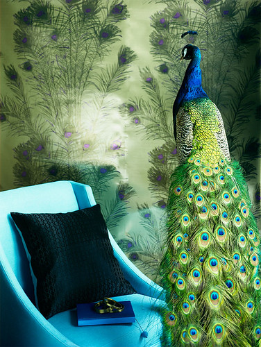
Patterned kelly green and gold wallpaper keeps the color light. If wallpaper isn't an option (renters, I'm talking to you), try stretching fabric over a a wooden frame, or wallpaper a large piece of masonite and frame with cheap, painted quarter round. Beep beep, beep beep, yeah.

green living room

House to Home

Homes with lots of molding and windows can handle the color because it covers less surface area. With deep greens, black, white and brown rocks.

per ranung

Per Ranung

If you don't have glorious architecture and the bones to prove it, consider painting a feature wall in deep green; keep the rest of the room bright and light.

james merrell

James Merrell

Maybe kelly green isn't for you, but Stokes Forest Green is looking mighty fine. Pair it with lots of neutrals and blood orange for a pop of unexpected color. Lighter colors need less white to balance them out.

chartreuse domino

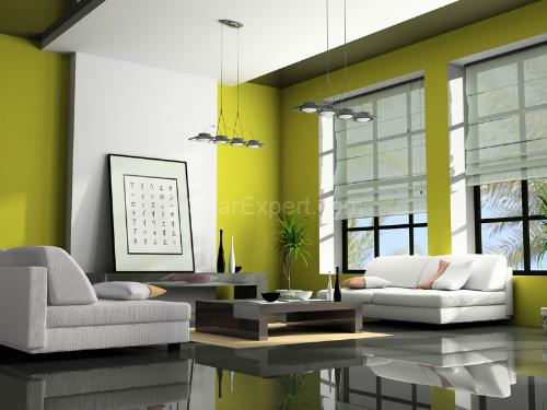
Brave souls may spring for chartreuse, like this Benjamin Moore Pear Green featured in Domino.

chartreuse

Boring picture, but the color is divine. And Designer's Brew shows how blue and chartreuse make magic. For a bedroom, maybe just a feature wall or nook would do.

Fear of commitment? No problem -- we all get cold feet sometimes. Consider green accents or furnishings instead.

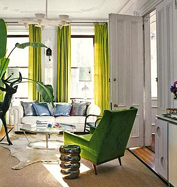
fawn galli

Fawn Galli's boho-glam apartment uses bright green curtains and upholstery to funk up her space.

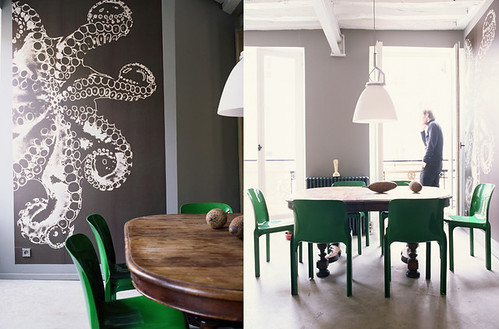
gaelle boulicaut

Gaelle le Boulicaut

Use that kelly green paint to spiff up a set of chairs in an otherwise neutral room. The wall paint in the photo looks a lot like my office paint -- Silver Fox by BM. It's a lovely, medium deep neutral.

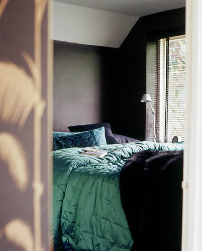
living etc

Living Etc.

Even a simple emerald throw adds depth to this dark and cozy bedroom.

Or maybe instead of feeling green at the gills by all this color, you're green with envy. If you're feeling emboldened by the power of green, don't hold back.

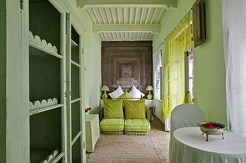
apartment therapy greens

Apartment Therapy

Try mixing and matching several shades in one room, like this Moroccan guest house. Lots of white space helps forest green, stokes forest green, and a pear green, go together like peas and... peas.

That's it for this installment of Ask Sanders. Hopefully you and Kristin got some new ideas and inspiration on ways to green up your space. For me, suddenly chartreuse is sounding like a fabulous nursery color...

If you would like to have your home featured on Ask Sanders, need help matching colors you may have spied in magazines, or just want advice on what paint colors could possibly make those peach wall tiles in your bathroom look like you MEANT to do that, email us at hollaback@design-crisis.com to ask Sanders, our resident Paint Guru, for help.

sanders

Thanks, Sanders!

Amy Bennett vs. Gregory Crewdson

I've just made a life decision to take a long weekend.  I'm exhausted and am sure you dudes wouldn't want to suffer through the nonsense I would most surely conjure up were I to write a full-fire post right now.  Instead, I'm bidding you all happy weekend, and sending you off with the lovely oil paintings of Amy Bennett, followed by photographs by one of my favorite photographers, Gregory Crewdson.  I think they share an eerie similarity, despite their different mediums.  Discuss.

And now, for Mr. Crewdson:

Happy Weekend, everyone!  And, KISSES!