Ben is pretty tolerant of my decorating whimsies. He let me choose the wood flooring in our house. He let me paint the dinette peachy pink. He begrudgingly allowed me to paint his office... twice. Basically I get to control all aesthetic decisions in our house.
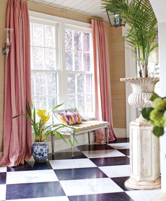
Except for the pink curtains.
If you will recall, I planned to do double height curtains in our great room. Well I'm too tired to tackle that expensive problem right now, so I decided to just throw a pair of cheap (but good) Ikea linen curtains on the lower windows to allay my neurotic empty window fixations. I chose some pretty basic flax linen curtains and figured everything would look kinda like this:
 Ok, and I may have taken the liberty of switching out the navy chesterfield for a pair of those Ikea Mellby chairs, because in my heart of hearts I know a pair of chairs (or maybe a chaise) would be best for my house... also, for anyone doubting the quality of Ikea's new leather wares: go sit on them. They're really nice soft pebbled leather. Totally worth the price.
Anyway, the mockup isn't perfect but I think it proves a priori that the flax curtains would be just fine and we should hang them and move on.
But...

And:

Plus:

Maybe a little too girly, but still:

Finally:

Yeah. Pink curtains keep whispering sweet nothings in my ear.
And of course Ikea sells pink linen curtains, so I mocked that beeswax up.

I switched the art because I think pink works best when mixed with dirty colors... otherwise it comes off as juvenile and/or cloying.
So now it is super girlytown up in there. Ben also hates the lady painting, but that is just wrong.
What do you think? I would say the board does not accurately reflect colors, that the curtains are warmer and and that there is definitely baby pink in the rug even though you can't see it in the board. Overall the rug is more raspberry than red.

Or perhaps I should just go halfway to girlytown with the lady painting and flax curtains? I could probably ask my sweet MIL to sew coral pink velvet piping on the curtains to up the oooo ahhhh factor.
So, for $100 which curtains should I choose? Flax? Or risk the wrath of my normally mild mannered husband and demand pink? I am, after all, about to be vastly outnumbered by penises and I don't really think he has a leg to stand on.
Ahem. Insert joke here.
And another joke.
Ignore my morning prurience. Instead tell me which art and curtain combo you like.
Thanks.
[Head Over Heels, Ruthie Sommers, Pinterest]


 Ok, and I may have taken the liberty of switching out the navy chesterfield for a pair of those


