 Discuss
or, see more branches here
Your Custom Text Here
 Discuss
or, see more branches here
Long ago, in a far away time, I bought my acid washed, peg legged pants from Esprit. Now I buy them at Urban Outfitters. In case you haven't noticed, the crazy 80s are back in a big way. Of course the wide world of interior design isn't immune to the vagaries of trends, which seem to progress through the art-fashion-pillow life cycle until they die a gasping, lonely death on the clearance shelves of TJ Maxx. Short lived though they may be, I like following trends -- although I have to say I felt a little green at the gills when I first saw the new slew of statement making brights and strong shapes. The 80s were not kind to me, with its broccoli bangs and crop topped warfare, and those linebacker sized shoulder pads that required nothing less than an absolutely unwavering sense of self confidence. Should I admit that confidence was not a quality I was born with? I still have to work for it. Every day.
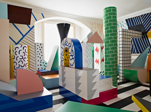
Maybe my hard work is paying off, because I'm starting to move beyond my own crippled sense of nostalgia as I approach this second wave of 80s inspired wares. I'm even setting my jaw and looking deep into the neon heart of the past, to primary sources like Italian designer Ettore Sottsass, who is looking more and more like a straight up genius when viewed through my new confidence goggles.
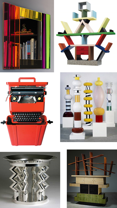
Ettore Sottsass
One part Beetlejuice, one part Bauhaus, and one part boozy good time, Sottsass set the tone to angular and primary as founding member of the Memphis design movement. Though his work should never be confused with the current, flimsy iterations of post modern furnishings typically found at Eurway, they do take up some majormajor visual space. As even Sottsass acknowledged, a little goes a long way.
Though I can finally look at his high Memphis work without enduring painful flashbacks, I was still jazzed -- and relieved -- to see this house he designed near the end of his long life:

Working into his 80s, Sottssass' mellowed out architectural effort looks to the past while also giving me something to look forward to. Within it, I see the seeds of a more mature Memphis inspired design aesthetic. And I like it. A lot.

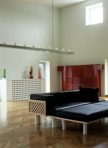

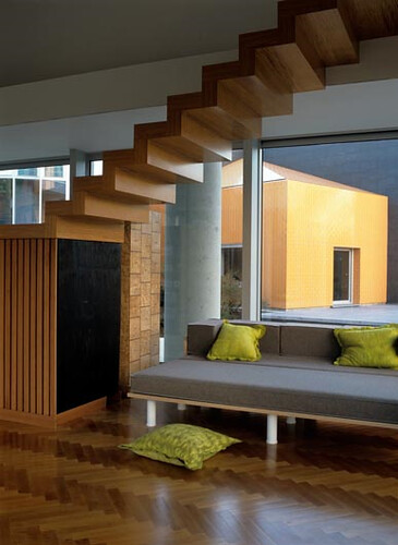
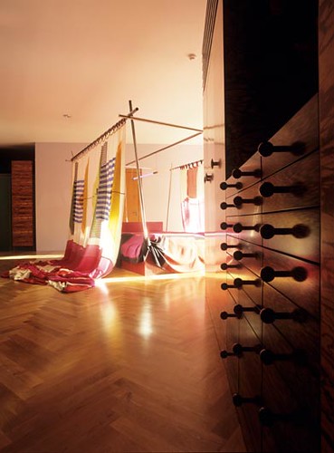

Spare but warm, angular but not wildly so, this house is eminently livable. And of course the acres of glass, stunning reflecting pools, and luxe finishes don't hurt. It's obviously the refinement of a life's work.
Sottsass died at the tail end of 2007. I suspect that the scope of his influence is only beginning to surface, but don't think that other designers haven't already begun mining. Kelly Wearstler's beach house and Avalon Hotel have obvious smart references to Sottsass' late work. Expect to see a lot more of the Memphis master, but not the kind that demands confidence.
The kind that inspires it.
I have obviously contracted a raging case of scarlet fever, or perhaps I've come down with the Pepto Bismol Flu. Because my new appreciation for hot pink can only be explained by a fit of delirium. Now -- I'm a black, white, and brown, kind of a girl. Sure, I like loads of bling to slick it up, but at heart I love my drabby neutrals. Except I have recently developed a strange, inexplicable attraction to hot pink. It's probably because the hunny says it doesn't look good with my hair -- which makes me like it even more.

Whatever. You can't deny that a dash of hot pink puts the schwing into spring.
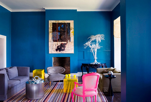
Nicolas Matheus
Girl, you know you be a sexy beast.
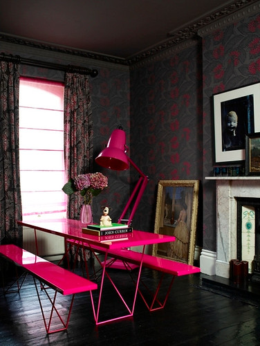
Yes, I realize I mixed my gender metaphors there, but it may just be that hot pink is a transvestite hooker with a heart of gold.

Hot pink's interests are: It's Raining Men, lip gloss, and having better legs than me.
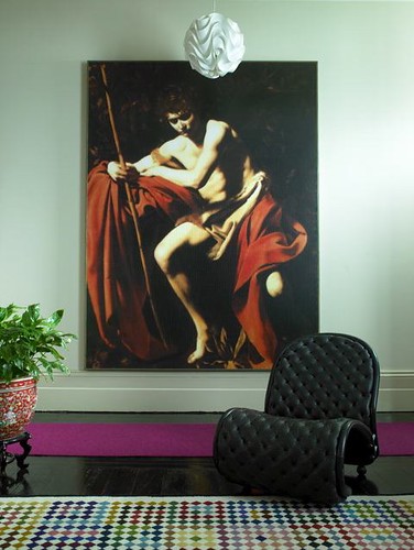
But you know what? I like her. A lot. Hot pink is sharp, funny, edgy, and adds a touch of in your face glamour to any room.
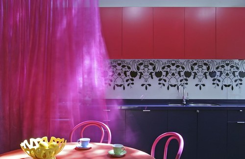
Scott Weston
Did I mention versatile? Pair her with other brights or darks and she will hold her own.

Abigail Ahern


Pair her with neutrals and she will coyly bat her false eyelashes at you with a flirtatious wink and a nudge.
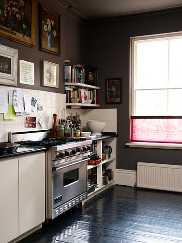
Abigail Ahern
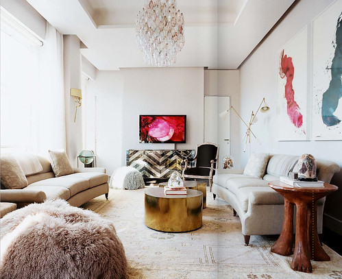
Laura Day via Lonny
Display her on your pedestrian TV in full frontal view, right next to your haute pink James Nares painting, and you will be a GENIUS.
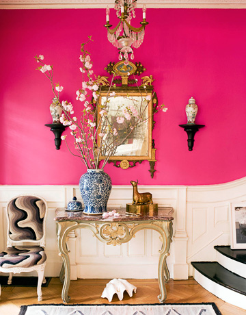
In closing, I leave you with this showstopper of an image, which is not to my usual taste. At all. For starters, I don't know who allowed a giant clam to crawl across the floor and die a horrible, ugly death beneath the console table. But that swath of hot pink brightness rescues the whole room from stuffy old lady land. And do you know what the paint color is called?
Razzle Dazzle.
That's what I'm talking about.