Thank You For Being a Friend

It's no newsflash that the 80s are back -- even street corners in remote Wyoming and North Dakota are swimming with hipsters clad in acid wash jeans and neon raybans. But if there's one thing I have learned while couch bound and channel surfing in my cocoon for these past six weeks, it's that there is a kinder, gentler 80s aesthetic out there. One that might best be described as... mature. For those golden years.
golden girls

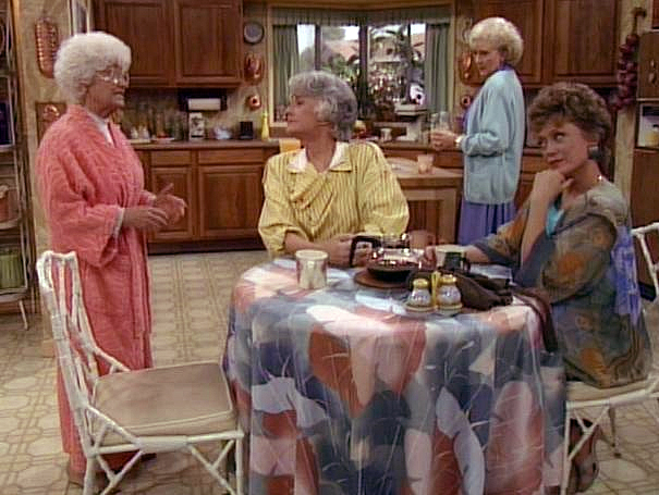
Yep. It's the sexy sexagenarians (and one sassy octogenarian - RIP, Estelle!) we all found as warm and comforting as an oversized pink bathrobe. Sigh. How I missed the Golden Girls! But I've had time to catch up and reflect on their grandma chic style, and I think there may be a few worthy design details to take in among their set pieces. Still, one must watch out for the obvious pitfalls:
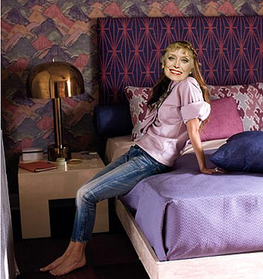
kelly wearstler blanche

Because you know Kelly Wearstler was totally channeling Blanche when she masterminded that mix; note the color/texture similarities between the GG's tablecloth and KW's wallpaper. The lesson here is that mauve is scary, and mauve plus any kind of blue is even scarier.

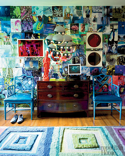
But did you see the GG's Chinese Chippendale chairs that have been splashed on the pages of every single shelter mag for the past few years? I'm pretty over them, but if you're gonna go that way, might as well go over the top. Yes, I admit it. I do love me some neon.
gene meyer

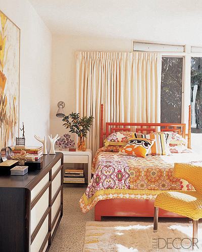
I get nothing but good vibrations from this wackadoo room by Doug Meyer that Karlykins posted ages ago, but if you buy these 80s redux chairs (available from Ballard here), nix the black and save the GG white lacquer for your boxy pieces a la Trina Turk's bedroom:
trina turk

Yes, that uber 80s Karl Springer nightstand would be right at home in Dorothy's bedroom. Sorry you need Sophia's bifocals to see it.
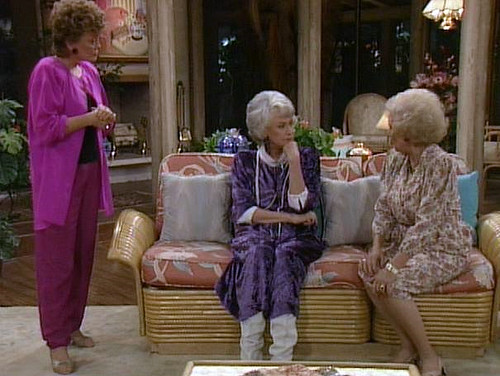
golden girls set

I can dig the blocky 80's shapes the GGs have scattered throughout their pad, like this blonde rattan couch. But nothing says Florida retirement home like rattan + mauve jungle print fabric. I'm envisioning a vintage couch like the one pictured, but with a fresher pattern:
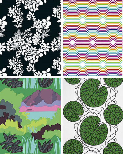
marimekko

I pulled these from Marimekko all quick like, but anything bold and bright would do. I'm thinking rattan needs a festive print to stay true to its tropical origins, but instead of faded pink I prefer a crisper color scheme to bring the shape and texture up to date.
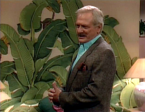
golden girls

Everyone in the world has seen the inside of Blanche's bedroom. Perhaps she fancied herself a tigress, hunting silver foxes in the jungle of love. Eeeeeeew. Whatever the case, that banana leaf wallpaper is springing up in well heeled homes everywhere and I probably should be tired of it, but I'm not.
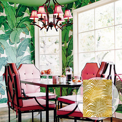
nicky hilton

However, I'm not sure I love Nicky Hilton's full monty interpretation here. It's pink, it's got chinese chippendale-esque chairs, and it has the wallpaper. Despite all the color, it feels kind of old to me.
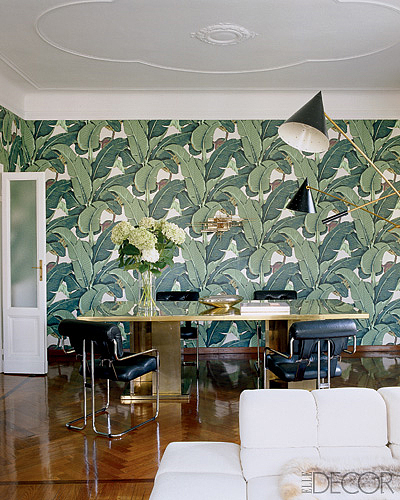
nate berkus

I blogged about Nate Berkus' apartment before, and I still want to go to there. He keeps the furnishings muted to let the wallpaper harmonize with -- rather than contrast with -- its surroundings. Because that's some big wallpaper, you know?

Now that I'm back blogging, I'm going to miss my time with the Golden Girls, but I'm so happy to return to say THANK YOU!!!! to all the people who filled in for me while I was gone, and to all the people who read the blog. And I especially want to thank Karly for holding down the fort with style and grace. A girl really couldn't ask for a better friend. This post be dedicated to you.

I'll be back on Friday with... something. But in the meantime, stay gold.

golden girls tattoo.

Apparently this incredible tat belongs to a friend of a friend. Only in Austin, people! Who better to spend the rest of your years with than Blanche, Rose, Sophia and Dorothy, I say? I call Rose. Which Golden Girl are you?
Rich and Skinny

Let's just put something out there front and center. I do food. I love design, but I do food. So when Karly and Erin mentioned they needed a few guest bloggers to help round out July and August while Erin was on baby vacay, my first thought was, this isn't for me. I love poring over design blogs, pondering remodeling ideas I will never have the resources to commit to, ogling furniture I have no business even considering. The idea, though, of posting on my own about design, with some modicum of authority, well that was as about out of my league as that Herman Miller LaChaise I've been eyeing. But something Erin posted the other day stuck in my head, specifically that bit about money being wasted on the rich. That got me thinking about molecular gastronomy. It's an unappetizing term for what some consider the sexiest most stylish and innovative edibles out there. They're also design-y as hell. And at about $240 a meal it's nothing to sneer at. I'm not about to argue that someone has to be clever and creative as hell to make this stuff up and to make it work. You have to be a mad scientist. I'm just saying, with all the money people are forking over for this stuff, couldn't we harness the scientific genius behind it to instead maybe, oh, I don't know, cure cancer? Make a new ozone layer? Bring back the honeybees??? I'm just sayin'.

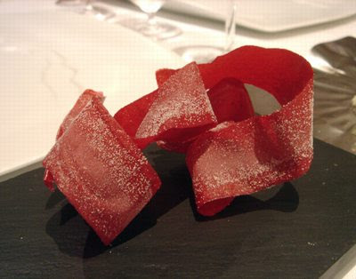
Consider this. It's a beet. Sort of. Hailing from the epicenter of the molecular gastronomy world, El Bulli, these beets actually strike me as edible. They don't strike me as beets, but I have nothing against them... unlike what is to follow.

Here we have eggs benedict (duh) created by none other than the molecular gastro star Wylie Dufresne.

I'm not sold on those gelatinized egg spheres as food, but if it was about 3,000,000 times its edible size it would make an interesting outdoor installation piece.

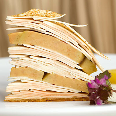
Here's a fun one. This here is a sandwich. I repeat. Duh.

I didn't find enough information (besides that this was created by Chef Pascal Barbot at L'Astrance in Paris) to figure out what that is sandwiched around the foie gras, but yeah, that's foie gras. Again, sculptural? Sure. Edible? Debatable.

Now our little tour de gastro-weirdness takes us to the UK where we visit the The Fat Duck, another destination point for creepy food experiences.

This little baby is inexplicable. Why don't people label their photos?? People! Help a sister out here! What IS this?? From my perspective it's a pod of some sort, filled with coffee grounds, the tiny golf clubs sticking out of it are topped in caviar. It's not a combination that comes to mind when I think "dinner", so I'm guessing I'm wrong.

Things at The Fat Duck only continue to become more inexplicable with this one. Dry ice, beneath a bed of moss with an odd assortment of odd looking morsels in containers around it. Whatever could it be?

Obviously it's jellied quail, langoustine cream, chicken liver parfait, oak moss and truffle toast. No notes on whether one is to eat the oak moss.

At The Fat Duck you can round out your meal with this.

This iPod, nestled in shell, is your musical accompaniment for the dish entitled Sounds of the Sea. The dish is composed of seafood and seaweed on a bed of sand-like tapioca. Customers report, and I kid you not, the oyster tastes stronger and saltier when the actual sounds of the sea are piped through the iPod.

I used to think I'd be lying if I said I wouldn't jump at the chance to sample some of this stuff... just for the experience. However, recently, as I pondered a menu that's most filling entrees were beef tonge sushi and duck testicle shish kabob, both at what equalled a week's worth of groceries for myself and my husband, it occurred to me... I'd prefer an ugly old taco any day. Design is to look at for years and years to come. Food is to eat.

Antiquarian is the New Black

Did anyone see this article on the New York Times site?  Not one to be slowed down by reading, I cruised the slideshow first and was pretty delighted by what I found.  Then, well, then I read the story.  It was gross beyond gross.  While I maintain full respect for the occupants of the homes profiled, I kinda want to barf all over the "reporter."

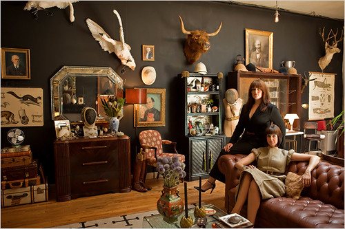
We start with an introduction of the Hovey sisters, who can be found on their blog here.  The reporter drools all over them and single-handedly credits them with starting the Ulysses S. Grant fashion trend in, wait for it, Williamsburg.  Am I to believe that I am watching the initial match spark that will ultimately lead to the full blaze that is the tipping point?  Oh to be so lucky.

Now, don't get me wrong, I'm digging their taste - remember, I swooned when I first saw the pictures - I just can't stand by an article that notes that the type of collecting the sisters and the others profiled "requires a lot more engagement than a similar passion for midcentury furniture"

WHAT WHAT WHAT?!

I am insane about interiors.  I have spent nights fighting sleep since I was four laying in bed imagining my dream home.  Every spare penny I have goes into my house, I don't even try to justify the expense, it's as necessary as food.  Can someone honestly try to tell me that this taste and commitment to collections requires more engagement than my own?  Or yours?  Come on readers, you've taken the time to find my measly design blog.  You probably have at least 20 more in your RSS feed.  We live for interiors.  New York Times:  give me a fucking break.

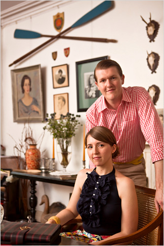
Ok, I'm over it, let's just spend the rest of our time together looking at the nice pictures that sparked my interest in the first place.  Above is a couple that also collects things.  That's all I'm saying about that.

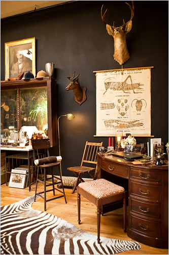
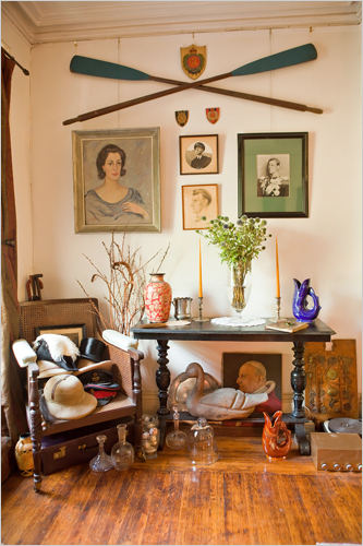
I think this room is awesome.  Again, all I'm saying.

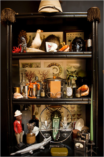
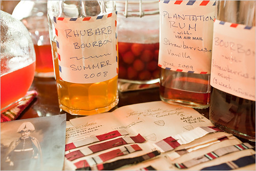
Their collection of arcane liquors, which I don't even pretend to understand and I certainly don't think is pretentious at all, oh no.  

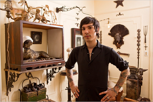
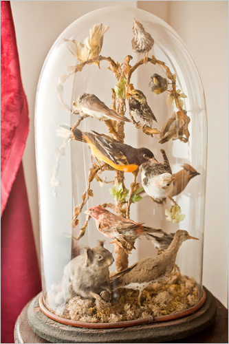
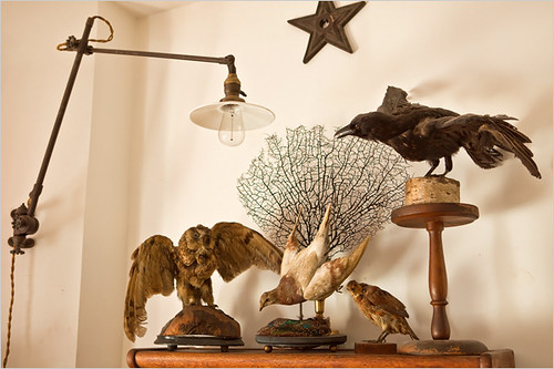
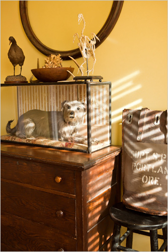
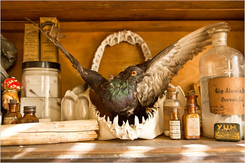
Ryan Matthews, his house is a 24-hour taxidermy party.

I can't get behind that stuffed dog, but the rest is fine, although it seems a bit dusty.

So, there you go, now you've gotten the lovely slideshow in it's entirety and you didn't even have to read the stupid article.