One Room Challenge: Week Three -- Make it Work Meltdown

Hello everyone! Welcome back for the latest installment of the One Room Challenge, hosted by lovely Linda of Calling it Home. For just a minute, might I divert your attention to my captain amazing new blog header? Designed by super buddy and Design Crisis alum Karly Hand, it represents pretty much everything I want to say about my life as a decorating lioness. I love it so much. And that is the end of this week's good news. Bust out your kleenex -- or handkerchiefs, for all you neo Victorian lads and lasses -- because this is going to be a Steel Magnolias of a tearjerker.

erin-williamson-arsenic-1-2

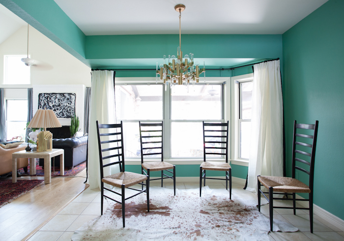
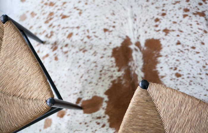
 To summarize my progress since last week, I scrubbed dirty grout on my hands and knees for 47 hours, popped my cowhide cherry with this rug I scored at Round Top, ripped down my blindingly orange blinds, talked Karly into sewing grosgrain trim onto my linen Ikea curtains, and whipped out the fab four mid century Italian chairs I scored for $5 each. That kind of seems like a lot, but something is missing...

Oh yes. MY TABLE.

ONE ROOM CHALLENGE

Let us hearken back the the glory days, full of promise and optimism -- the days when I thought I was going to have a marble Saarinen table. Despite being assured by multiple professionals that cracked marble was repairable after being literally dropped off the delivery truck, I am sad to report the dream is dead. Complete and utter fail.

erin williamson orc

Look how sad my chairs are! Like a bunch of jilted wallflowers. But at least my grout is clean. Yes, let's talk about the good things before I work myself into a lather over the whole sad situation.

erin williamson orc

The tape trim on my curtains is nice but not crazy overpowering. I'm going for arty and sculptural rather than preppy polished, so we just did the sides and not the bottoms. I hung two panels at each end for extra fullness.

erin williamson orc

The Sciolari light looks swank next to jade walls. Can I just take a picture of the chandelier and call the room done already?

erin williamson

This is a very unsexy photo, but a very important tip: when you have a strong wall color you MUST paint out any offensive functional items. I painted all my switch plates, outlet covers, and even the AC register. It looks mo better. Now your eyes don't zero in on the ugly things.

erin williamson orc

All the better to see the pretty things. I'm happy with this color combo, but I also feel like there is something missing...

erin williamson orc

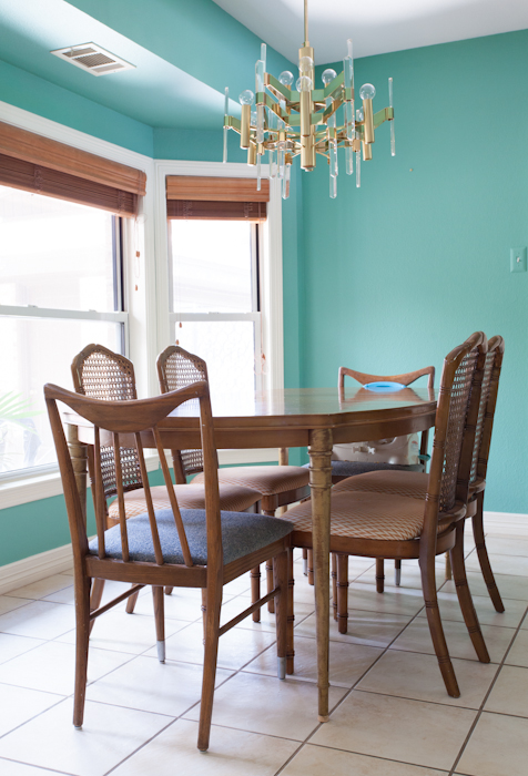
I'm pondering these fabrics hardcore, perhaps for upholstery. We're just a family of four but I'd still like to have six seats around the table. That means we're short two seats... and a table.

I need furniture. Stat. And I'm on a budget. Big time. Like many people my panicky first instinct is to throw money at a problem, but over the years I've gotten better about coming up with creative solutions that don't give me morning guilt. Do I upholster a fancy banquette that my children will surely destroy, or do I figure out how to add color in a more cost effective way? Do I refinish my old table, or do I attempt to cobble together a new top for my Saarinen pedestal? I would love to have a new marble top cut, but it costs as much as the table originally did and I'm on the verge of a kitchen remodel... must pinch pennies.

I only have three weeks to get over the hump, but I shall prevail.

Please pass the Tums.

While you're busy having sympathy anxiety hives for me, visit my fine friends to see how they are weathering the challenge. I bet they have furniture.

one room challenge

Calling it Home

Come back next week to see live video of me crying.

One Room Challenge: Week Two -- Hemlock Grove

Hello everyone, welcome to week two of the One Room Challenge! By now most assuredly you've had the opportunity to visit some of the other blogs participating in the challenge. So have I. Those people are talented. It's a little intimidating, but here I am powering through all of my self preservation instincts to bring you updates on the rehabilitation of my hideous dinette into proper society. You may recall that I spent last week hemming and hawing, holding a paint swatch of Farrow and Ball's Arsenic next to anything that would sit still.

farrow ball arsenic

Now I know lots of you out there wouldn't blush at the thought of a bubblegum pink living room or a lilac boudoir or an Hermes orange office, but I am Misses Conservative when it comes to paint. I like light neutrals and moody darks. I don't do midtone brights. But -- let's all say it together -- it's just paint. And it's a tiny, dark, boring room. I honestly couldn't come up with a reason not to spend a whopping three hours of my life painting this dinky dinette something transformative.

farrow ball arsenic

Like, LSD transformative.

erin-williamson-arsenic-3-4

And you know what, it's not half bad. I mean, my floors are bad, the soffit is bad, that unpainted register is bad. But the color? I kind of like it. I also think the name is cool... does that make me weird?

farrow ball arsenic

Arsenic is a super weird color -- it's not blue and it's not green. It's darker than the previous peachy pink yet suddenly I need to dim the lights at night.

farrow ball arsenic

It looks not too shabby with the things going on around it, although the dirty grout on the tile floors is KILLING me (spoiler alert: I already cleaned it).

farrow ball arsenic

farrow ball arsenic

I don't hate it. Does that mean I like color?

Will I pair it with neutrals as is my usual modus operandi, or do I go full on acid trip with mega bright art and upholstery? Perhaps somewhere in between?

Only time will tell. Tune in next week to see me pour a gallon of gasoline on that dining set and burn it to teeny tiny splintery ashes.

Just kidding, although I would pay to see that show. I do however need to get the furniture situation on lock. It's keeping me awake at night...

one room challenge

Until then, please do visit my lovely co participants:


One Room Challenge: Week One -- Dinette Disaster

Hello friends, old and new! Welcome to the One Room Challenge, wherein I and several other bloggers aim to transform a space in just six weeks. Say what? Am I crazy!? With two little dudes running around the house and a burgeoning interior design biz, it's a wonder we have clean underwear around here much less time to decorate. On the other hand, a very serious situation has been brewing and it must be dealt with... Fresh whitey tighties may have to wait.

 erin-williamson-orc-3

Before you stab your eyes out to stop the pain, let me (try to) explain myself. I am married to a man. I have a four year old man child. A little over a year ago, I found out I was pregnant with -- you guessed it -- another mini man. Now I love my boys to death and frankly cannot even imagine having a girl (although I am sure they are lovely, too), but for a little while there my pregnant hormones said PAINT IT PINK. My husband was horrified. My paint guru friend Sanders was apoplectic. But I couldn't let all those XYs get in the way of my pink dinette.

I probably should have.

erin-williamson-orc-2

As soon as I painted it, I was like bow chicka bow bowwww and then I couldn't get 1980s Hustler thoughts out of my mind. Plans to refinish the table and chairs ground to a halt, thwarted by this color which belongs either on Cinemaxxx after dark or perhaps in a grand mirrored ballroom with black and white marble floors, gilded candelabras, and enormous palms planted in turquoise and cinnabar pots -- not in my very humble Browntown USA dinette.

But alas it was too late... I had a baby and put on my diaper blinders and just stopped caring for a while.  It happens. Now my little guy is walking and talking, spilled milk and jelly fingers are on the wane, and there are no more excuses for this miserable hovel. So let's discuss the space.

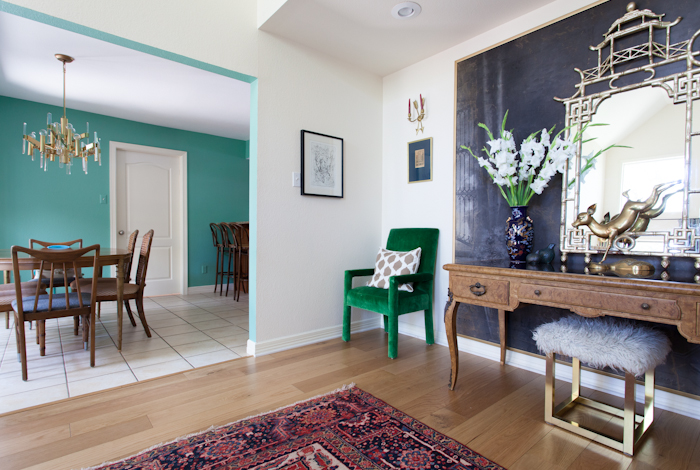
We bought our 1970s Tudor home two years ago. It's fairly modest by Texan standards -- about 2400 sq ft. The "dining room" is located by the front entry, but it's very small and disconnected from the living area so we decided to turn it into a study/play room:

teal dark harbor

I like it. But now the only place our family of four (plus friends and extended family) have to eat is the dinette.

erin-williamson-orc-4

It's a charmless room. The bay window is not symmetrical and it's topped by a soffit that conceals (wait for it) the roof. Nothing to be done about that, sadly. Also it's very dim in here because it faces north, we have tons of trees, and it overlooks a covered patio. Finally the floors are disgusting but we're not replacing them with wood until we redo the hideous kitchen. Please jeebus let that be soon.

erin-williamson-orc-5

This is a weird corner where a fugly built in desk used to live. I like this James Montish china cabinet, but if I found something more spacious to store my out of control gilded glassware problem I would buy it.

The first step in taming this beast is paint because there is no cheaper, faster, better way to transform a space. Period.

However, this is a very tough room to choose paint for -- which is partly how I ended up with pink in the first place. It's dark, there are tons of weird angles, and it's small. Also, because it's visible from many rooms I wanted the color to make sense with the peachy ivory of the living room and the deep teal of the study. And I wanted it to be a wow color.

I called Sanders.

one room challenge

For those of you new to my blog, this is Sanders Price Gibbs III. He manages the south Austin Benjamin Moore store and he picks colors for fancy places like the W Hotel, fancy people like coiffed Louis Vuitton toting decorators, and for regular people who just want to get it right. I think I'm pretty darn good at choosing colors but Sanders is a GENIUS and when I need an expert opinion I call him.

Sanders helped me choose something waaaaaaaayyyyy far out of my comfort zone of neutrals and dark muted colors (see my choices above). At first I thought he was crazy but you know what? It's just paint. Also, it is ridiculous to call someone in for an expert opinion and not take it.

erin-williamson-orc-6

Still, I made my oldest son Ike walk the color card around the house while I took pictures of it next to paint, wallpaper, artwork, rugs, my face... he was very happy about the situation.

Then I made a mockup of what I think the room would look like with this wacky color:

ONE ROOM CHALLENGE

Here's the plan: Chain Sciolari fixture to the house because it's awesome. Have broken marble table that I ordered over a year ago (!) glued together by Dr. Marble. Clean dirty grout on floors and toss a cowhide rug over the whole situation. Use the four mid century Italian chairs that I thrifted for $20. Add simple white linen curtains with black trim on the leading edge. Maybe replace the wood blinds... maybe not. Depends on budget. Create art wall -- it will probably be a tall grouping of pictures because the chandelier obscures most singular pieces. Learn to set a swanky table like a big girl. And somehow I need two more seats... should I do a bench? Two header chairs? A banquette? This is very dependent on budget, but I need another layer of ooomph in here somewhere. I have some ideas percolating, of course.

And then there's that Farrow and Ball Arsenic paint... will I or won't I? Tune in next week to find out!

one room challenge

Until then, please do check out the other uber talented participants in the One Room Challenge.