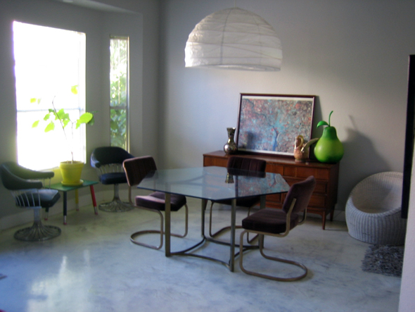
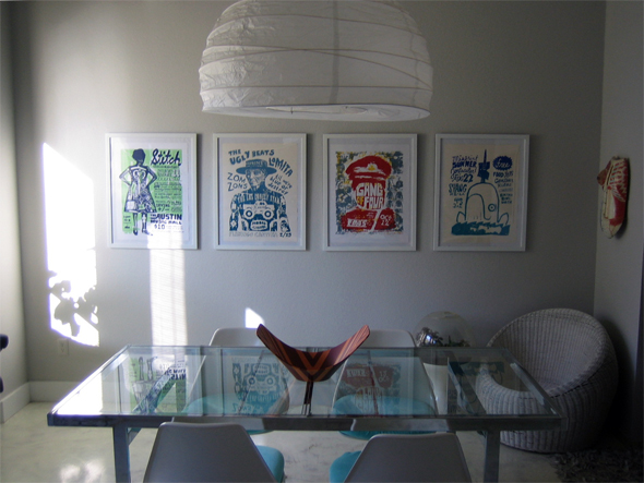
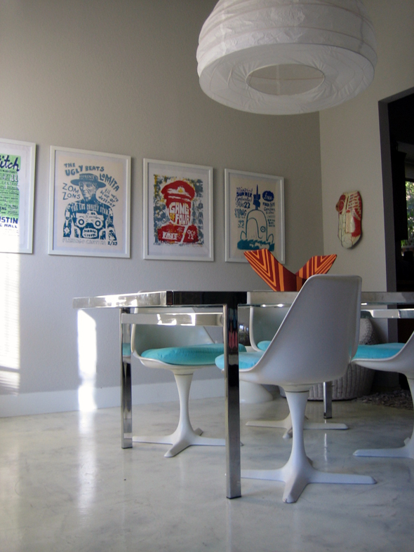
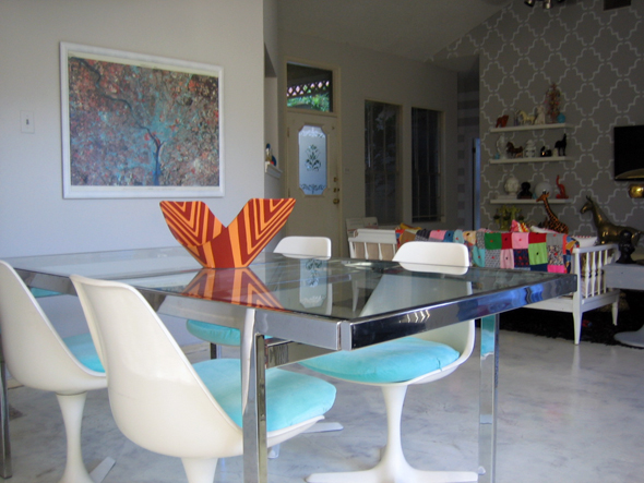
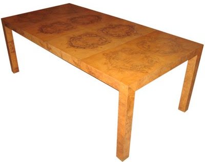
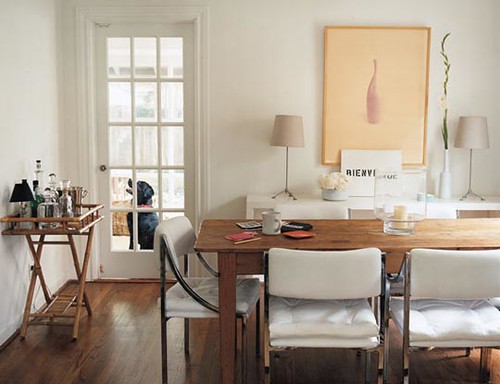
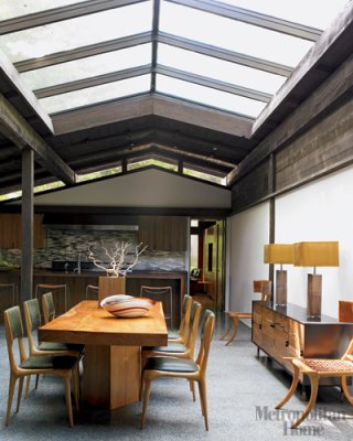
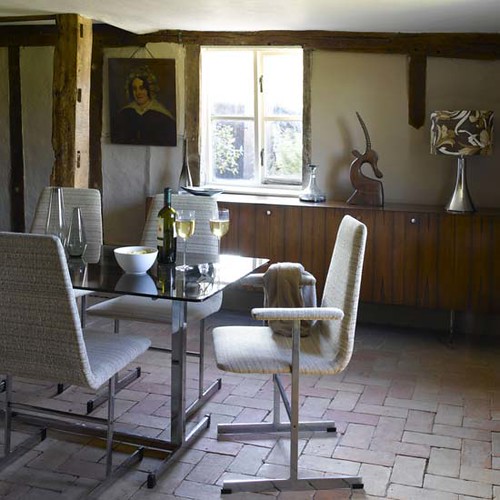
Hello, Design Crisis lovers! Wait, what are you called? ...Design Crisans? ...Citizens of Design Crisistan? Whatever you prefer. I am AB Chao, and I will be your tour guide here today. Here, have a visual aid:

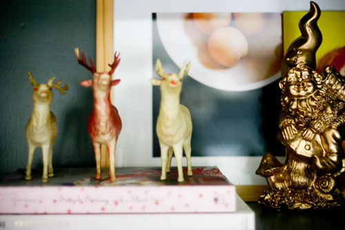
I am so excited to be here doing a guest post for y'all. Karly and Erin and I have a lot in common. For example, we love things that are gold:

and furry:

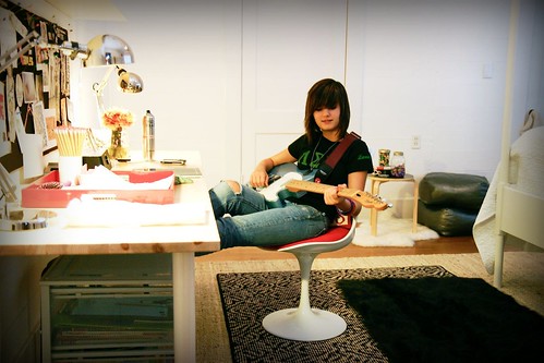
and sullen:

Oh, no, wait. I'm sorry, that's my 14 year old. Hi Madeleine!
It has been raining for approximately one hundred years down here in Louisiana. I am tempted to make a joke about a flood, but maybe it is too soon? I think so. Anyway, everyone is irritable and wet and absolutely no one's hair is cute, but do you know what always makes me feel better? Talking about me. More specifically, my house and the decorating of it.

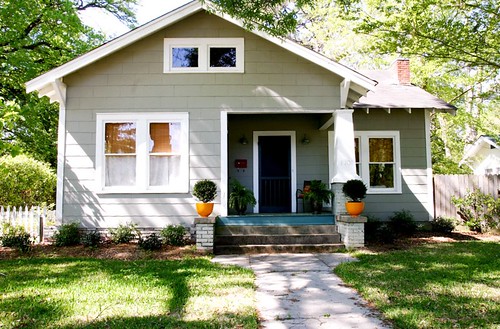
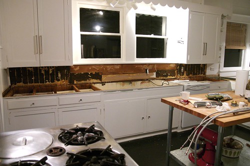
When we bought this place six years ago, it was cute, but needed work. (Confidential to the previous owner: Dear Kevin, I hate you. Thanks for "fixing" all that stuff. I hope your face falls off.) So we've been slowly updating, room by room. We started with the yard and garden, the results of which landscaping overhaul you see above. (I can't find any of my before pictures, sorry, but believe me when I say it looked like nobody lived here for 4 years.) Then we moved on to the kitchen:

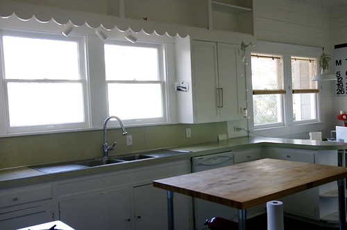
Aw. This actually gives me nostalgia, looking at that good old green Formica. I am pretty sure that it and the red Bakelite pulls were original to the house. Cute! But not cute enough to keep:

Oops.
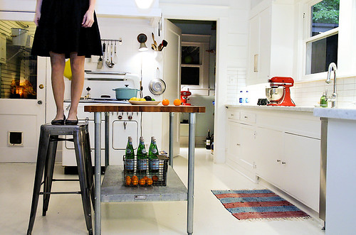
We replaced the Formica with (say it with me!) white Cararra marble, and covered the backsplash in 2" x 6" white ceramic tile. I painted the floor white my damn self, and had an electrician come in to change out all the light fixtures and add under cabinet lighting.

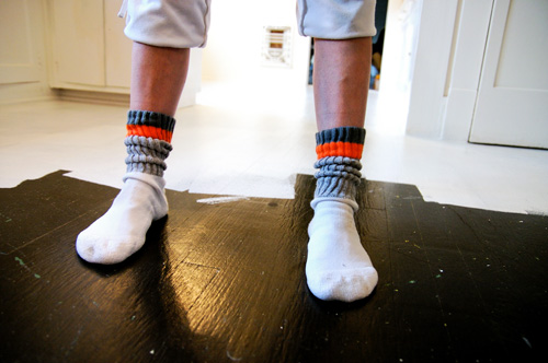
And then I stood on a stool and took one of many pictures of my own legs. I don't know. It's a thing.

And then an actual professional, my friend Lori Andrews, who consulted awesomely on this project over several million emails, came to visit from Canada and styled the room and took these incredible pictures. Here is one:

(Photo and styling, Lori Andrews, 2009)
So that was my first big project. All I knew when I started it was that I wanted marble on the counters, and for everything else to be white. I had no overall vision or endgame in mind. Each decision I made was the subsequent aftermath of some random decision I had made previously. Everything eventually fell into place and we ended up with what you see here. So, basically I am a genius. Just kidding. Basically, I am mildly retarded, but it all somehow worked out okay.
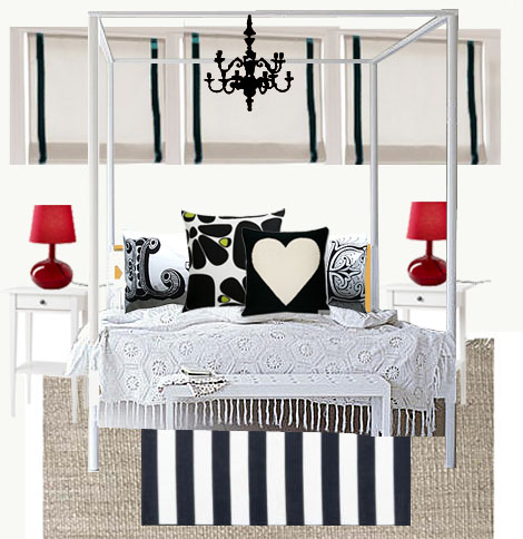
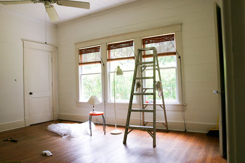
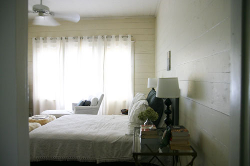
The next thing I wanted to do was overhaul Madeleine's room, and also, because it wasn't going to be hard enough, I decided that it needed to be a surprise. We pulled off this heist while she was at camp over the summer, and it was like a reality show ending: she cried, I cried, everyone was surprised, and we all took naps. And now, because I love you all very much, I'm going to show you my original, professionally Photoshopped plan:

I know. You're jealous of my skillz. Please note the "chandelier." Whee!

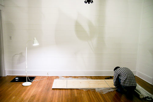
We cleared the room of everything, then painted walls, ceiling, doors. My long-suffering husband Vince refinished the floors like he was some kind of professional. I bought everything that was going to go in the room beforehand, and it lived in our dining room for two weeks. I regret that I didn't take a picture of that.

Post-painting and refinishing. Vince assembles one of the many, many Ikea products we purchased for this room OH MY GOD. I never want to see an Allen wrench or a Swedish person again.

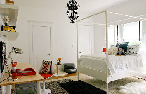
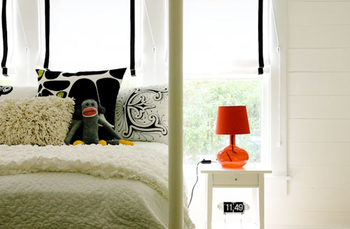
Almost all of the furniture and lighting is from Ikea, except for the chair, which is a Saarinen knock-off (what, do you think I am crazy? Who buys the real thing for children?), and the silver floor pillows, which are from Target. Bedding is Ikea, Lush UK, Crate & Barrel. The queen of hearts pillow is Jonathan Adler. Rugs are from overstock.com, Ikea, Bed Bath & Beyond, and (!) Walmart. The overhead light came with the house, and was ugly until I sprayed it black.


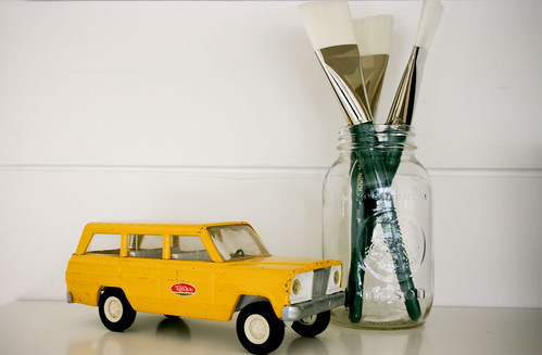
I think it turned out pretty well, even though Madeleine totally doesn't appreciate the vintage Tonka jeep I found on eBay, and I am going to be forced to steal it from her.
So...well...I was jealous, okay? After Madeleine's room ended up looking so pretty, I decided it was time for our own bedroom to get an upgrade.

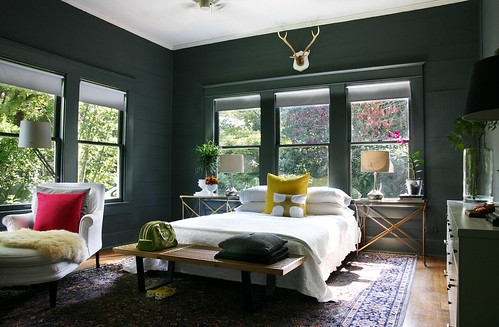
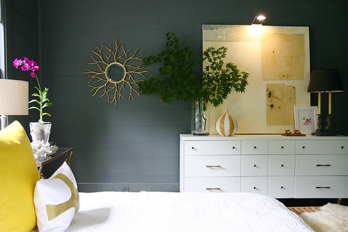
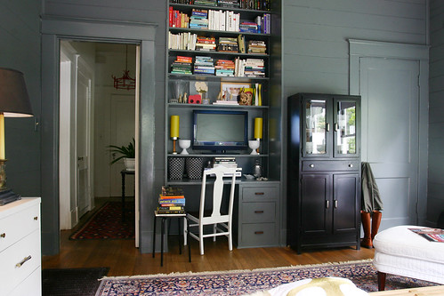
I had always been unhappy with our bedroom, no matter what I did to it. So obviously it was time for me to paint every single thing in it, including the windows and the bookshelves, a bold and dramatic color. Enter Abigail Ahern and her gorgeous, totally copy-worthy interiors painted all the same color of deep, dark gray. Helloooooo, Down Pipe.
All it cost was the price of a couple gallons of paint, a few paintbrushes, and MY SOUL.

I understand that these pictures of our bedroom have started a little mini-trend, but I am here to tell you, if I never see a gallon of Down Pipe again, it will be too soon. I absolutely LOVE the end result, but this color in paint form haunts my dreams. It makes my head hurt. It makes my eyes hurt. Take my advice, Internet, and hire a professional painter.

Oh, hey. What's up? Let's go win a Reader's Choice Award together.

I seriously already owned almost everything in this room, except for the antlers (eBay), and the toss pillows (handmade, Nate Berkus), and the sunburst mirror (a local store). Oh, and the orchid, which I bought at Lowe's (along with the roller shades) and which I recommend to everyone who wants to make his or her room look twice as styled as it actually is. Everything else was either already in here, or came from somewhere else in my house.

So that's it for now, Design Crisistinians. I hope you've enjoyed this little trip down memory lane as much as I've enjoyed showing you my house, and a bunch of sort-of-embarrassing "Before" pictures.
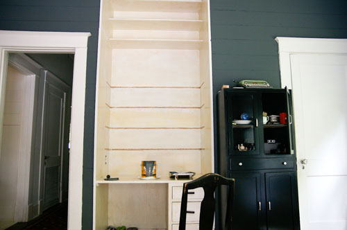
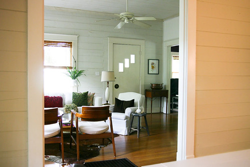
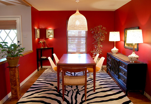
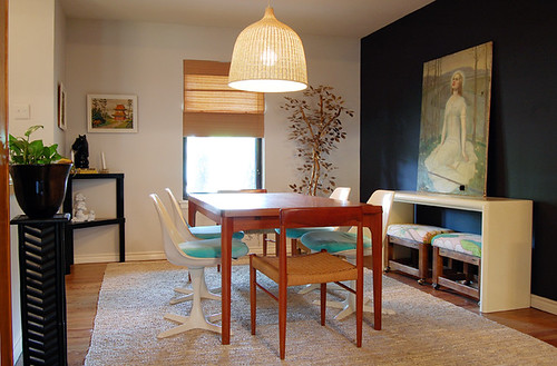
My next projects are still in the works, but I can give you a hint about what they entail. This room, which isn't so bad:

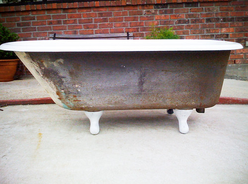
...and a room related to this object, which doesn't exist yet. Pray for me.

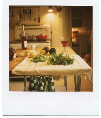
In the meantime, let's all go do something that looks like this:

That's right, I'm recommending you go make an arugula salad and drink wine.
I raise my glass to you, to elitist salads, and to good design always. So say we all!
(All photos by AB Chao except where noted)
