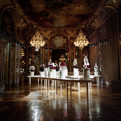
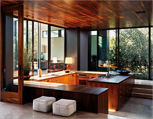
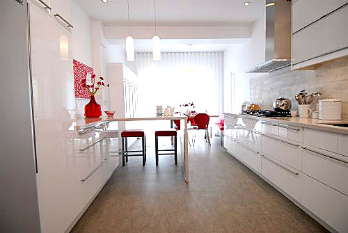
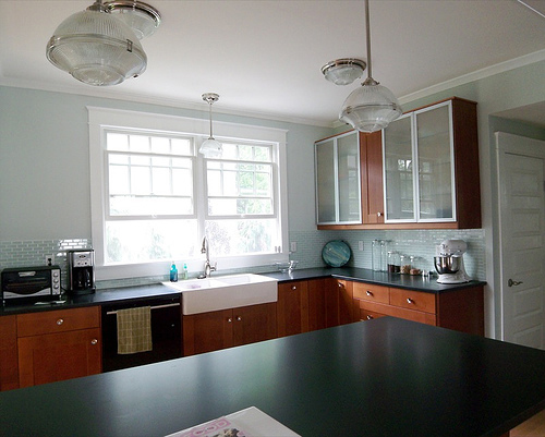
Thanks, guys. Thanks a lot. Because of you, we're planning to rip out our kitchen and replace it with this:

Sigh. Not really. I love this kitchen, but we'd pretty much have to raze the entire house and rebuild to get it, and Momma don't have that kind of cash (who does, these days?). But in all seriousness, because of your helpful comments on our first kitchen post, we expanded our $1000 kitchen "refurbishing" budget into... well, a hell of a lot more. I'll let you know the total damage when we do, and don't worry -- I plan to keep you updated every step of the way. Let's get started!
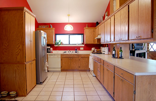
Here's a refresher picture for those of you who are scratching your heads in earnestness, trying desperately to remember what our hideous kitchen looks like:

Mmmm, the beautiful tile, the gorgeous plywood grain, the overhanging cabinets that bash your head in when you attempt to look into the living room, the hulking pantry, the cracked and stained formica... Yes, it was hard to decide what you hated most, so we're ripping it all out. All of it. Oh, and trust me, the cabinets are WAY UGLIER in real life. Paint ain't gonna hide the janky drawers, the gaps in between the ill-fitted doors that may or may not open all the way, or the weird filler pieces sprinkled here and there like plywood twinkies.
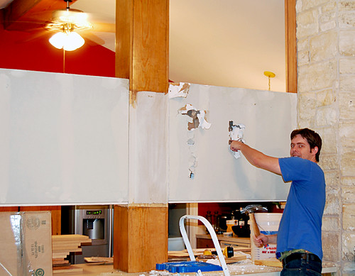
First thing was first: get rid of those overhanging cabinets that blocked the view to the living room (for more detailed pics, refer to the original post here).

Hunny Bunny to the rescue: the Berlin Wall is coming down, bitches! Ich bin ein Berliner, schweinehunds!
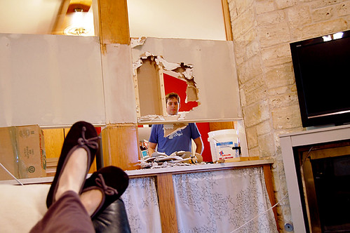
In case you were wondering, I was an integral part of the demo process:

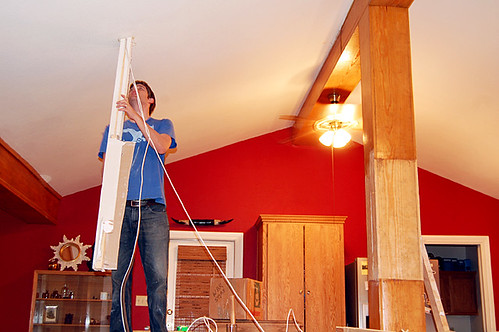
Almost done...

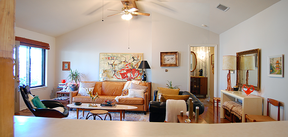
Awww... isn't he precious? So, let me tell you -- tearing watching Ben tear that wall up was the most liberating thing, ever. The ugly pine post is still unfinished, but I love the new sense of openness already, and I don't miss the cabinet space in the least.

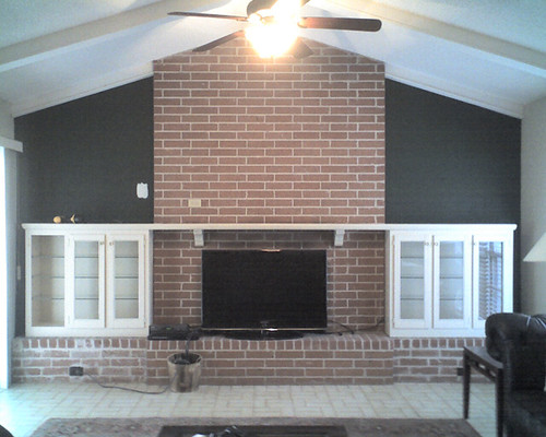
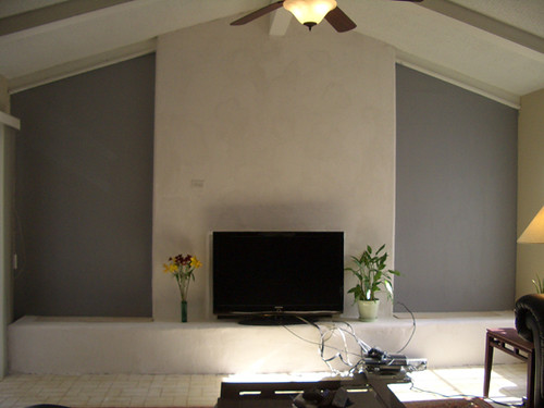
Yep, that's the (not actually that cluttered in real life) living room. Notice the post sans ugly cabinets on the left. Now if I could just get that back wall settled... oh well. One thing at a time.
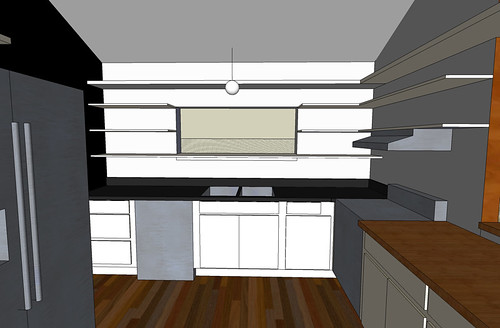
Ok, back to the kitchen. So here are some Google Sketchups that the Hunny da Vinci'd up for me:

Yes, we will be repainting. The window and stove walls will be the same pale gray as the living room, and the back wall will be black or some kind of a dark charcoalish color. Also, the post will be stripped of its hideous pine shell and dry walled to a (hopefully) smaller size. We will probably paint it white.
Unfortunately, as you can see above, Hunny Bunny went rogue a la Sarah Palin and added some wrap around beam that overhangs the bar area, and me no likey, especially because it makes the window area look cluttered:

Ugh. I really need three shelves for my dishes, and HB just can't understand why that extra shelf up top that is totally unreachable to 5' tall moi creates an ugly number. Can you help me out? So, here's the rest of our kitchen plan:
1) Rip out the fugly tile and run the same hardwood from the adjacent dining room into the kitchen. This is going to be a big nasty job full of sanding (our wood is unfinished and must be stained to match the old wood), but it's already scheduled for the end of the month, and the estimate is not too bad. Never fear, I shall blog the process and let you know how it goes and what it costs.
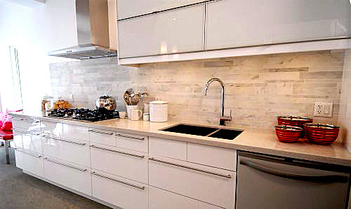
2) Rip the cabinet sea out and replace it with Ikea Abstrakt White lower cabinets that look like this:


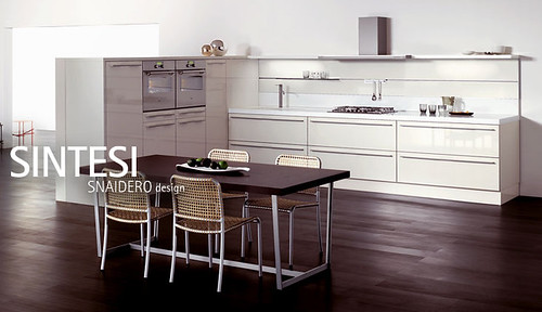
Oooh, shiny! I know there are some Ikea haters out there that will tell me I'm crazy for trading in my wonky plywood cabinets for particle board, but I did my research and I'm not concerned. Consumer Reports gives them a pretty stellar rating (not even considering the cost!), and I love that they come with swank Blum and Ferrari hardware. I have NO hardware except for pulls and outside mounted hinges on my current cabinets, and there's currently so much wasted storage it's pathetic. Also, there's a rumor circulating that Ikea's more contemporary cabinets are manufactured by super duper expensive maker Snaidero:

Like I said, it's just a rumor, but they sure look similar to me...
3) Karly's hubby Matt will help us build in another level to the peninsula so that we can have space to eat on the living room side. We're planning to use butcher block for the countertops on the peninsula since there aren't too many moisture issues in that area. Plus butcher block is cheap and pretty.
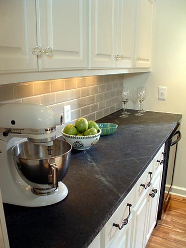
4) Soapstone for the counters on the sink side. Not sure if we're going to use tiles or slabs yet, but here's a picture of what a soapstone slab on a white cabinet with wood floors looks like:

Obviously our cabinets will be sleeker, but I think the soapstone is clean and minimal with a natural "grain" to it, and I like that it's matte and non porous. If we decide to do tiles instead, there's an awesome DIY post that will hopefully guide us through the process. The results look pretty amazing.
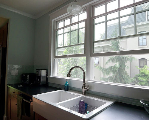
5) Replace the sink. Um, not sure what's happening here. We were looking at this farmhouse sink, seen in Jillian Frances' beautiful kitchen remodel:


Hers looks really pretty with dark wood cabinets, but I'm not sure it's the right style for the cabinets we've chosen. Also, will it chip and stain? Should we just go stainless instead???????? Help!
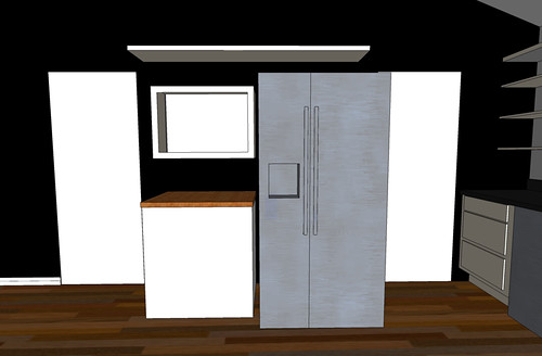
6) Deal with the wall of pain.

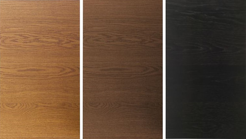
This was our plan, but I had an epiphany that we need a built-in pantry wall of cabinets between the two doorways that the fridge will fit snugly inside. I'm just not sure if I should use the same white cabinets on this wall... will it be too stark against the black? My other choices are wood slab Nexus doors from Ikea that range from light brown, medium brown to brown black.

If I weren't putting in wood floors, I would probably choose the lightest wood color, but I think it's way too close to my floor color. What do you think about the darkest wood color? Would it be strange with a black wall behind it, and gray/black soapstone counters? Should I just go with a monolithic white wall of cabinets, instead? Double help! It's super important since we stare at this wall all the time while sitting in the living room, now that our upper cabinets are gone.
Designer friends and readers with fabulous taste who first pushed me to accept that I need to tear my kitchen up and paint it black, you know who you are. As you can see I'm about to spend a crapload of money and I want to get this right. Help a girl out with the details, will you? You'll have my undying love, unless this kitchen renovation kills me first.
