One House, Three Magazines

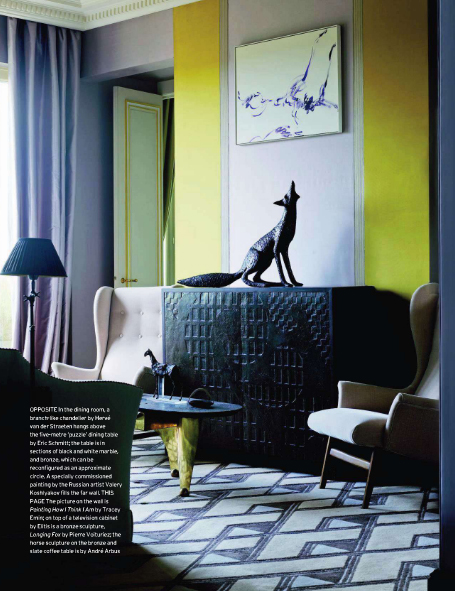
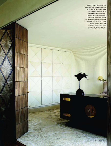
If you've already seen this place designed by Baroness Bruno de Pampelonne, that's because it has made its way around the interwebs courtesy of Vogue Living Australia. And AD Russia. And House and Garden UK. Obviously these magazines span three countries, but what I'm wondering is: who gets to decide what goes where? Is there some transcontinental decor convention where an ultra mega editor in chief (fashion, smashion -- it's probably still Anna Wintour) civilly metes out homes and schedules with a gilded pen? Or is it a global free for all, with every chief fighting for scraps like hyenas on a hunt... I prefer to consider the latter. With these thoughts in mind, please peruse a pretty pastel apartment -- now presented in 3D (that means via three magazines; sadly it does not mean you can reach out and pet the furnishings).
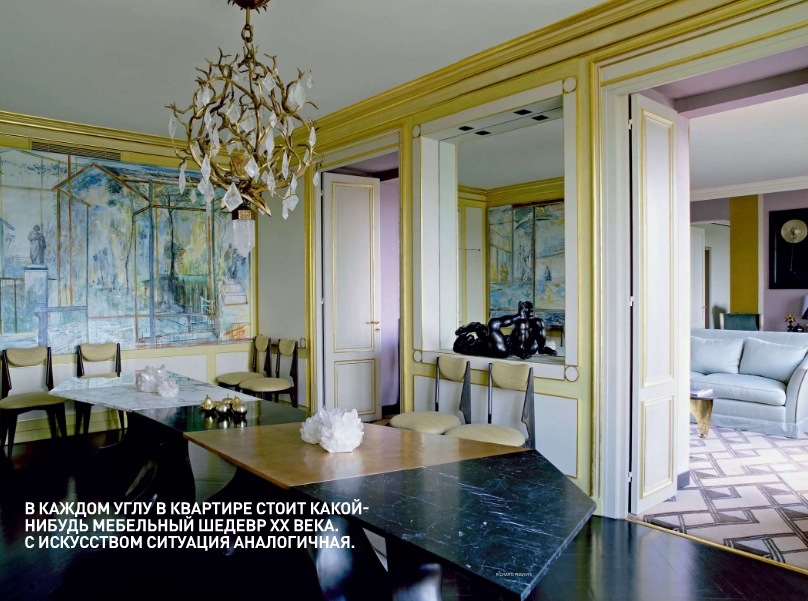
pastel house ad russia

Guess which magazine this shot is from...
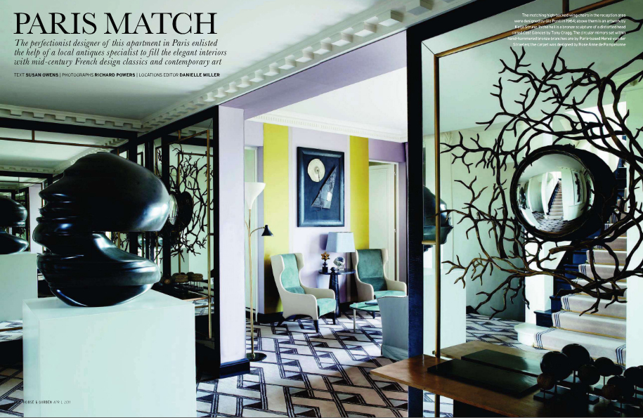
This one is from House and Garden, photographed by the inimitable Richard Powers. So does that mean all the pictures are by RP and other magazines just pay royalties to use them?
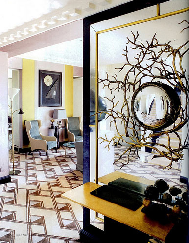
paris pastels

This ran in Vogue Living, and it's a totally different picture (not just a crop of the same image). Still looks like the same shoot, though.
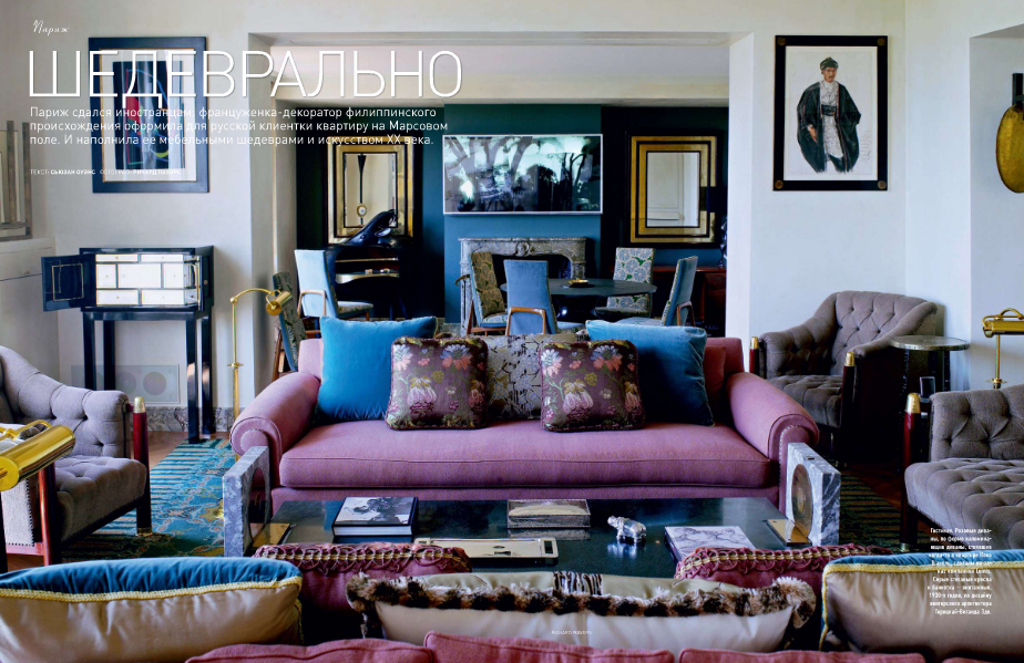
russia ad paris pastels

Whatever. I hate purple (it makes me look like death, and who wants to look like death in the comfort of their own home?), but this house is lovely in every magazine.

lalanne

Let's tour the entire pad is all its Lalanne bedeco-ed glory.
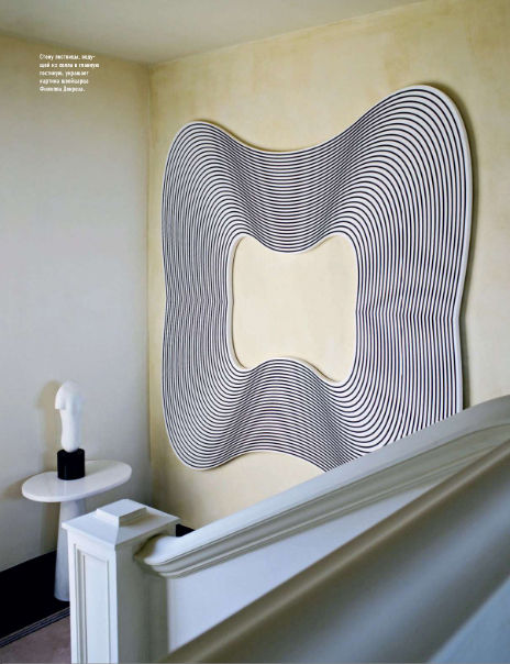
pastel house paris

The color palette kinda takes the southwestern sting out of that howling coyote, right?
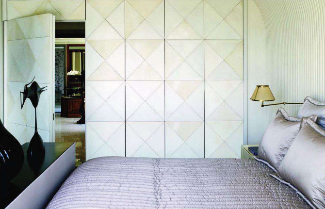
Holy amazing wall details!
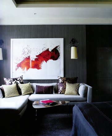
This room is a dark little unexpected gem. Lust.

That's it for the tour. Maybe someone out there can explain how the entire decor magazine industry functions, all within the span of a blog comment.

Or maybe we can just enjoy the pictures, however they come to us.

[Photos via AD Russia, House and Garden UK, Vogue Living Australia, Eye Spy, Habitually Chic]
Secret Lover

Confession: another website has been stealing me away, but I'm stopping by our special happy place for a few minutes today, just to say that I still love you. Don't be mad, baby. Let's have a three way.

erin williamson

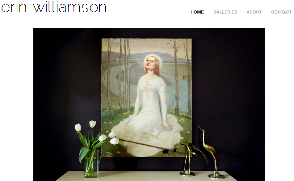
It's my new interior photography website! I'm still tweaking it (and will probably never stop tweaking it), but erinerinerin.com is finally up and running. Did you just say that is the most amazing site name ever? You can thank gin and Karly for that one.

Click on that link right now and tell me what you think. Lazy people, feast your eyes on picturez:

Dudes I am tired x infinity, plus I'm leaving on a jet plane early tomorrow to see my baby sister graduate from college this weekend (yay!), so I'm going to cut on out of here.

I'll try to stop by tomorrow, but if I don't make it have a supercallfragelisticexbealladocious weekend!

Color Me Rad

Here are a few things you should know about me: 1.  If I were to start a '90s tribute band it would be called Color Me Rad 2.  I'm not ever going to do that and 3.  I am writing a post about color today so my witty wordplay won't be lost on my own inner monologue.  You're welcome. In gearing up for today's post I found myself drawn to photos filled edge to edge in big, bold color.  While I'm most definitely steering my home decor ship into the land of neutrals, I still can't help but swoon when confronted with big bright pattern thrown right in my face.  Let's look, shall we?

Honestly, I don't even know what this is.  I'm sure one of you out there does.  Tell us, won't you?  For now I'm just glad to know someone had this idea and made it happen.

via

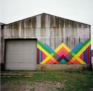
I think what I love most about this barn (as with the image above it) is the bright color splashed against a dreary backdrop.  The interest lies in the contrast.

Via

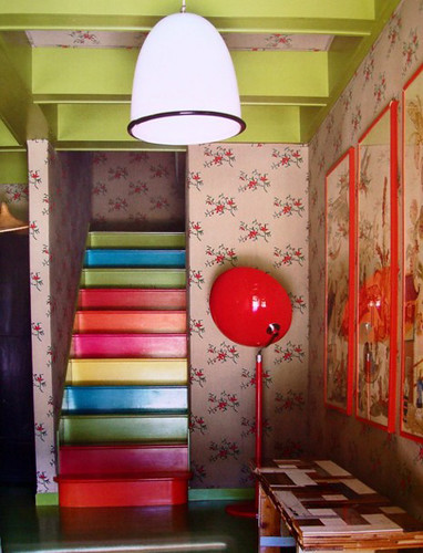
Of course, color against color is pretty great too.  I especially love the little house on the prairie floral mixed in.  And apparently it's audience participation day here as I'm about to ask you dudes what the hell is happening with that magic light over there?

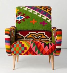
My affinity for beaded African seating continues.

via

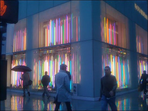
Colorful neon bars hung vertically say "hey, neon isn't just for Miami and you're going to like it." Now, let's get some Laura Ingalls Wilder Wallpaper up in this joint and we'll be good to go.

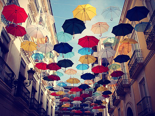
These photos by photographer Alain Delorme pretty much rock my face off.  Why didn't I just make this whole post about him?  Expect to see him again, be prepared to act surprised.

We will not be making any Rianna references here other than to say that there will be no Rianna references.  This photo is dope and it doesn't sing through it's nose so, win.

And there you go.  There was color, it was rad.  You know what it did.