Non Committal

Yesterday I may have come across as a little... wound up. Well I still am, but I'm also trying to relax so we can make a clear headed decision. This weekend it seemed we may have two houses to choose from, and then we had one. And then we flip flopped back to the other one. And now we have neither? Who knows... maybe tomorrow we'll be back to considering both. The problem is that Austin is suffering from growing pains. Excellent schools are probably being closed due to budgetary constraints. New schools may be built elsewhere.

Traffic has been rerouted to flow through neighborhoods we like, and a giant highway flyover may be constructed right behind one of the houses we fell in love with. Or maybe it won't. Should we gamble?

Thanks for listening, dudes. And for chiming in with your comments. Can I just tell you that I'm emotionally drained?
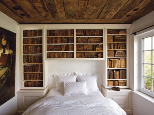
Right now this is all I dream of. Curling up in a fluffy white cloud and reading a classic novel -- perhaps some Anna Karenina -- would definitely put things into perspective for me.

At least none of the houses we're considering are near a train.
[Head Over Heels]

Reader Help: Calling All Restoration Experts (That Means You)

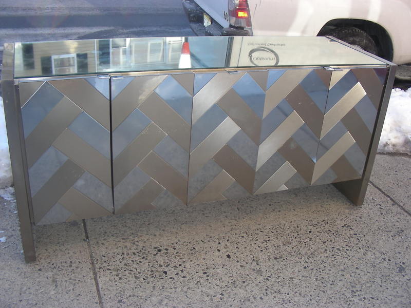
My new virtual bud and soon to be Austinite Rosie just sent me an email brimming with urgency, and when I saw the item in question my head almost exploded. Check it:

"Looking for some sound advice: I bought the attached chrome/mirrored sideboard on Ebay, and was chagrined to find that the seller left out some condition details: there's a light coating of hardened schmutz in various spots on the doors (Actually somewhat visible in the pic). I tried to scrape it off (bad idea) and am considering Goof-off, but am nervous about using it. Any other ideas?"

First of all, ZOMG! Did you really just buy that? Because I feel like it should belong to me...

It sure looks a lot like the mirrored credenza in one of my favorite rooms of all time, designed by Laura Day. I also feel like I have seen this beaut in another prominently featured interior, but I can't remember where... if you know what I'm prattling on about, send me a link and I'll post the pic. You will also receive my eternal gratitude for rescuing me from an Alzheimersish haze.

Ok, back to the matter at hand.

So I am having issues focusing on Rosie's request for help because I can't see through my angry tears of envy, but I'm going to try my best. First of all, do not scrape! The surface is fragile and can be scratched. Rosie says that the goo is mostly on the chrome parts, so she might have luck buffing it out with a balled up piece of foil, but I'm not an expert.

I know several of you out there have knowledge in this area, so if you know how to return this gorgeous hunk of bling to its pristine glory, let us know.

Meanwhile, I am going to try to figure out how to steal something for which there is no known location...

Rosie, maybe you better not move to Austin, after all.

Architectural Digest Gone Wild!

Will you think less of me if I admit I'm a bit of a shelter mag virgin? Sure, I've been blogging art and interiors for going on three years now, but until recently I depended on the internet for my resources. Thanks to a generous holiday gift, I am now the proud owner of AD and Elle Decor subscriptions. I'm sure trees everywhere are throwing up their branches in disgust, but what can I say? I'm addicted to the glossies already. So I was pretty stoked to get AD. I mean, Margaret Russell at the helm = instant awesomeness, right? Well, my January issue arrived and I was bewildered. The February issue arrived and I was confounded. As it turns out, the current issue is the first with La Russell's indelible mark. So now the March issue has arrived and I've been full on flashed by naked drunken boobies -- metaphorically speaking, of course.

That's not a bad thing. I like boobies.

Heiress and tastemaker Daphne Guinness' New York apartment almost warrants two black bars to cover up the naughty bits. Guinness maintains her space combines, "the shine of Metropolis... with the lush flora of Suddenly, Last Summer... a sort of savage modernism." I have to say that I sort of scratched my head at her apartment until I read that sentence, and then everything just clicked into place for me. I won't post the rest of her home, but you can see it over at 2THEWALLS (a seriously fantastic blog).

Beyond the types of projects featured this month (a glorious home designed by Commune, among them), the biggest change that stands out to me is the photography. I swear, AD homes always looked like nothing so much as mausoleums, darkly photographed using only artificial light. Downright dead and dull.

With Thomas Loof on duty as principal photographer at Guinness' shoot, and the inimitable Francois Halard at the helm of Pierre Passebon's wild and wacky pad (designed in collaboration with Jacques Grange, no less), things are looking a lot brighter. Alive, even.

RIP, old AD. Boobies in your face.