About a month ago I promised you that I would spend the rest of my time as a design writer waxing poetic about Spanish design super star, Jaime Hayon. Never in a million years did I ever ever foresee this post. Let us start by reviewing a bit of his work thus far:

ok, so we're all on the same page here: this man is an insane design genius. (counter clock-wise from top left: The Restaurant La Terraza del Casino, Swarovski cabinet and chandelier, Prive ceiling and Green Chicken). Since 2004 he has been collaborating with Dutch photographer, Nienke Klunder. Klunder's self portrait sequences genuinely leave me asking for more in a world otherwise completely overrun with photography series. Ici:

From the Happiest Celebration series
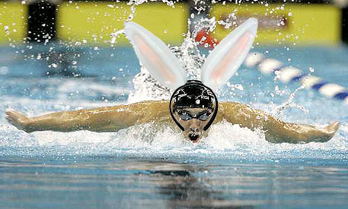
This is easily the best series of photographs ever created at any Disney greater metro area. I want to cry right along with you, sister. Those ears are to die for!
So, after reviewing the above, one would be lead to believe that the love child of such immaculate artists could only be the purest image of perfection. Upon hearing about new fabric line I was hoping to see the work of a 21st century Charles and Ray, instead it was a bit more John and Yoko:

WTF? no, seriously, what. the. fuck? Are you kidding me Jaime and Nienke? I feel so, the emperor has no clothes. Is this some sort of inside joke / test to all of us loyal followers to see if we really will fall for any Hobby Lobby knock-off you throw out into the world? Well, it's not funny and I'm not falling for it. I still love you both enough to adore every last thing in each of your personal portfolios, but this is just plain silly.
The """colaboration""" is entitled Serious Fun and was produced for furniture manufacturer Bernhardt Design. I understand that the artists were limited to work within the Bernhardt aesthetic, and that they wanted to create a fabric that would not just be a flash in the pan, but a bit of a flicker would have been ok, this is just plain, well, plain. More, if you can stand it:

oh, wow, blue and red? Maybe this really is the greatest fabric ever?! No it's not.

Jaime and Nienke outshining their lame fabric.
If you haven't sworn off our blog forever after posting such horrid pics, and you can actually stomach more, here's what the designer's had to say for themselves:
" This textile collection for Berhardt Design aims to bring a fresh and exciting input to the fabric world. We started to create funny fresh patterns, and using colour combinations which were just a bit more daring. Colour was the key, Basta with the browns, greys, green greys, blue greys and beiges!"
There is an exclamation point after the word beiges. beiges! Wrong, wrong, not ok. What does all this mean? Fresh, funny, daring color, color was key? As opposed to all other textile design where what I had for breakfast was key? Oh, how revolutionary, they decided to let color be the driving force. Genius! And the breathtaking use of blue and yellow next to each other is astounding, who ever knew that complimentary colors would compliment each other so beautifully? Bravo!
This fabric is lamer than the selection at Rowe furniture in 2001.
Ok everyone, am I just missing something here? Is this like one of those 3-D mall paintings where, if I look at it long enough a satanic robot will leap out at me? If so, I could almost begin to like this fabric but I would never ever let it in my house.