Kitchen Porn Stars

I desperately want to tell you about all the exciting! plans! I've cooked up thanks to your comments for our kitchen facelift, but I'm just way too sick. We're on week a million of the bubonic plague and I kind of want to shoot Little Orphan Annie in the head for even suggesting that the sun might come out tomorrow... I really don't want to get my hopes up. Because most likely we're in for another month of snot and misery and it's best to look a bleak future square in its runny face and get on with it.

Honestly the entire situation wouldn't be so bad if only I had some good tv to watch. I feel like I've seen EVERYTHING. Suggestions?

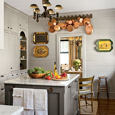
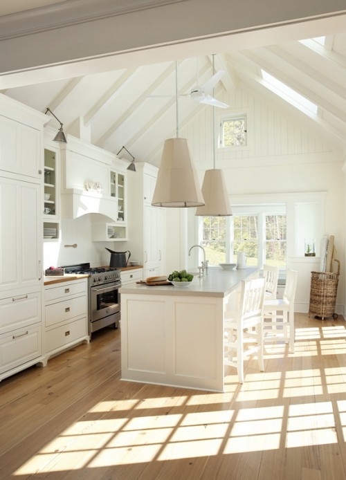
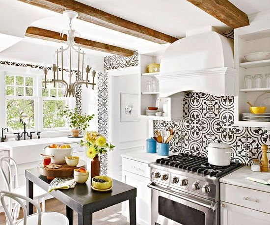
Anyway, sorry for dumping pink eye all over your day. Here are some toe curling good kitchens that have interesting, daring design elements. Hopefully they will be enough to get me off your naughty list.

Next up: wood kitchens. Who's with me?

[pinterest]

The Soffit on My Ceiling is Definitely Concealing a Load Bearing Beam, Which Makes me Want to Scream

Kitchen renovations have entered a mystical -- dare I say Seussian -- territory. I was pretty pumped by the surfeit of AMAZING comments on my last post, and fueled by renodrenaline I tracked down link after glorious link. Man, some of you are pretty freaking talented. And all of you have fantastic taste. I loved so many of the cabinet combos and layout suggestions you offered, and I promise we shall discuss them ad nauseum very soon.

But first, we must deal with this:

Oh yes. It's true. There are two 2x12 load bearing beams stapled together in that god forsaken soffit. Hell, let's call it what it is: a tray ceiling. The entire thing save a wee punch out in the center is dropped down to seven feet. As far as we can tell, the beam is the only thing that stands between us and gloriously smooth eight foot ceilings that rival an angel baby's bottom. But there it is, and it can't be moved.

Ben and I are going round and round about this... I don't want to address the cabinets and not bust out the soffit, because I want to raise the uppers and build the floor to ceiling cases up to the (hopefully) new eight foot ceiling. But he keeps pointing out the expense, the mess, and the MF BEAM, and contends it's not worth removing the soffit.

The whole thing is stressing me out and making me wonder if Stage One should be the floors instead.

It's come to Jesus time, people. Am I crazy? Should we leave the dropped ceiling in there? Is it worth a thousand dollars, a mess, and possibly more drama (pipes? other beams?) to raise the ceiling when the beam will still be there?

I keep bringing up our old house to make the point that our dining room would have been horrifying with seven foot ceilings. And that maybe we could turn the beam into some kind of architectural detail? (Aside: I am seriously missing our old house right now. Too bad it was in hobo town.)

We don't have room on the sides next to the cabinets to build out anything too boxy, but I was thinking maybe some glossy trim that tied into the upper creamy cabinet color might work? Yes, I see that there is still some kind of soffit in that room... Ben would be perfectly happy to move the soffit back to the cabinet line.

But I really want the whole thing gone. Perhaps a minimal wood facade would tie into our future light oak floors?

Love this, don't think we have the room.

Not the best picture, but it looks like this kitchen has a beam on top of drywall maybe?

Or maybe we should just do drywall, perhaps with some arch at the corner, and trim the ceiling with thin molding? Would that look weird on the dinette side of the room, where there's no cabinets or crown molding?

Oh, and there's a soffit on that side of the room that hides the roof edge. Awesome!

(ps: the pink is getting axed asap. pregnant women should never choose paint colors. also we are getting a new dining set.)

We could always straight up drywall the beam in and paint it ceiling white.

Or maybe we should build a box out on the dinette side of the room to house some electrical, then hang lights from it?

Ok, HELP. Please.

The beam is literally blocking the path to renovation.

Should we knock out the entire soffit, or do we keep a dropped ceiling that is ugly but perfectly drywalled and functional?

Or maybe we just push the soffit back to the cabinet line?

If we knock it all out, how do we finish the beam? The devil is in the details, y'all.

Thanks. I love you forever and I promise to come back to cabinet colors soon.

[pinterest]

Am I Going to Hate My Kitchen Cabinets if I Don't Paint Them White?

We're finally embarking on a kitchen redo! I talked Ben into doing it all... but in stages. Stage One will address the ceiling and cabinets. Stage Two will demolish the fugly floors and replace them with natural oak. Stage Three involves jackhammering out the counters and backsplash and sacrificing them to the Milquetoast Beige Overlord. Then I'm thinking white quartz counters and simple carrara backsplash.

In the interest of moving Stage One of our kitchen renovation forward, we priced out midgrade Ikea cabinets and they came in at over 5K. I have to admit I was a little surprised since we did our last kitchen in the most expensive Ikea cabs for less. Luckily the current cabinets are more functional and of better quality than the last setup, so we're going to work with what we have.

Where was I? Anyway, this whole time I have been planning something dramatic in terms of color for the kitchen... something not all white. Partly this is because my floors are revoltingly beige (for now), but also because I think painted white cabinets often scream HEY I PAINTED MY UGLY DATED OAK CABINETS.

two tone kitchen
two tone kitchen

Low contrast two tone.

High contrast two tone. Both good, just different.

I'm resurrecting the two tone plan for our cabinets. I do love a white kitchen, but I think painting a darker hue on the lowers will break up the sea of cabinets, while painting the uppers light (but not blindingly so) will help to open the back wall and let it recede somewhat.

I mean, if you have fantastic cabinetry and glorious kitchen architecture that you want to highlight, then by all means paint it white.

white kitchen
white kitchen

Yes! I mean, there's really no need to gild the lily here.

No.

And my kitchen is only slightly better than the one above. Let's review:

Yikes. And guess what? It looks worse in real life.

I was really hoping a two tone look would break up the oak acreage... but now that it's time to choose a color I'm second guessing myself.

We plan to live here for a decade, probably. When it comes time to sell, will I wish I had just painted everything white? Will I be sad that I chose some shade of gray for the lowers, because gray is sooooooooo 2010?

All of the pro color blogs are drilling the WHITE WHITE WHITE kitchen mantra into my brain.

But I just don't see all white kitchen cabinets looking good in here unless I rip everything else out and go mega snazzy on the backsplash to help distract from the cabinets, like this:

load bearing beam
load bearing beam

And that won't look dated at all in 10 years.

So what do you think?

Are white cabinets the only way to go?

Will the two tone look date quickly?

What about gray?

Tired, poor, inquiring  minds need to know.

[images via pinterest]