About a year ago, just after this blog was born, I wrote a post about one of my favoritest hotels ever ever. Because I celebrated my independence a week bit too hard this weekend (thank you house of slappy for your mad party throwin skillz) I've decided to repost it today. Enjoy and I promise all will be back to normal tomorrow
****
You know, Belinda Carlisle really sang her way right into my heart with all her talk of vacation business. Do you think that the missing verse to that song mentioned anything about well appointed hotel rooms and amenities up the wazoo, like pillows of varying firmness upon request? I certainly like to think that the Go-Go's would not have been willing to spend said dream vacation traveling across the hot desert in an un-air-conditioned car with nothing but a Howard Johnsons on the horizon. Gross.
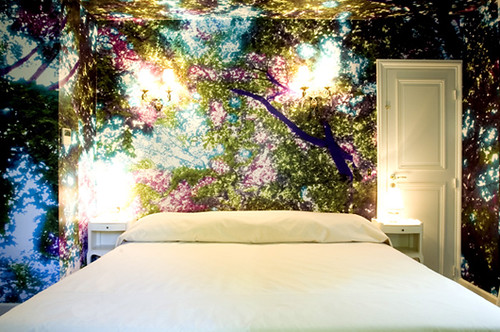
I digress, the point is, I want to go on vacation, I want to go to the Hotel Particular, and I want to steal every last gold leaf accessory in sight. Behold:

I know, right? Do I really need to write a paragraph about how this wallpaper is the most mind blowing thing you've ever seen? Do I need to point out that the sconces and table lamps make the forest look like it's glowing and only magnify the already awesome dramatic silhouette? Do you really need little old me to tell you that the uber-minimalist crisp, clean linens are the perfect counterpart to the most perfect wall decor ever? I didn't think so.
I will tell you that this room was designed by Martine Aballéa, an American artist working in Paris.
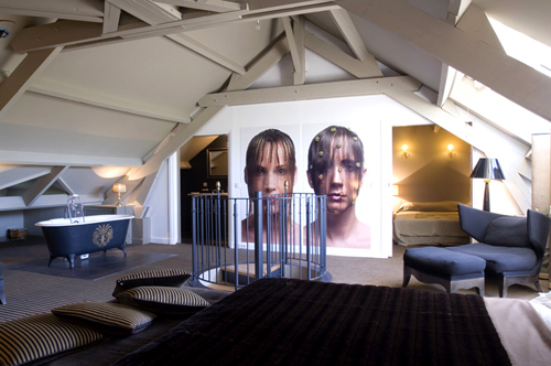
You probably think that I blew my wad on the first picture, but just you wait.

ta-da! Artist and photographer Natacha Lesueur thought it would be the coolest thing ever to put gigantic glowing portraits on her suite's wall and I agree. I showed this picture to Matt awhile ago hoping he would rush out and buy a large-format camera for this very purpose. Funny thing, he didn't like the idea at all. Does anyone know a good divorce attorney? I mean, did he really take a good look at this room? Maybe he thought our space wouldn't look as nice without the spiral staircase in the center of it all. He would have had a point. On a side note, I've always loved the idea of a free standing bathtub in the bedroom. No, I've never been one for practicality.
More:

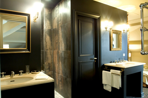
When you're done bathing in the bedroom, you can cruise on over to the bathroom proper and adore the black and gold walls while brushing your teeth and using the bidet.

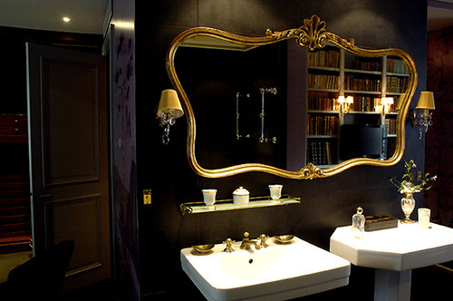
Another black bathroom. This place is rocking my world. I usually hate pedestal sinks (where do you put your stuff? I guess I am practical sometimes) but this one is great because it has that other pedestal dealie right next to it for storing said stuff. And it's a different shape, even better.
If you want to mingle with the other guests, here are some public spaces:

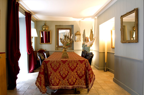
When I first saw this picture I thought that crazy giant angel was the coolest thing in the room, then I decided that the heavy red drapes might trump the crazy cherub, finally I came to my senses and realized that the crown over the mirror is the greatest gold accessory I've ever seen. I really want to store it right next to my crunk juice goblet.
Still feeling social?

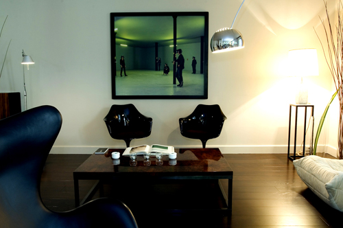
I will give a dollar to anyone who can tell me what is going on in that photograph above the stunning black tulip chairs. I will give four dollars to anyone who will bring me the chairs.
Did you spot an American tourist in a starter jacket and need to race back to your room? Go to this one:

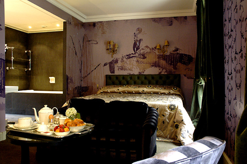
Purple and gold... so regal. I could wear my gold crown from the breakfast room in here! I have to admit that the distressed scribbly wallpaper is a little 2004, I bet I'll like it again in about 12 years, which works out great as I will have finally saved enough Euros to book this room by then. (room designed by Pierre Fichefeux)
**Ok, everyone, this is important: I want you to take a good look at the photo I just showed you. Did you note the incredible gold bathroom? Yes? Got it? Listen to this: I painted my master bath in my last rental in the most luxurious (and insanely expensive) metallic gold paint. Floors, ceiling all of it. My landlord liked it (it was just a duplex not an apartment) he kept it when I moved. BUT the, ahem, stylish, girl who moved in after me is painting over it. I am so grossed out. I'm tempted to cut out all the UK magazine articles I've been reading about gold walls and mail them to her with a threatening letter. Seriously, what is she thinking? I bet she paints it beige. yuck! yuck! barf city!**
sorry. back to the hotel.
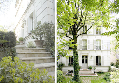
Incase you're as in love with this hotel as I am and you want to find it, here's what to look for:

so cute, right? I couldn't find any information on the building, but I'm guessing it was originally a home built forever ago, like everything else in Europe. Go there, let me know what it's like, bring me back a little scrap of wallpaper.





.jpg)
