No Mercy

I just finished watching The Diving Bell and the Butterfly, a movie about the former editor of Elle magazine who was paralyzed by a massive stroke at the tender age of 42. It was such an amazing film, so luminous and unexpected, that I was curious about what other projects director Julian Schnabel might be currently involved in. I already knew he was a famous painter and respected film maker -- having seen Basquiat I was expecting great things from his latest movie and I was wholly undisappointed -- but I didn't realize that he had also extended his creative pursuits to interior design. Now I know hotels are usually Karly's forte, but since I'm nursing a mental crush on Schnabel, I thought I'd check out his take on the newly renovated Gramercy Park Hotel in New York:
gramercy

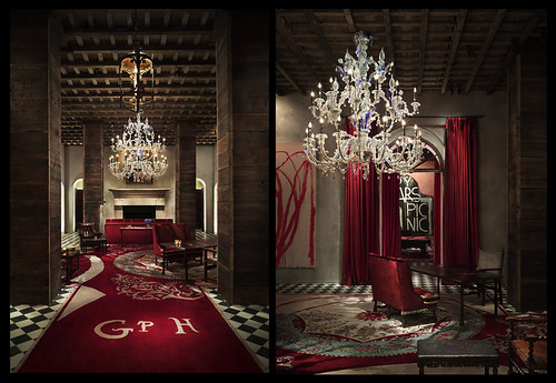
Is it just me, or does the (grand) entryway look like it belongs in a Harry Potter book? I think it's the script on the custom designed carpet... I have to admit I've always wanted a checkerboard floor, though.
gramercy

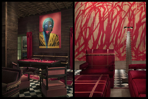
Here's a better look at the hotel's art collection which rotates some pretty heavy hitters. Although I'm not familiar with the particular pieces, I'm pretty sure that's a Warhol on the left and what must be a Cy Twombly on the right. Schnabel also included several cast bronze pieces he made, including that creepy Beetlejuiceified lamp.
gramercy

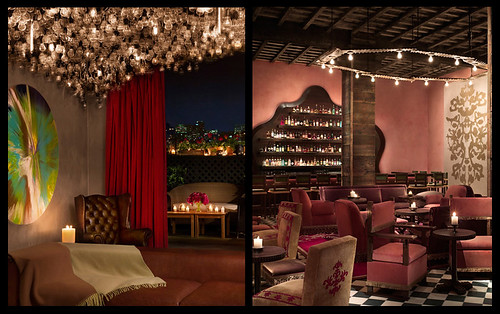
There are plenty of bars in the hotel, which suits the decor well since bar design seems to lean toward the theatrical anyway. Of all the rooms, I think these two are my favorite. The Damien Hirst spin art painting on the left is a great counterpoint to that amazing pendant light display and the red curtains, and I love the pink walls with the gold Warhol Rorschach painting on the right. The Beetlejuice bronze definitely looks better as a chandelier than as a floor lamp.
gramercy

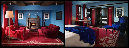
The rooms themselves are a little... different. Instead of relying on art as decoration, they almost look like paintings themselves. This suite is very Vermeer, I think.
gramercy

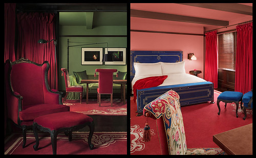
The penthouse is similarly jewel toned, with extremely bold color choices. I wonder what it would be like to actually sleep there, not that I'll ever have cash enough to find out.

When talking about his paintings and films, Schnabel claims that he's "aiming at an emotional state, a state that people can literally walk into and be engulfed." It's funny that his movies, not tactile in the conventional sense, do exactly that, but that his hotel seems superficial in comparison, despite its obviously tactile and luxurious environs. I think it's a little cartoonish, sort of like Disney meets the Whitney Museum, and that it misses much of what makes his films and paintings great: a sense of scale and proportion, a willingness to mix real with surreal, and enough grit to take the shine off the decorative.

What do you think? And I being to hard on my new hero? Does adulation always doom the adored?
Vacation all I ever wanted

You know, Belinda Carlisle really sang her way right into my heart with all her talk of vacation business.  Do you think that the missing verse to that song mentioned anything about well appointed hotel rooms and amenities up the wazoo, like pillows of varying firmness upon request?  I certainly like to think that the Go-Go's would not have been willing to spend said dream vacation traveling across the hot desert in an un-air-conditioned car with nothing but a Howard Johnsons on the horizon.  Gross.   I digress, the point is, I want to go on vacation, I want to go to the Hotel Particular, and I want to steal every last gold leaf accessory in sight.  Behold:

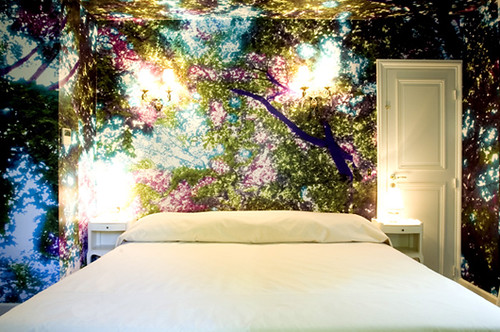
The Vegetal Room

I know, right?  Do I really need to write a paragraph about how this wallpaper is the most mind blowing thing you've ever seen?  Do I need to point out that the sconces and table lamps make the forest look like it's glowing and only magnify the already awesome dramatic silhouette?  Do you really need little old me to tell you that the uber-minimalist crisp, clean linens are the perfect counterpart to the most perfect wall decor ever?  I didn't think so.

I will tell you that this room was designed by Martine Aballéa, an American artist working in Paris.  

You probably think that I blew my wad on the first picture, but just you wait.

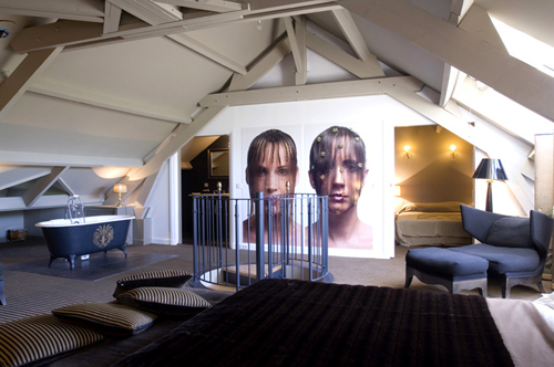
Hair Curtain room

ta-da!  Artist and photographer Natacha Lesueur thought it would be the coolest thing ever to put gigantic glowing portraits on her suite's wall and I agree.  I showed this picture to Matt awhile ago hoping he would rush out and buy a large-format camera for this very purpose.  Funny thing, he didn't like the idea at all.  Does anyone know a good divorce attorney?  I mean, did he really take a good look at this room?  Maybe he thought our space wouldn't look as nice without the spiral staircase in the center of it all.  He would have had a point.  On a side note, I've always loved the idea of a free standing bathtub in the bedroom.  No, I've never been one for practicality.

More:

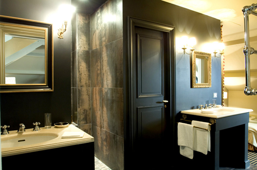
Hair Curtain Bathroom

When you're done bathing in the bedroom, you can cruise on over to the bathroom proper and adore the black and gold walls while brushing your teeth and using the bidet.

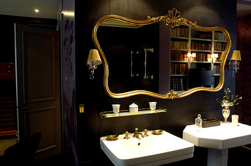
Bath 2

Another black bathroom.  This place is rocking my world.  I usually hate pedestal sinks (where do you put your stuff?  I guess I am practical sometimes) but this one is great because it has that other pedestal dealie right next to it for storing said stuff.  And it's a different shape, even better.

If you want to mingle with the other guests, here are some public spaces:

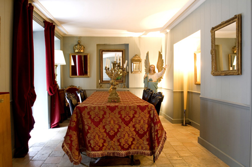
breakfast room

When I first saw this picture I thought that crazy giant angel was the coolest thing in the room, then I decided that the heavy red drapes might trump the crazy cherub, finally I came to my senses and realized that the crown over the mirror is the greatest gold accessory I've ever seen.  I really want to store it right next to my crunk juice goblet.

Still feeling social?  

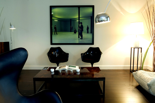
social room

I will give a dollar to anyone who can tell me what is going on in that photograph above the stunning black tulip chairs.  I will give four dollars to anyone who will bring me the chairs.

Did you spot an American tourist in a starter jacket and need to race back to your room?  Go to this one:

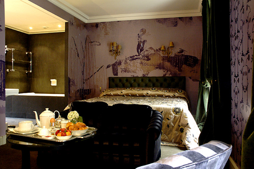
Guest Room

Purple and gold... so regal.  I could wear my gold crown from the breakfast room in here! I have to admit that the distressed scribbly wallpaper is a little 2004, I bet I'll like it again in about 12 years, which works out great as I will have finally saved enough Euros to book this room by then.  (room designed by Pierre Fichefeux)

**Ok, everyone, this is important:  I want you to take a good look at the photo I just showed you.  Did you note the incredible gold bathroom?  Yes?  Got it?  Listen to this:  I painted my master bath in my last rental in the most luxurious (and insanely expensive) metallic gold paint.  Floors, ceiling all of it.  My landlord liked it (it was just a duplex not an apartment) he kept it when I moved.  BUT  the, ahem, stylish, girl who moved in after me is painting over it.  I am so grossed out.  I'm tempted to cut out all the UK magazine articles I've been reading about gold walls and mail them to her with a threatening letter.  Seriously, what is she thinking?  I bet she paints it beige.  yuck! yuck! barf city!**

sorry. back to the hotel.

Incase you're as in love with this hotel as I am and you want to find it, here's what to look for:

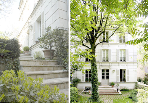
hotel exterior

so cute, right?  I couldn't find any information on the building, but I'm guessing it was originally a home built forever ago, like everything else in Europe.  Go there, let me know what it's like, bring me back a little scrap of wallpaper.

Hotel Me About It

I first discovered Portland, Oregon's Ace Hotel when a web design client of mine asked me to use the Ace splash page as inspiration for their site.  While the site is lovely and I was happy to accommodate my (awesome!) client, I was WAY more excited to take a peak at the grounds and play a nice round of fantasy vacation.  I wanted to pass it on to you kids today because, ever since last weeks post, I've been obsessed with ridiculously over-sized wall silhouettes:

Ace Hotel Guest Rooms 1

Get a load of that cat!!!  I have to tell you, I was dead set on painting a scary windblown woman until I saw this fancy feline.  What do you think his name is and do you think he wants to come live with me?  I'm also totally crushin on the freaky hanged man in the room on the upper left.  What do you think, for the guest bedroom, perhaps as some kind of warning:  return the towels to the rod neatly folded, or else.  Yes, I think that will work.

Before moving forward, I really need to clarify something:  when I say obsessed with giant wall silhouettes, I am in no way referring to the mass produced vinyl (usually floral) wall stickers  that are swimming all over the web right now.  I don't like them, I think they are tacky and I don't want them in my house.

That said, let's check out some more of these fancy diggs:

Ace Hotel Guest Room 2

While I often fantasize about vacationing for the hotel alone and skipping the city altogether, I do think it's important for a hotel to reference the town it's in.  I think these moose Thompson Elk (thanks Adnon) blankets are such a perfect solution; that bald eagle sends the message pretty well, too.

Ace Hotel Guestrooms 3

I really don't care about that shampoo and I'm even more disturbed by the web designers choice in font...dakota script, what's up with that?  I do however, really like that bathroom.  The black tub is sexified to the max, I'll take one, please.  The wild-things-meets-viking street art is nice too, but a little too cartoon-y for my house.  Again, loving the blanket.  I also really like how well they mixed rustic wood with a few sleek modern elements:  aces, Ace Hotel. 

While I'm hanging out with my giant cat, the Ace Hotel promises me these luxuries:

Ace Hotel

Wait, where's the room service?  I might have to leave my swanky pad?  But I was going to have dumplings in the tub!  But then again... there is a mini bar.

***

Update:  room service now available.  Bathtub food party for everyone, hooray!