Architectural Digest Gone Wild!

Will you think less of me if I admit I'm a bit of a shelter mag virgin? Sure, I've been blogging art and interiors for going on three years now, but until recently I depended on the internet for my resources. Thanks to a generous holiday gift, I am now the proud owner of AD and Elle Decor subscriptions. I'm sure trees everywhere are throwing up their branches in disgust, but what can I say? I'm addicted to the glossies already. So I was pretty stoked to get AD. I mean, Margaret Russell at the helm = instant awesomeness, right? Well, my January issue arrived and I was bewildered. The February issue arrived and I was confounded. As it turns out, the current issue is the first with La Russell's indelible mark. So now the March issue has arrived and I've been full on flashed by naked drunken boobies -- metaphorically speaking, of course.

That's not a bad thing. I like boobies.

Heiress and tastemaker Daphne Guinness' New York apartment almost warrants two black bars to cover up the naughty bits. Guinness maintains her space combines, "the shine of Metropolis... with the lush flora of Suddenly, Last Summer... a sort of savage modernism." I have to say that I sort of scratched my head at her apartment until I read that sentence, and then everything just clicked into place for me. I won't post the rest of her home, but you can see it over at 2THEWALLS (a seriously fantastic blog).

Beyond the types of projects featured this month (a glorious home designed by Commune, among them), the biggest change that stands out to me is the photography. I swear, AD homes always looked like nothing so much as mausoleums, darkly photographed using only artificial light. Downright dead and dull.

With Thomas Loof on duty as principal photographer at Guinness' shoot, and the inimitable Francois Halard at the helm of Pierre Passebon's wild and wacky pad (designed in collaboration with Jacques Grange, no less), things are looking a lot brighter. Alive, even.

RIP, old AD. Boobies in your face.
Guilt Gift

Sorry about yesterday. That was some ugly bizness, but I'm hoping to make it up to you. Let me prove it, baby. I'll never hurt you again.

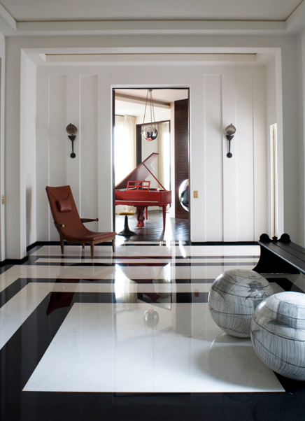
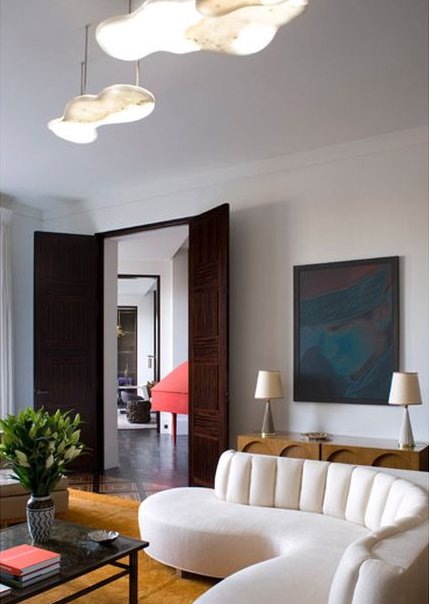
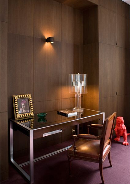
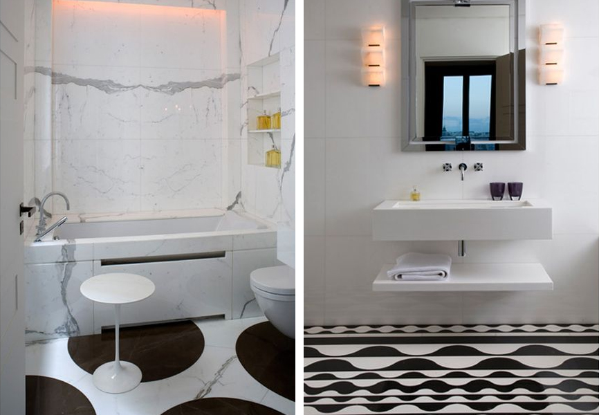
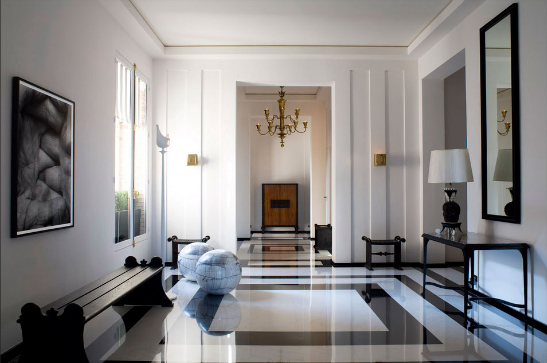
This gorgeous French home was designed by architect and decorator, Pierre Yovanovitch, and it should act as a healing salve for your sad eyes.

This place is P.I.M.P. Trust.

Later, dudes. I'm going to build a fire and try to avoid freezing to death.

Stay warm.

"A Glorious Pigeon Coop and Rat Motel"

I love old stuff. I'm sure a lot of my appreciation comes from being a photographer -- the camera loves decay like Top Chef loves Padma's boobs. I also grew up in a turn of the century house, and my earliest, fondest memories are of peeling fabric wallcoverings, stained ceilings, and wood burning stoves. It's the stuff teary eyed nostalgia is made of. So when I saw this renovation of an early 1900s abandoned building, I could almost feel the paint chips dusting my eyelashes. Ah, memories.

Industrial designer David Hurlbut has spent the last 10 years renovating this 20,000 square foot building in Selma, Alabama. Purchased for the ridiculous sum of $100,000, Hurlbut has also spent an additional $150,000 in renovation costs.

Considering the size and previous condition of this beast, I'd say that's next to nothing. Apparently the home was in shambles when Hurlbut moved in; the pigeon offerings alone filled several dumpsters.

Much of the low renovation costs can be explained by his sense of preservation. Whenever possible, all of the original flooring, woodwork and walls were kept and simply cleaned.

Other finishings were bought second hand on the cheap, like these vintage light fixtures.

The refrigerator was purchased from a New Orleans jazz musician for $100. The story goes that Louis Armstrong also used the fridge a time or two.

A few items -- like the hand cast gargoyle above the bed in this room -- were made by Hurlbut himself, who is an industrial designer by trade.

In other cases Hurlbut kept and refurbished fixtures -- case in point, these original chandeliers.

More examples of frugality personified: the chair on the left was $3 and the working ham radio was a gift.

“It's a joke amongst my friends... If if's not big, old, heavy, and obsolete, David doesn't want it.”

I love it all, except the peeling paint looks like lead poisoning on a stick. Cover that with a clear satin finish, stat!

It's really a wonder that I'm not dead from some kind of toxic dust, considering that I spent 15 years living in an old house that was constantly under renovation. Still, I would do just about anything to live in a house like this again... anything except move to Alabama. Sorry 'Bama lovers.

Check out the beautifully photographed NY Times slide show here.