How'd They Do That: Super Magic Edition

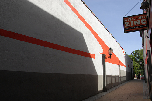
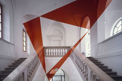
I've posted before about how much I love Swiss artist Felice Varini's eye popping large scale work:

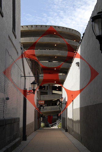
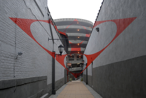
Until now his work could only be viewed in person when overseas, but non profit group Site Projects has brought Felice to New Haven, Connecticut, for his American debut. His signature perspective dependent graphics have taken over Temple Square and the result is predictably magical. If you happen to live the area, head over before the end of June to see some free, amazing public art. The rest of us can enjoy this backstage peek into the making of a megalith.

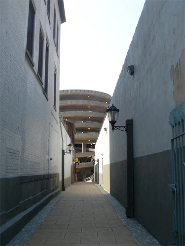
So, how does this ordinary alley and parking garage:

Become a mind bending play on space?

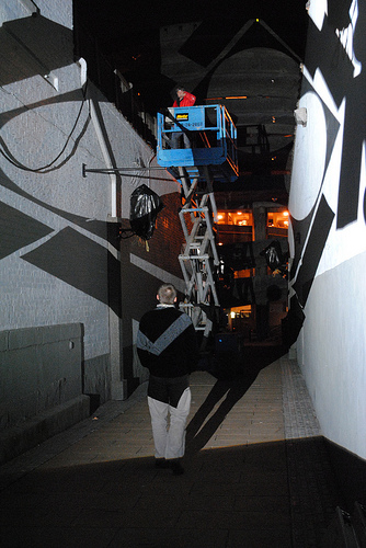
First you have to set up a giant projector:

And then you wait for darkness.

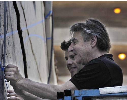
Once night falls, Felice gets busy taping out the design.

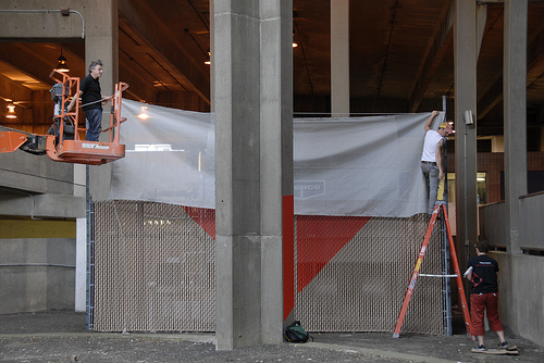
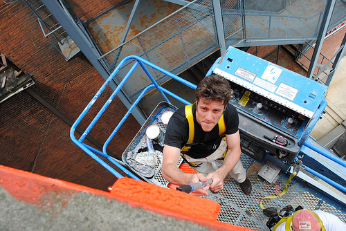
Then come the cranes, ladders, and paint.

Plus cute boys. Wait -- did I just type that out loud?

Once the painting is finished, every surface becomes a canvas, changing its shape depending on the viewer's perspective.

Magic!

Thanks to Site Projects for giving us this insight into the makings of a masterpiece. Now, you'll have to excuse me while I whip out my projector and start drawing on the walls... imagine the possibilities!

I'll let you know how it goes.

Invisible Cities

Long ago, in a far away time, I bought my acid washed, peg legged pants from Esprit. Now I buy them at Urban Outfitters. In case you haven't noticed, the crazy 80s are back in a big way. Of course the wide world of interior design isn't immune to the vagaries of trends, which seem to progress through the art-fashion-pillow life cycle until they die a gasping, lonely death on the clearance shelves of TJ Maxx. Short lived though they may be, I like following trends -- although I have to say I felt a little green at the gills when I first saw the new slew of statement making brights and strong shapes. The 80s were not kind to me, with its broccoli bangs and crop topped warfare, and those linebacker sized shoulder pads that required nothing less than an absolutely unwavering sense of self confidence. Should I admit that confidence was not a quality I was born with? I still have to work for it. Every day.
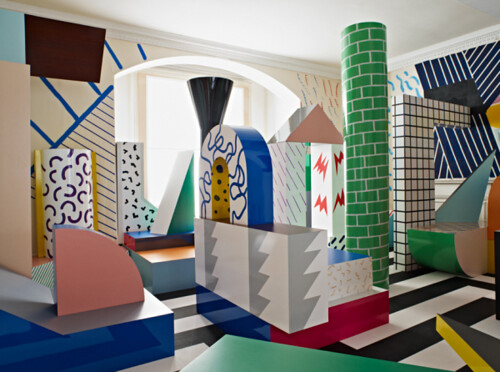
Studio Toogood

Maybe my hard work is paying off, because I'm starting to move beyond my own crippled sense of nostalgia as I approach this second wave of 80s inspired wares. I'm even setting my jaw and looking deep into the neon heart of the past, to primary sources like Italian designer Ettore Sottsass, who is looking more and more like a straight up genius when viewed through my new confidence goggles.
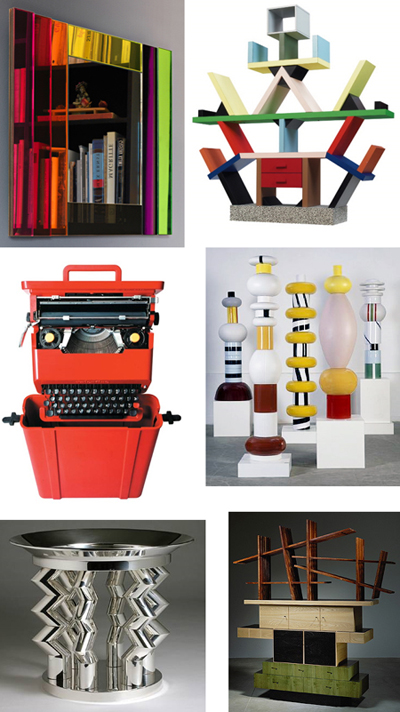
Ettore Sottsass

One part Beetlejuice, one part Bauhaus, and one part boozy good time, Sottsass set the tone to angular and primary as founding member of the Memphis design movement. Though his work should never be confused with the current, flimsy iterations of post modern furnishings typically found at Eurway, they do take up some majormajor visual space. As even Sottsass acknowledged, a little goes a long way.

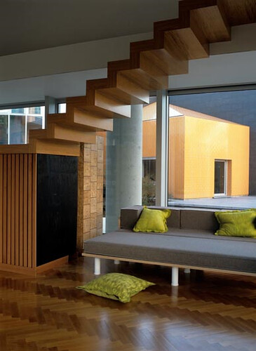
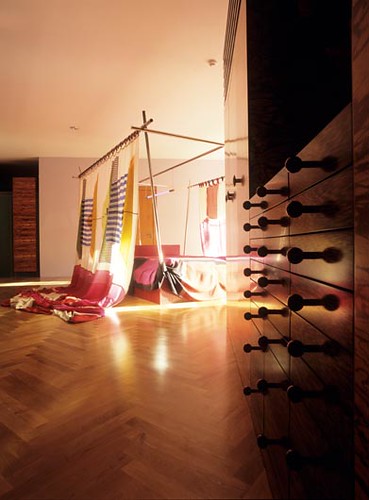
Though I can finally look at his high Memphis work without enduring painful flashbacks, I was still jazzed -- and relieved -- to see this house he designed near the end of his long life:
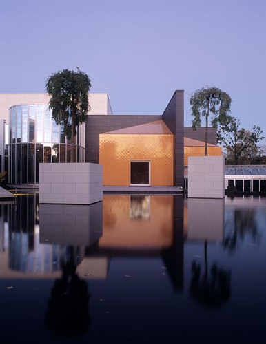
OWI

Working into his 80s, Sottssass' mellowed out architectural effort looks to the past while also giving me something to look forward to. Within it, I see the seeds of a more mature Memphis inspired design aesthetic. And I like it. A lot.

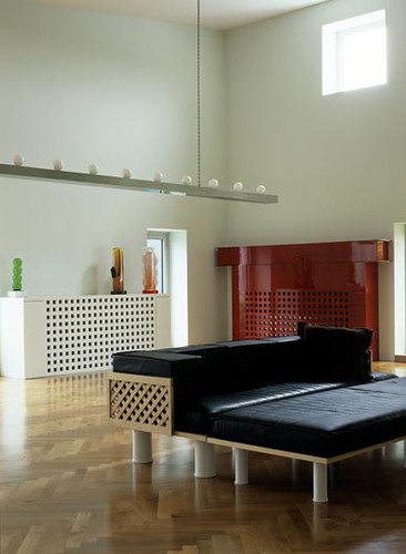
Spare but warm, angular but not wildly so, this house is eminently livable. And of course the acres of glass, stunning reflecting pools, and luxe finishes don't hurt. It's obviously the refinement of a life's work.

Sottsass died at the tail end of 2007. I suspect that the scope of his influence is only beginning to surface, but don't think that other designers haven't already begun mining. Kelly Wearstler's beach house and Avalon Hotel have obvious smart references to Sottsass' late work. Expect to see a lot more of the Memphis master, but not the kind that demands confidence.

The kind that inspires it.
Is That Your Pupa, Or Are You Just Happy To See Me?

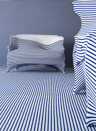
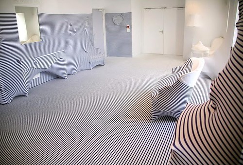
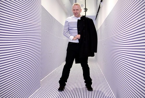
Jean Paul Gaultier is the latest in a succession of fashion industry giants to design a room for Elle Decoration Suite, and the results are predictably offbeat. Because you can't exactly expect a man obsessed with assorted fetish wear and tasseled conical boobies to suddenly morph into a winsome Nick Olsen type, now can you?

jean paul gaultier elle decoration suite

Employing various motifs found within his fashion collections, Gaultier's apartment reads like a whimsical S&M club.

jean paul gaultier elle decoration suite

jean paul gaultier elle decoration suite

There's something larval about this whole setup, but I find it to be credible as a concept room. This, however, frightens me:

jean paul gaultier elle decoration suite

Sorry, but dolls are always going to elicit a WTF?! response from most people.

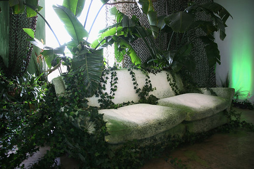
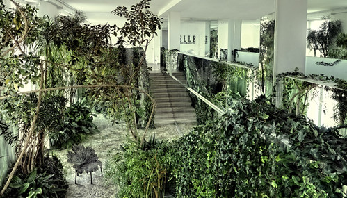
Oh, and there's also an indoor jungle. As if you could have a fashionable apartment without one!

jean paul gaultier elle decoration suite

jean paul gaultier elle decoration suite

These days it seems that every Tom, Dick, and Zac, is jumping from fashion to interior design -- often with retinal scorching results. If the previous two iterations of Elle Decor Suite by Christian Lacroix and Martin Margiela hadn't been so worthwhile, I might altogether question the wisdom of these endeavors.

jean paul gaultier elle decoration suite

What do you dudes think? Love or hate Gaultier's take on apartment dressing? He is kind of cute in those stripes...