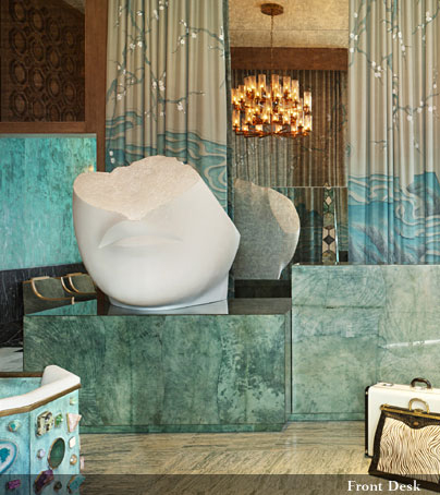
Yesterday it was plywood, today it's Kelly Wearstler. Could two things possibly be more diametrically opposed? Anyhow, I had kind of forgotten about KW (possibly due to the fact that her hair raising exploits on Top Design are on hiatus), but whilst cruising fave blog If the Lampshade Fits I was informed that KW's house had made an appearance in Vogue. Has Erin been living under a baby shaped rock, you may ask? So I'm a little slow on the uptake, but I'm chancing an overpost in order to put up a zillion KW pictures because I think she deserves a rematch in the KW vs Haters fight for world domination over interior design.
Say what you will about Wearstler -- she has wrong hair, the whole world has seen her boobies in Playboy (find your own link, pervs), she is responsible for the trellis pattern that will not die, she thinks pink and purple look smashing together -- but you can't say that she isn't influential. And she is never, ever boring. Negative space? What negative space? Her rooms have an all overness that many other designers' spaces lack; every square inch looks considered. And I really like what she did with her house giant freaking mansion.

Well, most of it. A zebra rug? Really? But doesn't that wallpaper make you want to go paint your own walls all scibbledy scrabbledy, because it is AMAZING. And it doesn't hurt that she lets her adorable kids climb all over her mansion like little berserker monkeys. I like that about her.

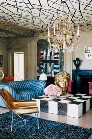
And, uh, have you seen this? Have you? Hello giant gold head and insane ceiling wallpaper! KW always has the most interesting furniture, but her house never looks like a furniture museum -- nothing sticks out, and everything looks properly integrated. Apartment Therapy is buzzing with hate over it, but the only thing I hate is the crappy image quality. Oh, and the flowers.

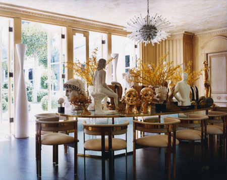
This does not mean I am professing a sycophantic love for everything Kelly Wearstler. I do not understand this dining table arrangement at all. Unless those gold heads are undercover plate holders, this just strikes me as weird. Actually, it strikes me as weird, anyway. But how about those chairs?

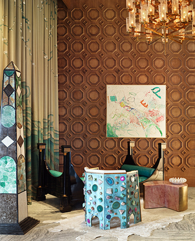
She does have a knack for picking quirky furnishings. Everyone needs a giant pair of priapic verdigris topiaries, right? Ok, so her spaces often veer toward the fantastic, but that's not such a bad thing, is it? Can we not just pick and choose certain ideas and apply them to our own home design?
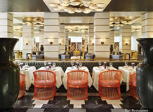
Enough rhetoric. I am concluding my argument with a barrage of images from what I think is the most interesting hotel she has designed for the Viceroy empire -- Miami. It's maximalist in the extreme, but I could tear up a weekend at that spa.


So what do you think? Did you notice the giant head sculpture looks a lot like the one Karly found at Round Top? Did you catch the Eadweard Muybridge inspired mural in the spa locker room? Did you see the couch in the pool???
I rest my case and await your rebuttal, gentle readers.


