No Mercy

I just finished watching The Diving Bell and the Butterfly, a movie about the former editor of Elle magazine who was paralyzed by a massive stroke at the tender age of 42. It was such an amazing film, so luminous and unexpected, that I was curious about what other projects director Julian Schnabel might be currently involved in. I already knew he was a famous painter and respected film maker -- having seen Basquiat I was expecting great things from his latest movie and I was wholly undisappointed -- but I didn't realize that he had also extended his creative pursuits to interior design. Now I know hotels are usually Karly's forte, but since I'm nursing a mental crush on Schnabel, I thought I'd check out his take on the newly renovated Gramercy Park Hotel in New York:

gramercy

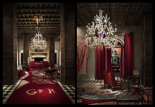
Is it just me, or does the (grand) entryway look like it belongs in a Harry Potter book? I think it's the script on the custom designed carpet... I have to admit I've always wanted a checkerboard floor, though.

gramercy

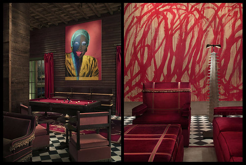
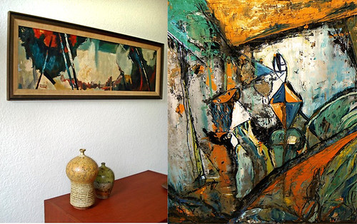
Here's a better look at the hotel's art collection which rotates some pretty heavy hitters. Although I'm not familiar with the particular pieces, I'm pretty sure that's a Warhol on the left and what must be a Cy Twombly on the right. Schnabel also included several cast bronze pieces he made, including that creepy Beetlejuiceified lamp.

gramercy

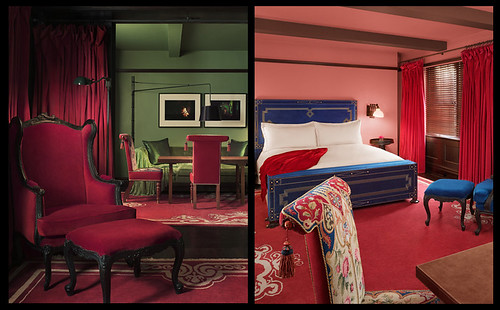
There are plenty of bars in the hotel, which suits the decor well since bar design seems to lean toward the theatrical anyway. Of all the rooms, I think these two are my favorite. The Damien Hirst spin art painting on the left is a great counterpoint to that amazing pendant light display and the red curtains, and I love the pink walls with the gold Warhol Rorschach painting on the right. The Beetlejuice bronze definitely looks better as a chandelier than as a floor lamp.

gramercy

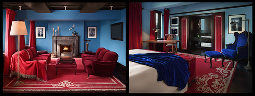
The rooms themselves are a little... different. Instead of relying on art as decoration, they almost look like paintings themselves. This suite is very Vermeer, I think.

gramercy

The penthouse is similarly jewel toned, with extremely bold color choices. I wonder what it would be like to actually sleep there, not that I'll ever have cash enough to find out.

When talking about his paintings and films, Schnabel claims that he's "aiming at an emotional state, a state that people can literally walk into and be engulfed." It's funny that his movies, not tactile in the conventional sense, do exactly that, but that his hotel seems superficial in comparison, despite its obviously tactile and luxurious environs. I think it's a little cartoonish, sort of like Disney meets the Whitney Museum, and that it misses much of what makes his films and paintings great: a sense of scale and proportion, a willingness to mix real with surreal, and enough grit to take the shine off the decorative.

What do you think? And I being to hard on my new hero? Does adulation always doom the adored?

Color me bad

My dear sweet ma is still in town, which has done wonders for my household organization but is really putting a damper on my blog posts (I'm thinking of starting a "while guests are in town" category, just to put all the sad, weak posts in one pathetic little corner).  Don't get me wrong, the pictures you're about to see are ever so delightful, but my humor really isn't up to par (especially following Erin's great bathroom post yesterday). Tomorrow my mom and I are going to be hanging some floating shelves in my living room, I have long planned to organize my books by color, so these photographs by artist Helga Steppan from her series, See Through, jumped right out at me:

white

blue

black

yellow

gray

red

pink

misc

Notice how she has, like, hardly any pink?  I don't blame her.  Red is great until it becomes pink.  Also, notice the last picture, all the miscelanious stuff:  I have been wondering what to do with all my books that have several colors, should I just throw them in a pile and take a picture of them?  Maybe I can force someone to blog about them for me.

In other news:  my new couch fabric came in today so I'm hoping to have a big fat couch after post soon.  I also got some deluxe black and white striped fabric for my bedroom curtains (sorry erin, I'm going with a printed curtain).

that's all, time to go watch sad sad HGTV design shows with mom.


Express Yourself

Sorry for the short posts of late, but I've been super busy with house guests and birthdays. In other words, I've been having a little bit way too much fun... I do love summer! Anyway, I know I'm behind the curve here, but I am completely obsessed with Mad Men. If you haven't seen it yet, well, watch it not only for the great acting and story lines, but also for the AMAZING set decor. It takes place at an advertising agency in 1960, so all the furniture is sleek Knoll and Herman Miller, Saarinen tulip chairs and Stiffel lamps, walls are covered in walnut paneling and grasscloth, all with punches of lime and red to lend character to the neutral furnishings. This isn't the best picture, but I think you can see what I mean:

mad men

The paintings in particular caught my eye, mostly because I am searching for the perfect something to fill a blank space on my wall. I never thought I'd say this, but I think I want an abstract expressionist painting for the wall behind my sofa... I really hope my old art profs are covering their eyes, because matching art to your furniture is so very naughty.

Nevertheless, Ebay tempts me to decorate away with their wide selection of vintage abstract paintings:

ab ex montage

Clockwise from top left: J. Van de Bogert, Nicola Naimo, Andre J. Grill, W. Nolte.

Although I had to hunt through pages and pages of paintings that said they were abstract but weren't (hello, people, a painting of driftwood and flowers is representational), I did manage to find quite a few gems. Of the paintings above, I really think the black and white is the best of the bunch, followed by the one with the white background.

Here are some more goodies by Bela de Kristo and I. Zevon:

paintings

I think lefty is more versatile, but with the right wall color that purple background could look fantastic. Really, though, I like both of these, but with starting bids at $450 they're too too rich for my poor poor blood.

paintings

These paintings by Martin Pearce and an unknown artist have earthy undertones that would work well against a pale aqua wall... which I no longer have.

painting

I'm considering this 50's painting by Josef Jose but it's so hard to tell what the colors will read as in real life, and I suppose this is part of the danger of decorating with art. If you buy something because it's amazing and it speaks to you, then you'll always find a place for it. If you buy a piece to coordinate with something, then you run the same risks of color trauma that you do with ordinary fabrics, rugs and patterns.

Hey painting, if you want to live with me you better start talking.