Well, well. Finally a challenge where each person has to design a real living space, and no ridiculous swithcharoos took place to amp up the contrived drama. Is it just me, or was last night's episode actually... better? I kind of even found myself beginning to identify with the contestants. Eddie didn't come off as a bitchy subhuman prima donna, and Natalie said the word "Caesareum" to her carpenter. Someone's not as stupid as she looks (or at least as stupid as the producers script her to be). Maybe I'm just feeling warm and fuzzy because I kicked ass on the Pop Design. Was that a clever manipulative tactic by the producers to give viewers a means to participate in the show? Whatever. I WON. So I liked that part.
On to da important stuff: Critiquing each contestant's "Room of the Future," all of which were furnished largely with pieces from Ikea, Modernica, and lots of spray paint. I could point out here that only one of the previously mentioned categories is actually futuristic, while the other two are rooted in the 60's vision of Stanley Kubrick futurism, but why bother. It's clear that contemporary design is largely pastiche anyway. Let's go from worst to best, shall we? First up: Natalie.

Wow that's a lot of junk in that gross tangello colored space. The bookcase is particularly vile, and to that end I have a word of advice for all the contestants: don't use giant bookcases because you don't have anything to put in them! I mean, how many tchotchkes can a person collect in two days? Also, I would like to know what happened to the holographic strip club background that Natalie was pole dancing in front of. Even though I hated it, I kind of miss its extreme tackiness. This room just looks like a poorly staged Ikea showroom.
Second up: Andrea.
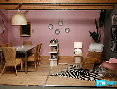
This room isn't horrible, it's just boring and tired. Sadly, I actually own that giant badass wicker light fixture* and a zebra rug. It's making me want to get rid of those two items even though my dining room is thankfully NOT saccharine pepto bismol pink. Point is, this room is so 2007, ergo, it's NOT FUTURISTIC. In the future, we have eaten all the zebras, wicker is an endangered species, pink is outlawed, and we have learned to hang multiple items in odd numbers. (Although I'm pretty sure even the Greeks knew that last part, right?)
*Where did Andrea get that light fixture? Didn't she have another one that she was unable to put together???
Third: Ondine.
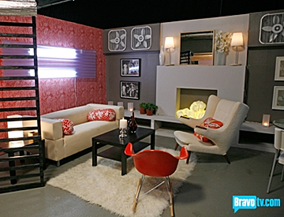
Ondine, Ondine. I kind of like this chick, and I even found her headless chicken routine to be a touch endearing, as I imagine that's how I would act if I were on this show. However, her designs are always missing something. I loved Kelly's idea to have 16 of those industrial fans mounted on the wall, and I think her comment speaks to the fact that Ondine can't just pick one idea and really go for it. Still, her colors are goodish, I liked that she did a lot with lighting, and overall there were some worthwhile ideas in this space. I just reread everything I wrote and it sounds... nice. What's happening here?
Fourth: Nathan
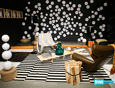
Ok, so this room is way over cluttered, but Nathan's concept of boxing up vintage design to display it like an artifact was so much more interesting than anyone else's. At first I thought he was going to have a giant plexiglass vitrine with an old, tattered dining set inside it, and I thought that was such an awesome idea. Instead, we got this unedited mess. He should have yanked that rug out, or painted it. Or whatever. But I still think that Nathan's better at making something out of nothing than the others are. I like his bundle of logs as end table and I see the beginnings of a layered room here, which must be hard to achieve when you have such limited resources in terms of shopping and time. I mean, would it kill the producers to give them an extra day and a chance to go to a flea market? The results would be EXPONENTIALLY better.
Fifth: Eddie.
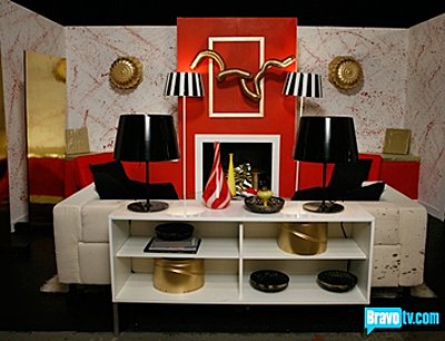
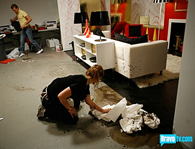
This is Eddie's lobby at a cloning firm, which looks like American Psycho slaughtered Beetlejuice. Kelly called it "Granny Gone Wild," which I found to be utterly confusing, but Kelly is confusing, as I will get to in a sec. Anyway, the red mantle is cartoon to the max, but I kind of like lampshades and the paint splattered wall... just not in blood red. Actually, it's too bad he didn't go ahead and give his Ikea Klippan sofa the jackson Pollack treatment after Ondine started the job for him:
Winner (and deservedly so): Preston.
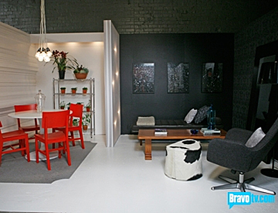
What a terrible picture, whereas many of the previous pictures made the rooms look better than they really did. Oh well. This room was kind of... good. I liked the black wall with space portal pictures, the dark wallpaper which read more as texture than pattern (thank god!!!), the fabric panel that separated the spaces and acted as a light box, and the weird molding wall painted glossy white. Oh, and the industrial light fixture made from several bare bulbs. I hate the cow print pouffle. Otherwise, I am pleasantly surprised. Hmmm.
On to the most important issue -- what was Kelly Wearstler wearing?
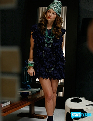
No seriously, what IS this? It looks like Joan Crawford in a navy blue Big Bird costume. Although I think her hair looks good under that... hat thing. Turban. Flower pot. Whatever it is. And she has nice legs, although I don't really feel like I need to see that much of them.
All in all, this week still felt like a Science Fair project on steroids, although I see a few faint glimmers of talent in there. I may not wish that I could stab my eyes out rather than watch Top Design next week.