One Room Challenge -- Where are They Now? My Crazy Dinette

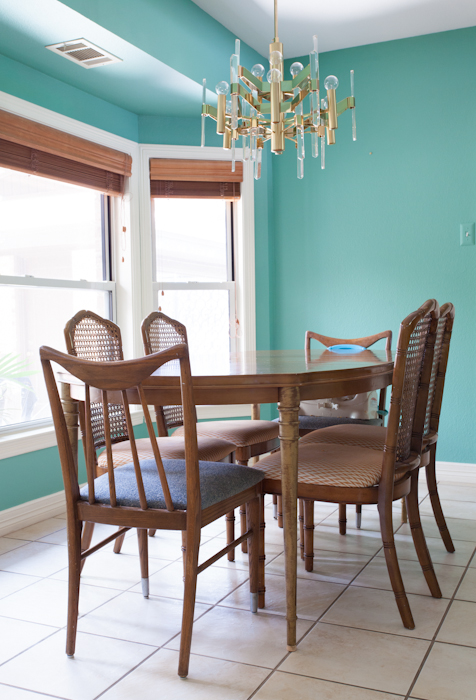
True to form, I am continuing my headless chicken routine by linking up late to the ORC party. It's a wonder anything gets done around here, what with 70 rounds of the flu and a work load that just won't quit (thankful for that part, not thankful for the flu). But I really wanted to tell you about what happened with my dinette. When last you saw it at the ORC reveal, the walls were screaming acid green and the vibe was OTT: arsenic austin designer

Not to toot my own horn, but in the photos it looks money. Solid gold. I know my strengths, and I'm good at dressing a set -- which is exactly what this room is for me. It's my little corner of the world where I can experiment and run wild. It's small and easy to repaint, which is handy because that color got on my nerves. For real.

arsenic austin interiors

In the daytime it was ok, but at night it felt like I was locked in an insane asylum on the moon. It was SO BRIGHT and the room is so small... it was intense.

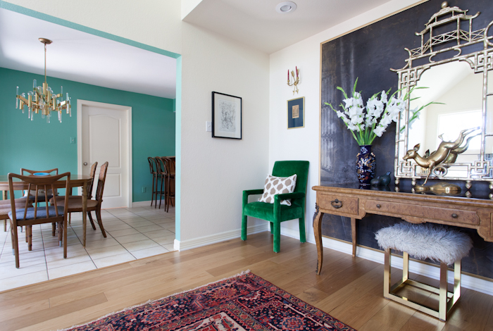
Add that to the fact that Bungalow Magazine asked to shoot my house right after the ORC ended and I panicked. As a self contained room this space worked, but when viewed in the context of the rest of my house it felt unbalanced.

So I did what I do. I repainted that shizz. Sanders helped me pick the color, of course -- Benjamin Moore Antique Glass.

bungalow buff strickland

And here's the photo Bungalow took. They made the room all dark and moody like, but you can see that the color is in the same vein but far less intense. I also swapped out the art with a vintage Round Top find and I think the whole thing is a vast improvement, although maybe not as bling bling exciting as the ORC reveal shots.

It's real world successful. My family can eat in here without sunglasses.

Next up for this room: figure out the horrible soffit situation. It can't be removed. Molding maybe?

Then I will probably repaint or wallpaper or get a new table and chairs or something. I can't leave well enough alone, you know. Designer problems!

***

I’m linking up to Linda’s ORC Now party.  To check out updates on all the ORC projects, please check out Calling It Home.


One Room Challenge: Week Two -- Hemlock Grove

Hello everyone, welcome to week two of the One Room Challenge! By now most assuredly you've had the opportunity to visit some of the other blogs participating in the challenge. So have I. Those people are talented. It's a little intimidating, but here I am powering through all of my self preservation instincts to bring you updates on the rehabilitation of my hideous dinette into proper society. You may recall that I spent last week hemming and hawing, holding a paint swatch of Farrow and Ball's Arsenic next to anything that would sit still.

farrow ball arsenic

Now I know lots of you out there wouldn't blush at the thought of a bubblegum pink living room or a lilac boudoir or an Hermes orange office, but I am Misses Conservative when it comes to paint. I like light neutrals and moody darks. I don't do midtone brights. But -- let's all say it together -- it's just paint. And it's a tiny, dark, boring room. I honestly couldn't come up with a reason not to spend a whopping three hours of my life painting this dinky dinette something transformative.

farrow ball arsenic

Like, LSD transformative.

erin-williamson-arsenic-3-4

And you know what, it's not half bad. I mean, my floors are bad, the soffit is bad, that unpainted register is bad. But the color? I kind of like it. I also think the name is cool... does that make me weird?

farrow ball arsenic

Arsenic is a super weird color -- it's not blue and it's not green. It's darker than the previous peachy pink yet suddenly I need to dim the lights at night.

farrow ball arsenic

It looks not too shabby with the things going on around it, although the dirty grout on the tile floors is KILLING me (spoiler alert: I already cleaned it).

farrow ball arsenic

farrow ball arsenic

I don't hate it. Does that mean I like color?

Will I pair it with neutrals as is my usual modus operandi, or do I go full on acid trip with mega bright art and upholstery? Perhaps somewhere in between?

Only time will tell. Tune in next week to see me pour a gallon of gasoline on that dining set and burn it to teeny tiny splintery ashes.

Just kidding, although I would pay to see that show. I do however need to get the furniture situation on lock. It's keeping me awake at night...

one room challenge

Until then, please do visit my lovely co participants:


Things They Are a Changing

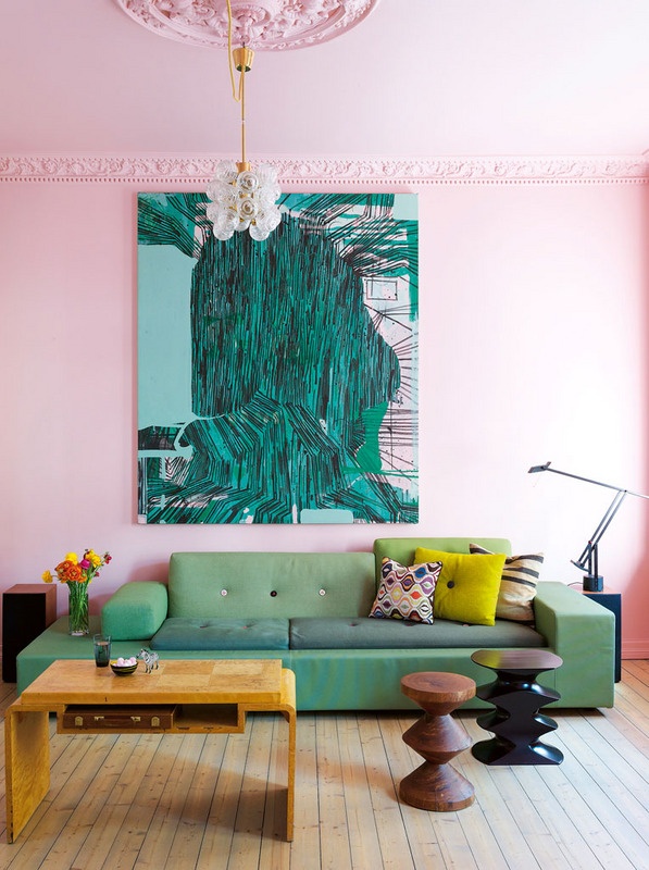
Out with beige and dirty colors, in with eye popping shades ranging from clear to blinding. Put away the olive greens and washed out blues and dingy neutrals. You can do those any day. Now is the time to go clearer. Bolder. Cooler. The perfect antidote to nasty dark winter. In particular, I think this is happening: design crisis

design crisis

design crisis

design crisis

design crisis

Keep the crazy under control by making everything else neutral and rich. Dusty black, creamy white, golden brown, all with loads of texture and patina.

Who's with me?