I just received the first shipment of wallpaper samples I ordered from Ye Olde Englande (that's what the English themselves call it, yes?) and I'm already adrift in a sea of choices. I was pretty pumped to start taping samples all over the walls until Ike caught wind of game, and let's just say I had to take him on as my assistant. Or else. Kid is either going to be a decorator someday, or he's going to design race cars made of paisley foil wallpaper. Boys are weird. Anyway, let's check out Round One of Wallpaper Sample Throwdown 2012.

Some cutie pie black and white patterns: Feather Fan by Cole and Son and Abigail Edwards' Seascape. You may recall I was pretty set on the seascape print for the nursery, but I'm not loving any of the white white fields in this house -- I feel like the walls need to go dirtier/creamier.
These are superfly powder room options. From left to right: Cole and Son Wisteria, Osborne and Little Summer Palace, Osborne Mara (fabulous with jewel tones). Any could work in there, but I was thinking of Summer Palace. However, the old teal colorway seems to be gone, and I'm still on the fence about this delfty colorway. Maybe too formal?

It's kind of... girly, and girls are weird.
Moving on, look how I am artsy AND fartsy. Embarrassing. Anyway, on the left is Neisha Crosland's Zebra. On the right is Cole and Son's Silk, which looks like a fabulous tufted fabric with this oddly tactile quality due to the layers of ink that sit on the paper surface. It's a really sweet paper. I picked these for the entry way but I think Zebra is too dark and Silk is too light. Bummers, because Silk is the one I had in mind, but like I said -- not loving the whiteyfied look. I did reorder a sample of Zebra in the stone/beige colorway. Maybe maybe.
I like these two better for the hallway. The left is Cole and Son Malabar and the right is Cole and Son Malachite. Bonus points to C&S for making non woven papers that are supremely easy for even a village idiot to hang (see my post here). Both are popular papers, but I think the tone on tone colors give them some new life. I'm not digging anything overtly graphic for the entry since you see it from both the dark teal room and the living room -- midtone neutral with a little something something is the way to go. I'm still not so sure about the metallic aspect, as I've actually been trying to cool it on the bling blung front (yeah, who am I?), but I like the way the patterns appear and disappear.
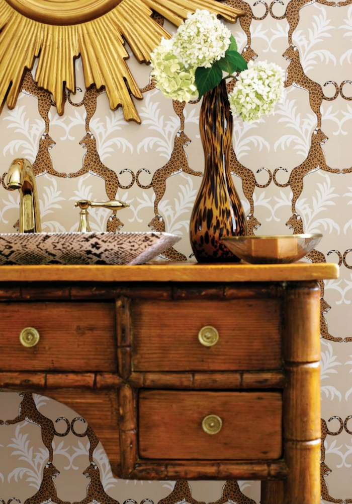
And then there's Thibaut's Cheetah. I don't know what I had planned to do with this paper... maybe powder room? Maybe upstairs hallway? Maybe paste it to my face? It's pretty amazing.

It's also totally ridiculous. I'm trying to avoid anything over the top, but... it's talking to me. I'm just not sure what it's saying.
Stay tuned for Round Two of Wallpaper Sample Throwdown 2012, which should be arriving any day now.
In the meantime, please tell me which ones I should choose, and which I should burn. Thanks.


