Yeah, I might want to marry these pictures... is that really so wrong? Is it truly unnatural to have a crush on home decor porn? Because there is a straight up delicious zeitgeist sweeping the decornation, and it's taken me a while to pinpoint exactly what it is that I like about it, but I'm on to it now. Contrast. Oh, sure, contrast has always been a decorating principle; the eye loves a good focal point, right? It's just that lately it's been contrast in pattern(s), contrast in color(s), and some of it -- while fun -- is frankly fatiguing and may cause retinal scarring. I'm certainly not going to abandon the best of trends past (why throw the baby out with the zebra bathwater?), but what I'm currently digging is contrast in form and texture, and especially, especially, contrast that comes from abutting something old with something slick and new. Like this:
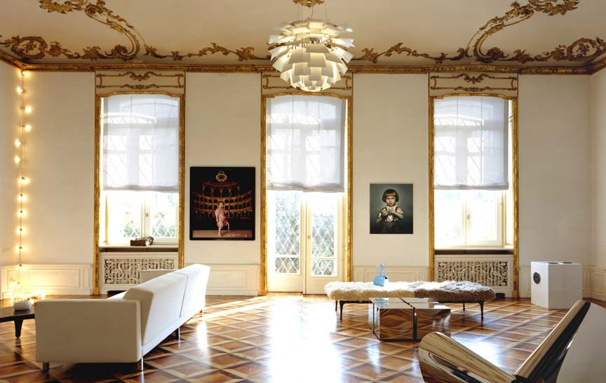
This is the number one reason that I'm sad to be an American: we don't have buildings this old, and if we do, I will never, ever, be able to afford to live in one (insert your own economy joke here). Nevertheless, I can freely admire these images shot by photographer Thomas Loof because they are sexy as all get out (whatever that means).
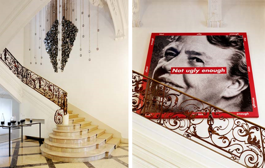
I spy a Barbara Kruger photograph and it's funny. That hallway is NOT ugly enough, but somehow such an ugly print just sharpens the pretty. Oh, and my family members may or may not be reading my posts, so I won't mention all of the illicit things I would do to own that house. (Instead, just think about what you would do, and feel free to leave your musings in the comments section below...)
Of course, there's contrast that real people can achieve, that isn't entirely dependent on jaw dropping architecture (although gorgeous bones definitely mean you can cut down on the makeup, as seen above).
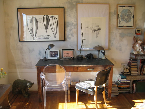
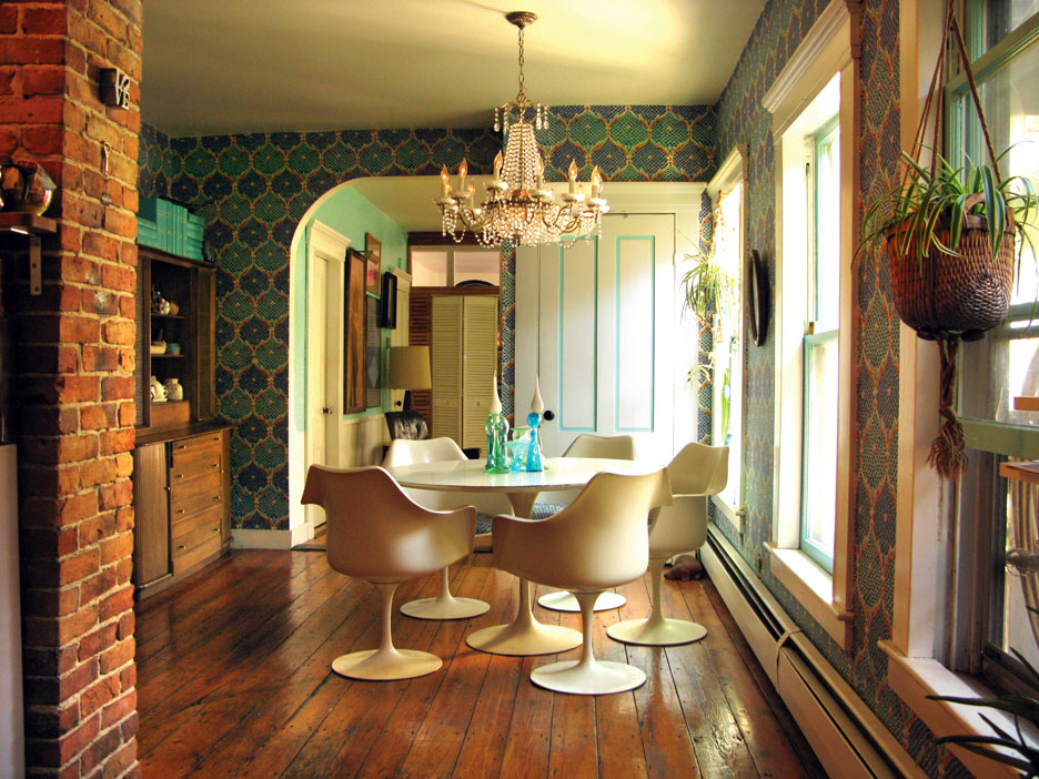
This little gem comes from Apartment Therapy, where the owners chronicle their hellish transition from cesspool to quirky San Francisco repository for a billion vintage collections. I do really love all the modern touches that keep this young couple's roughed up home from looking like crazy old Aunt Frances' cat-filled hovel. What do you think: is one Ghost Chair a gimmick, or does it go a long way towards adding polish and structure to this deliberately aged space? (Guess you know which way I'm leaning, but I love to argue...)
Of course, you can always depend on Tom Scheerer to show you how to mix and match new and old furniture for a splash of eclectic panache:
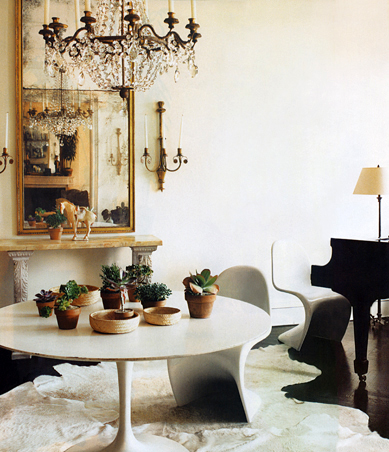
Are you sick of tulip tables and Panton chairs yet? I'm not, as long as they look like this.
Although I appreciate the clean white walls of Scheerer's rooms, I also like the ancient looking, rough hewn treatments that have been popping up everywhere, as seen here in Lucas Allen's portfolio:
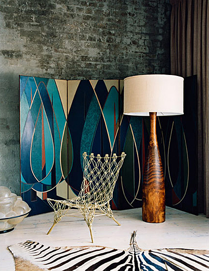
Did I say I didn't like zebra rugs, or blue for that matter? (But I totally want that Marcel Wanders chair!) As crazy Harvard professor cum shaman Timothy Leary said, "Set and setting." Modern shapes and patterns take on a new life when paired with natural elements (as in, NO imperial trellis wallpaper... although I'll probably eat those words when I see a single trellis papered wall hanging out in the middle of a forest... Actually, I kind of like that idea).
More brick juxtaposed with modern angles courtesy of Shoot Factory:
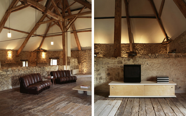
I love the bluntness of the furnishings against the randomness of the brick. (But I'd have white couches instead of brown, thank you very much).
Perennial faves Wary Meyers are masters of this aesthetic:
Yep. Another tulip table. But it looks so good when it's set against dark and natural surroundings. I love the oldness of the floor and the dinginess of the brick heroically holding its own against what appears to be relatively alien technology. I love the contrast. I know the new rustic aesthetic would throw a farmhouse table into this woodland mix, but I just can't go there. I need some relief from the browness of it all. (But there ain't nothing wrong with a farmhouse table in a super sleek and modern white house...)
This is another house that deftly mixes old and new, muted and punchy, baroque and sleek:
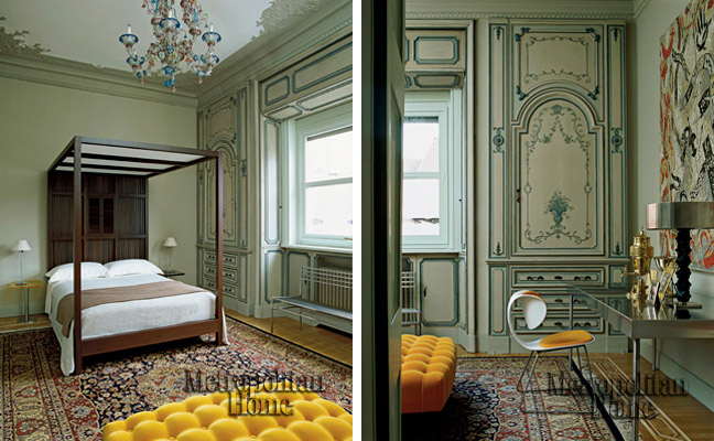
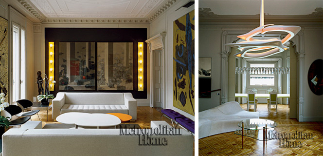
Holy hotness, William Sawaya's home featured in Metropolitan Home is incredible. To say anything else would be superfluous. (Except this: hey Met Home, your pictures are too tiny and would it kill you to make the watermark smaller???)
My last picture for today comes from He Who Must Not Be Named (no, it's not Voldemort. Well, maybe it is).
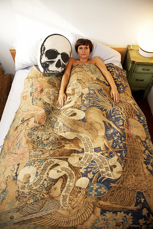
Reminds me very much of the gorgeous Suzy Hoodless pics I posted a few days ago. I now have the overwhelming urge to run out and buy some fusty old tapestries for my guest bedroom and artfully toss some shockingly red pillows on top. Stay tuned...