If any of you have peeked an eye into the real world lately then you know that the 2010 Winter Olympic Games are upon us. While winter athletics are the only sport I personally like to participate in, the thought of watching this season's games isn't really getting me all fired up. My lack of muster is 3 fold: 1. No Michael Phelps, or any hot swimmer ass for that matter. I'm sure that Johnny Spillane is cute as a button but until he races down the slopes in some swim trunks I'm really not interested. Reason #2: No time, dude. As you can see I have Olympic-sized blog posts to write which leaves me with very little Olympic-sized time to watch tv. Reason #3, and the reason for my post today: Crappy graphics. Sure, my HDTV delivers a fine picture, but who cares when the logos, posters and typefaces are so darn bad? Today's gigantor post (the proof is in the pudding, ya'll) is dedicated to the evolution of Olympic graphics, the good, the bad and the just plain not worth watching at all.

In the first quarter of the 20th century most Olympic posters looked like this. Before the spark of industrialism, they were fancy, flowery and not really appropriate for mass reproduction. Since the Bauhaus and all those funky Dadaists hadn't spiffed things up yet, I give them a free pass and say "ok, fine."
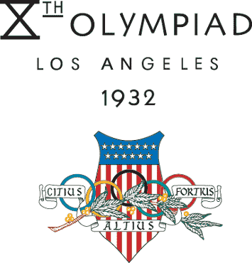
Same goes with the logos. Ok, in 1932 they should have known a little better, but, hey, it takes a while for the WHOLE WORLD to get all progressive and junk. Again, I assign a "sure whatever" to these designs.
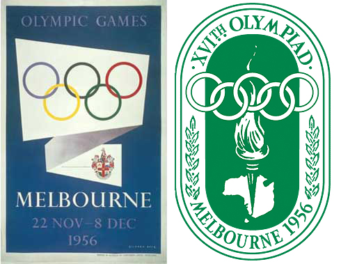
In 1956 things got a little shaken up down under. The Melbourne poster is leading the way for some pretty sexy Olympic graphics but that junky logo is dragging them down, man.
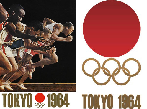
In 1964 the Japanese came in and put the kibosh on the crappyness. Cutting out the clutter altogether, the Tokyo Olympic games stuck to clean lines for their logo and highlighted their advanced printing techniques in their poster.
While the Tokyo Olympic graphics were pretty swell, shit went down in 1968:
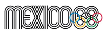
Designer Lance Wyman made way for a new era in Olympic logos by doing nothing short of balling up perfection and tossing it onto a piece of paper where it blossomed and flourished into the most perfect Olympic logo ever known in the history of mankind. Finally, a visual worthy of the athletic giant it represented. Rather than having a separate logo and poster design, Wyman expanded upon his (amazing! awesome!) design above, to create the official poster for the games:
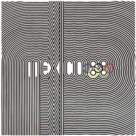
I'm just going to give you all a minute to enjoy this.
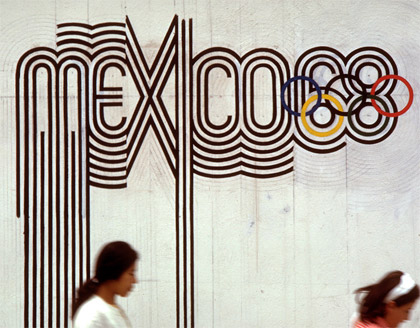
From his progressive graphics came a well-spring of art around Mexico City:
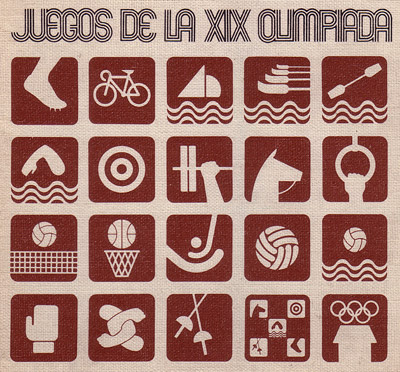
Wyman didn't stop there, he also spiced up the doldrum pictograms that had been used to identify each sport in the games:
Like the logo, the visuals were reinvented throughout Olympic village:
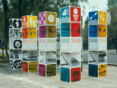
Even the least sporty among us can't deny how rad these colorful images are. Juxtaposed with the bold stripes of the logo, I would have attended these games even though my sweet baby Phelps hadn't even been born yet.
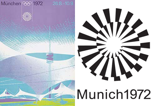
With the wind at his back, designer Otl Aicher was brought in to design the 1972 logo and graphics. His designs for the games celebrated the rebirth of Germany vis-a-vis colorful posters (a wee too fussy but still stunning) and a fancy light at the end of the tunnel logo. Do I like it as much as Wyman's? Um, no. But do I still think it's pretty awesome and that the Olympic officials are moving in the right direction? Yes, yes, and yes.
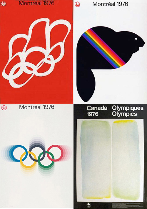
Things stay cool for the '76 Montreal Games. Look! Abstract Expressionism! I can get behind this. I can even get behind this:

Sure, it looks a bit like a logo that could slide across the screen before a PBS educational doc, but I like PBS, I like beta graphics and I like what's happening here.
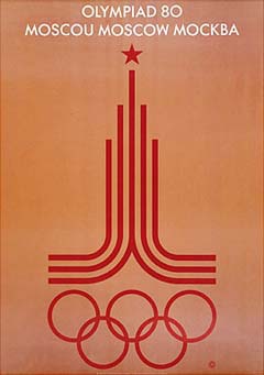
In 1980 Moscow doesn't let the Cold War (or 60 boycotting countries) put a damper on their logo. In fact, they hype the hell out of their games with an unprecedented number of official Olympics posters
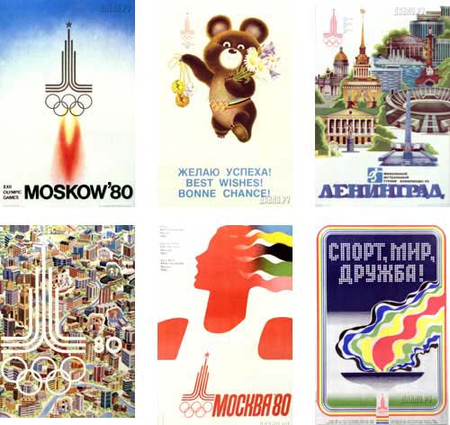
These graphics are starting to get a little cluttered, but I can really get behind any city that decides to put a good luck teddy bear on their official poster. Also, that rocket ship poster sets my space-race heart a flutter.
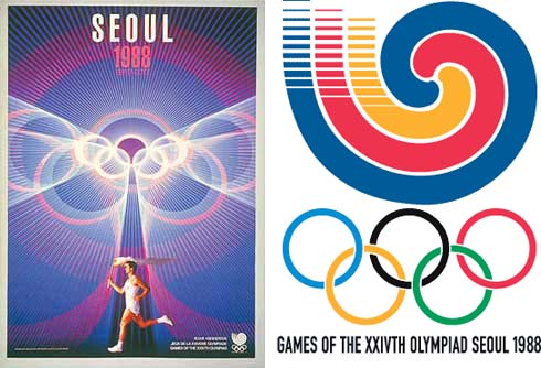
Things start to go a little pear-shaped in the 88 games. While that Journey-style poster makes me say "don't stop believin" that swirly logo says to me, "the wheel in the sky just might stop turnin"
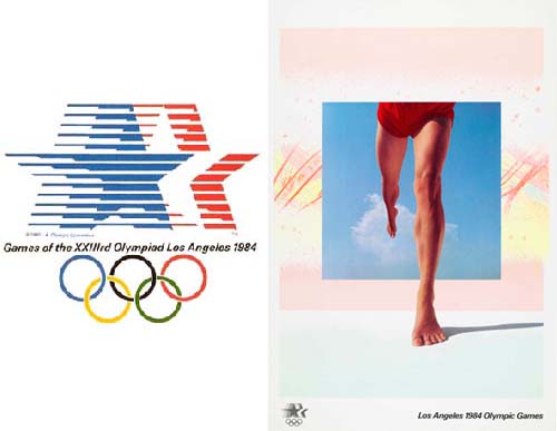
By the time the Los Angeles games roll around in 1984, the clean lines and sexy graphics of '68 are a distant memory. Here is a short list of where these snoozy, American-ized stars belong: on a box of Wheaties; the cover of a Bruce Springsteen album; or perhaps just team USA's jerseys, but never, ever ever should they represent the entire kitten-kaboodle. Also, would anyone care to tell me what the hell is going on in that poster? I think the background was lifted from the fabric on my childhood sofa.

It's pretty much down hill from here, with "contemporary" and "whimsical" design taking the place of anything smart, slick or sophisticated.
These are the biggest games in the world, what the fuck is happening? Is there an underground room filled with ex-disney employees coloring new logos somewhere that I should know about? If so, how does said room look? Maybe we could write a blog post about it.
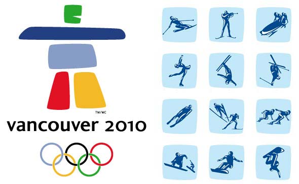
Here is what we have to look forward to this winter. That inuit come hockey goalie on the left hardly seems worthy of walking in Wyman and Aicher's footsteps. The pictograms on the right are ok, but I long for the days of simplified images, when 3 bold strokes instantly conveyed each sports motion.
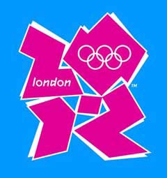
In 2012 we get to digest this vomit-blob for the entire summer season, I'm not even sure that Phelps's speedos can make this bearable. While I appreciate the divergence from the tonka-colored crapfest that's been taking place since 1992, the 2012 logo is just trying too hard. Simplicity man, simplicity.
It should also be noted that the 2012 logo is the first ever to allow variation in color throughout it's use. Translation: official Olympic sponsors may now use the logo in their marketing materials in any color they like. Let's prey to god that McDonald's is not a sponsor, I really don't want to look at this monstrosity in yellow and red.
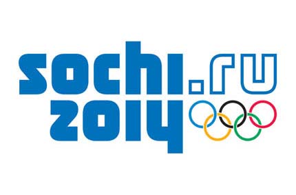
The Russians shine a wee baby light at the end of the 2014 tunnel with the first decent logo in over 2 decades.
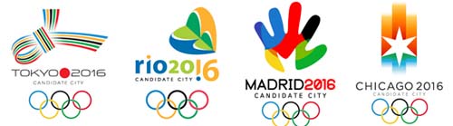
A location has not yet been selected for the 2016 games but, judging by the looks of things, it doesn't even matter. Until they hold that Olympic torch under the design committee's ass and demand some suitable logo work I'm starting my own Olympic boycott. Well, at least until Phelps is back.