In remodeling my home I've come to realize that you make good friends with the people who help you then, once your project is over, you don't get to see your redecorating buddies too much anymore. This is why we invented the ask Sander's column: even though most of my house is painted, I still have an excuse to stop on by Benjamin Moore (Hill Country Paint to you South Austinites) any time I want (insert maniacal laugh here). So, when Jason wrote us with an email lovingly titled "dumb dude needs help" I was more than happy to pay a visit to the King of Paint.

Jason recently purchased this ranch and is experiencing something my husband would never dare to dream of: his wife has handed him decorating carte blanche. From what I've heard about his plans for the inside, hello Cole & Son wallpaper, he's doing a bang-up job. The outside, as you can see, needed serious consultation. Jason asked Sanders to present him with 2 options: 1. Trim, accent, and door paint leaving the brick as-is, and 2. A palette for painting the whole kitten-kaboodle, brick and all. We'll start with the former.
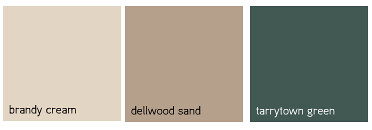
Sander's first suggestion is to use Benjamin Moore Brandy Cream on for the trim, Dellwood Sand for the accent (the piece of wood that runs below the roof) and a pop of Tarrytown Green for the front door. I like that this selection updates the home while simultaneously blending with the preexisting brick. One of the major problems with the house right now is that the trim is just way too dark brown. Lightening it up and letting the front door provide the contrast will clean up the look lickety-split.
Next.
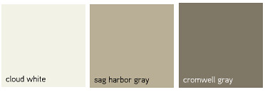
Another option for Jason that doesn't involve the laborious task of painting the brick: a nice light trim in Cloud White, an accent in Sag Harbor Gray and a Cromwell Gray Door. I like that sanders kept the door fairly neutral with this combo, letting the cloud white do the talking. The white would really pop against the brick, but in a really fantastic way, unlike what the brown is doing now.
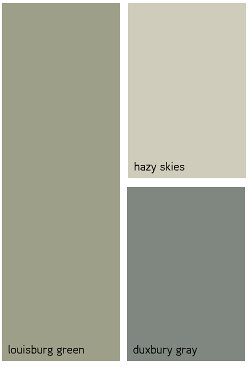
If Jason decides to paint the brick, which I 10000% support, here is an option for him: Body paint in Louisburg Green, trim & accent in Hazy Skies and a door in Duxbury Gray. Who can go wrong with Gray and Green with a nice, light accent? I think this palette will modernize the home without conflicting with the ranch style.
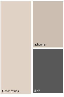
I have to admit that I'm a pretty big fan of this option: Body in Tucson Winds, trim and accent in Ashen Tan and Door in good ole Gray. I love a light house, I think it would really pop in that gigantic yard. Like the last option, it's a nice update without trying too hard.
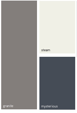
Finally, we have my favorite option. Ok, I'm a sucker for gray, with the Granite painted brick you could probably make the trim neon green and hot pink and I'd still love it, but I like what Sanders has chosen even more: Steam trim and accent with Mysterious for the door. I think this palette is the most sophisticated and I am BEGGING Jason to please please paint his house this color and send us some pictures.
I tried to find homes online painted similarly but wasn't able to find the right combination, so instead I did a crappy photoshop mock-up of Jason's house. Hopefully my elementary rendering won't scare him out of the project:
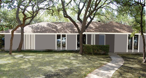
Jason, bear in mind that there will be much more depth in reality, it won't look like a gray play-doh fortress if given the treatment in real life. Squint your eyes and look at it (god, I've never had to say that about a design project) see, isn't it grand?
Best of luck, dumb dude! Be sure to send us pictures when you're done.
For anyone in Austin who is looking for a walking-talking color encyclopedia be sure to visit Sanders at Hill Country Paint: 5501 South Congress / 78745